Michael C here for an episode of Unsung Heroes dear to my heart. It took years for today's film to be elevated to something approaching its proper status. I feel like it's my duty to heap on it some of the praise it deserved when it first hit screens twelve years ago.
There are some elements to our favorite movies that our so beloved, so much a part of our imagination, that it’s tough to think of them as the result of a creative process. Like when you hear how the time machine in Back to the Future was originally written to be a refrigerator or how Errol Flynn was the second choice to play Robin Hood after James Cagney. The way we know it is so perfect, so unavoidably the way it should be that it’s difficult to get your mind around the fact that it didn’t spring from the script to the screen fully formed.
The design of the Giant from Brad Bird’s The Iron Giant (1999) is that way for me. The Giant is beautifully designed down to the smallest detail that reading Ted Hughes’ original children’s book I was a bit shocked to discover how little of it is there on the page. The most detailed the description of the Giant comes on page one when his head is described as being “the shape of a dustbin”. Every other description is limited to it being “giant” or “iron” or both. The book’s illustrations by Andrew Davidson not surprisingly depict him as an eighty foot tall Tin Man, with maybe a little Gort mixed in.
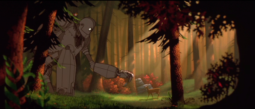
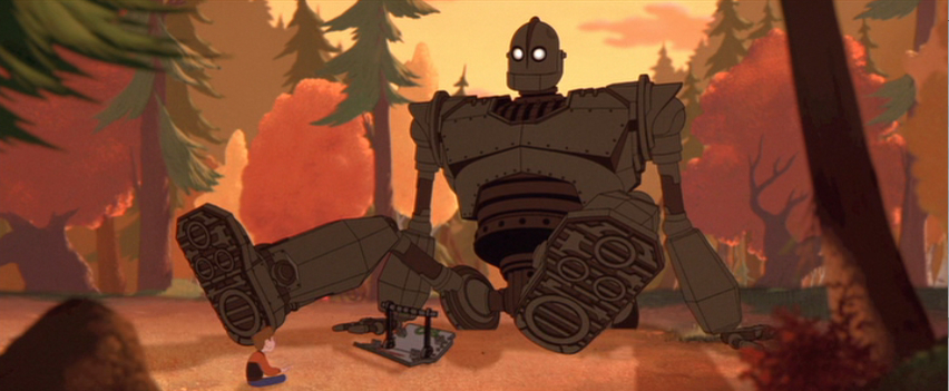
This makes the achievement of the film’s animation team all the more impressive. With his hollow eyes, bucket head, and immobile grimace it is astonishing just how expressive the Giant is. I was reminded of Gromit from Wallace and Gromit. The Aardman animators got around Gromit’s lack of facial feature by giving him one extremely expressive brow. The Iron Giant team manages a similar trick with mechanical shutters that act as eyelids. These, combined with body language (I love the way he clenches his fists in determination before blasting into space the final time) are incredibly effective at giving the simple Giant a full range of emotions.
Apart from expressing character there is also the basic beauty of the Giant’s design. The title character’s sleek 1950’s B-movie–flavored look is more visually arresting than an army of garish, cluttered Transformers. Part of the wonder of the character is that he seems plausibly functional.
Its ability to put itself back together is present in the book, but Hughes has him stumbling around sticking in limbs like a Mr. Potato Head, nothing like the movie Giant ‘s wonderfully intricate systems of moving parts.
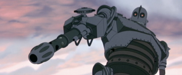
All that attention to detail pays off in spectacular fashion during the climax when the filmmakers reveal an amazing series of surprises about the Giant’s design, including rocket feet and an increasingly terrifying series of hidden weapons. You get the feeling the film’s artists, notably Steve Markowski, head animator for the Giant, could take him apart and put him back together again. It’s that depth of knowledge that makes a character, animated or otherwise, one for the ages.