New(ish) Posters! Let's discuss (aka judge harshly).

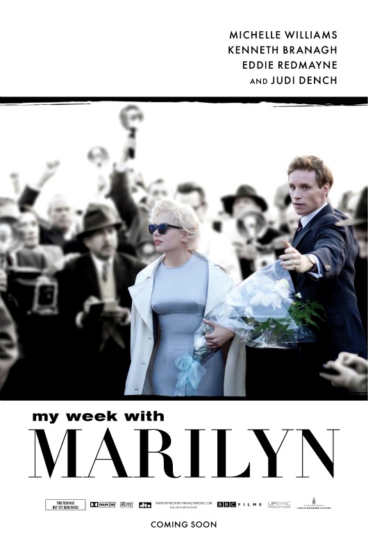
It's actually nicely stylized. But note that the big sell is not Michelle Williams but Marilyn Monroe herself, whose font size towers over her pretenders. I wonder what this movie will mean to Michelle Williams career though? If it flops does Hollywood assume she can't carry a film, even though it's less a Michelle movie than another Marilyn nostalgia exercize?
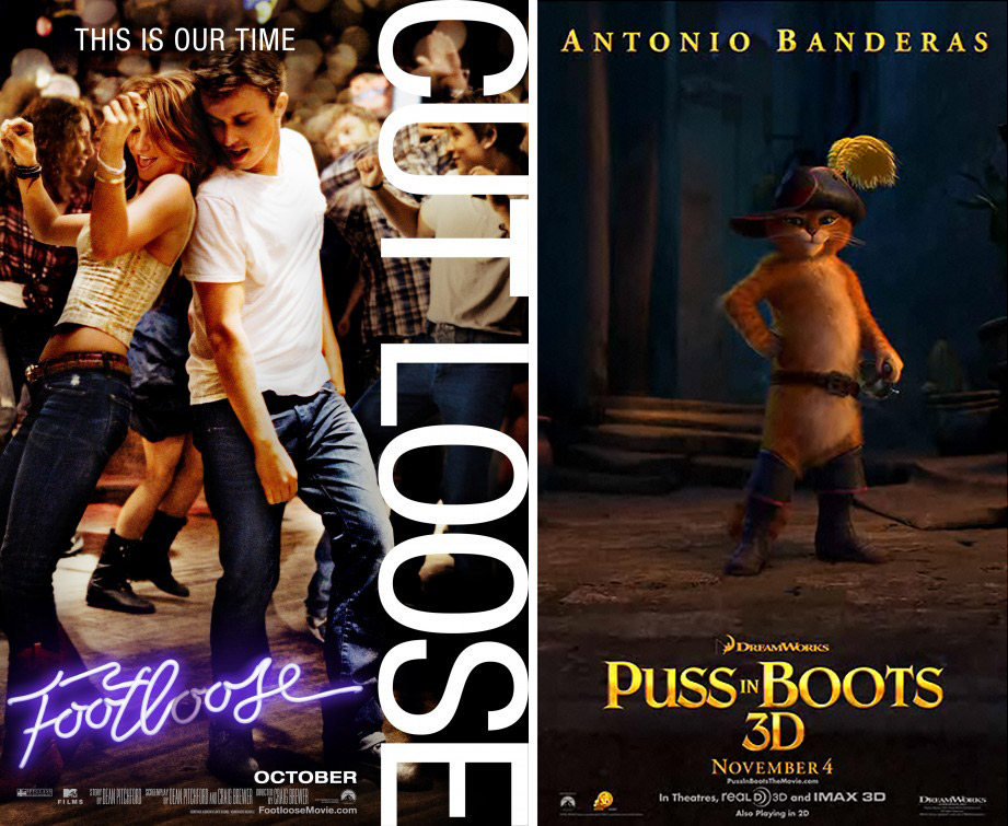
I swear to god that tagline for Footloose irritates me like little else. It can't be your time, when you're robbing the previous generation of one of their quintessential identifiers. Saying that Footloose represents "our time" (i.e. today's teenagers) is like seventies teenagers pretending that the 1950s (Grease) were their ti... oh wait... uh...
Meanwhile you can't tell it here but the Puss in Boots motion poster is brilliant. You simply must click over if you love cats like I love cats.

Finally here are two European posters for David Cronenberg's A Dangerous Method, which each put the three star faces all in each other's headspace -- one of them literally -- as their guiding design principle. You can see what they're going for but don't the faces need to be more level and more obscured by one another to achieve that psychological note. It's a little pedestrian, right? May the movie be anything but.
