So many new posters. So little wall space. Let's look at seven new posters for four movies. Starting with this inky and intricate gothic family tree tease for Park Chan-Wook's Stoker, which works best if it's wall sized since the details will be lost in any other setting including the web...
STOKER (2013)
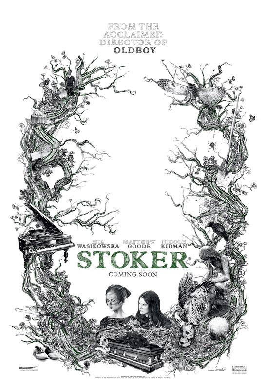
If you want to try and tease out plot details for yourself, Empire lets you hover over pieces of the poster. I've selected just a couple to focus on after the jump (plus six more posters)
Still with us? Good. One should always click after the jump because we have this tiny problem of very big posts here at TFE.
Stoker Poster Details Fig. 1
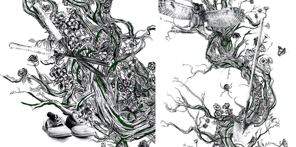
Given that the plot is something of a mystery, I haven't and won't watch anything beyond that first teaser we discussed. But gardening shears and a shovel? They're either both weapons or used in tandem on one murder. Pity that Clue doesn't have these as weapon choices!
And I'm I the only one that finds abandoned shoes totally creepy (in horror / mystery context)?
Stoker Details. Fig. 2
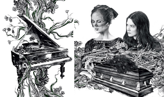
You mean someone in the cast plays the piano? Pianos and icy resentful actresses? Oh Stoker you spoil me! (Not in the spoiler alert sense)
QUARTET (2012)

Like Stoker this one is full of enigmati.... no, haha, this is as straightforward as it gets. Or backforwards? Um. Yes, That's left to right the back sides of one time Oscar Nominee Pauline Collins, two time Oscar Nominee Tom Courtenay, Six time Oscar nominee (twice winning) Dame Dowager Countess Maggie Smith Always in Her Prime and... Billy Connolly. He's never been Oscar nominated but at least he's been Oscar adjacent. Early reviews suggest that Pauline is the stand-out and on paper Maggie Smith is always a credible threat but given this film's very very low profile (thus far) and that it doesn't have the built-in heat of something based on a bestseller (see Exotic Marigold Hotel) for its target crowd, we shall see.
The lavender color scheme is fine but should not remind anyone of Ladies in Lavender since no one saw that one.
OZ THE GREAT AND POWERFUL (2013)
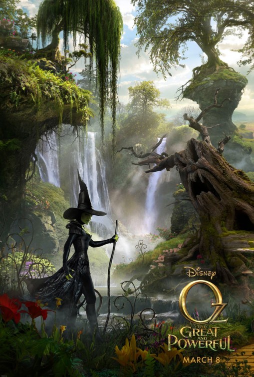
This is the first in a triptych so one supposes that someone will show up on the yellow brick road just off frame to your right. I'll give you a minute to spot it. The poster is busy so it's easy to get lost. At first I was all "this is too busy!" about every frame I've seen of this movie. But then I was rewatching The Wizard of Oz the other day (it happens) and Munchkinland is just color explosion and curlicues and everything plus kitchen sinks. So never mind.
The costumes in this feature are by Gary Jones who has done terrific work in the past (think The English Patient, The Talented Mr Ripley, Spider-Man 2) and who has lately been doing contemporary critically savaged romcoms (New Year's Eve, All About Steve) but frankly I've hated everything I've seen on the brunette ladies thus far (Kunis, Weitz)... too modern, don't you think? This looks like The Wicked Witch by way of The Matrix.
LES MISERABLES (2012)
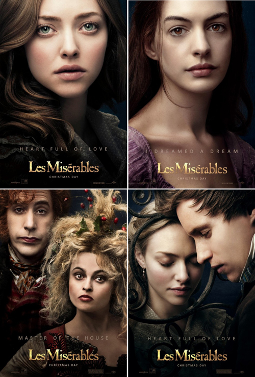
The character posters keep coming but now they've added taglines and the taglines are SONG TITLES. I'm loving. I really think that they should redo the Hugh Jackman poster now with a "BRING HIM HOME" added, because... who wouldn't?