 Glenn here with my yearly tradition of counting down 2013's best movie posters. I've done this for the last however many years at my own blog crowning such gorgeous designs as An Over-Simplification of Her Beauty, Here I Am, The Runaways, and Antichrist. but this year we've shipped it on over to The Film Experience. I've gotten a bit of a reputation as "the poster guy" due to being one of the only people online who seemed to look at poster art in details and with any sort of critical eye. Thankfully that's not so much the case anymore with more and more websites starting features and writing lists dedicated to key art. For once I was ahead of the curve!

50. Errors of the Human Body: For its strange, unethical beauty.
49. In Fear: For its visual trickery.
48. Texas Chainsaw 3D: For its gruesome inventiveness.
47. As I Lay Dying: For its literary beginnings.

46. The Darkside: For its haunted minimalism.
45. Blue Caprice: For its sleek, quiet terror.
44. Lee Daniels’ The Butler: For its strange, eye-catching use of iconography.
43. The Hunger Games: Catching Fire: For its grandeur.

42. Rewind This!: For its retro blast from the past.
41. Blue is the Warmest Colour: For its Instagram eroticism.
40. White Reindeer: For its X-rated X-mas.
39. Elles: For its black beauty.

38. Ain’t Them Bodies Saints: For its painterly strangeness.
37. I Am Divine: For its in-your-face queerness.
36. Mystery Road: For its sparse, modern western vibe.
35. Animosity: For its abrasiveness.

34. Leave Me Like You Found Me: For its neat central visual.
33. Evil Dead: For its grand, ball-busting chutzpah.
32. Leviathan: For its beguiling, apocalyptic natural darkness.
31. Bastards: For its red, roughed up film-noir look.

30. Zero Charisma: For its hi-fi design for lo-fi movie.
29. Grabbers: For its humour and not taking the easy road.
28. Stoker: For its intricateness and making me look twice.
27. The Great Gatsby: For its decadence and Debecki’s art deco pose.

26. The Dirties: For its thematic and relevant embrace of pop-minimalism.
25. Computer Chess: For its engaging comical use of retro imagery.
24. Upstream Color: For its actors looking like twisting DNA.
23. F**k for Forest: For its cheap, but graphic conceit.

22. Trance: For its explosive graphic edge.
21. The Selfish Giant: For not giving into grim imagery for such a grim tale.
20. The Conjuring: For its old school aesthetic and Lily Taylor’s captivating face.
19. You’re Next: For its game-playing and uniqueness.

18. The Institute: For its ethereal twist on “face in the sky”.
17. Blackrock: For taking this Deliverance poster and making it feel fresh.
16. Maniac: For being genuinely queasy and unsettling and no bad Photoshop or Drive rip-offs.
15. Blackfish: For its quiet, oversized mystery.

14. I’m So Excited: For its hyper-colored, sexual feast.
13. Stranger by the Lake: For its hyper-colored sexual feast.
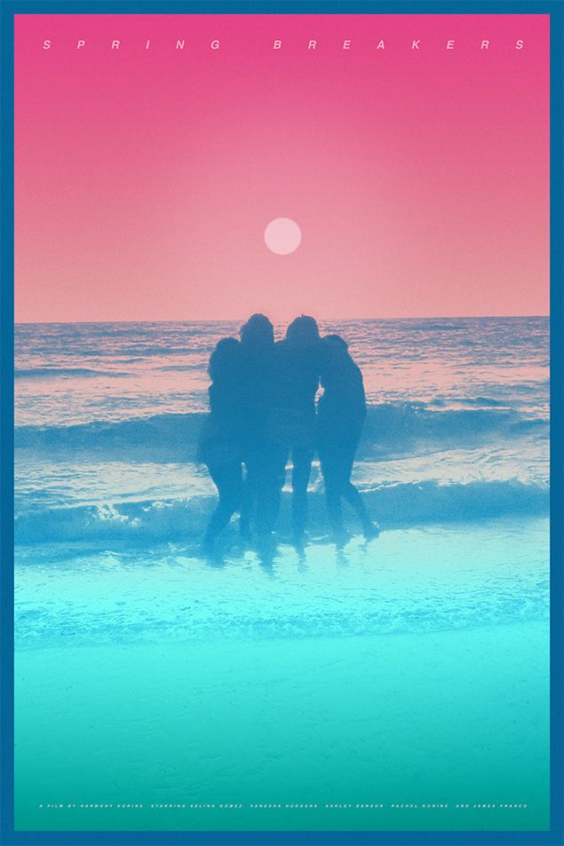
12. Spring Breakers: For its simple storytelling through images.
11. Side Effects: For not turning its concept into a joke. For genuine menace.

10. Stoker: For the creepy, reflective play on the body and identity.
9. Simon Killer: For its hypnotic quality.
8. Continental: For its (ahem) cheekiness and panache.

7. Kiss of the Damned: For being so in tune with its film. One of the industry’s best designers.
6. The Bling Ring: For so succinctly, and comically, selling its materialistic satire through character.
5. Berberian Sound Studio: For its 35mm horror nightmare. A twisted terror.

4. Sightseers: For a cutesy concept that’s entirely relevant and not making it cheap.
3. Jodorowsky’s Dune: For being breathtaking by actually making a poster for Alejandro Jodorowsky’s Dune.
2. The Wolverine: For using its film’s setting as a means of doing something new and unique. For not flubbing it with bad Photoshop and inappropriate text.

1. Spring Breakers: For the neon. For the pose. For the tagline. For being iconic, dangerous, youthful, and totally in spirit with the film.
And that's that! I could also share the worst posters of the year - trust me: that list is also quite long - but I think we'll leave it with the positives. What designs piqued your interest in 2013? Did I miss any? It's very likely that I did, but I'm also happy with the list as it stands.