Manuel here to talk about the gorgeous designs we saw last night. The Oscar telecast was, as usual, a very pretty affair. Humor may be subjective (a pun can both garner a laugh and an eye roll) and winners can be fought over (oh those Birdman takedowns aren't gonna get any less nasty now are they?) but the show will always provide the eye candy. And I'm not just talking about the gorgeous dresses, the preened faces and the sculpted male torso that walked the stage. I'm here to talk about the beautiful title cards that were featured throughout the night.
Combining Tumblr-ized minimalism and Instagram's cataloguing style, Henry Hobson and the Elastic Design created some beautifully stylized graphic sequences for last night's awards:
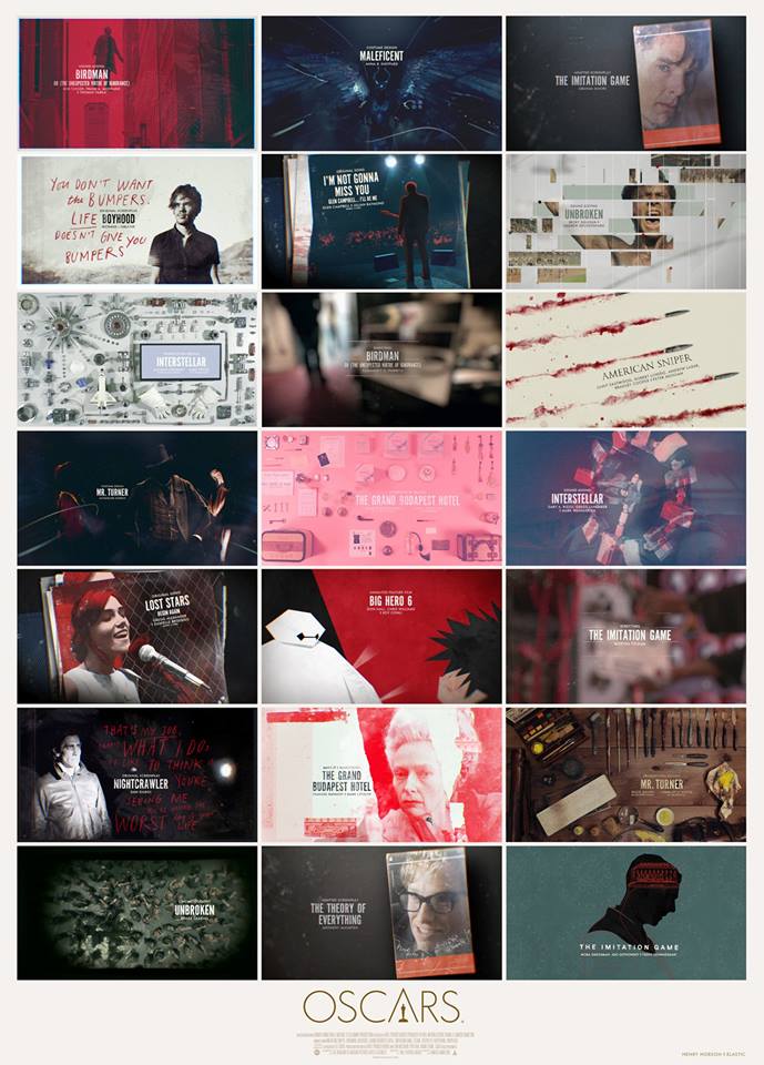
I particularly loved the (ever so brief! -- guess they wanted to keep these sequences short and sweet?) Best Picture montage:
Best Picture Oscar Nomination Title Sequence - 2015 from henry hobson directing & design on Vimeo.
If there's one objection to make about all these pretty pictures is that they seemed designed to deny us of the power of those moving pictures we were supposed to be honoring (or, in the case of the In Memoriam tribute, of the work which Meryl reminded us, would live on).
Were you taken with the designs? Or did you wish we could have gotten full clips of some of these nominees, especially as the telecast was unusually reticent to show clips of any kind?