"The Furniture" our weekly series on Production Design. Here's Daniel Walber
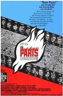 This week marks 50 years since the release of Is Paris Burning? (not to be confused with documentary classic Paris is Burning) an epic that hasn’t quite stood the test of time. In the tradition of The Longest Day, it harnesses a cast of thousands to tell the story of a single, crucial moment of World War Two: The liberation of Paris. French stars like Jean-Paul Belmondo and Alain Delon take roles in the Resistance, while the likes of Kirk Douglas and Glenn Ford play American generals. There are cameos from Simone Signoret, George Chakiris and Anthony Perkins, to name only a few.
Directed by René Clément with a script by Gore Vidal and Francis Ford Coppola, you’d think it would be more popular. Still, it’s worth revisiting, and not only for its two Oscar nominations (art direction and cinematography).The film’s visual ambition is often astonishing. Its commitment to accuracy caused at least one unlucky Parisian passerby that the Wehrmacht had actually returned. Everything is bold, nothing subtle.
Production designer Willy Holt, an American who mostly worked in France, later worked on Julia and Au revoir les enfants. Art director Marc Frederix designed for films as disparate as Moonraker and Love and Death, while his colleague Pierre Gufroy won an Oscar for Roman Polanski’s Tess. Clearly, the talented group was more than up to the task of winding back the clock 20 years on one of the world’s most recognizable cities.
More importantly, they were able to distill the emotional polarity of this deeply patriotic film into a few symbols. Much of this has to do with the display of wealth. The Germans, aggressors and thieves of French property, surround themselves with the best of Parisian style.

There are ornate props as well, especially within the German headquarters at the Hotel Meurice. Here is General von Choltitz (Gert Frobe) sitting by some very elaborate cakes.

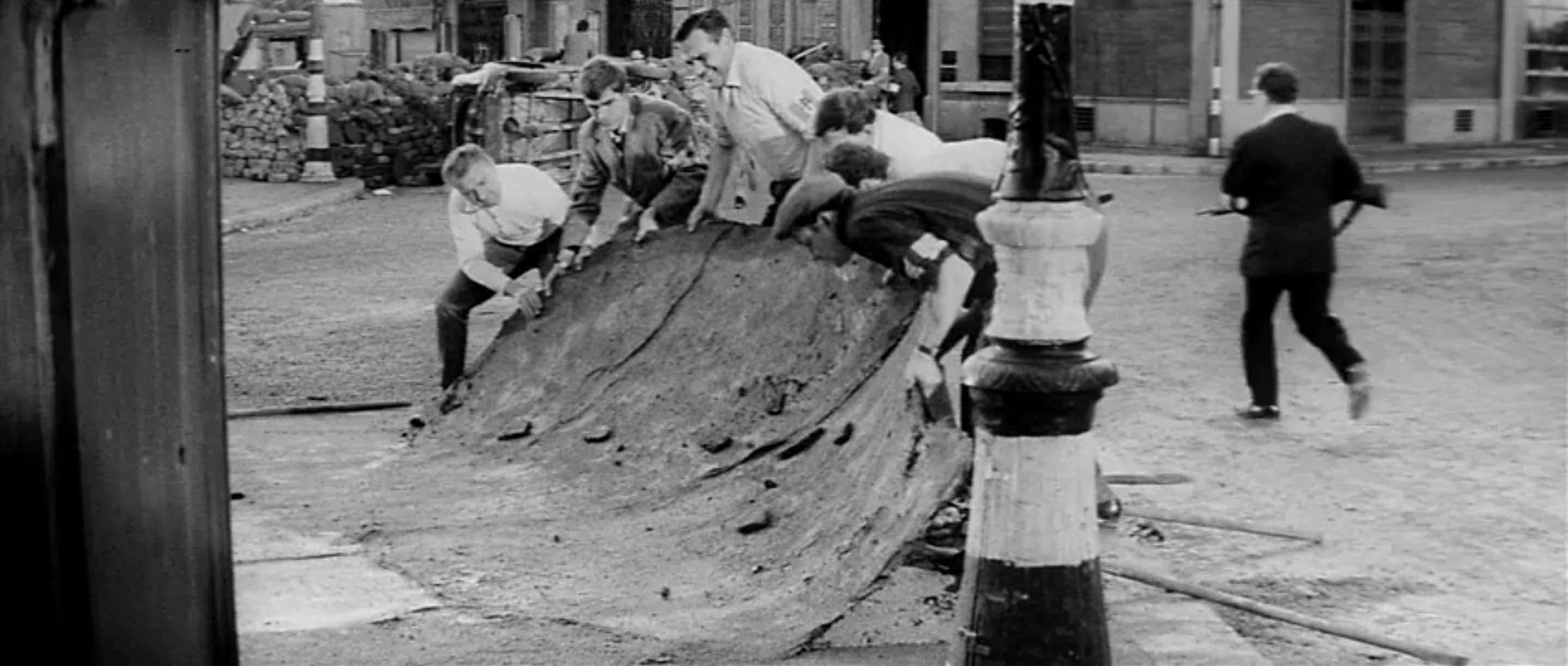
This sits in contrast with the surroundings of the French resistance fighters, who make molotov cocktails in old wine bottles and build barricades out of everything available. Here, a man is bringing a mattress to toss onto a pile of furniture that is meant to withstand Nazi firepower.

This makes it especially satisfying when these symbols of excess are demolished. The film’s title refers to the German plan to level the entire city, even the Louvre and the Eiffel Tower, on their way out. That doesn’t happen, and instead the Hotel Meurice goes up in flames.

The best image in the sequence is probably this next one, an unforgettable glimpse of an elevator in flames.

The use of slogans is equally blunt. Resistance fighters paint letters on everything they can get their hands on. Vehicles are particularly important targets. Here, for example, is a formerly German tank emblazoned with FFI: Forces Françaises de l’Intérieur, DeGaulle’s official name for his Free French army.

Other tanks sport the names of towns, or nicknames like “Mort-Homme,” “Dead Man.” There’s a truck that reads “Mort aux Cons,” “Death to the Assholes.”

The best use of vehicle-decoration-as-politics comes in the form of a flag. The film is in black and white, in part so that the montages of archival footage don’t stick out like a sore them. But there’s also something else. The Parisian government objected to the use of so many real Swastikas. The design team had to use green flags instead, which would comparably photograph without color.

There is another flag. Orson Welles plays Swedish Consul Raul Nordling. He spends the film’s first act helping a young woman named Françoise (Leslie Caron), whose husband is a political prisoner. He speeds around Paris in his diplomatically-recognized vehicle, identified by the enormous Swedish flag affixed to the roof. But we do not see the yellow and blue of the House of Vasa in black and white. Instead, it is simply a cross. The implication isn’t exactly subtle, but neither is anything else in the film. Less enthusiastic design might ruin the mood. There’s a war on, after all.
