 Adam Stockhausen and Anna Pinnock with their Grand Budapest Hotel OscarsDavid here with a closer look at this year’s Oscar nominees for Production Design. Not too close, mind: this is all about the big picture. The PD is responsible for the entire art department, and as such, the entire visual look and feel of a film. If it’s difficult to separate that idea from what cinematographers and costume designers do, well, that’s the difficulty in awarding all these disciplines as if they act independently of one another. Such is the nature of the awards season beast.
The origin of the title is an amusing, unsurprising fable: William Cameron Menzies, coined it to describe his own function on the set of Gone with the Wind (a mammoth task, to be sure) after David O. Selznick instructed everyone that "Menzies is the final word” on the set on every technical aspect of the visual production. Menzies, incidentally, was the first Oscar winner of the award, under the label ‘Best Interior Decoration’ - the award changed to 'Best Art Direction – Set Decoration’ in 1947, and didn’t become ‘Best Production Design’ until 2012.
As we saw earlier in the week when the Art Directors Guild gave out their awards, the Oscar race seems to be a two-horse race. [More...]
It's the rugged American wilderness of The Revenant vs. the wild apocalyptic mayhem of Mad Max: Fury Road. What we have, though, is a field of five worthy nominees - perhaps not all the finest of the year, but we’ll cover those omissions soon - with a great diversity of textures and landscapes on show. Put out your hand and explore with me, why don’t you?
Last year’s Oscar winner for The Grand Budapest Hotel, Adam Stockhausen took over when regular Spielberg collaborator Rick Carter had to step off the project (possibly for a little film called Star Wars…?). The PD had to tackle the extraordinary task of recreating Cold War Berlin in the process of having the wall constructed right down its middle. As he explains in a video interview for Variety’s Artisans strand, “Berlin, today, just doesn’t look like Berlin in 1960 any more”, so his first task was finding suitable locations to ape the oppressive grey surroundings of a city in crisis. A scout found the production in the Polish city of Breslau. The facades of the buildings are up to the task, but I never quite believed that this world existed beyond the immediate scene; the necessary effects work to decorate the backgrounds left a cold feeling on the film’s edges that was quite apart from Spielberg’s typically restrained characters. Even when Hanks takes his train rides across the borders, it never quite feels like these icy locations fit together in a cohesive version of a city beyond their dark matching colour.
Stockhausen’s stronger efforts are visible in the film’s interiors: Hanks’ bare, chilly apartment on his arrival in Berlin is particularly effective to preview his explorations of the inhospitable city, the Russian prison interior is strikingly intimidating and the rich mahogany panelling of his New York office provide a rich space that isn’t much explored (which was shot in the New York Bar Association). Given a bigger canvas, Bridge of Spies seems to stumble: an isolated scene set in a Russian courtroom feels flagrantly overdramatic. Overall, it’s sturdy period recreation work, but it often feels studio-bound and airless, and is certainly far from seamless.
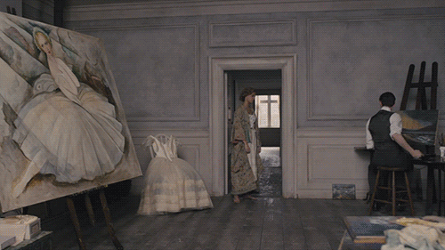
If I had to choose the finest element of the largely, er, misguided The Danish Girl, it would be the production design. The Copenhagen apartment is such a striking space and gives Hooper and the cinematographer an abundance of opportunities that they don’t really explore. Most of the spaces in Denmark are sparse ones full of “peculiar melancholy light” and air, a freedom contrasted with the more decadent, decorated world of Paris and the clinical brightness of the Dresden hospital. Eve Stewart took inspiration from Lili and Gerda’s own painting and their Scandinavian contemporaries for the Copenhagen scenes, the pale lightness drawn from pastel blues and greys, while the Parisian scenes feature the curves of art nouveau in Brussels, which Stewart has described in both feminine and masculine terms as Matthias Schoenaerts’ character enters the picture to provide a contrast to Lili in Gerda’s life.
Stewart is a Tom Hooper vet through her Oscar-nominated work on The King’s Speech and Les Misérables, but is truly beloved for her time with Mike Leigh on Vera Drake and the Oscar-nominated, visually lavish Topsy-Turvy. You could see her work on The Danish Girl as pairing the intimate naturalism of the former kitchen-sink drama with the latter’s dramatic flamboyance. The actors seem to get a bit lost in the Parisian clutter, and the rich style never quite convinces as that very historically recognisable locale - the film closes in on Lili as she is contrapuntally blossoming into her truest self. Again, this is crafty period work, but it seems destined to be remembered as second-tier work on the CV.
There’s no denying that Mad Max: Fury Road is a stunning visual experience, and while some of that is due to the superb cinematography of John Seale and the awesome imagination of director George Miller, the detail of what we see on screen is down to pd Colin Gibson. Simply sorting through the sheer volume of ideas from Miller for this dense apocalyptic world must have been exhausting enough, but to mash them together in such dynamic form on-screen, contrasting the bare desert landscapes with the intricate detail of the vehicles, is a truly awesome achievement. Of all the nominees here, Fury Road is most definitely the weirdest, the most estranged from our Earth, but it also seems to me the most complete and robust work.
The film’s old-school reliance on practical effects meant that the constructions Gibson’s departments put together, by hand, had to be vividly real and strongly constructed. In Gibson’s own words, "It is just a question of keeping everything in balance, having the arresting image but also something that works.” Safety of the actors and stuntpeople was paramount, but it’s obvious on-screen how audacious what they ultimately managed to pull off thanks to Gibson’s departments' equilibrium of imagination and caution. Fury Road is a world recognisably broken down from our own, with tiny details of the construction as fascinating as the overall visual spectacle, bringing “new context” to familiar objects. Hundreds of people worked under Gibson to bring Miller’s extraordinary vision to the screen, refreshing not only a dead franchise but the tired visual conceptions of an apocalyptic world, and this, truly, is an achievement for the annuls of cinematic history.
 Some images courtesy Territory Studio
It may be largely set on a planet on which humankind is yet to set foot, but realism was the goal for pd Arthur Max and his team, who took their cues for their space encampment designs from NASA concepts. Reuniting with Ridley Scott for their eleventh (!) production together, and garnering his third Oscar nomination (after Gladiator and American Gangster), Max is a trusted hand that has done dynamite work across Scott’s diverse filmography. He sticks to a functional colour palette - the dusky orange of Mars, the black of endless space, the silver of the machinery, the white of the clinical camp buildings - and the genius here is all in the sleekness of it and how the situation breaks that beauty down. Max spoke to In Contention about his research at NASA and why certain colours dominate their workplace, and it’s a fascinating topic. Max’s job was to bring this functional palette and give the film’s interiors a dynamic look that worked both for the limited physical space Matt Damon’s astronaut has and provides the opportunity for visual diversity as the narrative progresses.
It seems sensible to mostly limit our focus here to the buildings and interiors; Scott and Max returned to Jordan, where they shot for Prometheus, as the desert stand-in for the Martian landscape, with the planet’s landscape being the domain of the VFX department. As Max has said, this is “near-future, not futuristic” (the ADG category placement as ‘Contemporary' perhaps taking a dubious cue from this idea), and the big achievement here is the astronaut’s encampment on Mars, and particularly how integral Max’s department were to the ingenuous transformations Damon makes to the spaces as he fights to survive on an inhospitable planet. Prometheus, perhaps tellingly, always felt a bit false and coldly constructed, but space seems almost effortlessly tangible in The Martian.
 Some images courtesy Architectural Digest
Oscar’s final nominee is a very different proposition; whereas the others are dominated by their diverse interiors, Jack Fisk’s work on The Revenant is primarily set in the wilderness of 1820s America. For all that people may decry this nomination, I don’t think it can be denied that one of the few things Innaritu’s film does achieve is an immensely vivid sense of place. This feels like a long lost America, a desolate and unconquered landscape, peppered with ruins of locations that have not withstood the ravages of the environment. Constructing a coherent landscape out of the variety of filming locations and leaving no hint of modern civilisation behind was likely more difficult than it might seem. Emmanuel Lubezki’s cinematography seems a bit too convinced of the landscape’s savage beauty, but the locations scouted by Fisk are impeccably selected, providing a roster of textures and colours for DiCaprio to be ravaged by.
Despite them ultimately featuring in a tiny percentage of the film’s running time, Fisk’s team constructed a ruggedly realistic frontier encampment, which Innaritu engulfs in the surrounding forests. Within such a mammoth running time and endless landscape, it would be easy for the detail to get lost, but every inch of the design feels strongly authentic, allowing the actors to move into the period - an important point given how hardcore Innaritu insisted on going for the production. Fisk even finds viable visual expressions for the director’s awkward spiritual moments; that the narrative of the film falters and Innaritu can’t make these more interior character notes work properly is nothing to do with Fisk’s earthy settings for them. It’s not flashy work, and perhaps not among Fisk’s most challenging, but it gives the film a solid foundation of vivid realism that it needs to ground it.
So, in case it wasn't obvious, Mad Max: Fury Road is easily my winner here, but the race looks tight between it and The Revenant for the Oscar itself. How about you all? Who do you think will win - and who do you think should?