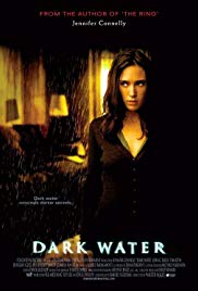
You know how this works. Thoughts as they come without self-editing...
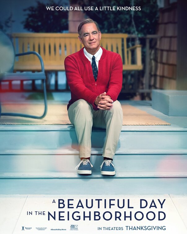
• We could all use a little kindness" is a good tagline. Because, if A Beautiful Day in the Neighborhood is one of the nicest movies you'll see this year. Please don't read that as a dismissal. "Nice" and "Kind" are holy adjectives when they're said with truth and not as shorthand for anodyne comforts.
• The soft focus is maybe overkill on the poster because the movie isn't soft. It's just kind.
• Are people going to reject this movie once they realize that it's not really about Mr Rogers, because the poster is false advertising in that way. Not a biopic!
• Those clothes look like they've never been worn before but also comfy which is an oxymoron.
• 🎵 You only see what your eyes want to see
How can life be what you want it to be
You're frozen when your heart's not open
You waste your time with hate and regret
You're broken when your heart's not open
Mmm, mmm, if I could melt your heart
Mmm, mmm, we'd never be apart
Mmm, mmm, give yourself to me
Mmm, mmm, you hold the key 🎵
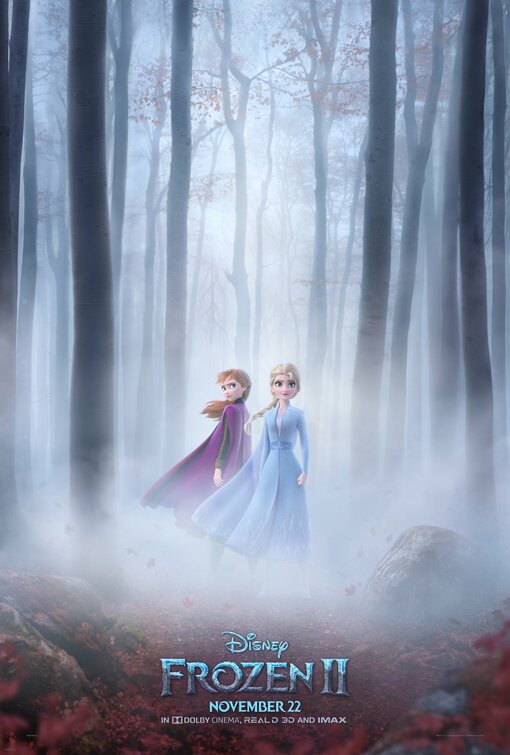
• "Do you want to build a snowma🎵"... needlescratch. This doesn't look very wintry. Frozen II: The Fog
• Speaking of somber, this poster is trying to hard to look mythic and serious, yes? You know there will be Olaf hijinx and probably other goofiness. Stop lying to us Disney.
• Elsa got all glittery for her coming out ball in Frozen but she's dressed very demurely again. Hmmm. That means no girlfriend for the Queen.
• If they don't give Jonathan Groff a song this time we are going to riot. He's only one of the best musical stars. It's like the modern equivalent of when Barbra Streisand cast Mandy Patinkin in Yentl and then didn't let him sing.
• I still have nightmares about that garbage Frozen short Frozen Fever (2015) and avoided Olaf's Frozen Adventure (2017) like the plague so hopes are not high.
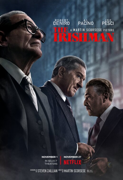
• Kinda dig the diagonal composition of the poster.
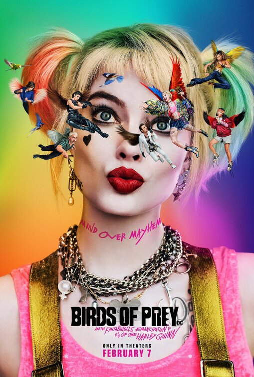
• ... like when cartoon characters hit their heads and see birds... but in this case Harleyquinn doesn't need a concussion to see herself and other characters floating around her because she's batshit crazy.
• The full title of this is kind of awesome Birds of Prey: And the Fantabulous Emancipation of One Harley Quinn but can we talk about how annoying it is to have a colon franchise title followed by an "And"... drop the colon and it reads better but they're already presuming lots of sequels that need the branding up front.
• Remember when Suicide Squad won an Oscar? HAHA
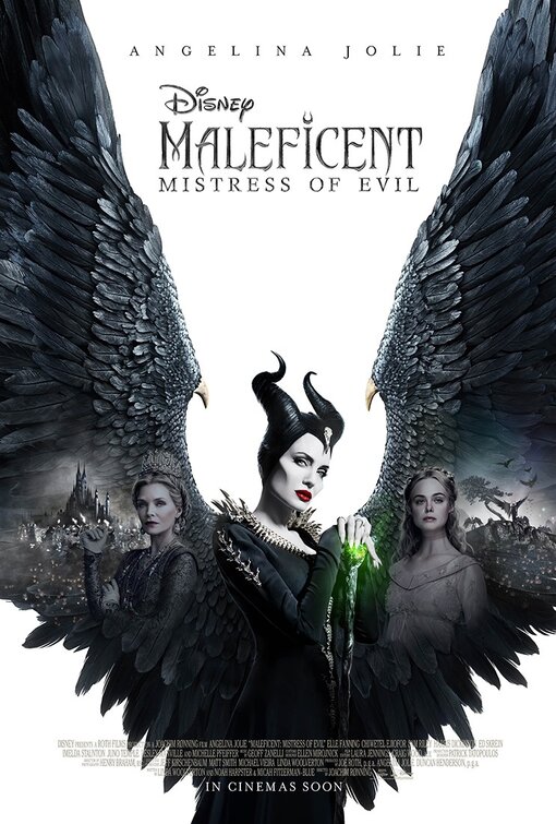
• Given audiences sheep-like behavior around Disney films, wouldn't it be weird but also not shocking if this flopped?
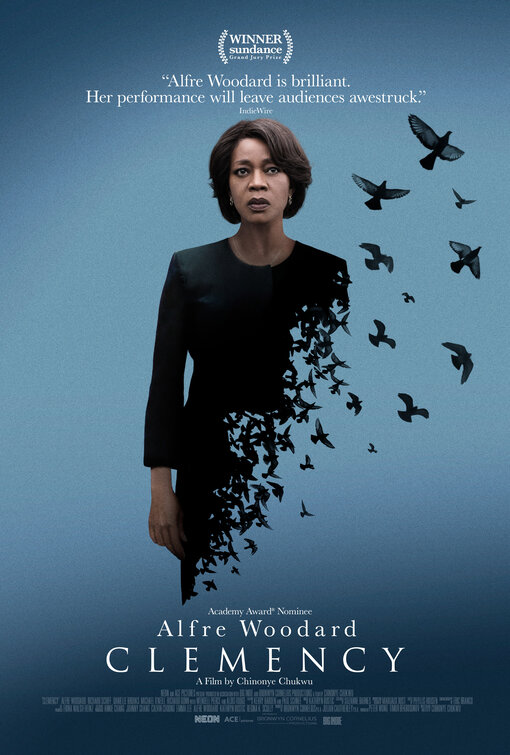
• Prefer this poster, naturally
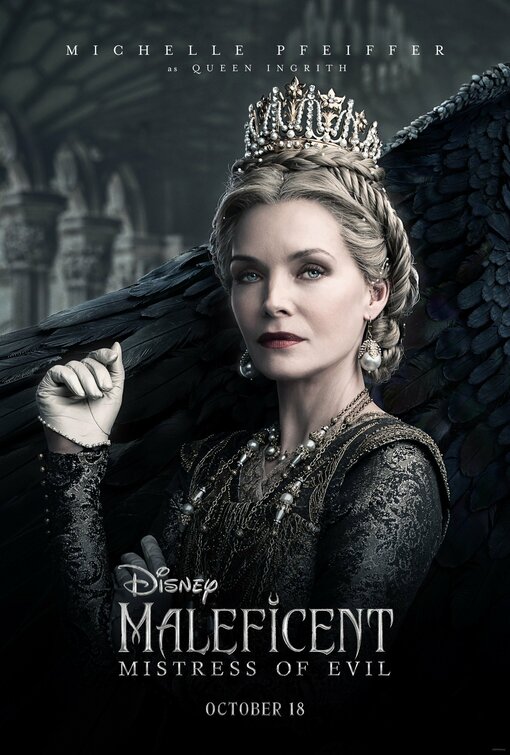
• Though in truth the stark background white with the black wings is a good visual read for a movie poster which are meant to convey their entire movie with a singular memorable image and the really transcendent posters (not that this is one) end up being iconic for their ability to do just that.
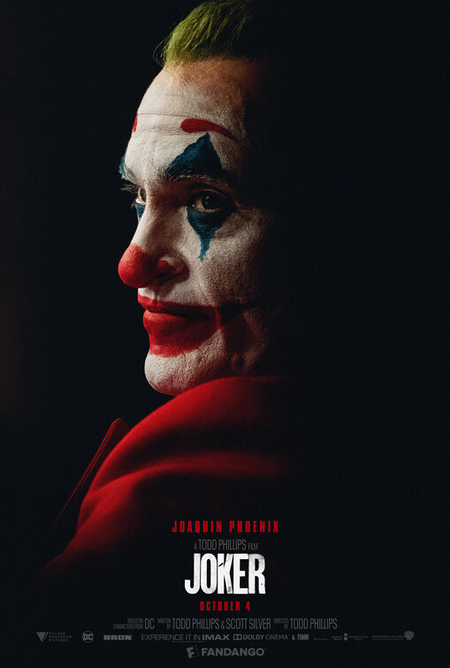
• Trying to go into this movie with an open mind but already feel oversaturated by it.
• The posters have been good though. Their bold colors (as above) and hard compositional lines (not this one so much but some of the others) work pretty well at being unsettling .
• The lip work makes us long for Dina Martina's take on this role.
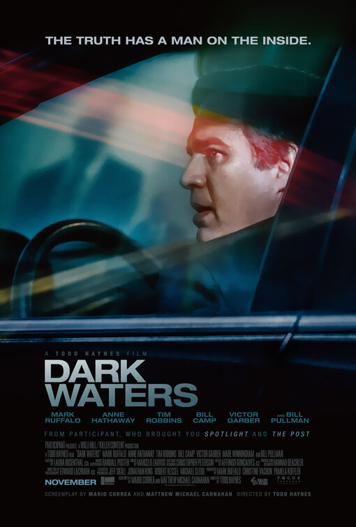
• "The truth has a man on the inside" ... someone got paid well to write that hokey tagline.
• What's with this new trend of photographic posters that look like illustrations without being illustrations they're so airbrushed without any attempt at looking like unaltered photos?
• Annoying that "A Todd Haynes Film" is less visible than the production company that brough you "Spotlight and The Post" but maybe that's better for Todd Haynes since this appears to be (at least in trailer form) the only time in his entire career when he hasn't been himself and is just a journeyman director for hire.
• Undecided on whether this poster is cool with its triangular drama and weird color streaks or awful in its vaguely sinister photoshopped way. Help me to decide.
• Missed opportunity that Jennifer Connelly isn't in this...
