by Nathaniel R

Movie posters may be an endangered artform since movies are seldom chosen from lobby posters or slapped on DVD covers anymore. Most people see only those interchangeable rectangles of movie star faces deployed by Netflix or Hulu in scroll bars. Nevertheless we still love the way posters at their best can brand or encapsulate a movie, become iconic pieces of art in their own right (rare), or cleverly tease or suggest the kind of experience you'll be having when you watch the movie.
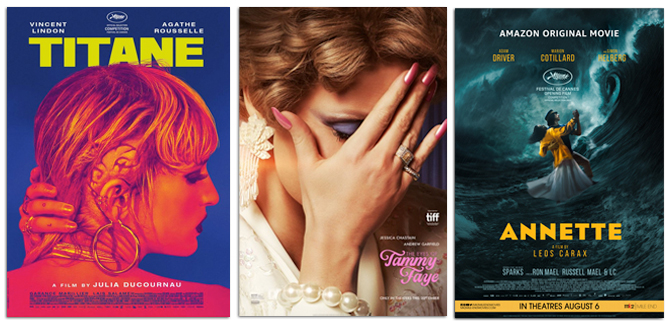
Movie posters are often lazy so we want to cheer the good ones. Some titles that missed the following list but remain noteworthy are: Benedetta which arranged the text in an invisible crucifix frame, Annette, which memorably placed its romantics underneath a tidal wave, the teasers for The Matrix Resurrection and Black Widow which went minimalist and flat but impactful, Swan Song and The Eyes of Tammy Faye for the way they presented the main character's face while also obscuring it emotionally, and the graphic whatsthis? boldness of both Titane and Tragedy of Macbeth.
The best movie posters of the year after after the jump...

HONORABLE MENTION SHIVA BABY
With the highest ratio of laughs-per-minute from any movie this year, this scrappy indie comedy should be better known. The performances in this story of a mixed up bisexual girl whose highly compartmentalized life comes undone at a Jewish funeral are as tasty as its creamy cheeky poster.

RUNNER UP: LICORICE PIZZA
Paul Thomas Anderson's meandering valley comedy about a teen star who pursues a directionless girl in her twenties is filled with hang-out vibes and is elevated by a series of terrific side characters. Smartly then, it conjures an earlier more innocent sex comedy era (when the adjective "problematic" wasn't the first or even the hundredth world used to describe any given movie) with its illustrated poster and also highlights all those amazing bit players.
TEN BEST POSTERS OF THE YEAR

10 BARB AND STAR
Barb and Sar released multiple posters and all of them were blissed-out colorful, like benevolent goofy hallucinations whether Barb and Star were floating in the sky (to show off their memorable culottes), sitting in seashells with their backs turned to us, or riding a giant shrimp.

09 FLEE
Rather than a single image of our protagonist Amin, a gay Afghan who has built a new life in Denmark, this terrific documentary's poster presents a collective of humanity, vivid characters we only meet in brief glimpses of Amin's often lonely and transitory life. The illustrations are by Mikkel Sommer and Kenneth Ladekjaer.

08 PASSING
Cleaving a poster in half, black to one side and white to the other, is an extremely worn design tactic. It's been around forever (Scarface and American Gangster are just two famous examples). Passing gives it fresh life, though, by having a literal reason to deploy it. Tessa Thompson and Ruth Negga play very different women, both living in the segregated black and white world of New York City in the 1920s. The crux of the drama involves Irene's reaction to Clare's decision to "pass" as white and live in a different world.

07 ELECTRICAL LIFE OF LOUIS WAIN
The weirdest iteration of the traditional biopic this year was this occasionally hallucinatory costume drama about an artist whose surreal cat paintings changed society (at least in terms of pet ownership). The official poster gives off a whiff of the film's druggy veneer, but we like this early tease best.


06 THE GREEN KNIGHT
More posters like this one please. The Green Knight's series of teasers never game the game away but instead sold creepy curious mood, presenting stark shadows of strange characters in quarter profile, imagery that felt pulled from iconography of some ancient, even alien, medieval time.

05 RED ROCKET
Like Licorice Pizza, it opts for a throwback style, opting for a painted poster recalling the promos of sex comedies of the 1980s that were flirtatious about their naughtiness, shamelessly performing faux innocence. Red Rocket is singular and fringe enough as a movie that the advertising could have really gone in hundreds of different directions. We're guessing they chose the best one.

04 SPENCER
In the movie this shot is actually Diana retching on a porcelain throne. The poster wisely retcons the vomit, inks out the context until its an empty void, and repurposes the collapse as a princess glamour shot. Glamour... now with more existential despair!

03 OLD
The poster for M Night Shyamalan's latest supernatural flick is a high-concept bullseye. It's so satisfying in and of itself, camp in a scary way and vice versa, that the movie feels almost superfluous but enticing. 'Oh, someone made a movie adaptation of this poster?? I'm in!"

02 PARALLEL MOTHERS
Yes the teaser poster for this same picture was quite memorable: just a nipple with one drop of milk hanging. Somehow the "official" poster even topped that. The poster to Pedro's latest blesses us with Almodóvar red as background, plops Penelope Cruz's soulful face in the foreground center (where it always belongs), and suggests a close, similar, but not symbiotic relationship between two mothers in a way that makes you wonder about the women, the title, and its meaning, even as the linework hypnotizes. Brilliant stuff, even if our friend Tim did memorably quip "Yes, but it's not Perpendicular Mothers, is it?"

01 FRENCH DISPATCH
Wes Anderson's films have been both praised and reviled for their presentional style, but one thing is for certain: they're ideal films for movie posters, flexible enough in subject and character to provide endless inspiration to designers. For his latest film, the first poster (seen above) and the first few follow up posters (before the also eye-catching "Character" posters) were mockups of the fictional magazine at the center, and the stories within it. How can you look at them and not want a subscription to the Liberty, Kansas Evening Sun.