The New York Film Festival has begun. Here's Glenn taking an alternative look at David Cronenberg's divisive Cannes winner 'Maps to the Stars', now a confirmed 2014 contender.
 Digital filmmaking has a lot to answer for – much of it good, but a lot of it bad. Its biggest crime, however, may be eradicating David Cronenberg of style. It’s as if the transition of celluloid to digital, which coincided with his swing away from merely a cult name-brand director to one whose films, at least briefly, appeared to be targeting a somewhat more acceptingly mainstream audience (A History of Violence and Eastern Promises certainly), weakened his eye for visual storytelling. Not only is Maps to the Stars a surprisingly ugly film in terms of its garish lighting, messy blocking, and lethargic, bulky transitions, but it’s a distressingly amateur in one in terms of simple camera placement and editing.
Much was made of Matt Zoller Seitz’s plea for film writers to discuss form in more detail. “Form is not just an academic side dish to the main course of content”, he said last year, and while I am not sure what Seitz’s opinion is on Maps to the Stars I can’t imagine he would be too thrilled.
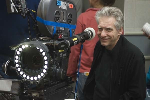
 Cronenberg and his camera
As somebody who always considers the aesthetics (both visual and aural) of a film and enjoys writing about them, certainly in many cases much more than any other aspect of a film, I was angry at the eradication of it from his latest.
There is one shot where a character diagnosed with schizophrenia flushes their medication down the toilet and the camera catches their reflection in multiple mirrors. It's not exactly original, but it’s one of the only moments in Cronenberg’s entire film that suggests character, story and detail through its visuals as opposed to clunky (often badly delivered) dialogue exchanges. Those sequences, meanwhile, are filmed flatly, almost always in mid-range cutting back and forth between whoever is talking. One scene involving Robert Pattinson behind the steering wheel of a car and Julianne Moore (who is fantastic in the film’s lone silver lining) in the backseat was apparently filmed by simply plonking a camera in the empty seat beside them, cutting between the two with little thought put into making the scene visually interesting.
Cronenberg and his regular cinematographer Peter Suschitzky have been behind some of the most indelible images of cinema since 1980, their collaborations predominantly in the horror and thriller genres that allowed that wonderfully evocative look of celluloid to capture their images of grotesquery and urban decay with such menace and panache. Seeing Dead Ringers on 35mm last year, for instance, was mind-blowing. In Maps to the Stars, the visuals most closely resemble cheap direct-to-DVD titles, certainly not helped by the use of Toronto masquerading as Los Angeles. Cronenberg even goes and forces viewers to recall Holly Hunter from Crash in the way he's styled Mia Wasikowska, only furthering the remembrance of fonder times.
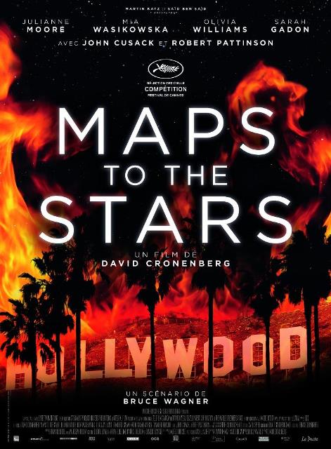
 The poster featured here to the left has a more striking slice of imagery than anything in the film, despite art direction and (especially) set decoration that adds detail and allure – gotta love that Genie Award. Maps to the Stars really could have used that slick, sick grime of his pre-2000 work, especially if you’re going to make a movie of such static satire. David Lynch traipsed similar ground on Mulholland Drive, but was doing so many intricate and interesting things with design, image, story, structure and sound that it didn’t matter. There are many ways to make a dark(ly comic) tale of Hollywood look good on screen, but this isn't one of them.
Nathaniel discussed the film late last week and was far more accommodating to it than I was. Maps to the Stars a genuinely disappointing film in many ways, but even Cronenberg material that can’t quite stand up to its targets should at least be visually invigorating. Despite featuring ghost children, spontaneous combustion, horrific Baby Jane-esque divas, bloody violence, burn victims, and sex in cars, this may just be the most bland film of his career and no amount of the incredible Julianne Moore can change that. D+