


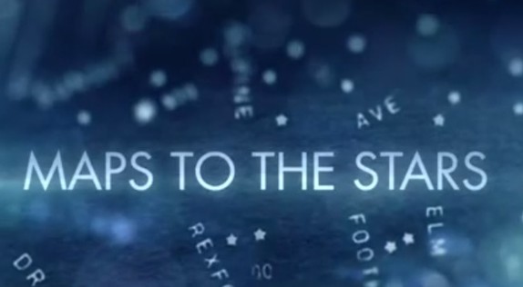
NYFF: Seeing Isn't Believing in 'Maps to the Stars'
The New York Film Festival has begun. Here's Glenn taking an alternative look at David Cronenberg's divisive Cannes winner 'Maps to the Stars', now a confirmed 2014 contender.
 Digital filmmaking has a lot to answer for – much of it good, but a lot of it bad. Its biggest crime, however, may be eradicating David Cronenberg of style. It’s as if the transition of celluloid to digital, which coincided with his swing away from merely a cult name-brand director to one whose films, at least briefly, appeared to be targeting a somewhat more acceptingly mainstream audience (A History of Violence and Eastern Promises certainly), weakened his eye for visual storytelling. Not only is Maps to the Stars a surprisingly ugly film in terms of its garish lighting, messy blocking, and lethargic, bulky transitions, but it’s a distressingly amateur in one in terms of simple camera placement and editing.
Much was made of Matt Zoller Seitz’s plea for film writers to discuss form in more detail. “Form is not just an academic side dish to the main course of content”, he said last year, and while I am not sure what Seitz’s opinion is on Maps to the Stars I can’t imagine he would be too thrilled.
 Cronenberg and his camera
As somebody who always considers the aesthetics (both visual and aural) of a film and enjoys writing about them, certainly in many cases much more than any other aspect of a film, I was angry at the eradication of it from his latest.
There is one shot where a character diagnosed with schizophrenia flushes their medication down the toilet and the camera catches their reflection in multiple mirrors. It's not exactly original, but it’s one of the only moments in Cronenberg’s entire film that suggests character, story and detail through its visuals as opposed to clunky (often badly delivered) dialogue exchanges. Those sequences, meanwhile, are filmed flatly, almost always in mid-range cutting back and forth between whoever is talking. One scene involving Robert Pattinson behind the steering wheel of a car and Julianne Moore (who is fantastic in the film’s lone silver lining) in the backseat was apparently filmed by simply plonking a camera in the empty seat beside them, cutting between the two with little thought put into making the scene visually interesting.
Cronenberg and his regular cinematographer Peter Suschitzky have been behind some of the most indelible images of cinema since 1980, their collaborations predominantly in the horror and thriller genres that allowed that wonderfully evocative look of celluloid to capture their images of grotesquery and urban decay with such menace and panache. Seeing Dead Ringers on 35mm last year, for instance, was mind-blowing. In Maps to the Stars, the visuals most closely resemble cheap direct-to-DVD titles, certainly not helped by the use of Toronto masquerading as Los Angeles. Cronenberg even goes and forces viewers to recall Holly Hunter from Crash in the way he's styled Mia Wasikowska, only furthering the remembrance of fonder times.
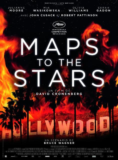 The poster featured here to the left has a more striking slice of imagery than anything in the film, despite art direction and (especially) set decoration that adds detail and allure – gotta love that Genie Award. Maps to the Stars really could have used that slick, sick grime of his pre-2000 work, especially if you’re going to make a movie of such static satire. David Lynch traipsed similar ground on Mulholland Drive, but was doing so many intricate and interesting things with design, image, story, structure and sound that it didn’t matter. There are many ways to make a dark(ly comic) tale of Hollywood look good on screen, but this isn't one of them.
Nathaniel discussed the film late last week and was far more accommodating to it than I was. Maps to the Stars a genuinely disappointing film in many ways, but even Cronenberg material that can’t quite stand up to its targets should at least be visually invigorating. Despite featuring ghost children, spontaneous combustion, horrific Baby Jane-esque divas, bloody violence, burn victims, and sex in cars, this may just be the most bland film of his career and no amount of the incredible Julianne Moore can change that. D+
 Glenn Dunks
Reader Comments (12)
I agree completely. It's hard to believe that the same director who gave us Dead Ringers and Naked Lunch could deliver something so incredibly flat. It's not even really about Hollywood; it's about weird Hollywood family lineages and their ghosts. Granted, the script is the biggest problem, but Cronenberg does nothing on his end to make the film at least visually or aurally engaging. Julianne was fantastic, but everything else was severely maladroit.
Digital is not responsible for the lack of aesthetic enthusiasm from Cronenberg and his DP. They are getting up there in age. And are likely doing things in a simplified fashion. Look at the book cover for Cronenberg's first published novel. It looks very generic. Keep in mind he did not write the script to Maps and the bulk of lesser entries in his filmography are movies he did not write the scripts for.
Sad to hear such disappointing things about MAPS TO THE STARS. I'll reserve judgement on whether to blame digital cameras for Cronenberg's lack of visual style until I actually see the film, but it's a different perspective than I've heard before.
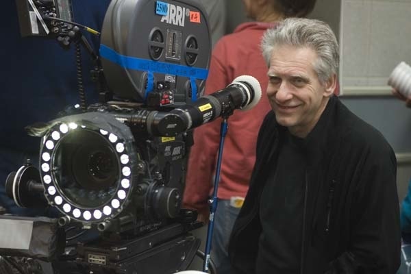
One small thing: That camera Cronenberg is pictured with is actually a 35mm Arricam ST, not a digital ARRI Alexa. You can tell from the film magazine at the top of the camera. Just fwiw.
I agree it is surprisingly flat visually. Crash, one of my favorite of his, has a camera that travels through the scenes and creates such an eerie atmosphere by simply moving slowly. He could have applied the same effect here. But I insist that there is a great movie (saved by a performance that will be remembered for years to come and a highly quotable too) in Maps of the Stars. All one has to do is bring earphones to the theater and put them on every time Moore is not on screen. You will have the best 39 minutes and 8 seconds (officially Moore's screen time) in a theater this year!
3rtful, have you seen MAPS? I wasn't a fan of the film, but even COSMOPOLIS was visually interesting and most of that was spend inside a single vehicular set. I think a lot of it has to go to watch Nathaniel has said before in the podcast and on the blog about people choosing to work with the same people over and over again who eventually stop challenging each other. Cronenberg and Suschizky have been making movies together for years, although since 2000 Suschizky has only made three non-Cronenberg films: RED PLANET, SHOPGIRL and AFTER EARTH. They're not challenging one another and I can't help but think somebody else could have pushed Cronenberg into a more interesting visual direction. But, then, you do just like to disagree and blame their age, which is odd since plenty of directors keep making visually dynamic films well past Cronenberg's age.
Mack, thanks for the info. I think it's a picture from... either Eastern Promises or A Dangerous Method. I'm not sure when he finally took the plunge.
Glenn: I like to disagree–continuing the false narrative of me as a resident villain. Whatever. When you make a solid argument no one will have anything to challenge you on. Of course my perspective is there for provocation and not conversation. I want a real exchange and dialogue around this place. But everyone wants polite agrees or disagrees. That is not the way of the world or those with a passionate opposing view.
Glenn - I didn't much like Maps either, but my problem was more with the script and Evan Bird's performance, and the amount of screen time he has to carry. It is certainly not Cronenberg's most visually dazzling picture, but it's not like there's *nothing* going on on screen. Take the example you cite: the limo scene between Moore and Pattinson. Yes, it just intercuts between two profile medium shots of the actors. But isn't that enough? Cronenberg sets up a simple framework for the scene - two nearly identical shots, suggesting balance and parity between the characters - and then lets the actor's body language - Moore projecting forward, eyes steady, in control; Pattinson fidgeting, eyes forward, back, up to the mirror, back - reveal the truth. I thought there were similarly simple, but subtle and evocative, touches throughout. If I had to guess why Cronenberg went with a largely "invisible" or even non-style style, I'd say it has to do with his approach to the narrative, which is kind of a bait and switch, setting us up for a hollywood satire and then giving us a final act that plays more like a myth or a fairy tale. I think his aesthetic approach was to treat it all in the same straight forward manner so that he could hit you with the right hook in the last act. I'm not sure it works, in which case you're probably right to fault his stylistic decisions. But I'm quite sure it *was* a decision arrived at via Cronenberg's typically thoughtful creative process, and not just the erosion of the man's filmmaking talents (as you say, his last film had plenty of visual punch), an insufficiently rigorous relationship with his DoP, or the failings of digital cameras.
Roark, I definitely could have written much, much more about the film in regards to its failed satire (it's not telling us anything we don't already know), that terrible performance by Evan Bird who hasn't the chops to handle the very obviously daring dialogue he's been given, and the screenplay that is awfully chuffed with itself for reasons I can't quite figure out (was it the repeated poem? did he think he was smart because he included poetry?). Alas I was keeping it solely to the visuals. And even then I could have gone into much more detail regarding 35mm film. I didn't even get to discuss PASOLINI, Abel Ferrara's film at the festival which I think suffers from the same problem of a filmmaker making a movie with themes and locations that would have benefited greatly from the far more gritty and textural imagery that their earlier works on celluloid have (fwiw I don't know if PASOLINI was filmed on digital or not, but it needed the scum of MS 45 or KING OF NEW YORK, you know?)
Glenn - Oh god, that poem was awful!! Considering that Cronenberg is a pretty great writer himself, I can't believe he let Wagner's self important twaddle make it to the screen intact.
And that's definitely not encouraging re: Pasolini (which I'm seeing Thursday).
Glenn, thanks for reminding me...it's time to rewatch Dead Ringers!
Roark -- that's really perceptive and I shall officially adopt it as my stance on the visuals. haha. Because it *is* flat... at least comparing it to other Cronenberg pictures. Though he seems to be doing this more often now. I couldn't figure out why Dangerous Method which had such promise also seemed so lifeless but here we are.
Mr Goodbar -- next time i see the picture I may try your suggestion!
Nathaniel - thanks! You're welcome to it! Glad it makes sense to someone else.