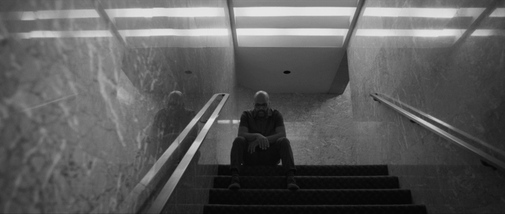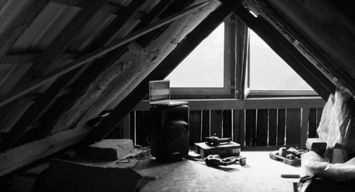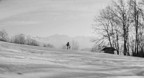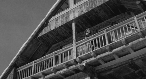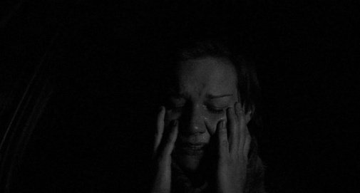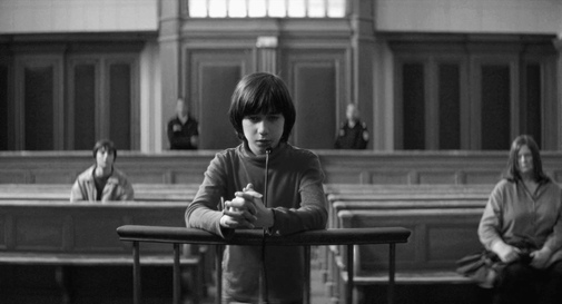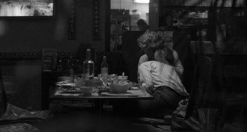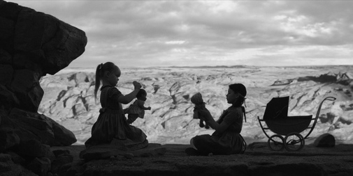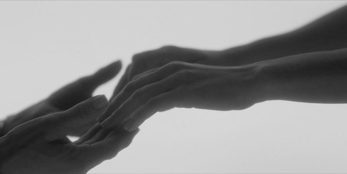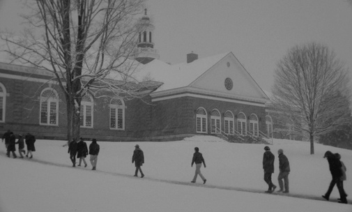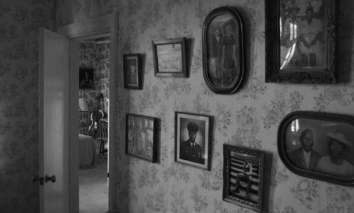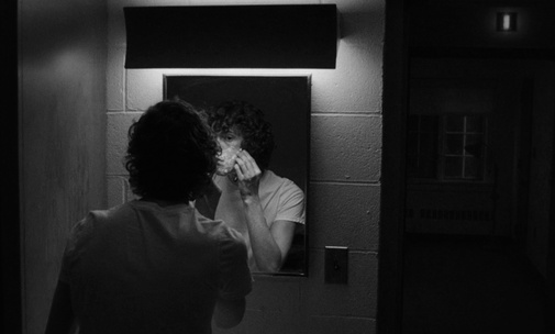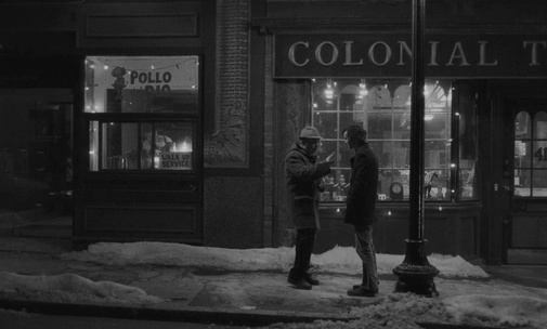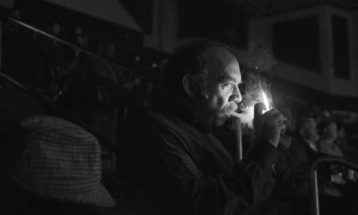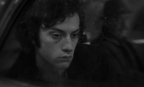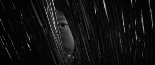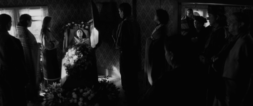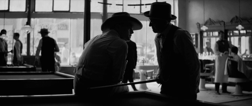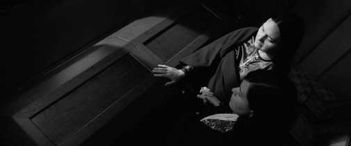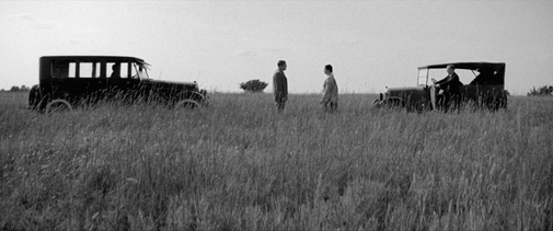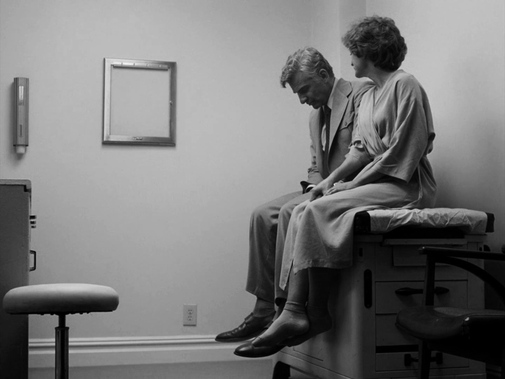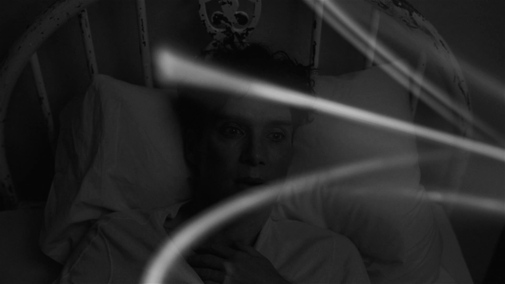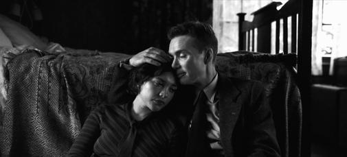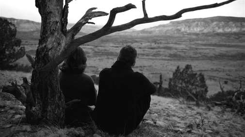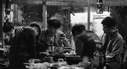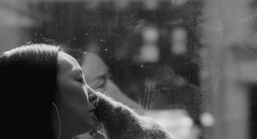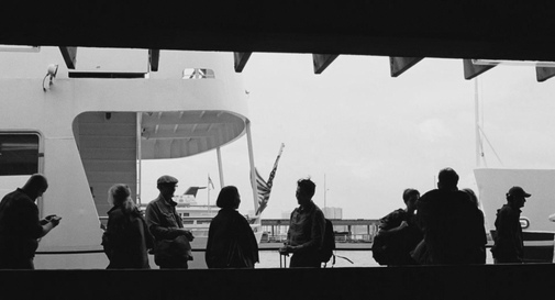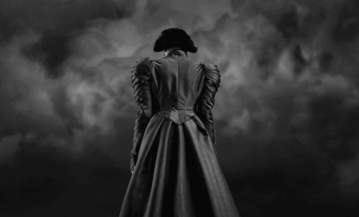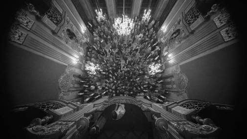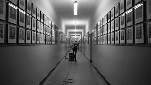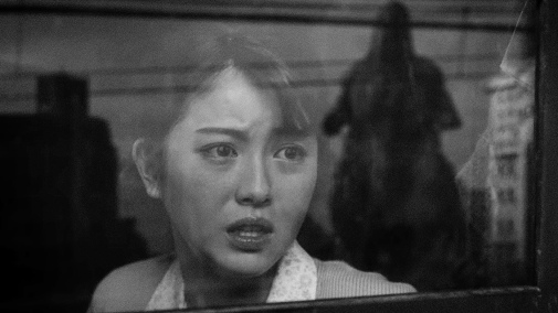
Re-releasing films in black-and-white, whether in theaters or through physical media, has become something of a trend. This year, Godzilla Minus One prompted a new edit with color stripped away, revealing a new way to consider its post-war twist on the kaiju mythos. I understand why audiences and filmmakers get carried away by these experiments. After all, for the past few seasons, it's a The Film Experience tradition to re-think the year's Best Picture Oscar nominees in silvery monochrome, pondering what each flick would look like transformed.
This is an exercise that can reveal qualities in composition and lighting, as well as provide a reference for the role of color in visual storytelling. Sometimes, its absence makes no difference. In other cases, a movie can't work in grayscale…
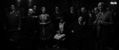
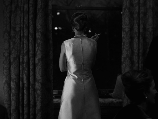
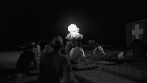
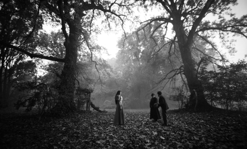
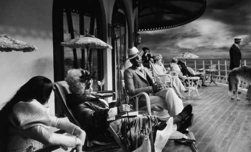
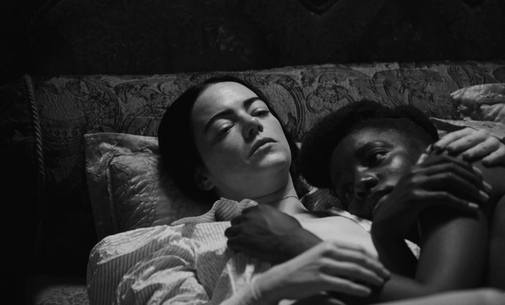
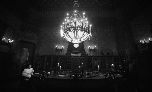
Curiously, 2023 was a year full of releases that dabbed in black-and-white cinematography, even if only for a couple of sequences. Indeed, half of the Best Picture roster does so. Maestro, Oppenheimer, and Poor Things are the most prominent examples. Still, there are also the recreated newsreel passages in Killers of the Flower Moon and the infrared monochrome of The Zone of Interest's night. For the first three titles, this exercise in picture editing didn't reveal much beyond the quality of their lighting, sharp contrast between light and shadow in an era where such things are becoming ever rarer.
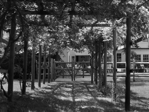
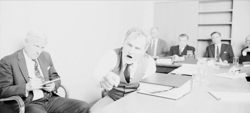
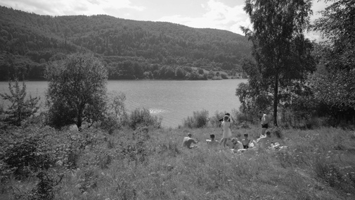
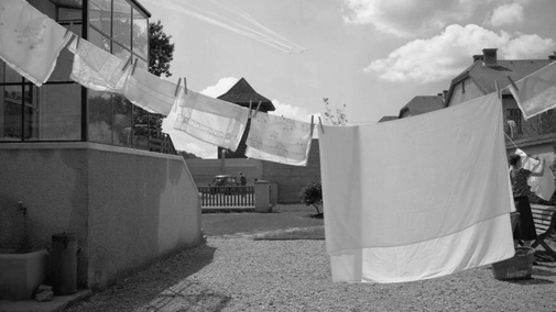
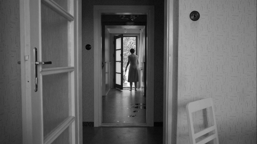
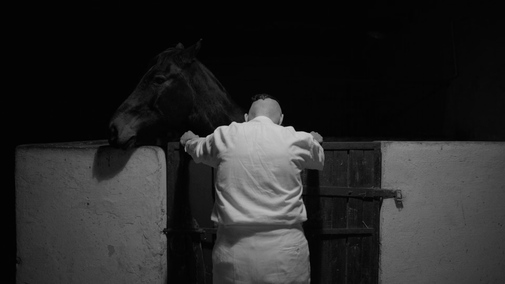
But the seven remaining nominees reveal something when put through this desaturating treatment. For example, while a few critics have overstated The Zone of Interest's debt to Haneke's cinema and theories, its black-and-white frames look remarkably like The White Ribbon. On the other hand, Killers of the Flower Moon is a gorgeous example of a film that might have even been more striking and worked better without color. We lose the landscape's natural colors and the chromatic variations of the Osage culture but gain a sense of cinematic classicism. In that sense, it recalls similar conclusions about The Irishman.
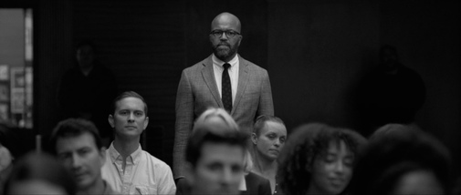
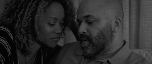
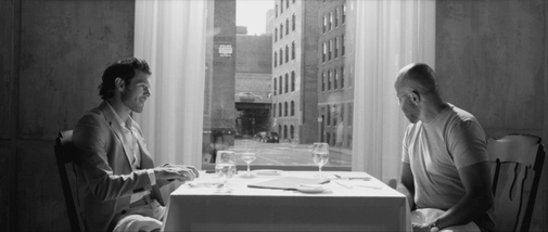
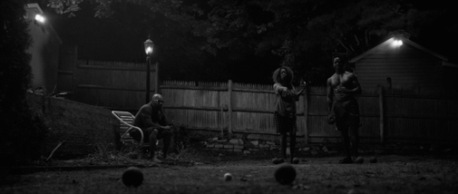
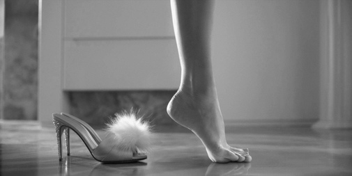
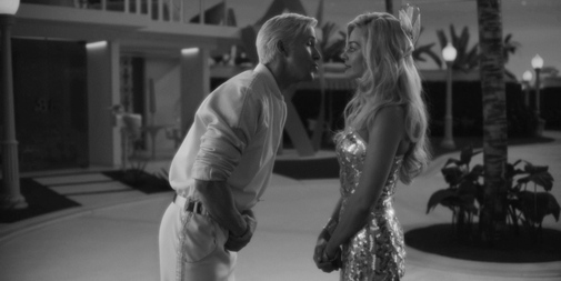
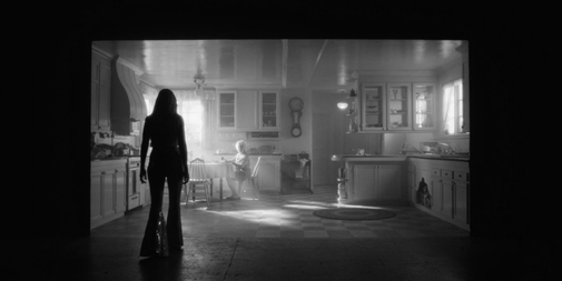
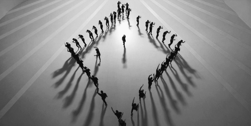
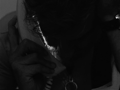
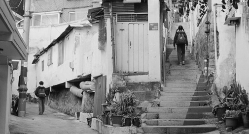
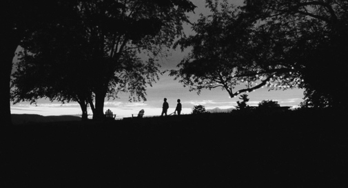
The other Rodrigo Prieto-shot film, however, breaks apart without color. What is Barbie without her pink? A disappointment, even if the fantasy world's soft lighting and reality's occasional harshness still come through. Past Lives shines brightest when it can play with color, but Shabier Kirchner's cinematography survives the transformation. I was less enchanted by the black-and-white twists on American Fiction, The Holdovers, and Anatomy of a Fall. The latter, especially, loses much of its visual personality when divested of pops of blue and red, refracted light painting rainbows on the edges of shots.
Finally, before we get to the screenshots, it's essential to acknowledge that filming in black-and-white isn't as simple as reducing the saturation levels to zero. Similarly, re-grading the final feature for this sort of special re-release is a complex process that goes far beyond what I've done with these screenshots. This annual post isn't about discrediting such work, rather a fun exercise so we can rediscover the season's much-discussed contenders from a different perspective. Hope you enjoy the results.
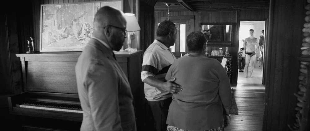
AMERICAN FICTION
Cinematography by Christina Dunlap
ANATOMY OF A FALL
Cinematography by Simon Beaufils
BARBIE
Cinematography by Rodrigo Prieto
THE HOLDOVERS
Cinematography by Eigil Bryld
KILLERS OF THE FLOWER MOON
Cinematography by Rodrigo Prieto
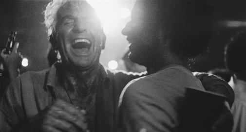
MAESTRO
Cinematography by Matthew Libatique
OPPENHEIMER
Cinematography by Hoyte van Hoytema
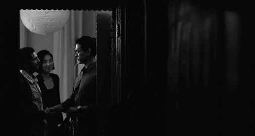
PAST LIVES
Cinematography by Shabier Kirchner
POOR THINGS
Cinematography by Robbie Ryan
THE ZONE OF INTEREST
Cinematography by Łukasz Żal
Which of the 96th Academy Awards Best Picture nominees would you like to rediscover in full black-and-white?
