


Best Picture in Monochrome
The trend of rereleasing critical darlings in black and white is apparently here to stay. After George Miller’s Mad Max: Fury Road and James Mangold’s Logan, it’s time for Bong Joon-ho’s Parasite to be revisited in sharp monochrome. The artistic value of such exercises is dubious, but they do offer a chance to reflect upon a film’s visual idiom and aesthetic construction. After all, do these works gain something by being in color? Is that an intrinsic part of their form or simply a consequence of convention? Would they be better, at least better looking, in black and white?
Those answers will have to remain unanswered, but as a fun exercise here are some from this year’s Best Picture nominees. They’ve been drained of color for your pleasure…
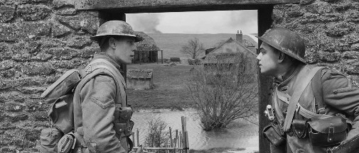
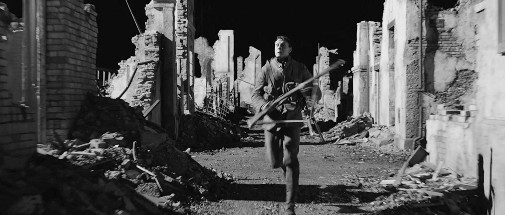
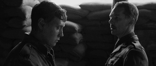
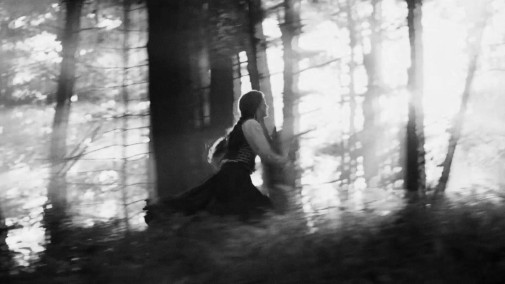
1917
directed by Sam Mendes
cinematography by Roger Deakins
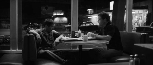
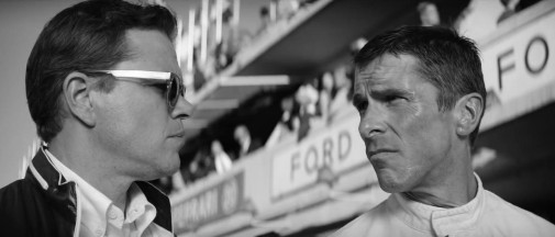
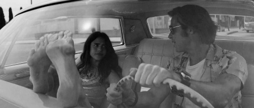
FORD V FERRARI
directed by James Mangold
cinematography by Phedon Papamichael
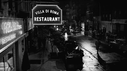
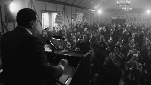
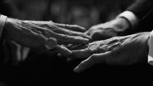
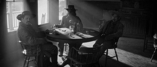
THE IRISHMAN
directed by Martin Scorsese
cinematography by Rodrigo Prieto
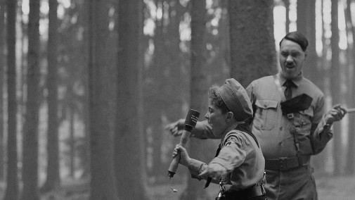
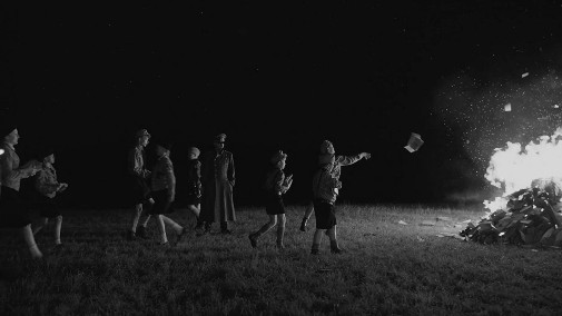
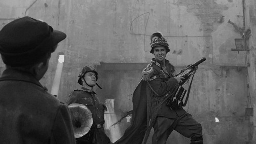
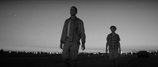
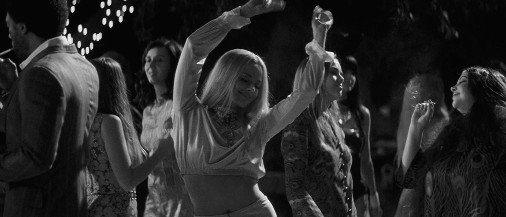
JOJO RABBIT
directed by Taika Waititi
cinematography by Mihai Malaimare Jr.
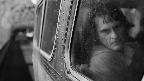
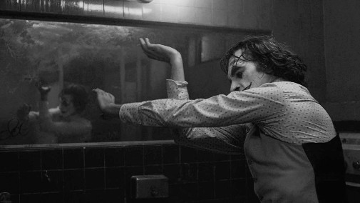
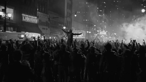
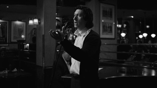
JOKER
directed by Todd Phillips
cinematography by Lawrence Sher
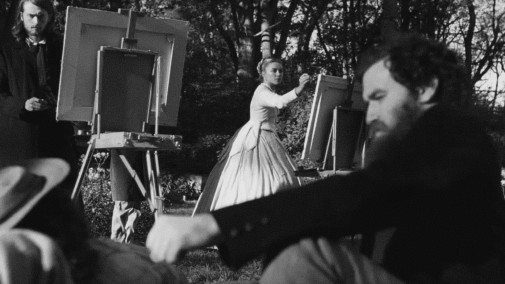
LITTLE WOMEN
directed by Greta Gerwig
cinematography by Yorick Le Saux
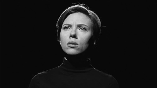
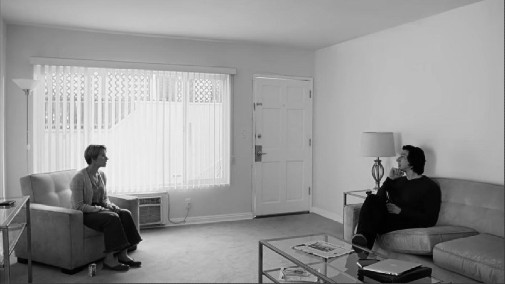
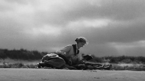
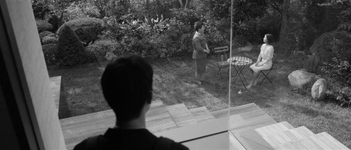
MARRIAGE STORY
directed by Noah Baumbach
cinematography by Robbie Ryan
ONCE UPON A TIME… IN HOLLYWOOD
directed by Quentin Tarantino
cinematography by Robert RIchardson
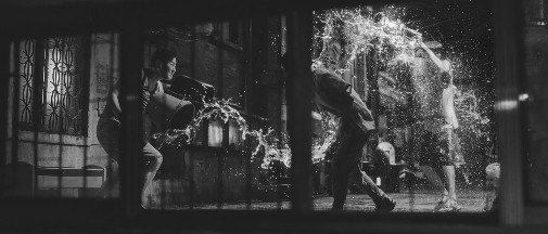
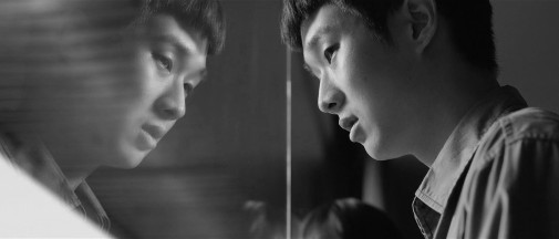
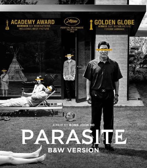
PARASITE
directed by Bong Joon-ho
cinematography by Kyung-pyo Hong
Would you like to watch any of these Oscar contenders in beautiful black and white?
 Cláudio Alves
Reader Comments (26)
Marriage Story. I feel like the black and white would mesh beautifully with the raw honesty of that film.
Yes: The Irishman, Marraige Story
No: Jojo Rabbit, Joker, Once Upon a Time... in Hollywood, Little Women
Maybe So: Parasite, 1917 (the colour is used superbly, but I think I might respond to the aesthetic choices made more in B&W),
Haven't Seen: Ford vs Ferrari
The stills from Jojo Rabbit make the film look a helluva lot more serious in tone. It's kind of scary how much colour helps the film.
Once Upon a Time in Hollywood doesn't look nearly as good in these stills. It's not that QT can't shoot in B&W, but it's clear how much colour means to his films.
I think this trend is the cinematic equivalent of reuploading the same picture with a different Instagram filter. Needless and attention seeking.
Joker and Little Women -- i'm very surprised to say -- look best to me desaturated
JOKER in B&W would've made it seem even more insufferable.
JOJO RABBIT & LITTLE WOMEN would not have worked in B&W. I can see the other films work to varying degrees.
Marriage Story looks like Woody Allen’s Manhattan.
Jojo Rabbit is the most reliant on color (particularly think of the shoes) so I think it would be the least successful translation. That said, Joker is reliant on color as well and looks great here, so who knows?
How much we have to wait for a nominee for LeSaux?
Anyone else feel like last year Roma would have been better in colour? Had the thought recently and can’t get it out of my head.
For this year, I think Marriage Story and The Irishman would best suit it.
@Paranoid Android, if Marriage Story was more like Manhattan, it would have been more transcendent instead of simply great.
Yes: The Irishman, Marriage Story and Joker. Reason behind that last one? Because of the subject and stated time frame, it's simultaneously both the early 80s and, implicitly, the late 20s. So, even though the Scorsese movies it's otherwise riffing on WERE in colour, Black and White would have made A LOT of sense as a choice.
No: Once Upon a Time...In Hollywood, JoJo Rabbit
Maybe: The Rest.
I think of all the films, Joker needs color the most.
Now I want to see The Lighthouse with colors.
Wow, this actually gave me the revelation that "The Irishman" would have been superb in B&W. Those stills look incredible, and that's just from a basic computer filter!
Those Irishman stills look amazing. I think black and white would for the movie thematically speaking as well.
Of those, I like the selected stills from Irishman and Marriage Story most of all. But as I noted on twitter the other day, the PARASITE black and white version holds little interest to me much like the FURY ROAD chrome edition didn’t.
Yes: The Irishman, 1917, Marriage Story
No: Joker (the calibration of its colour palette, with those queasy juxtapositions of orange and blue, is its finest quality), OUATIH, Jojo Rabbit, Ford v Ferrari, Little Women (colour is what gerwig uses as visual shorthand for past and present)
Ooh I guess I should really be following Glenn on twitter for those exciting hot takes.
Joker and Marriage Story for sure.
Owen, no need to be a dick about it. Yeesh.
The B&W version of Parasite looked marvelous. I saw it three days ago at IFFR with Bong Joon-ho in attendence for a 50 minutes Q&A afterwards.
Seeing 1917 like this makes me a little more comfortable saying that the cinematography is pretty ugly...
THE IRISHMAN and MARRIAGE STORY look the best of these.
Marriage Story
Joker
The Irishman
The rest looks blah w/o colors
Color is indeed v impt in making or breaking a movie feel.
I doubt Roma will win cinematography if it's not shot in B&W.
A lot of people said it already but damn those Irishman stills really pop. Of all these, the B&W really seems to tap into something in the soul of that film.
I liked this post when I was looking for I want to tell you something foundation repair denton is essential to maintaining the structural integrity and safety of homes and buildings in the area. Located in the heart of Texas, Denton experiences extreme weather conditions, including heavy rainfall and drought, which can cause the soil to expand and contract. This movement in the soil can lead to foundation issues such as cracks, settling, and shifting, posing a threat to the stability of the structure.