


Best Picture, Black-and-White Edition
Ever since NEON released a black-and-white version of Parasite during the awards season's peak, we've begun a tradition here at The Film Experience of looking the Best Picture nominees each year, and trying to imagine what they'd look like devoid of color. Naturally, we'll never know that since making a black-and-white movie is much more complex than simply turning the saturation to zero. Matters of design and lighting are involved, as are other elements of pre and post-production. Still, it's fun to peruse movies in search of striking imagery. But of course, beyond personal amusement, there's another component to this exercise…
Simply put, it helps to better appreciate certain aspects of a film's cinematography. By slightly deconstructing shots, one can find clarity and even make out previously overlooked qualities. Taking color away from a movie makes the geometry of shot composition more evident, all lines and blocks, actors, and scenic architecture. Some lighting choices also become rather glaring when chromatic variation distracts the eye. Paradoxically, this can also teach the role that color plays in a specific film. "What doesn't work once you take the color out?" can be a valuable question to ask when examining a flick's visual strategy.
With all of that out of the way, let's look at some black-and-white screenshots. Obviously, Belfast isn't here since it's already mostly colorless, but all the other Best Picture nominees are represented. So let's go alphabetically, starting with…
;)
;)
;)
;)
;)
CODA
Cinematography by Paula Huidobro
Honestly, CODA might as well be in black-and-white. It's not as if the picture has any discernible personality or point-of-view in its visual aesthetic. Sian Heder's sophomore feature gave me the most trouble out of all these movies. It's hard to select arresting shots when there are none in sight!
;)
;)
;)
;)
;)
DON'T LOOK UP
Cinematography by Linus Sandgren
Most movies shot by Linus Sandgren live and die by their stylized color stories. Don't Look Up's no different, putting great emphasis on the clownish artifice of modern politics. As a result, many images lose their comedic pop without contrasting hues fighting for attention in the same frame. Moreover, the primary use of hand-held cameras to record improvisational riffs means there's little in the ways of controlled framing. At best, Sandgren and McKay show a taste for using frames within frames, often approaching a character through visible props, cameras, and screens.
;)
;)
;)
;)
;)
DRIVE MY CAR
Cinematography by Hidetoshi Shinomiya
Probably because Drive My Car is, in some ways, about theater, there's a certain level of stage-bound stateliness to Hamamguchi's compositions that's not as evident in his previous films. Shinomiya's work also makes excellent use of presentational spaces, contrasting the intimacy inside the car with the formality of rehearsal, performance, social order. However, one can't help but feel the absence of scarlet in all these pictures. The Saab's bright red is central to Drive My Car's aesthetic, making its exclusion glaring, even debilitating to its storytelling.
;)
;)
;)
;)
;)
DUNE
Cinematography by Greig Fraser
For some reason, I remembered Dune as a film low, in contrast, so fixated on somber interiors and washed out exteriors that light is never white, black becomes muddy. Well, that was an illusion of memory. In truth, Fraser shows great care in allowing shadows to vary in intensity, often including dark voids in his shots, giving dimension to even the fleetest image. There's beautiful monumentality to the relationship between people and their surrounding space. However, small moments are filmed with just as much reverence. All that being said, the clash of supernatural blue eyes and the desert is keenly missed in this black-and-white Dune.
;)
;)
;)
;)
;)
KING RICHARD
Cinematography by Robert Elswit
It turns out that the lightning flash of yellow is essential to how tennis looks on screen. At least, it does in King Richard. All in all, it's not the most exciting of photographic achievements, though the lack of color makes one more aware of the careful blocking employed by director Reinaldo Marcus Green. Even if the text and editing privilege Richard above everyone else, the cinematography feels more egalitarian.
;)
;)
;)
;)
;)
LICORICE PIZZA
Cinematography by Paul Thomas Anderson & Michael Bauman
PTA's films are always full of beguiling textures, shadows, and light. Licorice Pizza is no different, which means its images are still magnetic even without their brightly-hued design. However, the film does feel different without its colors. As it lingers in my memory, Licorice Pizza feels less like a comedy than a tragedy of recurrent disappointment – more akin to something like The Graduate than American Graffiti. I wonder if the silvery tones would erode romanticism and nostalgia from the picture, revealing its darkness more instantly.
;)
;)
;)
;)
;)
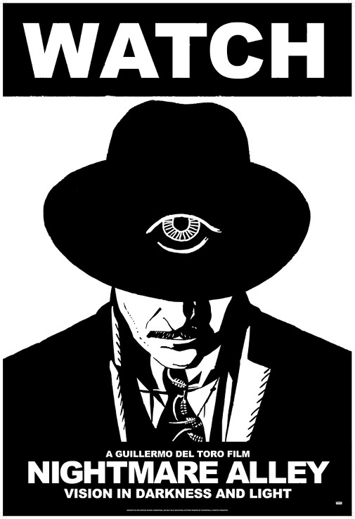
NIGHTMARE ALLEY
Cinematography by Dan Laustsen
Color noir isn't a new concept. You can go back to the origins of film noir and still find Technicolor wonders among the shiny black jewels the genre is known for. And yet, there's something about Nightmare Alley's colors that make the film look uncomfortably digital, smooth like a pebble polished into dust. It's hypermodern but also referential to early color processes. In other words, it's weird and very distracting. So much so that it's easy to miss the moody chiaroscuro work Dan Laustsen does throughout the movie. No wonder del Toro wanted to re-release it in black-and-white.
;)
;)
;)
;)
;)
THE POWER OF THE DOG
Cinematography by Ari Wegner
So, this was the biggest and pleasantest surprise of this little game. Drained of color, The Power of the Dog looks like a late-60s revisionist western, old-fashioned with a twist. It looks like the kind of movie that would have starred post-Hud Paul Newman and twinkish Sal Mineo, defining sexual fantasies for many generations of queer men. Honestly, I want to watch that movie. I also want to see the entirety of Campion's vision in silvery monochrome. As much as I love Wegner's work as is, this Oscar-nominated cinematography almost looks better in black-and-white.
;)
;)
;)
;)
;)
WEST SIDE STORY
Cinematography by Janusz Kaminski
Finally, we have Spielberg's musical remake, all those blue-ish lens flares turned to fifty shades of grey. As it happens, if you take the colors out of West Side Story, it starts to look a lot like a 1950s crime picture about urban youth. It's all very stylish, if overwhelmingly somber. Also, I can only hope I find someone in my life who loves me as much as Janusz Kaminski loves contouring his actors with conspicuous backlight. Somehow, this new version looks more artificially lit than the 1961 colored gels extravaganza.
Which Best Picture nominee looks better in black-and-white?
 Cláudio Alves
Reader Comments (5)
In my opinion, the striking imagery of CODA is the film’s determination to introduce, to examine, to celebrate the beauty of sign language. Cinematographer Paula Huidobro doggedly keeps the act of signing on screen without sacrificing a long, hard look at the world of a depressed New England fishing village.
For those ignorant of the emotive nature of sign, the film is a revelation. It would be easy to cut away to some storm clouds in foreboding images to reinforce the story. The task of creatively filming the signed dialogue is a greater challenge. That effort honors the humanity of the deaf community as meaningful. The cinematography here is more than pretty pictures. It is a statement of social justice.
Finbar McBride -- I realize I was a bit salty regarding CODA's cinematography. As someone who sees cinema, first and foremost, as a visual medium, such formalist inertness bothers me greatly. Those are not everybody's priorities when it comes to appreciating a film, I know, and I apologize for being dismissive.
Furthermore, I take your point that CODA frames sign language better than other high-profile productions with deaf protagonists. Hell, I complained about obscuring framing in CHILDREN OF A LESSER GOD when participating in the Supporting Actress Smackdown of 1986. Still, I feel that intelligible framing of sign language should be the bare minimum and that one should strive for more. At least, I yearn for more.
I also find it frustrating that the film's sole formal flourishes come in its sound design, primarily out of reach for hearing impaired audiences.
CODA looks awesome in black-and-white.
This post is a real *treat*, loved it!
I am surprised by how well Dune performs without its signature warm&sandy palette, bur maybe the whole movie won't work as well without the chromatic contrast between Caladan and Arrakis.
B&W Nightmare Alley really has a stronger appeal, an allure the original version has not, at least for me.
Love this series, but this year seems like mostly duds (in terms of how well they transfer to B&W). The one exception, where I'm in total agreement with you, is Power of the Dog, which looks somehow even more iconic and stripped down without color.
And lol at the fact that even B&W Nightmare Alley (2021) still pales next to OG B&W Nightmare Alley (1947). Sorry/not sorry.