Kieran, here wishing everyone a very happy Carol week. If ever there was a film that truly deserved an entire week dedicated to celebrating it, it’s Todd Haynes’ sumptuous cinematic buffet. The piece is a rare animal in the landscape in that it truly feels like every element of its filmmaking works cohesively in service of the overall vision. That was apparent on a re-watch last Friday evening in Los Angeles and even more so afterwards listening to cinematographer Edward Lachman talk to the audience about the process of finding the appropriate look for it after the screening.
“Todd always does great research before every film,” one of the many moments of him singing his director’s praises. “One of the greatest mandates was making sure it didn’t resemble Far From Heaven,” Lachman stated. [More...]
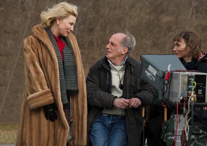
 Cate Blanchett with Ed Lachman & Rooney Mara on set
“We wanted to draw a distinct line, visually between the mid-to-late 50s aesthetic [Far From Heaven] and more immediately post-war America [Carol].” In contrast with the bright, Sirk-ian palette of Far From Heaven, they opted for faded magentas, greens and yellows—what Lachman says Haynes called a “soiled, muted look.” He also discussed the importance for Todd Haynes that the look of each film be in line with the mindset and perspective of the characters, much like the deep, saturated exaggerated color palette of Far From Heaven being a reflection of Cathy Whitaker’s bright-eyed, naïve optimism, at least in the beginning.
 much of the film feels shot from Therese's POV
“In the novel, Therese’s character is a budding set designer. The switch was made to her being a photographer in the film in that it allowed us to delve further into Therese’s viewpoint, particularly when she’s photographing Carol.”
Watching the film a second time, it was especially apparent how true this is and it throws into even sharper relief how ridiculous it is to categorize Rooney Mara as a supporting actress. The filmmaking itself so often takes us into Therese’s mind and Lachman’s camera frequently feels like a stand-in for her eyes.
“You see a lot of shots of Therese in doorways, in cars, surrounded by objects or activity that’s in motion compared to how static she is. Todd wanted to create the feeling that this character is trapped, suffocated and unsure of how to proceed.”
 Therese lost in thought at work
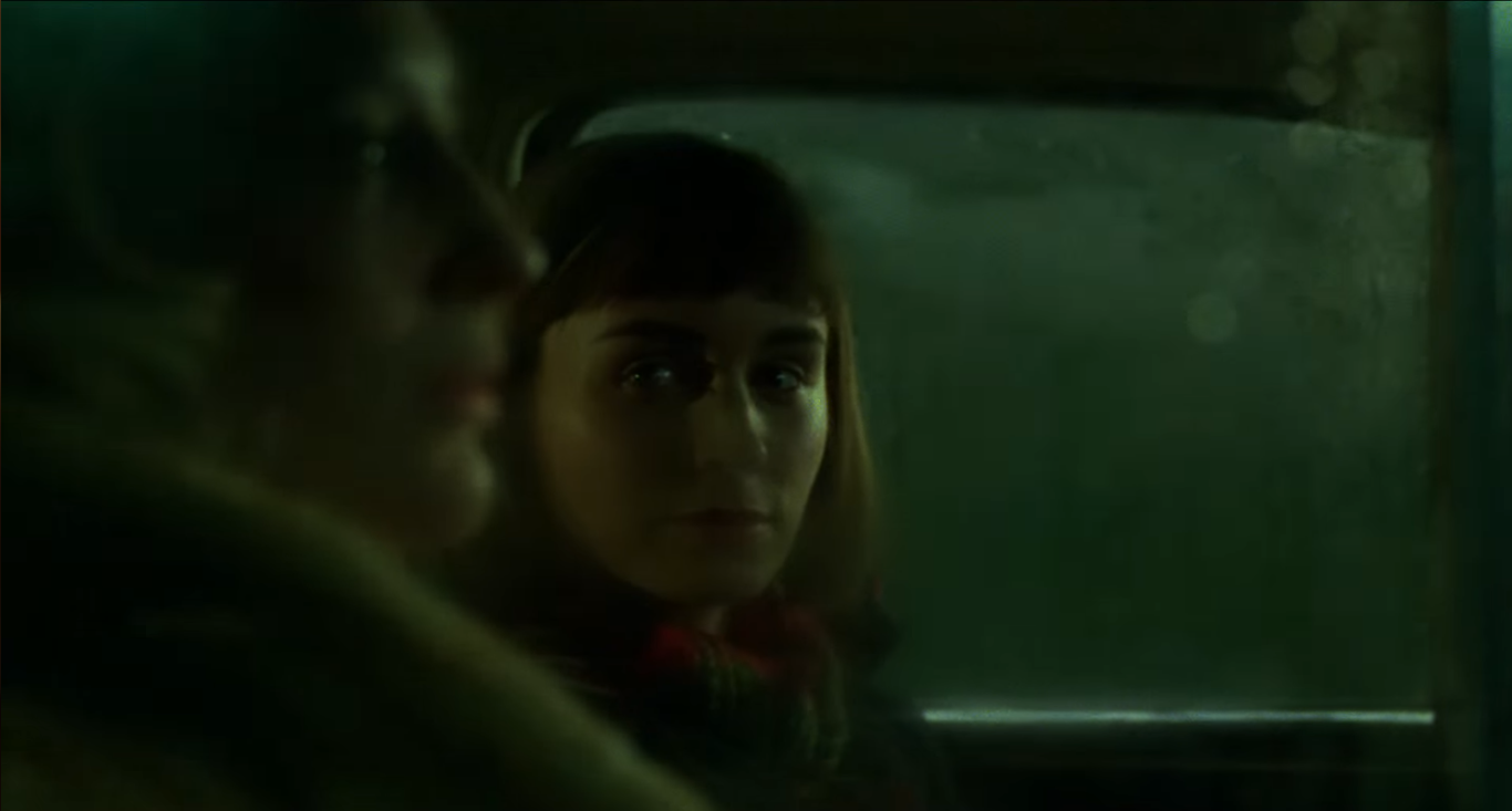
When asked about the most difficult scene in Carol to shoot, Lachman answered without hesitation. “The opening sequence that ends with us viewing Therese obscured through the window of the car,” his frustration apparent.
“Todd wanted very little light, despite the fact that it was night time and we were outside.” The obscuring of both Therese and Carol in several shots, like when they are driving through the tunnel, wasn’t always intentional it turns out. “Carol is often an obscured object in Therese’s estimation, so it fit well.” In a film so seemingly meticulous, so impeccable in its construction, it’s fascinating to imagine any part of that construction being a happy accident.

Even with Haynes being absent from the screening, the rapport between him and Lachman was evident. Carol is their fourth collaboration and they are currently in pre-production for a fifth feature film. Lachman was reticent about giving away any details about the latest project, but he did say this, with a slight chuckle. “I’m sure it’ll be lovely.”

more on Carol | more Cinematography posts | Oscar predictions visual