Curio: Oscar Unsheets, Part I
 Tuesday, January 31, 2012 at 8:00AM
 Alexa here. Announcement of the Oscar nominations brings about a flurry of poster creations by design geeks around the net, something I love to follow. Screenwriter John August has called these fan creations unsheets (a play on the term onesheet), and the label seems appropriate, especially since so many indie designs are now influencing actual onesheets released by the studios (like those Iron Lady campaign posters, for one). With so many great designs out there, I'm devoting my Curio posts leading up to the Oscars to unsheets made from the nominated films. This week I'm focusing on my favorite designs from films nominated outside of the Best Picture category, say for acting, Best Foreign Language Film, etc. Enjoy the design candy!
 Beginners by Sondy Bojanic.
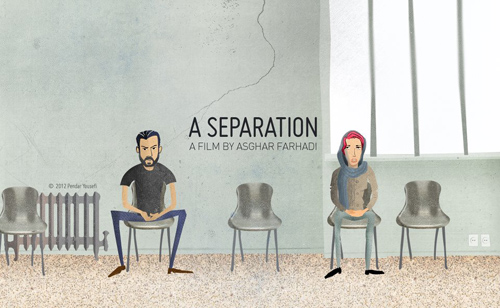
 A Separation by Pendar Yousefi.
click for more, including Albert Nobbs and Marilyn...
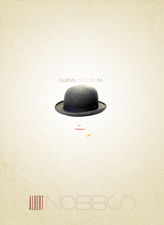
 Albert Nobbs by Monica Mohapatra.
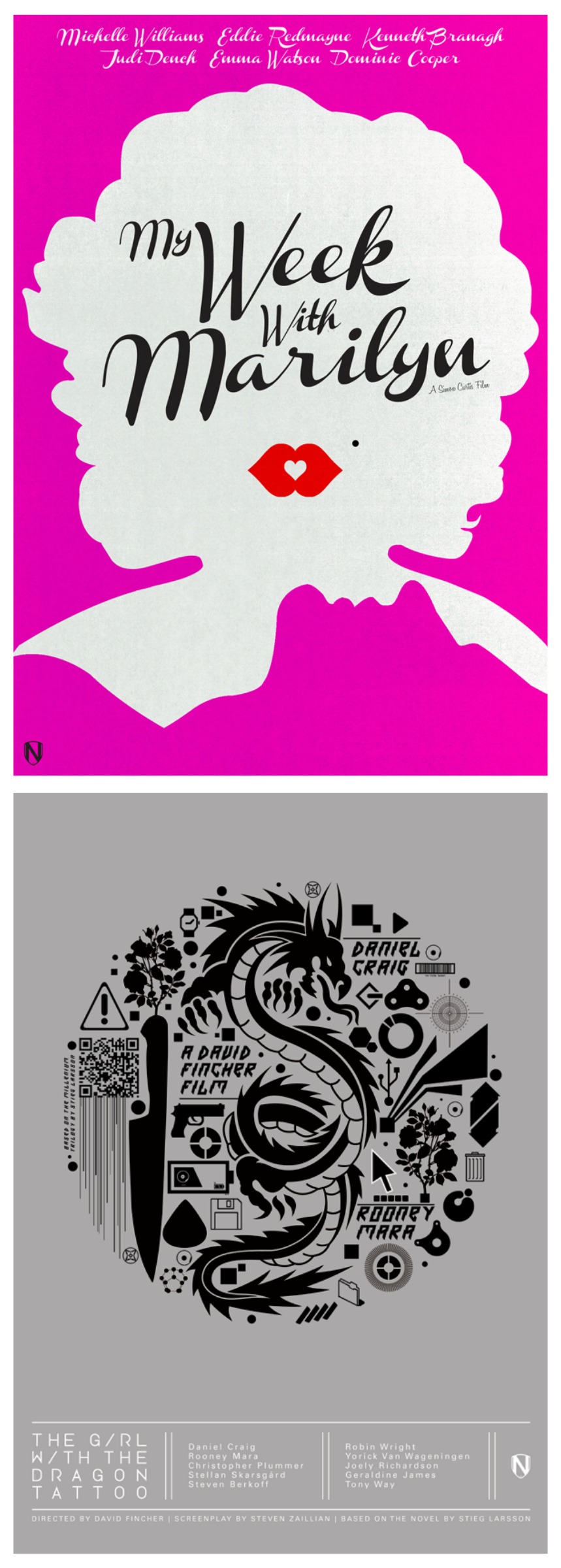
 My Week With Marilyn and The Girl With The Dragon Tattoo, both by Matt Needle.


Reader Comments (8)
The Albert Nobbs poster is truly effective: the title character as a ghost, a man disappearing...
I love the BEGINNERS and A SEPARATION. such great straightforward images to represent complicated movies.
Second the love for The Beginners unsheet. (And you're right, Nat - that movie is much more complicated than the trailers would indicate. So many layers of sadness, melancholy - what's with that theme this year? - frustration, and no villans, just people doing the best they can.) the albert nobbs one is very effective; it really reminds me quite a bit of the original teaser trailer, but perhaps improves upon it.
I meant "orignal teaser poster" not "trailer", obviously.
I think this Melancholia one is so awesome!
http://26.media.tumblr.com/tumblr_lykxucM1d31qhzdcmo1_500.jpg
Looking at A Separation’s animated unsheet, if only there was an animation that had same greatness like A Separation, that would win Oscar so easily.
thanks for the blog mention!
Well, Sondy Bojanic's animated poster is what I like the most. And my second choice would be "A Separation" by Pendar Yousefi. I find them cute.. :D