


Curio: Oscar Unsheets, Part III
Alexa here. With less than two weeks till the Oscars I'm spotting more and more fabulous unsheets (or fan poster art) inspired by the nominated films. (See last week's post for some criminally overlooked films). This week I'm moving on to the Best Picture nominees. Interestingly, The Help seems to be one of the nominees most posterized this year; is it the lure of illustrating pie?
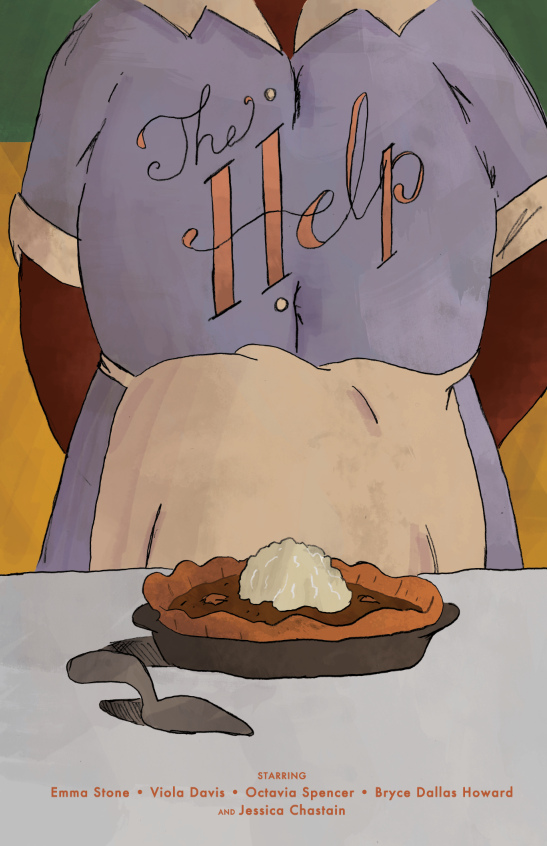
 The Help by Hector Pahaut.Here are some of the best celebrations of the Mississippi Maids, along with some key-themed designs for Extremely Loud & Incredibly Close, mathematical minimilism for Moneyball, and evocative staircase imagery for The Descendants. Click for more.
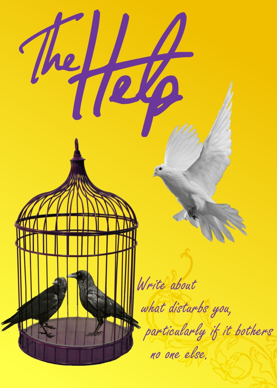
 The Help by Gideon Slife.
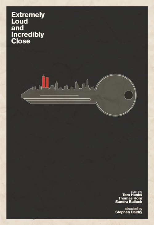
 Extremely Loud & Incredibly Close by Derek Eads.
 Extremely Loud & Incredibly Close by Hunter Langston.
 The Descendants by Hunter Langston.
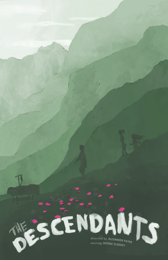 The Descendants by Gideon Slife.
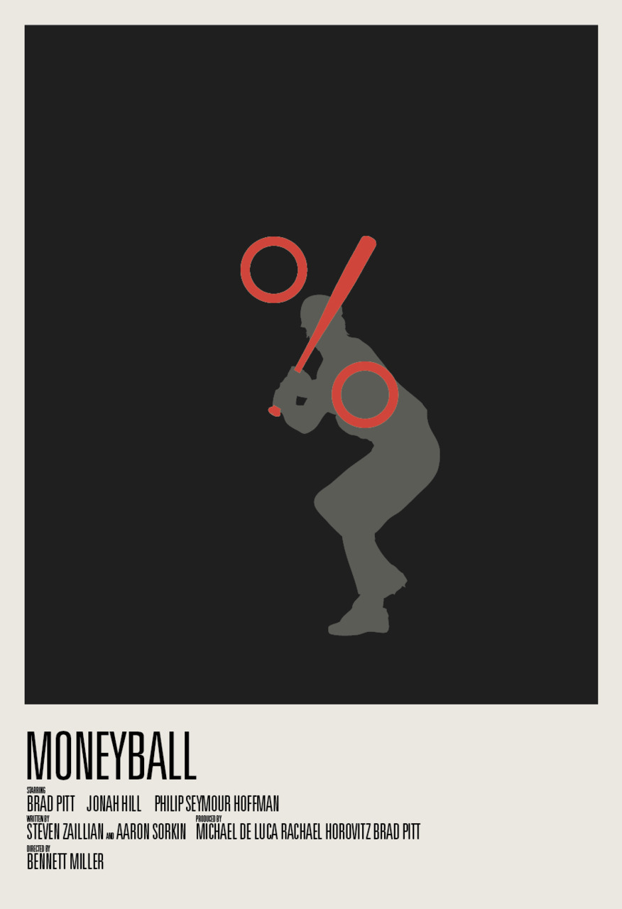 Moneyball by Hunter Langston.
 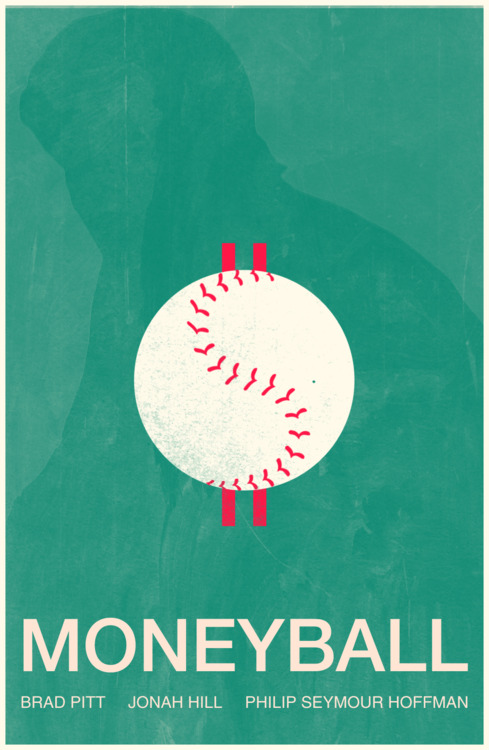 Moneyball by Derek Eads.
 Alexa
Alexa
Reader Comments (5)
These posters are so beautiful that they're even making me question hating "The Descendants" so much.
You hated the Descendants Jose? I thought it was ok - although I unintentionally laughed during the big emotional scene at the end - "Ok look! George Clooney's attempting tears. What growth".
That 2nd "Descendants" post is pretty stunning (and the 1st one is pretty cool, too). Also loved the "Moneyball" posters and the "EL&IC" with the key. Didn't really love either of "The Help" ones, though.
I'm with DJDeeJay on that - I particularly like the second help poster. I can see the pie but can't even make out the figure properly. (Is that one person, or two split in half? Is that intentional, or just less-than-stellar drawing?) The other ones are fairly amazing, especially the ones DJ mentions. (they don't want to make me see the films, but I would put those up on my wall without embarrassment.)
Speaking of posters (although off-topic a bit) - I know this is a bit late for Nathaniel's set design/art design catagory (he did that great post a few weeks back), but I saw Beginners after reading that, and the use of the very bright, exuberant and carnal Polish moive poster in Oliver's house, which is otherwise very spartan and bare, all white walls and neutral colors, during those scenes in which he and Anna are trying - and failing - to cohabitate - reminded me very much of the shot Nathaniel selected from The Skin I Live in for his art direction post, or certainly added some texture to those scenes in contrast to everything else surrounding the image. (Then again I love the film, so I;m not really objective.)
Am I the only one that finds that first The Help (with the birds) poster sort of... distasteful?