The Furniture: Camelot, a Silly and Furry Place
 Monday, October 23, 2017 at 2:00PM
"The Furniture," by Daniel Walber, is our weekly series on Production Design. You can click on the images to see them in magnified detail.
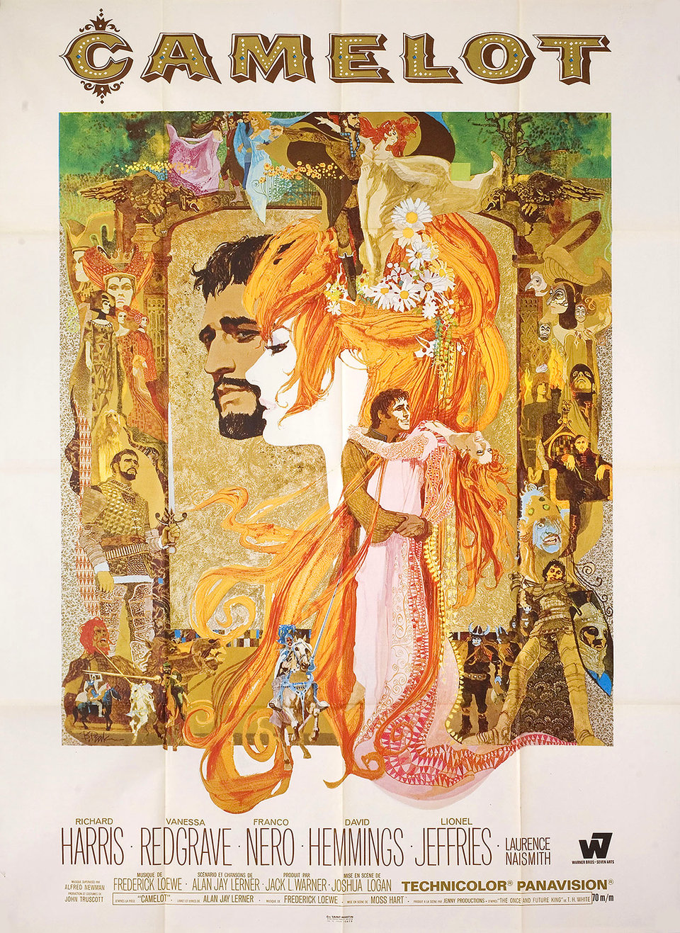 Back in August, I wrote about two dramatically different ways of portraying Arthurian Legend on screen. To recap: the bright silliness of Knights of the Round Table (1953) looks like psychedelic compared to the bland grit of King Arthur (2004) and the gruff, imperial fantasia of King Arthur: Legend of the Sword (2017). But even these at least share a mild interest in engaging with English historical design. Camelot (1967), on the other hand, is a flighty fantasy of utter nonsense.
Of course, this is why it’s such a delight to watch. It’s a furry, oversexed epic that sends its glamorous cast out into magical forests to sing Lerner and Loewe songs at the top of their extravagantly-adorned lungs. The film won Oscars for production designer John Truscott, art director Edward Carrere and set decorator John Brown, with Truscott taking home a second statuette for the costumes. Lavishly made and lavishly awarded, it’s a classic of committed inspiration.
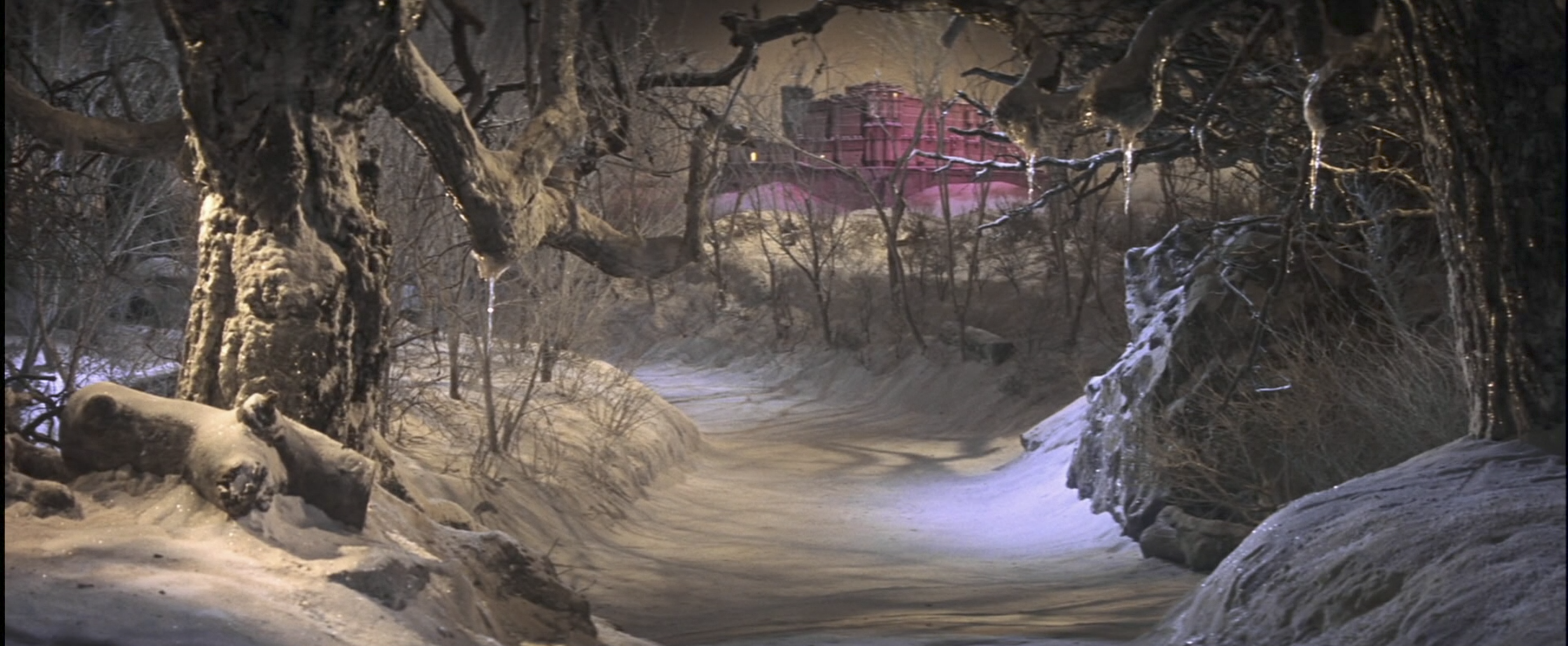
Production was split between expensive studio sets and on-location shoots at two Spanish castles, the Alcázar and the Coca. Both stand in the Castilian city of Segovia and both demonstrate Moorish architecture. Neither looks a bit like England in either the Dark or Middle Ages, but even speculative realism is hardly the goal here. The studio model of the Coca, playing the role of Camelot, even gets to turn pink.
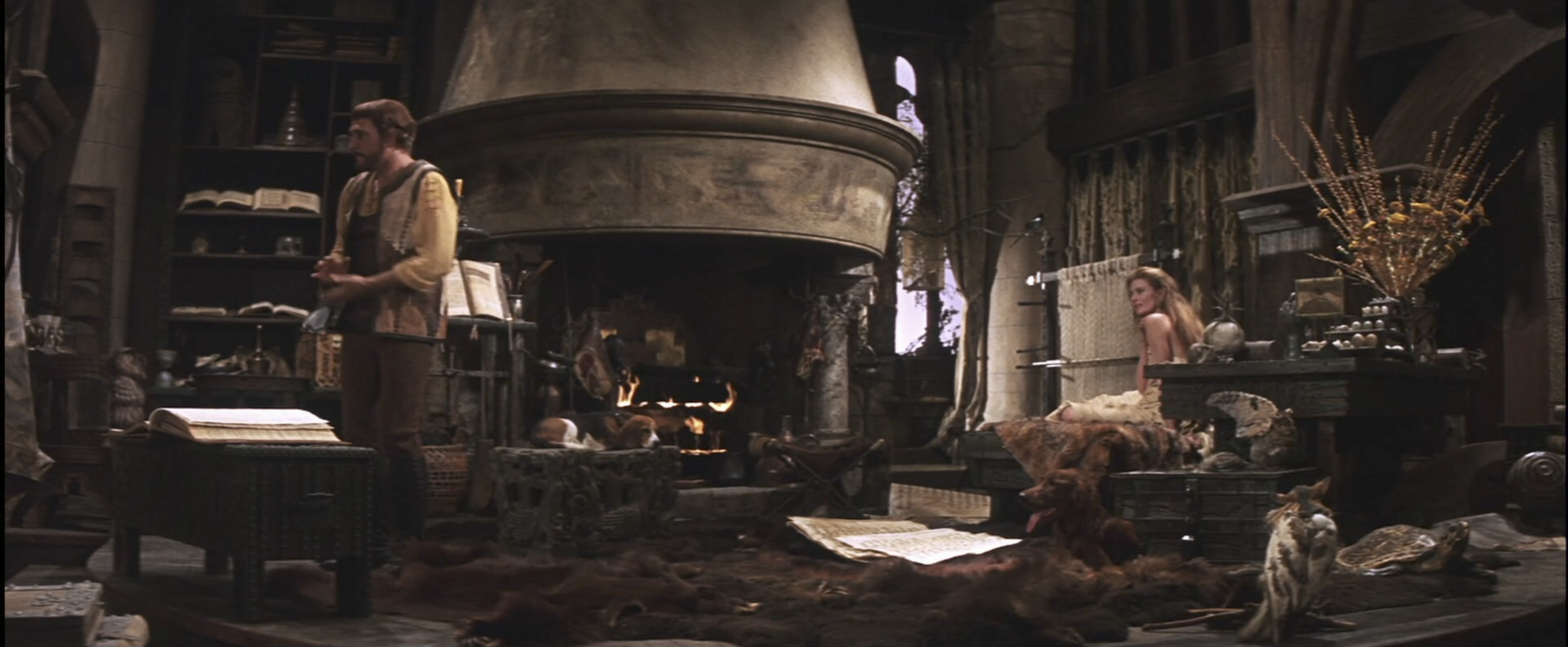
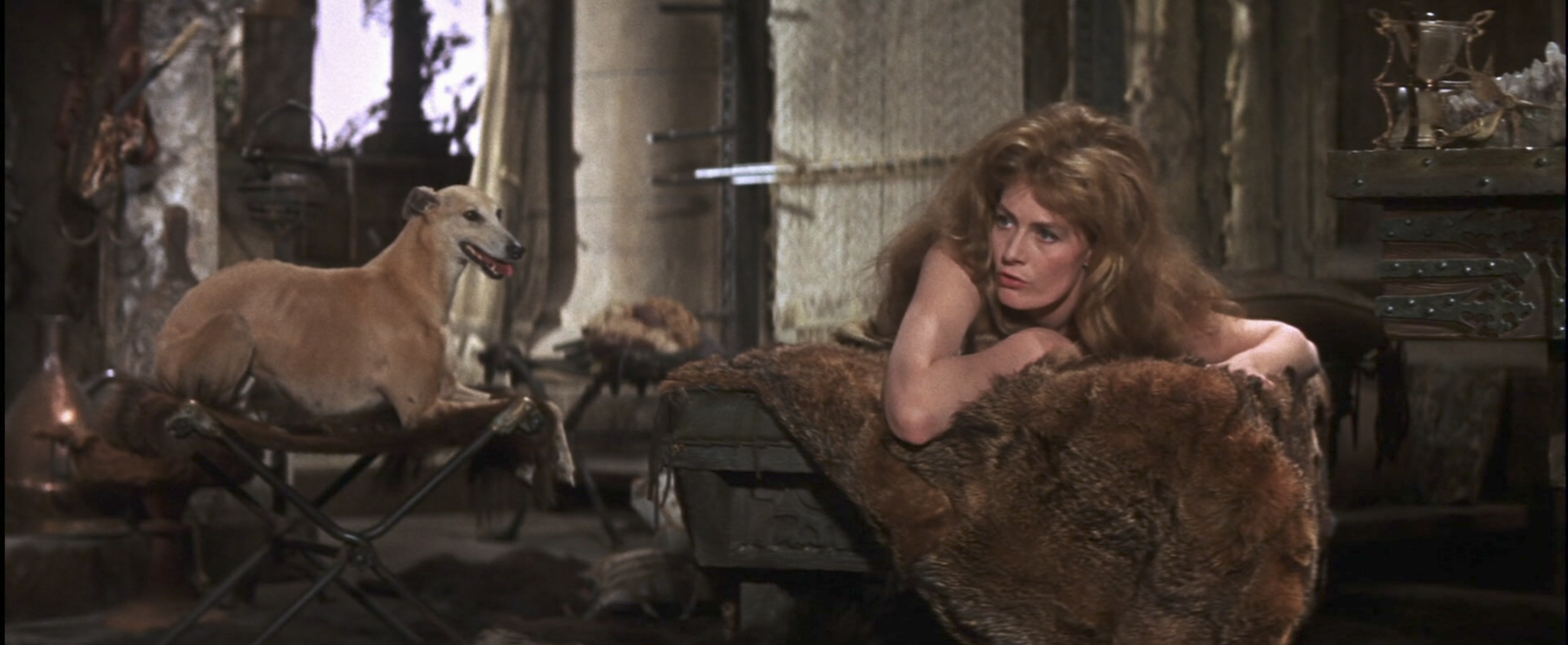
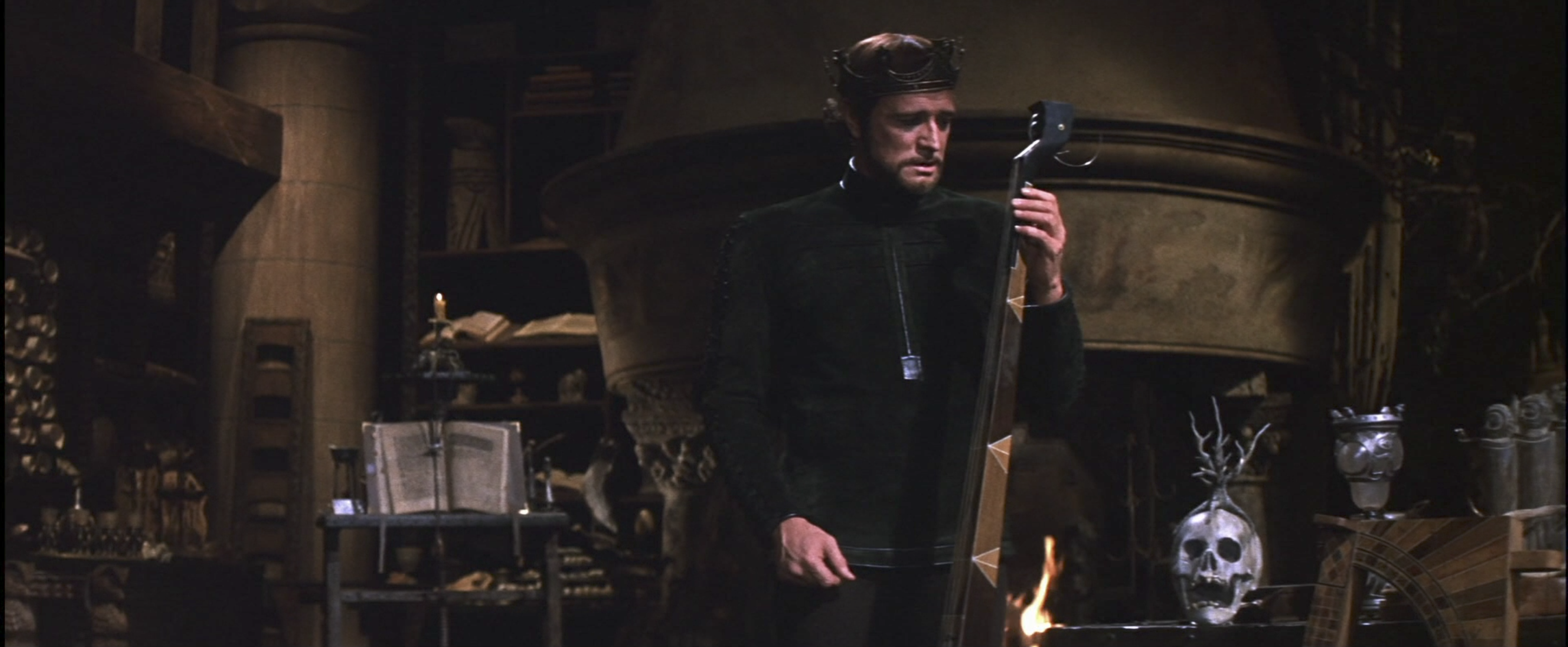
The interiors of are just as lavish. Much of the film takes place in King Arthur’s (Richard Harris) enormous bedroom/home office, nearly every inch of which is covered in luxurious fur. All of the wood is dark, every book is open and if something can be shaped like an owl, it probably is. While watching Camelot, a fun game is to pause and count how many dogs are in the frame. Find both here:
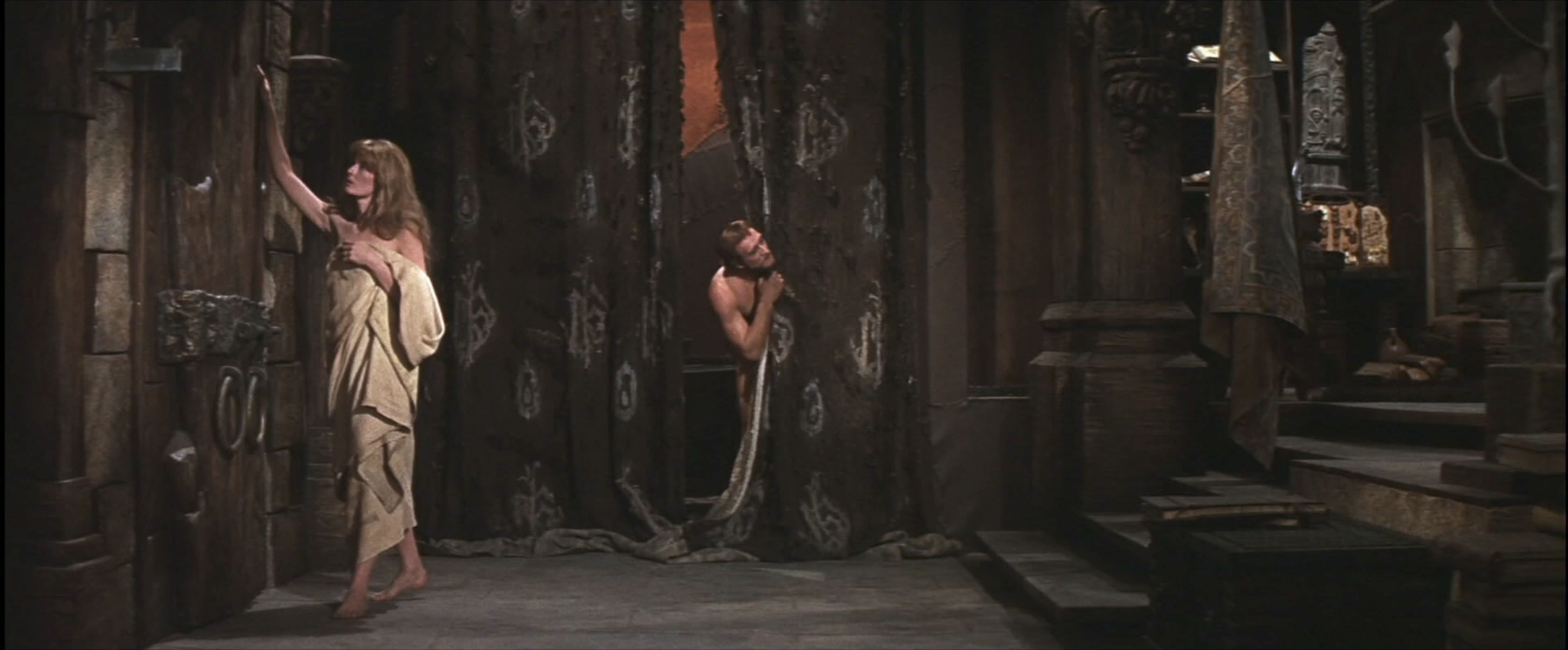
It’s impossible to overstate the fur. The (false, of course) dilemma faced by most Arthurian films is whether to represent the more theoretically accurate Dark Ages or the more aesthetically pleasing High Middle Ages. Camelot has ignored both, instead rushing toward a kind of neanderthal Europe, where it’s impossible to tell where one’s own hair ends and where something else’s begins. Arthur’s bedroom is like a cave, in which he and Guenevere (Vanessa Redgrave) live in the furry nudity of prehistory.
After all, this is really a movie about sex. If every surface is upholstered with soft animal fur, then every surface accommodates passionate rolling about.
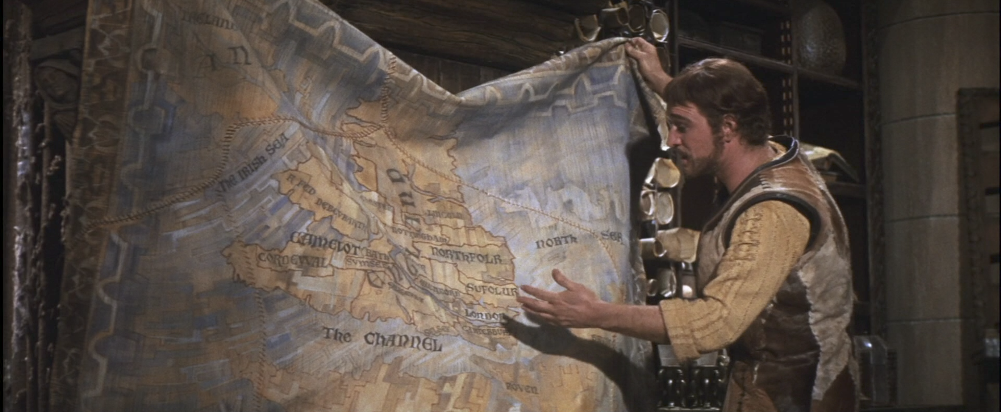
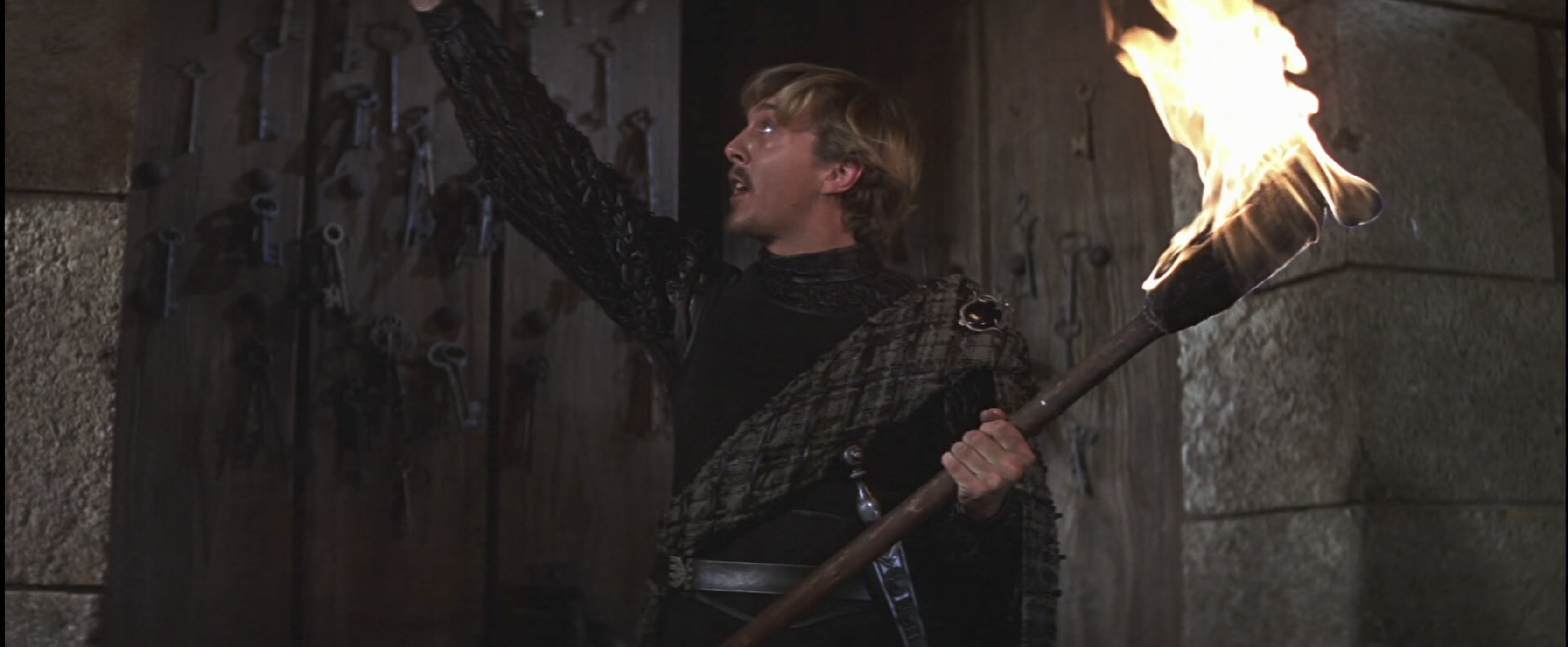
Uncontrollable sexuality is also the cause of the inevitable disaster, sparked by the irrepressible (and real-life) chemistry between Guenevere and Lancelot (Franco Nero). This causes a political crisis at Camelot, though of course the details are left as vague as they are loud. This charming map, for example, isn’t exactly a helpful tool.
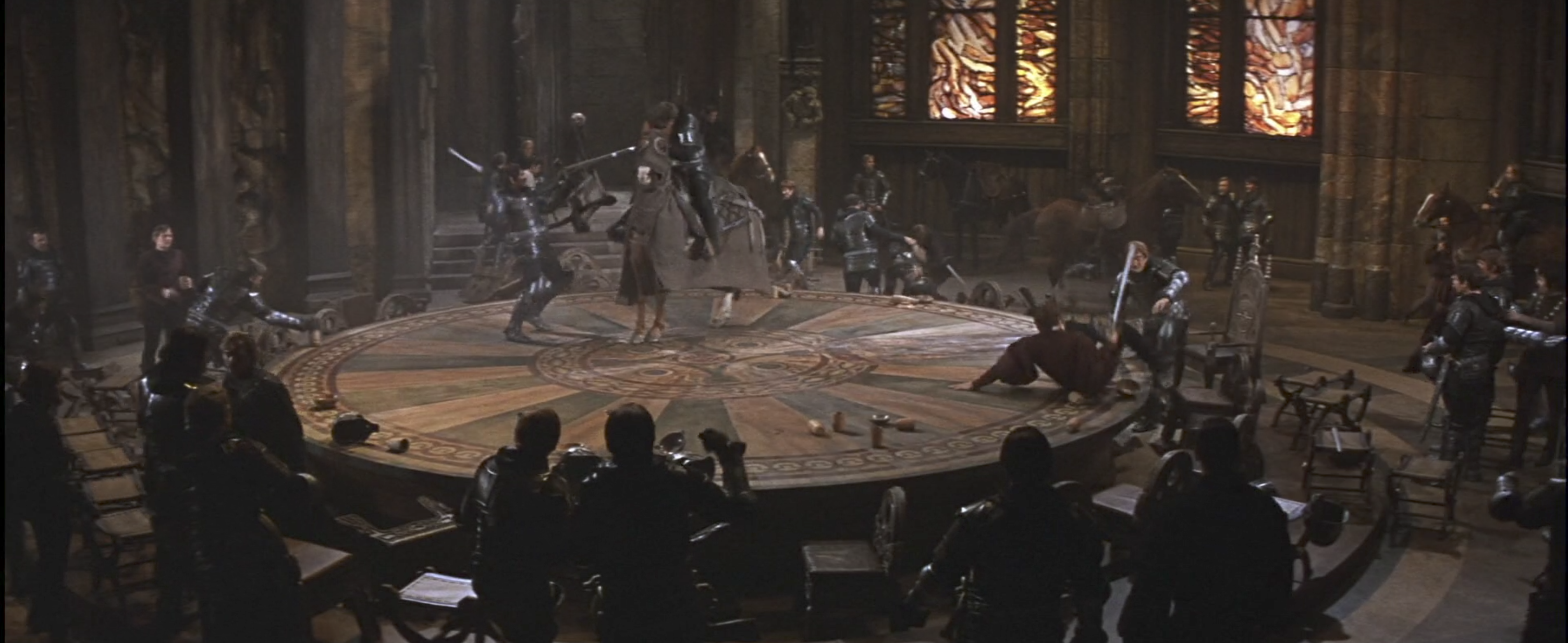
In the end, Arthur is like this novelty skull: woeful, disembodied and sporting a decorative antler for no obvious reason. He becomes his own Yorick, Camelot an infinite (or nearly, at 179 minutes) jest of most excellent furry fancy. Not that Shakespeare is an especially appropriate reference for this Arthurian legend, but neither is anything else in the movie - which is why it’s such a delight.


Reader Comments (8)
Love what you've written about the look of "Camelot". Especially the amusing but affectionate tone used to describe it. So many writers over the years have just quickly consigned this one to the critical scrap heap, then moved on. Your description of it as "a classic of committed inspiration" hit just the right note for me. I think the "outdoor" scenes in the forest went too far in the direction of airless artifice, but costumes and interiors were all sensational. Of course, it didn't hurt to have a fully radiant Vanessa Redgrave at the center of things. She'll always be the definitive Guinevere to me. I'd have given the '67 Oscars in Costume and Art Direction to Zeffirelli's "Taming of the Shrew ". That picture has visuals I could revel in forever. But thanks for reminding me that "Camelot" was a worthy - and endearing - contender.
Good article makes me want to see the film again
the greatest visual in camelot is franco nero
As a kid, the sight of a shirtless Franco Nero in bed is the first memory of my own sexual awakening. Didn't know what it meant but suddenly I couldn't breathe.
Yes Seisgrados, Nero awakened it, and the next year Leonard Whiting confirmed it.
Great article, such a unique vision for this musical. I recall reading Redgrave's wedding gown was sewn with thousands of pumpkin seeds into the fabric.
Thanks for highlighting the best thing about this gorgeous but ponderous bore of a movie. Made right in the middle of Roadshow-itis it's a bloated seemingly endless trial to sit through so thank goodness for all the visual splendor on display. I like all three leads as performers and in Vanessa's case I adore her but none of them despite their beauty at the time belong in this musical, you know owing to the fact that none of them could sing and all!
joel, LOL--perfect assessment! Egads this movie is ridiculous but in a fascinating way. Viewers, watch this on mute--the singing will do permanent damage.
I'm not afraid to admit that I immediately fell under the spell of John Truscott's unique design for Camelot. For that matter the costumes held very strong influence on half a generation growing up during a "summer of love" revolution just getting under way.
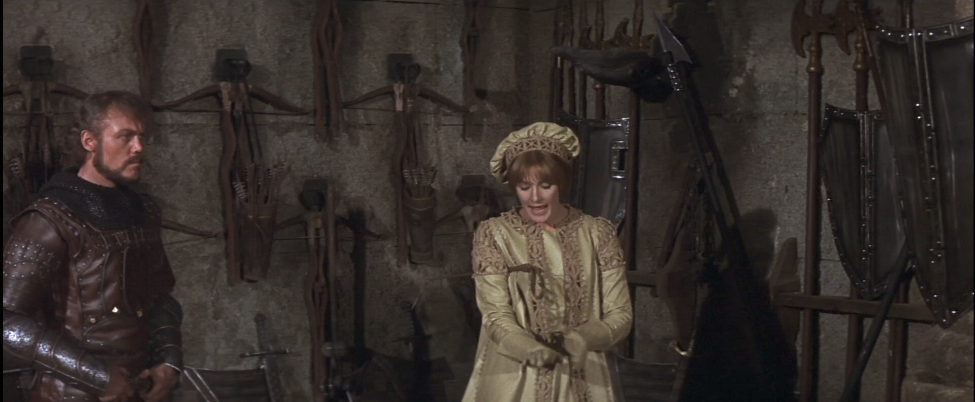
There were good reasons for the collections of keys and arms to be displayed the way they were in the film. Arthur's dream for Camelot was explained in the lyrics of the title song. A kingdom without battle and crime. The wall of keys are gifts from the various towns in support for Arthur's dream and reflect a kingdom without fear. The round table is Arthur's civilized replacement for the "obsolete" crossbows on display.
Years later I had the opportunity to call Truscott for a potential art direction assignment. He sadly had to decline, retuning to his native Australia to design the Melbourne Civic Theater and many of its theatrical productions.
The year he passed away I happened to be in Melbourne and they were presenting Camelot in that theater...so I went not knowing the connection until reading my program at intermission. The staging of Camelot was dedicated to Truscott who had died after becoming the patron saint of design projects throughout Melbourne.
Today and every day I am fortunate to gaze upon several props from Camelot, including Excalibur and Arthur's owl bedecked chair from that incredible chamber room.
Of all the films that have tried to create visions for this mythical time period, most wind up austere or Broadway flashy and never livable. Only one created an imaginative lived in backdrop that was embraced by a generation about to change the world. It reflected their awakening style of free thinking, "and was known as Camelot".