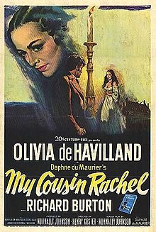
The Furniture: Ghosts of Property in My Cousin Rachel
 Monday, June 12, 2017 at 12:45PM
"The Furniture" is our weekly series on Production Design. You can click on the images to see them in magnified detail.
Location is everything. Daphne du Maurier’s My Cousin Rachel is so intimately associated with the Cornish landscape that you can go take a “My Cousin Rachel Walk” along the coast. Its cliffs and pastures feature prominently in the new adaptation of the book, starring Rachel Weisz, which was shot close to the novelist's home.
The 1952 version, meanwhile, was shot almost entirely inside an American film studio. The real Cornwall only makes a few brief appearances. But, despite the appeal of literary tourism, authenticity is not necessarily art. The location choice forces much of the plot indoors, taking full advantage of the complex and Oscar-nominated work of art directors Lyle R. Wheeler and John DeCuir and set decorator Walter M. Scott. It's more subtle, more effective.
After all, natural beauty is not really at the heart of the drama. This is a story about wealth, property and suspicion...
Richard Burton is the young Philip Ashley, an orphan raised by his genteel bachelor cousin Ambrose. The elder Ashley becomes suddenly ill and goes to Italy, where he meets and marries his cousin Rachel (Olivia de Havilland). Then he abruptly dies. Philip is left with only a few vague and panicked letters.
But it turns out that Ambrose left everything to Philip, not his wife. Did she murder him or not? Rachel’s unexpected arrival in Cornwall dares the blustery young Ashley to make up his mind. What follows is either a battle of wits or a series of misunderstandings. Philip, despite his best efforts, remains in the dark. So does the audience. The house itself is a dynamic scaffold for shadows, expertly exploited by Oscar-nominated cinematographer Joseph LaShelle (Laura).
The sets are an active participant in answering the film’s driving questions. Who will be granted this house? Who has more ancestral right to live within its walls? Occasionally the rooms themselves seem to betray their sympathies. Rachel certainly appears more at home in her temporary bedroom than Philip, though he has lived here for most of his life.
In fact, Philip never seems comfortable anywhere. His rough energy clashes with the house’s luxurious accents, grand floral arrangements and charmingly upholstered furniture. He seems more fit to stand angrily above this delightful chair than to actually sit in it.
But these light touches are mingled with stern architectural features. The oppressive, shadowy atmosphere weighs on Rachel as well. The stone walls of the common spaces are warped, sometimes suggesting a malevolent stucco. One does not climb these stairs lightly.
Instead, the estate takes its revenge. In the 2017 version, the climactic tragedy comes at the hands of nature, the Cornish cliffs. In the 1952 version, however, it is a man-made bridge. The decay of Ashley wood sends Rachel tumbling to her death, in part due to Philip’s own malevolent negligence. Perhaps, at the end of the day, the shadowy spirits of the Ashley past have deemed neither one of them worthy.


Reader Comments (4)
I haven't seen the remake, but it seems to me that this tale is best told in black and white. These still seem to confirm that.
Looking forward to catching the new version but the observation about the heaviness of the settings seeming to way down the emotions of the characters is spot on. It's not a perfect picture and is missing that certain malevolence of The Heiress, what Wyler could have made of this!, but the performances are good and it's a fine mood piece with superior set design.
wonderful piece. I've never seen this version (just got out of the new one) but your comments about location vs artifice make the two pictures seem even more interesting as a pair.
Very interesting, good job and thanks for sharing such a good blog. Your article is so convincing that I never stop myself to say something about it. You’re doing a great job. Keep it up