Art Directors Make Their Picks
 Thursday, January 9, 2014 at 10:29PM
  Jose here, with yet another batch of guild nominees. This time members of the Art Directors Guild have determined nominees in three categories (which are just as nonsensical as those of the Costume Designers Guild...how is Her contemporary and Gravity a fantasy?). It's mostly more of the same, except for one or two rather interesting choices here and there, and truly it seems as if Oscar mostly cares about the "old look" which is why the Period nominees might pretty much translate into our final five nominees. Right?
The nominees were the following:

Period Film
American Hustle - Production Designer: Judy Becker
The Great Gatsby - Production Designer: Catherine Martin
Inside Llewyn Davis - Production Designer: Jess Gonchor
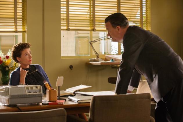
Saving Mr. Banks - Production Designer: Michael Corenblith
12 Years a Slave - Production Designer: Adam Stockhausen
Don't these look like our Oscar five? Perhaps remove the Coen brothers movie and add Gravity or Her? All of these are impeccable choices and Catherine Martin should receive awards for everything she does. That scene with Leo throwing the shirts in Gatsby still haunts my dreams (and visits to Banana Republic where I've been made to promise never to reenact that scene again, sigh)

Fantasy Film
Elysium - Production Designer: Philip Ivey
Gravity - Production Designer: Andy Nicholson
The Hobbit: The Desolation of Smaug - Production Designer: Dan Hennah
Oblivion - Production Designer: Darren Gilford
Star Trek Into Darkness - Production Designer: Scott Chambliss
Other than its music and Andrea Riseborough's to-die-for dress, Oblivion was a pretty run of the mill flick until you remember that house she and Tom Cruise lived/had weird public pool sex in. Between this, Gravity, Star Trek and Elysium (which pretty much had designs from the Versace home collection in the year 2154) all of which are mostly set in space, we might be able to give a very slight edge to The Hobbit, which seems like the "warmest" in terms of design, but also feels like a been-there-done-that deal. Let's just move on to the next category instead...

Contemporary Film
August: Osage County - Production Designer: David Gropman
Blue Jasmine - Production Designer: Santo Loquasto
Captain Phillips - Production Designer: Paul Kirby
Her - Production Designer: K.K. Barrett
The Wolf of Wall Street - Production Designer: Bob Shaw
Am I the only one who keeps being surprised by all the Blue Jasmine love? Don't get me wrong, if anything Woody's movies are often too ignored in terms of technical categories so this is rather pleasant. Earlier this year I saw The Assembled Parties on Broadway and all I can say is Santo Loquasto is a genius, he gets exactly what is it about key design elements that make someone's space their own. For example in Ginger's little house in Jasmine, we have ethnic decorations, lots of color and bright patterns, she obviously did all the decoration herself, while Jasmine's apartment and country home are so specifically designed that they feel more like museums than live in places. Loquasto transmits so much about who these women are merely by their choice of plates!
Who are you pleased to see among these nominees? Who do you think was snubbed?


Reader Comments (10)
Design on 12 Years was excellent. Glad to see it getting notice and Martin rules.
Shouldn't "Her" be in the fantasy category? It's set in the future as evidenced by the fact that no one drives in its version of Los Angeles.
the Fantasy section is just about the only one that has anything like surprises. the others are just "movies people think are competing for best picture"... which is ... well at least many of them have good production design.(though i REALLY dont understand wolf of wall street in this particular category when films like The Bling Ring and Frances Ha and The Place Beyond the Pines exist... but i guess that's asking too much of voters to actually keep up on current contemporary cinema.
In Fantasy, I think I would remove Gravity and add This is the End. I mean, James Franco's house was a HUGE deal, almost a character in the film...
I'm not a fan of Blue Jasmine, but this nomination and the one for costume design are more than deserved. I wish more contemporary work would make the final five.
The one I'm more please about is Llewyn Davis because I loved every single apartment (including the corridors!).
I guess no one outside the foreign film branch has seen La grande bellezza. The opening party scene is as good as the whole Great Gatsby.
Mad curious about you mentioning Pines in Art Direction, Nathaniel. The film was all shot on location at real houses, real offices, real forests, etc. I think the most 'art' was done on Ryan's whole body. It's a beautiful looking film, no doubt, but I always accounted that to its naturalism.
AH stumbled here...we needed way more hot oranges, avacado greens and houndstooth in the background. Don't think there was one shred of shag carpeting. The design schemes read bland, not garish. It just wasn't 70s enough for me. Guess this is a sign AH is gonna be Oscar-nommed for everything. Including Best Sound. Sigh.
llewyn davis was drab drab drab, like the characters and the movie's bleak ouroboros sense of life. i liked the restaurant over the highway but the ny apts were just ok. they distinguished class well (the columbia prof vs greenwich village) but everything was calibrated to avoid anything that had a whiff of what makes that period in nyc cultural history so mythical. love the coens but it strikes me that only a successful artist has the luxury to be programmatically misanthropic and only a relatively happy member of the audience would love the movie. the truly misanthropic would just be irritated by the parade of human folly and the truly suffering would avert their eyes.
brookesboy, absolutely agree with you about ah. they needed to lay on the avocado tack to match the tacky characters. it's going to be a long oscar season for those of us who aren't into the ah hoopla.
I haven't seen AH but our family redid the suburban house in mid-70s and we went with "tasteful" bright green shag carpeting in the living room, and lowpile rust a/k/a burnt orange in the kitchen (yes, you read that right, carpeting kitchens was very in vogue). What year is AH set? Please tell me they have the boston ferns at least?
I really do like these categories because they "force" the design guilds to consider contemporary films. Those kind of films tend to get swept aside in the costume, production design, cinematogaphy, and hair & makeup categories.
"Oz the Great and Powerful" is getting reamed in the nominations for the tech categories--maybe people think it's too derivative of the 1939 movie, but I think it's gorgeous in its own right. Nods for art direction, costumes, sound, sound mixing, and maybe cinematography would not be unreasonable. (It didn't make the cut for Visual Effects, another unfair snub.)