The Furniture: Designing Dignity in "How Green Was My Valley"
 Monday, October 24, 2016 at 10:48AM
 "The Furniture" our weekly series on Production Design. Here's Daniel Walber
 Filmmaking is often an art borne of flexibility. Tim Burton built Sleepy Hollow from scratch when he couldn’t find just the right town in the real world. Vincente Minnelli was forced to make Brigadoon indoors in Hollywood, because the studio wouldn’t pay for an expensive production in Scotland. Both films are likely better for it, too.
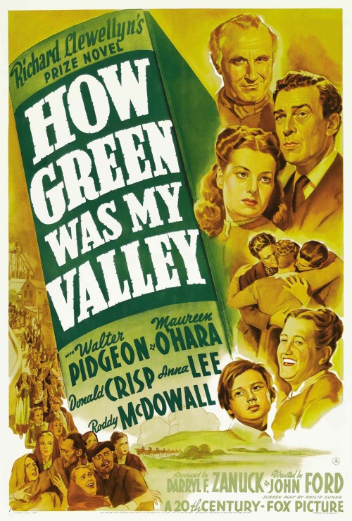
The same is perhaps true for How Green Was My Valley, which premiered 75 years ago this week. John Ford wanted to make shoot it on location in Wales, but World War II intervened. Instead, the production team built an entire mining town in the Santa Monica Mountains. This condensed and idealized version of the setting of Richard Llewellyn’s 1939 novel is among the most emotionally resonant sets of its era.
The film won five Academy Awards, including Best Picture and Best Art Direction.

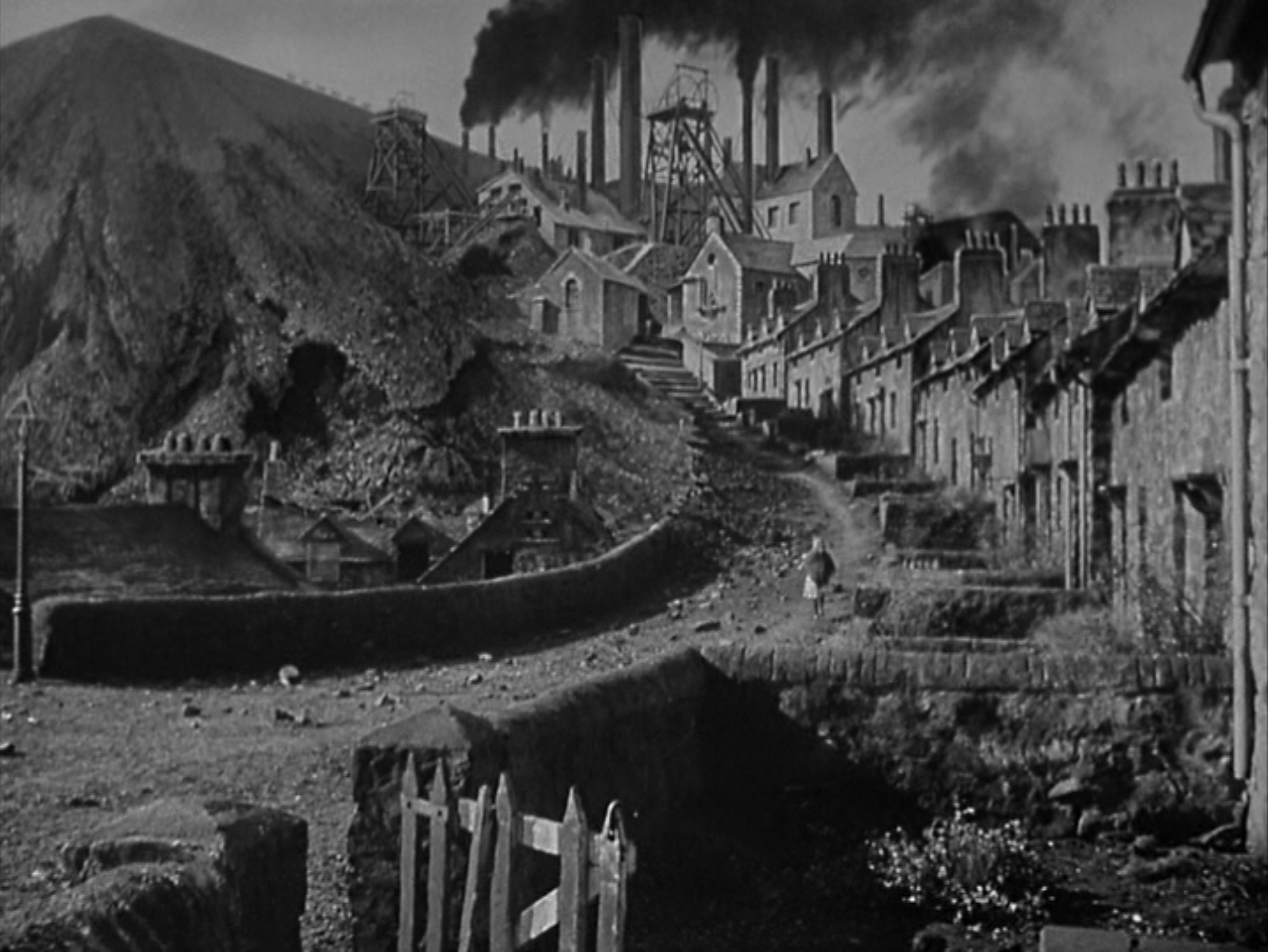
The design team consisted of Richard Day, Nathan H. Juran and Thomas Little, no stranger to Oscar success. They based their village on Gilfach Goch, a quintessential Welsh mining town, but they dramatically reduced the size and jammed the houses much closer to the colliery...
To the left is the spoil tip, the accumulation of waste material dug up alongside the coal. Houses line the town’s lone road. Its terminus is the colliery, where nearly every man and boy marches for work, lunchpail in tow. It’s an allegory of Welsh industrialization small enough to fit in a single frame. It has many of the same features as the real Gilfach Goch, but is much more compact. (For more period images of the real town, click here.)


At the top lurks the colliery, a frightening tower of industrial dominion. It represents the power of the company, which can turn any employee out on his year without a second thought. Yet its size also comes to represent the strength of collective action. Ford gradually turns the set from a menacing watchtower into a sturdy platform for the men.

Even this newfound strength, however, doesn’t change the nature of the job. These men work in the most dangerous, cramped circumstances imaginable, in a time before sane safety regulations. The shots of the tunnels themselves, though rare, linger in the memory.

The Morgan family home, meanwhile, is surprisingly malleable. Early in the film, when the house is still packed with all of its children, it is cozy and intimate. The walls are mostly unadorned and the ceilings seem low, as if the Morgans live in a cave. Their wealth is not in their decorations, but in themselves.

Once Huw’s brothers and sister have begun to leave, however, the place suddenly seems cavernous. The ceilings tower over the boy and his parents. Domestic scenes become tableaux like these, with shadows lurking everywhere.

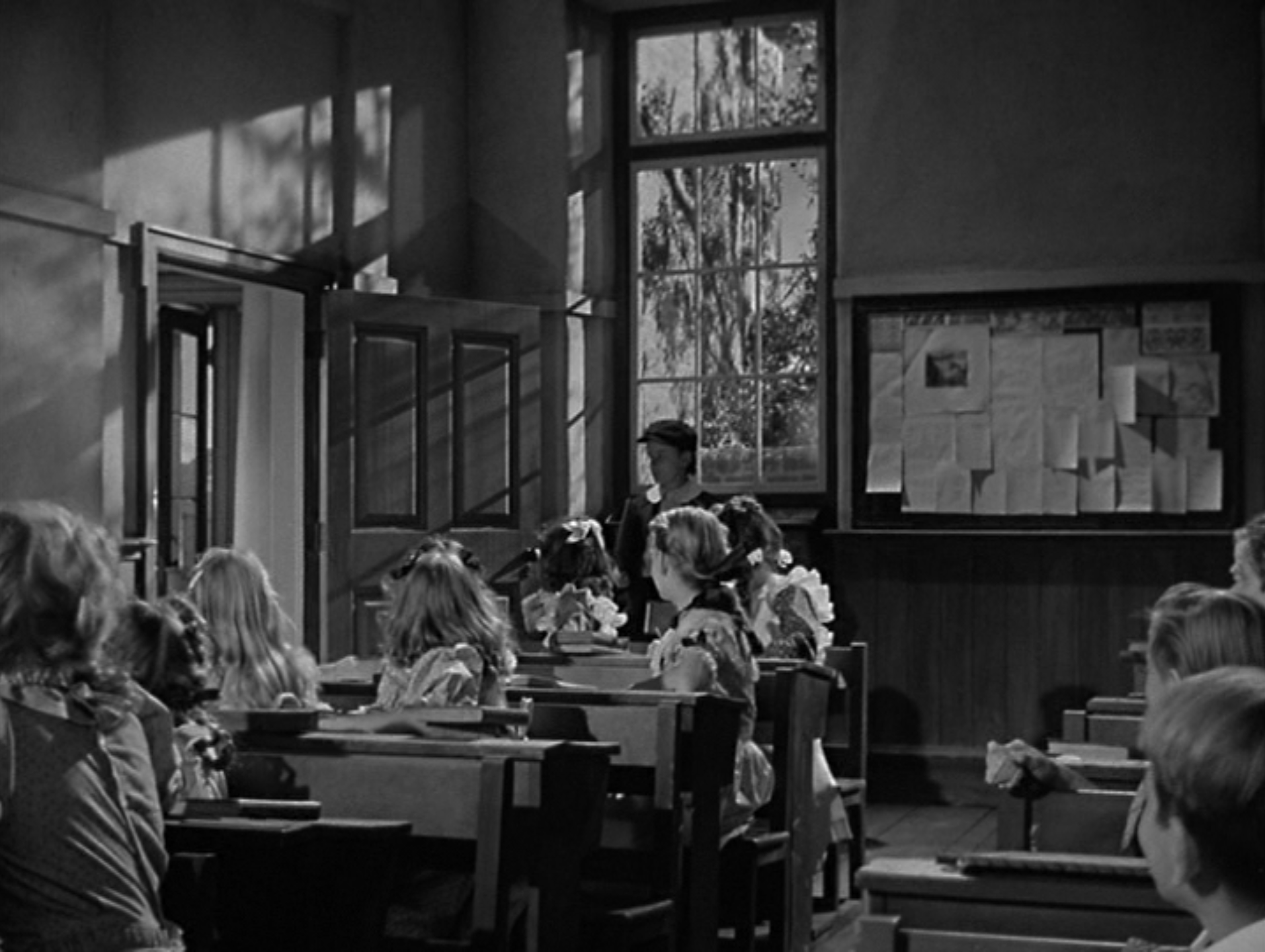
Even in shadow, however, the home remains a place of warmth. Huw’s school is a different story. The first of his family to attend, he is instantly mocked by a teacher who refuses to believe a coal miner’s son could learn. The classroom has extremely high ceilings and a great deal of natural light, but it is a place of pompous cruelty.

It is no surprise, then, that Huw decides to forego more education and enter the mine. Yet Ford’s point is not that the men of this village all belong in the mines. Rather, it is about the reclamation of dignity from the high-ceilinged institutions of the British ruling class. How Green Was My Valley honors the lives of those who abide in cavernous homes and work in the perilous, narrow mines. Its visual language, dominated by low ceilings and heights of industry, is an essential component of this mission.


Reader Comments (6)
I have grown to love this movie over the years though the first time I saw it I was too hung up on Oscar history and injustices to fully appreciate its artistry. But every time I see pictures of that curved hill and the tight houses (as in the first photo here) the movie springs vividly back into mind.
It's really quite a memorable film. And sadder and sadder in retrospect... at least to me.
I feel history has been so unkind to this movie just because of the way Oscar history unfolded. It's hard to be up against "the greatest movie ever made," particularly when you are just a great movie with a lot of heart.
And head vs. heart has been an ongoing Oscar battle forever, i.e. King's Speech v. Social Network, etc.
I also think the one two punch for "the common man" of this movie and Grapes of Wrath to be perhaps the height of social justice for its time.
I totally agree with Nat - it's easy for the film to suffer in context but on its own it really so great and moving and that first image of the town is so hauntingly evocative.
And your exploration of the home and its comparison to the classroom is really insightful.
This movie is a perfect storm of emotions, wonderfully communicated in part by the art direction. The performances of Donald Crisp and Maureen O'Hara were real and heartbreaking, too. It's unfair to dismiss the movie because it happened to win the Oscar over Citizen Kane.
Everything is beautiful in this movie: the great B&W cinematography that photographs the “furniture”; the sound; the Welshmen singing; Walter Pigeon; even the narration warms the heart.
Love this movie, and the look of it went a long way to why.
Much better than Grapes of Wrath, which I seem to pair with this film a lot for some reason.