


The Furniture: The Color of Beaches
 "The Furniture" is our weekly series on Production Design. Here's Daniel Walber...
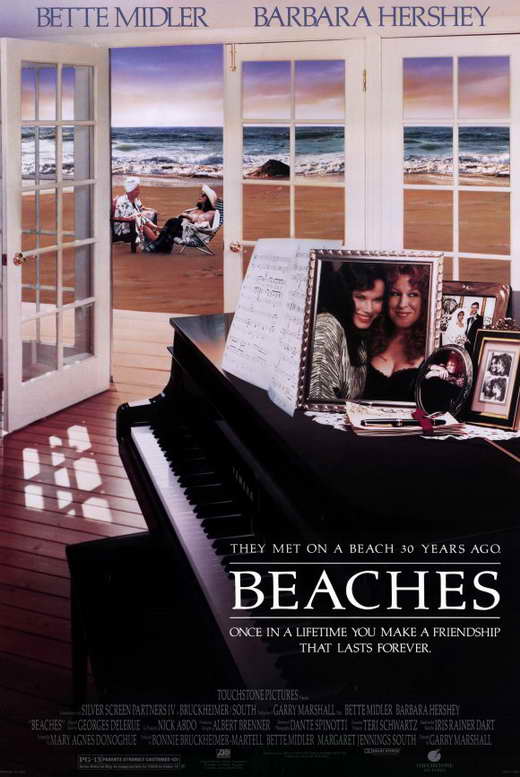
Beaches, despite its enormous and enduring cultural imprint, still retains some surprises. It’s not subtle at all, yet it also contains countless little details, both of performance and design. It’s a melodrama that rewards rewatching, not only for the ritual of crying along with a beloved tearjerker, but also for the charismatic density of its images. And so, heeding the call of Nathaniel’s obituary and reappraisal of Garry Marshall’s long career (and a comment from Craver), here’s a look at the Oscar-nominated production design of Beaches.
The color palette of the film is almost schematic. That’s not a slight against production designer Albert Brenner and set decorator Garrett Lewis, either. It works, this insistence on pinks and greens reaching its emotional pinnacle along with the characters.
To be sure, Oscar nomination is probably owed specifically to the two fabulous production numbers, “Industry” and “Otto Titsling.” But rather than praise two isolated scenes, I’d like to take a look at this insistent thread of color...
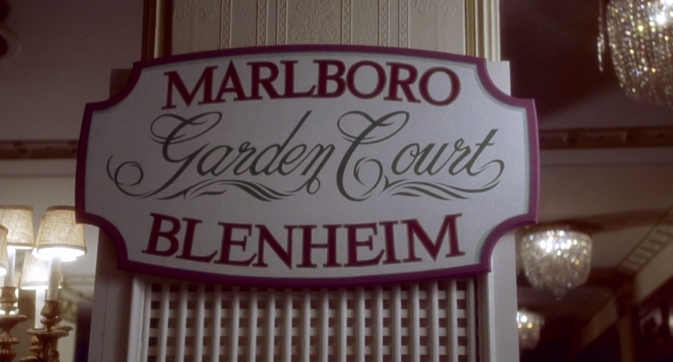
CC Bloom and Hillary Whitney meet as children in Atlantic City. The preteen CC (Mayim Bialik) is spending her summer performing in “Sammy Pinkiner’s World Famous Kiddie Review,” belting standards in a child-sized showgirl getup. Her milieu is like her costume and her dressing room, a contest between hot pink sequins and bright electric lights. Hillary (Marcie Leeds) is on vacation with her father, staying in the ritziest hotel in town. Her world, like the following sign, is full of the softest greens and pinks.
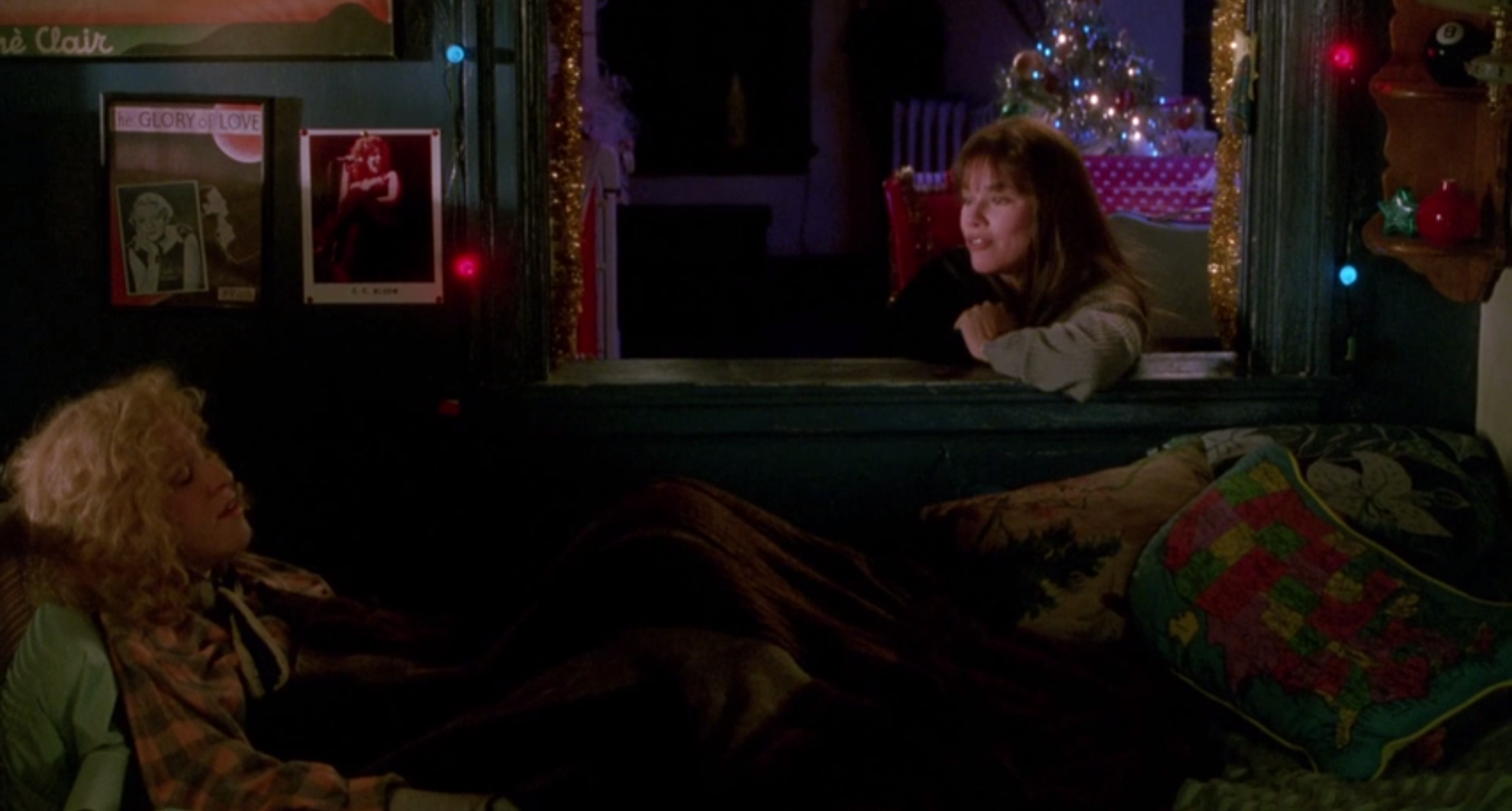
This approach to color represents a distinction and an affinity. Spaces in which adult CC (Bette Midler) and Hillary (Barbara Hershey) both feel comfortable are always full of both greens and reds. They look good together, neither too harsh or too dull. Here’s the apartment they share, decorated for a Christmas season that Hillary will later remember with great fondness.
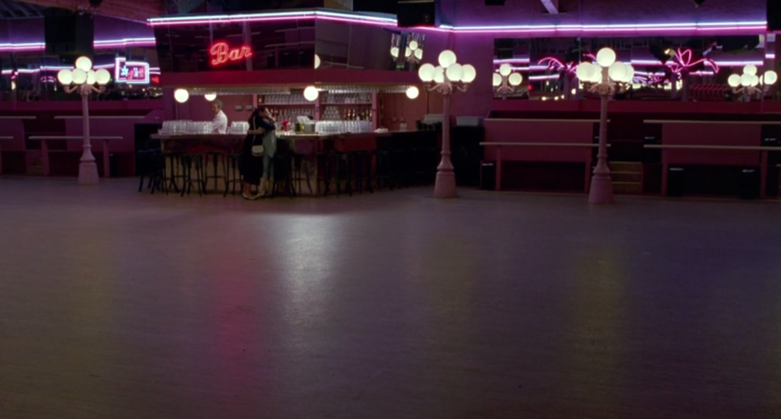
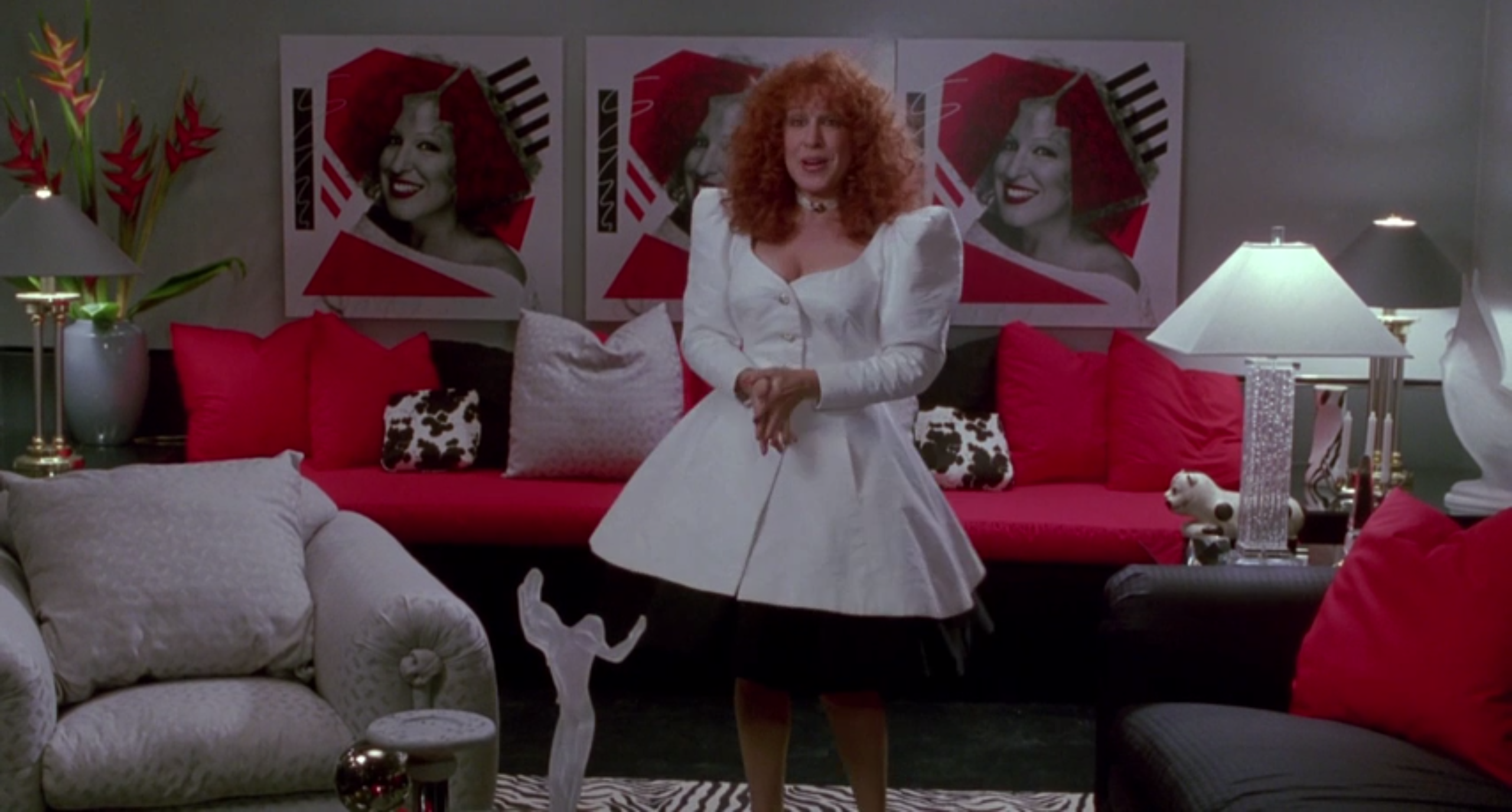
Their spaces contrast as they drift apart. Hillary’s disastrous trip to New York with her horrendously snobby husband climaxes in a fight in neutral territory, Bergdorf’s. But CC’s fancy apartment, paid for by the success of her hit review, is a bold example of the gulf that has grown between them. Green has been almost entirely banished from her life and the reds have become bawdy and brash.
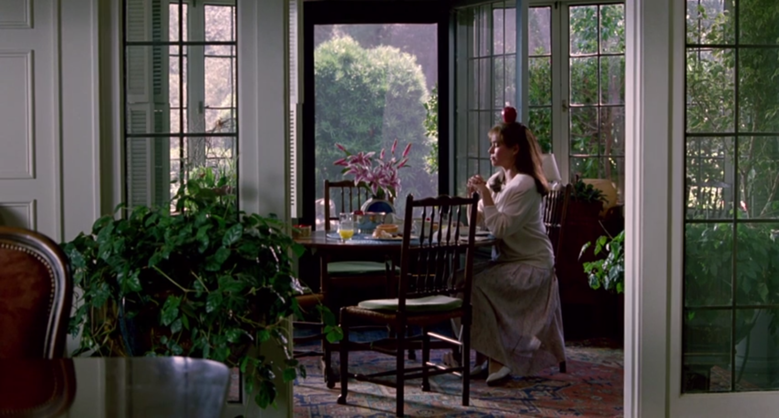
The life that Hillary leads apart from CC, meanwhile, is pale and dull. Her house with her husband, he of the good job and the “good body,” is decorated with greens and pinks as muted as her affection.
As she surrenders her independence and her joy, the only thing left of her character manifests in her skill as a gardener. There are plants everywhere. She envelops herself in green the way that CC swamps her life in the brightest red.
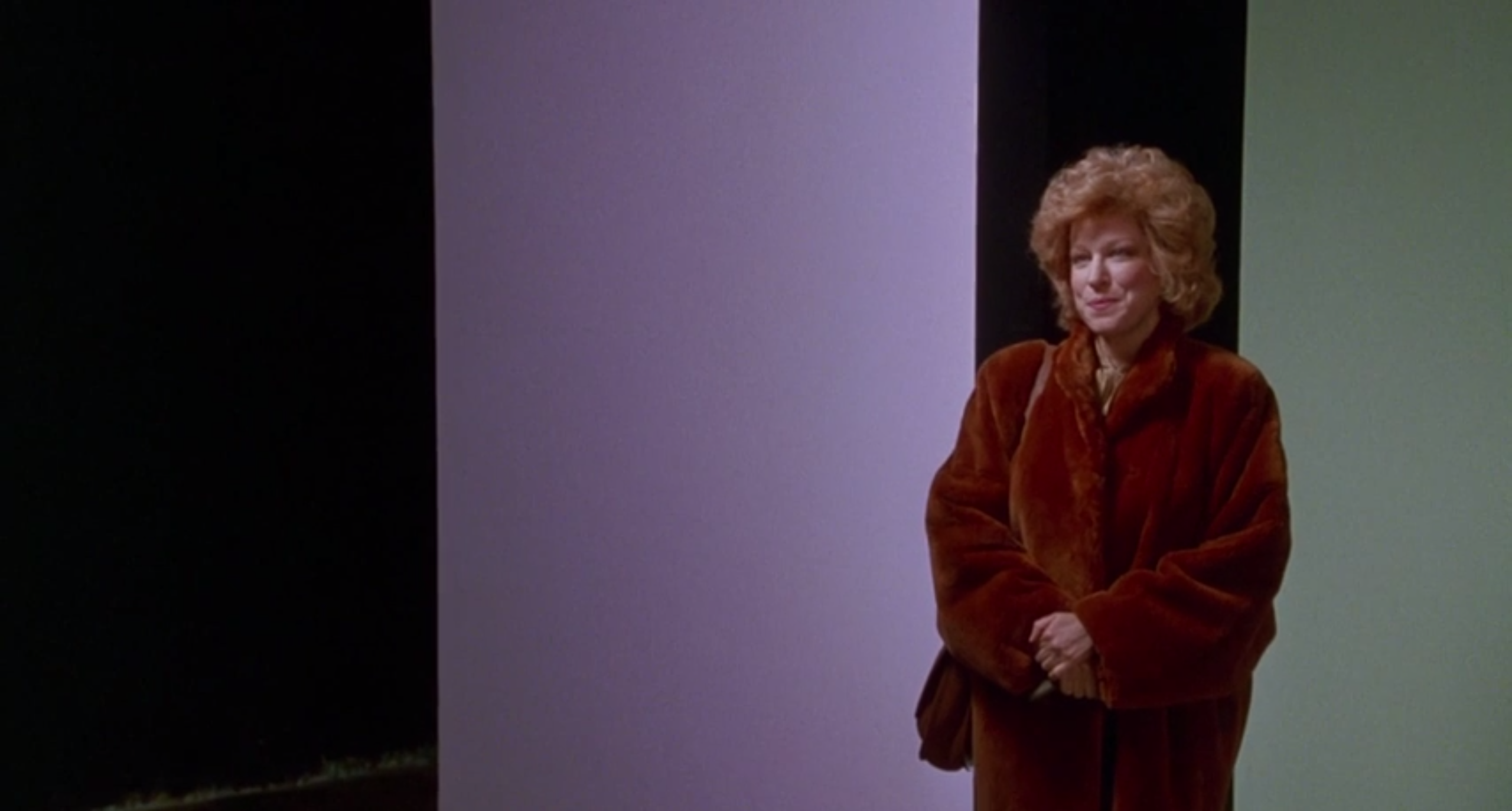
Of course, eventually the two women reconcile. They have to, it’s the whole point of the movie. The color scheme asserts itself even more in the final act, a visual reminder of the strength of this friendship in spite of the stress of impending tragedy. When CC returns to the Falcon for the role that will kickstart her big comeback, it’s soothing to see her stand right in front of the film’s two colors. All is right in the world once again.
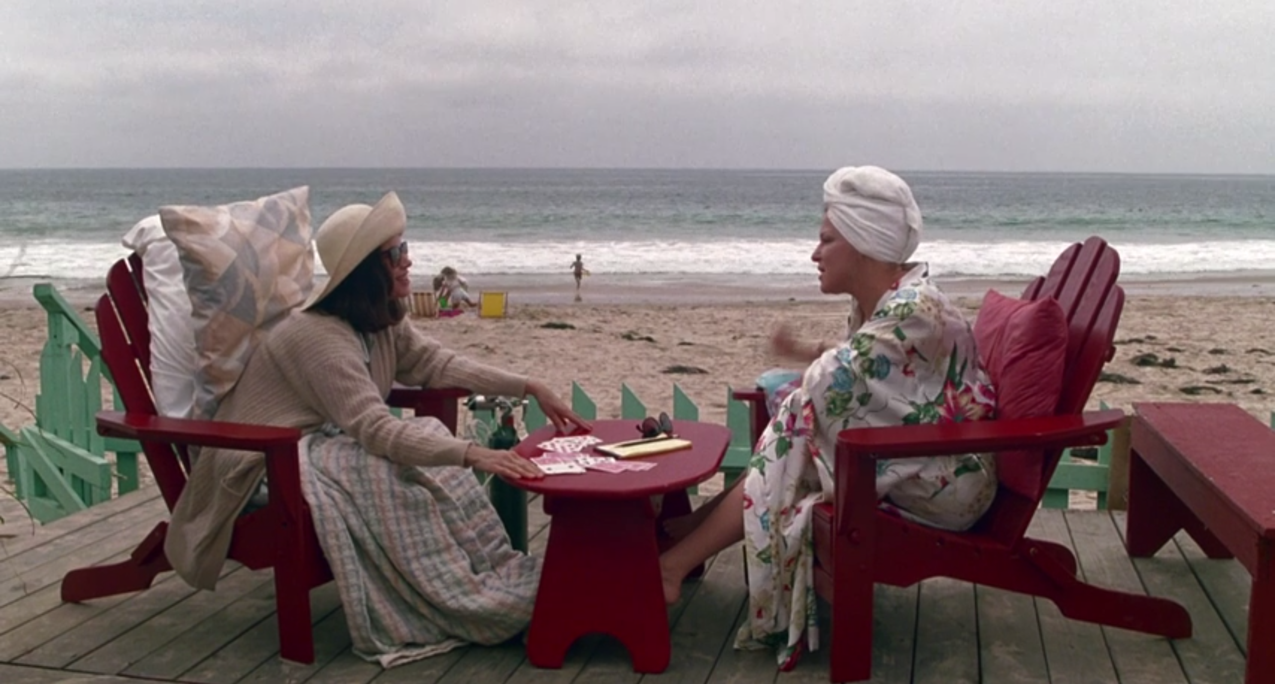
For the whole film, CC and Hillary have been struggling to find just the right tone, something that represents them both. In their last moments together, playing gin on the beach, they achieve it. The logic of color smoothes over the jagged edges of mortality. These particular shades of green and maroon may be a little tacky, Exhibit A in the case against the design sensibility of the 1980s. But you know what? For CC and Hillary, they couldn’t be more balanced.
 Daniel Walber
Reader Comments (11)
I love this post.
AMAZING POST!!! Keep em coming!
Me too,I think it's sucha well told tale,Bette should have won the 88 C/M Globe for it,was she even nominated.
My fave shot is that crane type shot at the beginning where Bette is not drowned by the arena.
Why is this such a Gay Classic,I loved it when I was 12 and new nothing of gay culture at all.
Can't believe I never noticed this about the film! Great article.
Mark, one explanation I've heard is that this came out in the late 80s, when the AIDS crisis was devastating and many in the gay community were burying their friends. I always felt this film, where friends are family, is even more emotional when viewed through that lens. Ultimately, these women are truly the loves of each others' lives, and romance had nothing to do with that.
Great article. I always felt the clashing colors symbolized the opposing personalities of CC and Hillary. Also, I love Barbara Hershey in this. A fantastic year for her, as she also won acclaim in A World Apart.
I just realized When Beneath My Wing is a required song selection at Marshall's farewell services.
*Wind
Eurocheese --same
Daniel -- I'm reading along and then BAM that image with Bette and the two colors as bold walls behind her. Way to tie it all up.
Oh thank you so much Daniel for granting my wish. I really appreciate it. You're like my genie or something LOL
Such a great write up as usual!
Now I just hope that more greatly designed contemporary movies, like this one, will be nominated for Production Design at the Oscars.
Well done, there was such a great look to the whole film. Nice work.
This is so good and so smart. And props to the art direction branch for nominating BEACHES when it could have easily been confined to the "popular, but we don't like stuff that's too girly" pile.