The Furniture: The Lobster's Phony Flowers
 Monday, August 15, 2016 at 10:49AM
 "The Furniture" is our weekly series on Production Design. Here's Daniel Walber...
 In a 2014 interview, production designer Jacqueline Abrahams described her job as “creating an environment that is credible but sometimes incredible...always aiming to be authentic in spite of being made up.” As this was two years ago, she may not have had her work on The Lobster in mind. Yet the sentiment couldn’t be a more perfect fit for the weird universe of Yorgos Lanthimos.
The dystopia of The Lobster, after all, is not particularly flashy. It’s a world just like our own, only a little grayer. If every frame held immediate physical evidence of a dramatically different future, the carefully calibrated mood would collapse. Instead, the dystopia emerges subtly, through little gestures of performance and design.
Abrahams, a BAFTA-winner for her work on BBC’s Wallander, is an integral part of this achievement. Her presence is felt from the first shot, in which she makes her acting debut as the woman who shoots a donkey on the side of the road. Her design contributions are even more memorable.

The hotel for singles is a triumph of carefully planned ennui. If you look closely, you can pick up the tone from the very first scene within this last resort...
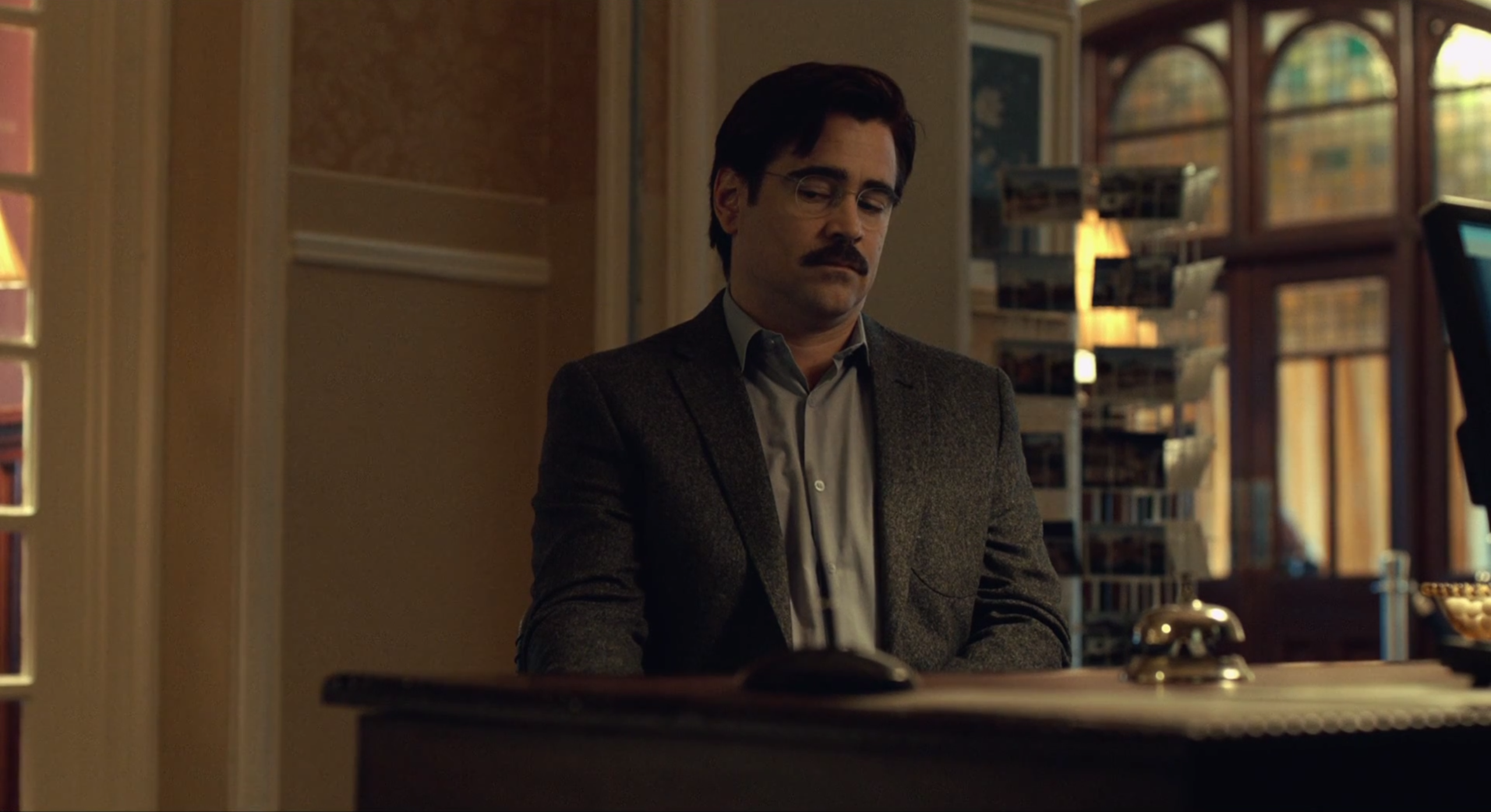
David (Colin Farrell) sits in an office, answering some preliminary questions. Behind him, never in focus, is a rack of postcards. Its subtle cruelty lies in the fact that these guests have no loved ones to mail, nor do they have any reason to fondly remember this miserable vacation.
The hotel is full of these recognizable elements of a luxury retreat. They are often exaggerated, pushing the location slightly over the edge from authenticity into parody. Take the dining room. The tables-for-one are arranged with military precision, white cloths complementing the pale wallpaper and the stale, stately art.

It is as if the managers of the hotel were so overzealous in their attempts to naturalize the space that they unwittingly exposed its falseness. It is never more apparent, or silly, than at the daily dance party. It is a ‘60s throwback, an affair overwhelmed by blinding lights and balloons.

Yet it is not until the alarm goes off and the party disbands that the total fraudulence of this already uncanny extravaganza is exposed. It may not have felt either musically or romantically authentic, but at least it seemed like it was probably evening. When the curtains open, it is revealed that this uncomfortable sober event actually happens in the middle of the day. Even musically lubricated recreation is just stiff performance at this wretched resort.

The most insistent motif is the use of floral prints. They are absolutely everywhere, a hilarious overcommitment to the generic decorating scheme of so many real-life hotels. There are at least four framed prints of flowers in David’s room alone, most of them indistinguishable from each other.

They never go away. Nearly every assembly of the hotel guests is accompanied by large flower arrangements flanking the stage.

Even the small boat, to which couples retire to prove their commitment, has a little floral print of its own. Water is hardly protection from the petaled claws of the hotel’s decorators.

The only hotel sequence mostly devoid of either flower arrangements or paintings of flower arrangements is the dance function. They’re not necessary. All of the women wear floral print dresses.

The coup de grace is the hallway in front of the ominous transformation room. It is a final confirmation that the flowers are there to cover up the brutal horror of this dystopia. Flowers are pretty and soft, the stuff of amorous poetry. Their message is that this is not a dictatorship of harsh domesticity, but simply a society that does everything that it can to encourage the beauty of love.
And so they are most needed where this world is at its cruelest. They are in excess, seven on the walls beneath the greenhouse-like roof. It is this expert visual humor, distilling and parodying the single-mindedness of this social nightmare, that keeps The Lobster afloat.


Reader Comments (3)
I'm going to imagine the framed pictures of flowers are a nod to the spoons of THE ROOM.
Abrahams won a BAFTA for *Wallander* of all things? How odd. Competition must have been thin.
Thanks for yet another fantastic article. Can't wait to re-watch.
Such an interesting take in the movie. The production design in this may not be as prominent as in other genres (fantasy, period...) and particularly in contrast with the script and performances but it definitely brings SO MUCH to the movie. Great read!