The Furniture: Another Art Deco Oscars
 Monday, February 27, 2017 at 5:26PM
 "The Furniture" is our weekly series on Production Design. Here's Daniel Walber with a special Oscar ceremony episode.
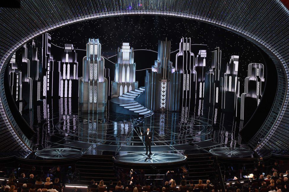
The following is an image of the 89th Annual Academy Awards, taken from the craziest moment of the broadcast. You know the one.
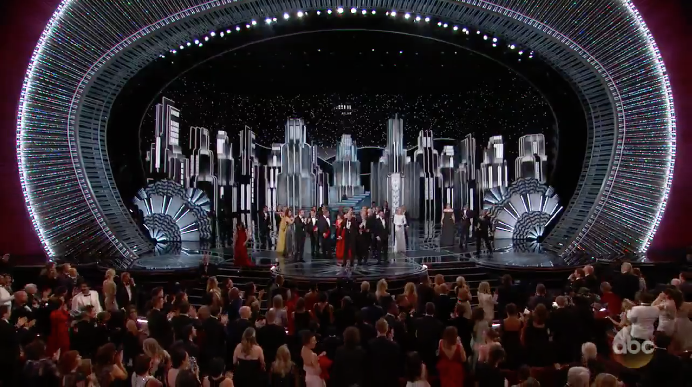
I am not here to talk about the Best Picture Situation, however. Instead, I’d like to draw your attention away from the drama and toward the shining Art Deco Gotham City/Metropolis that looms above it.
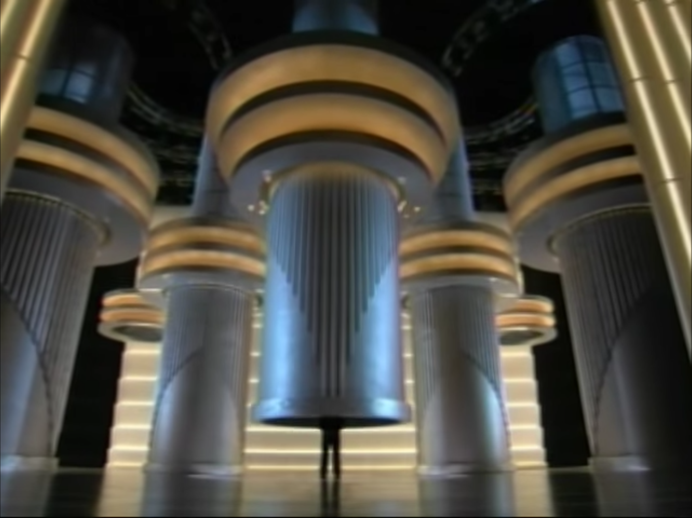
Since the Millennium, Oscar ceremony set design has been dominated by a few trends. I know this because I spent last week analyzing every televised set in Academy history. You can trust me. This year was very in tune with the past decade, with the notable exception of the “Classy Spaceship.” Thank heaven for that. If you don't know what I mean, here's a still of Jon Stewart being slowly released from a tube back in 2008...
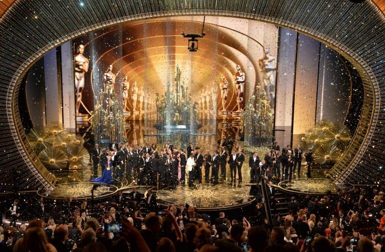
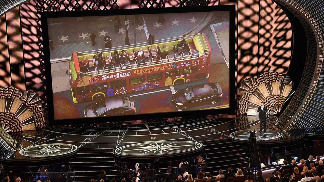
Aside from that blessing, this year’s show fell in line with recent trends. One of these tropes is more technological than artistic, and so even more destined to stay. The stage is dominated by surfaces that double as giant screens, upon which everything from montages to shimmering Oscar statues can be projected.
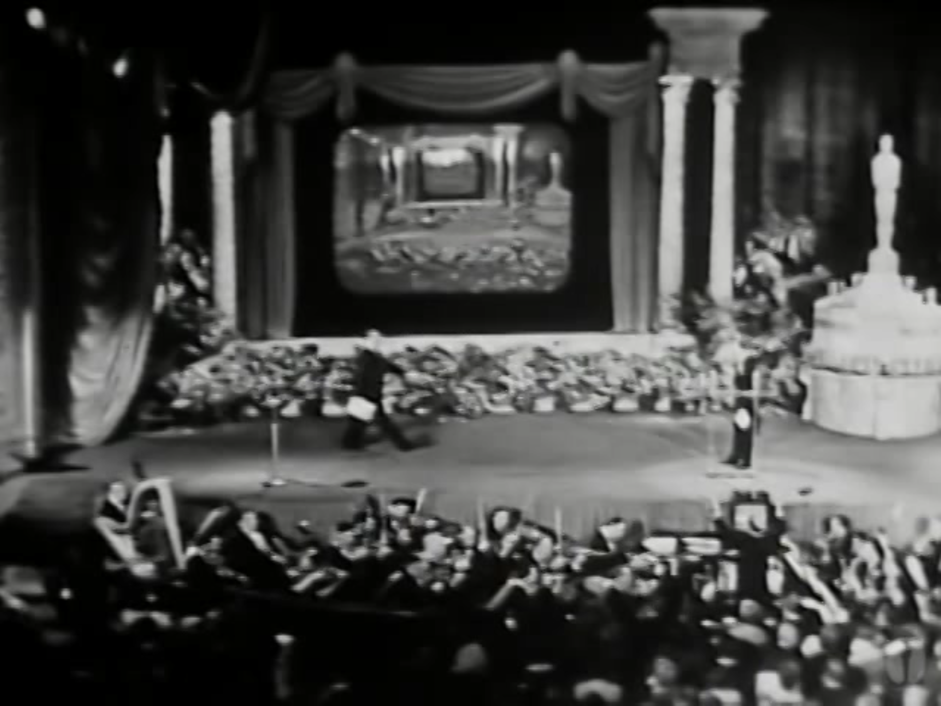
Of course, this has always been present, to a degree. The very first ceremony to be televised featured its own giant screen, upon which the audience could watch both themselves and the feed from the simltaneous New York ceremony.
Still, it wasn’t until technology allowed for it that screens began to dominate the show. Now the whole stage is malleable, perfect for quick changes between the ecstatic golds and cool blues that have been so popular recently.
Some day soon the Oscars will just be a bunch of holograms handing out statues to other holograms, and every Best Picture nominee is a “live action” remake of a classic animated film about talking furniture.
But I’m getting ahead of myself. “Everything is a screen” isn’t exactly a central design idea, just a distribution method. The actual graphic design of this year’s ceremony mostly fell into a very common Oscar category: the Art Deco Movie City.
Granted, not every one of the set’s transformations featured the image of actual buildings. But each successive backdrop fit into this particular era of design. This is true of every part of the stage, from the far wall up to the cartographic floor. I especially enjoyed the discs on the sides, which suggest roulette wheels.
For those of us who started watching the Oscars in the 1990s, the idea that Hollywood glamour is adjacent to Art Deco may seem as old as the hills. The Academy Awards have featured this particular design era a lot over the past two decades.
But it wasn’t always the case. This may be hard to believe, but the set design of the Oscars hasn’t always been about nostalgia. It is, after all, hard to be nostalgic about something that wasn’t very long ago. Even then, “nostalgia” isn’t a concept with a specific design profile. It wasn’t until 1985 that Oscar producers began to use Art Deco as a point of reference for the glories of Old Hollywood.

Once it was introduced, however, it quickly became a favorite. Nearly every year since has prominently featured Art Deco on the Oscar stage. The exceptions usually come in the form of the “Classy Spaceship," which is derived from Art Deco anyway.


Reader Comments (5)
Fascinating stuff. Thanks, Daniel!
I love it. it is crazy how it's always art deco... but the classy spaceship. LOL. especially that delivery tube.
i wonder how long until we have something wholly unwatchable like the sets of Zardoz or something.
I love your pithy description of Art Deco as "Classy Spaceship" - the set this year was very Metropolis. Very good article, thanks as usual.
The "Classy Spaceship" was one of my least favorite designs over the years. Derek McLane's designs have been some of the most beautiful and consistent I've seen, although I'd like to see something a bit different eventually. The set design for the MTV Music Awards in 2010 come to mind...
"Here’s hoping for Brutalism." Yes, PLEASE.