The Furniture: Stark Contrast in "The Eyes of My Mother"
 Monday, March 13, 2017 at 10:27AM
 "The Furniture" is our weekly series on Production Design. (Click on the images to see them in their more detailed large glory.) Here's Daniel Walber...
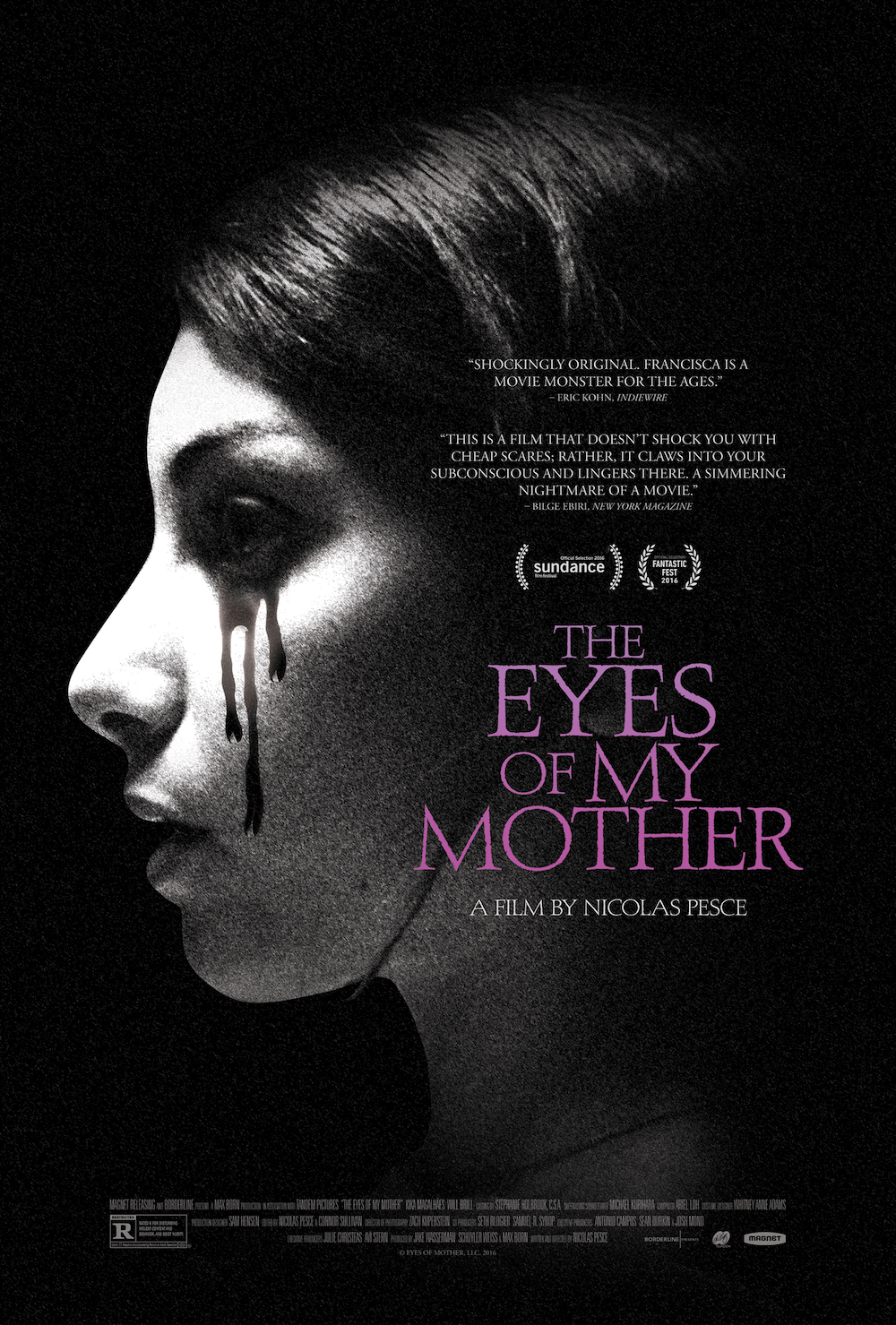 The Eyes of My Mother, one of the best horror films of 2016, stands in a grand tradition of scary iconography. Which is, of course, also a polite way of saying that Nicolas Pesce’s debut feature is not much of a departure. Francisca (Kika Magalhães), the film’s murderous anti-heroine, grows up surrounded by anatomical grotesquery and Catholic devotional objects. As is often the case in the genre, she is gradually driven to violence by the meticulously-crafted environment in which she lives.
But what makes The Eyes of My Mother different is the way these otherwise familiar tropes are woven together. The unsettling sets and weird props aren’t simply tossed in for dramatic impact, but arranged to unite the darkness of the setting with the psychology of the protagonist. This is why production designer Sam Hensen so richly deserved his American Independent Film Award last month, winning over some much more colorful and outrageous competition.
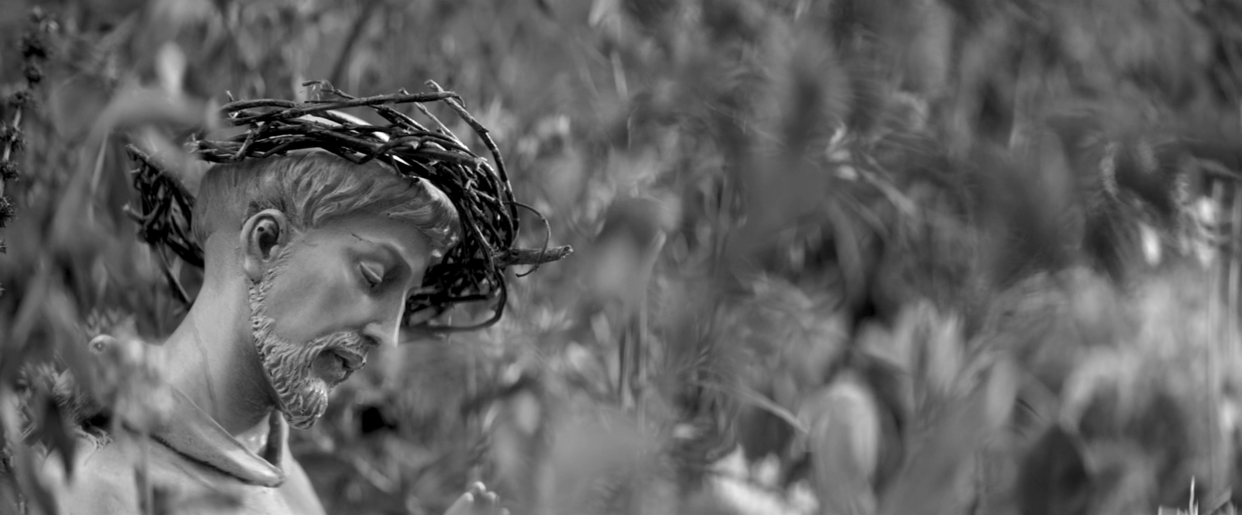
The two most prominent design themes are announced out very beginning, each with a single, striking object...
The first is a statue of Christ, nestled amid the tall grass outside the farmhouse. Its twiggy crown of thorns seems like a recent addition, a flourish perhaps added to the sculpture by Francisca’s mother (Diana Agostini). It’s a quiet, devotional nod to the Catholic iconography of wounds and the accompanying baggage of blood and sacrifice.
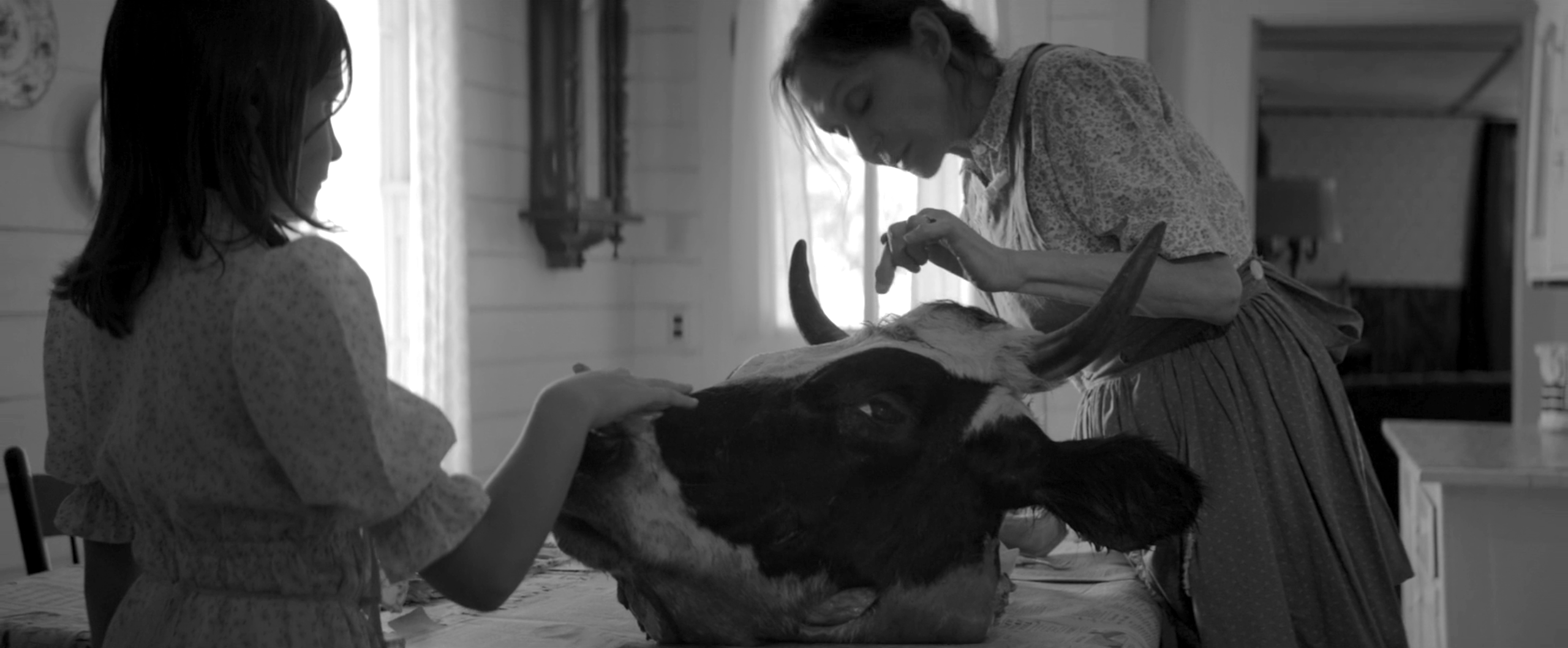
Shortly thereafter, the mother takes the young Francisca (Olivia Bond) inside for a lesson on the basics of surgery. Their subject is the head of a cow, looming large on the kitchen table.
Yet it doesn’t seem quite dead, instead projecting an odd sort of boredom from its open eye. The sober violence suggested by this morbid stoicism pushes out any tone of familial tranquility from the house, making way for the lacerating nightmares that so quickly follow.
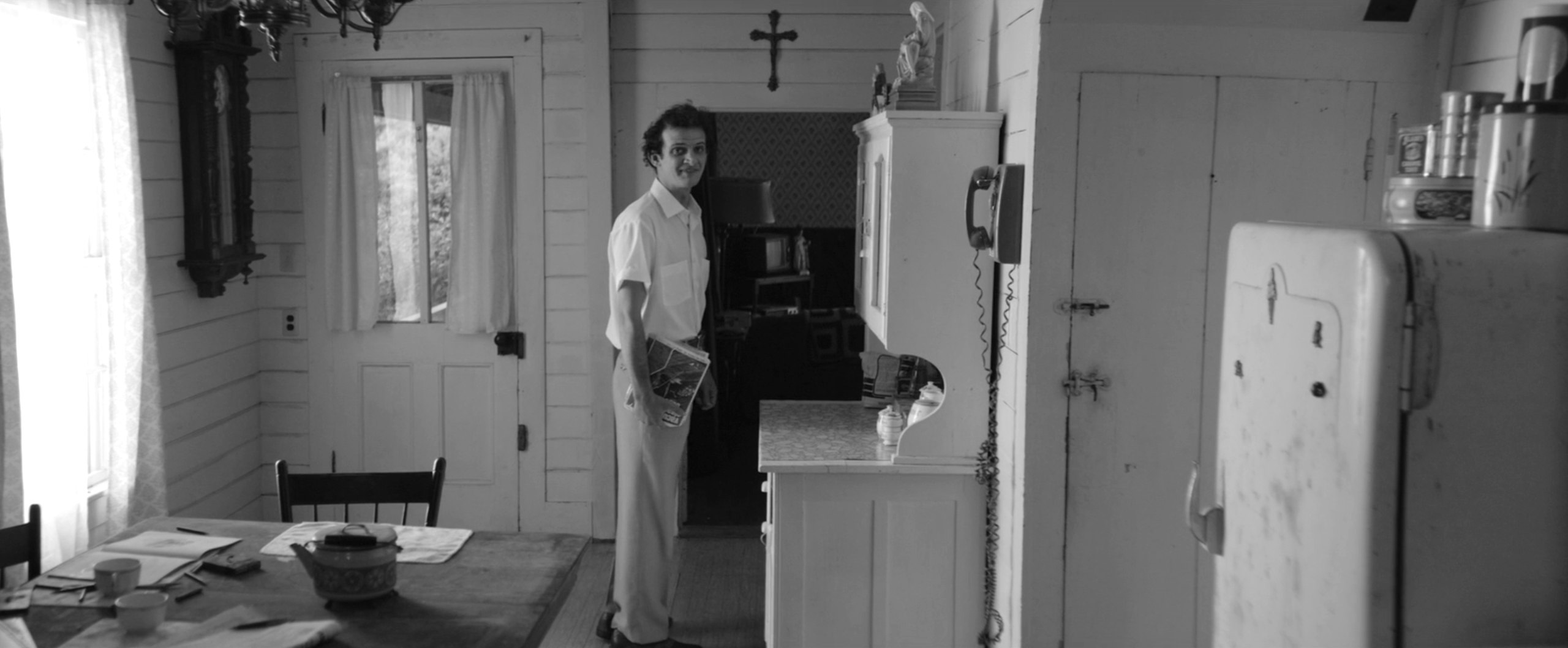
Charlie (Will Brill), the passing drifter, talks his way through the front door and into this same room. His jittery presence inverts the bluntness of the defunct bovine, unsettling in a quite different way. This energy further disrupts the stark visual balance of the space, in which all of the furniture participates in a bitter, geometric standoff. His intrusion lingers here, the last place he is seen before his off-screen rape and murder of Francisca’s mother.
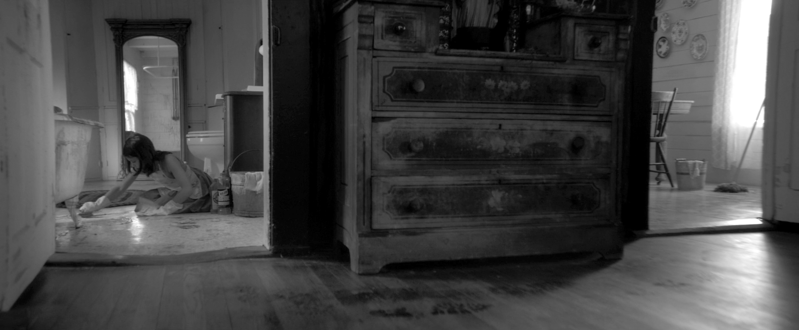
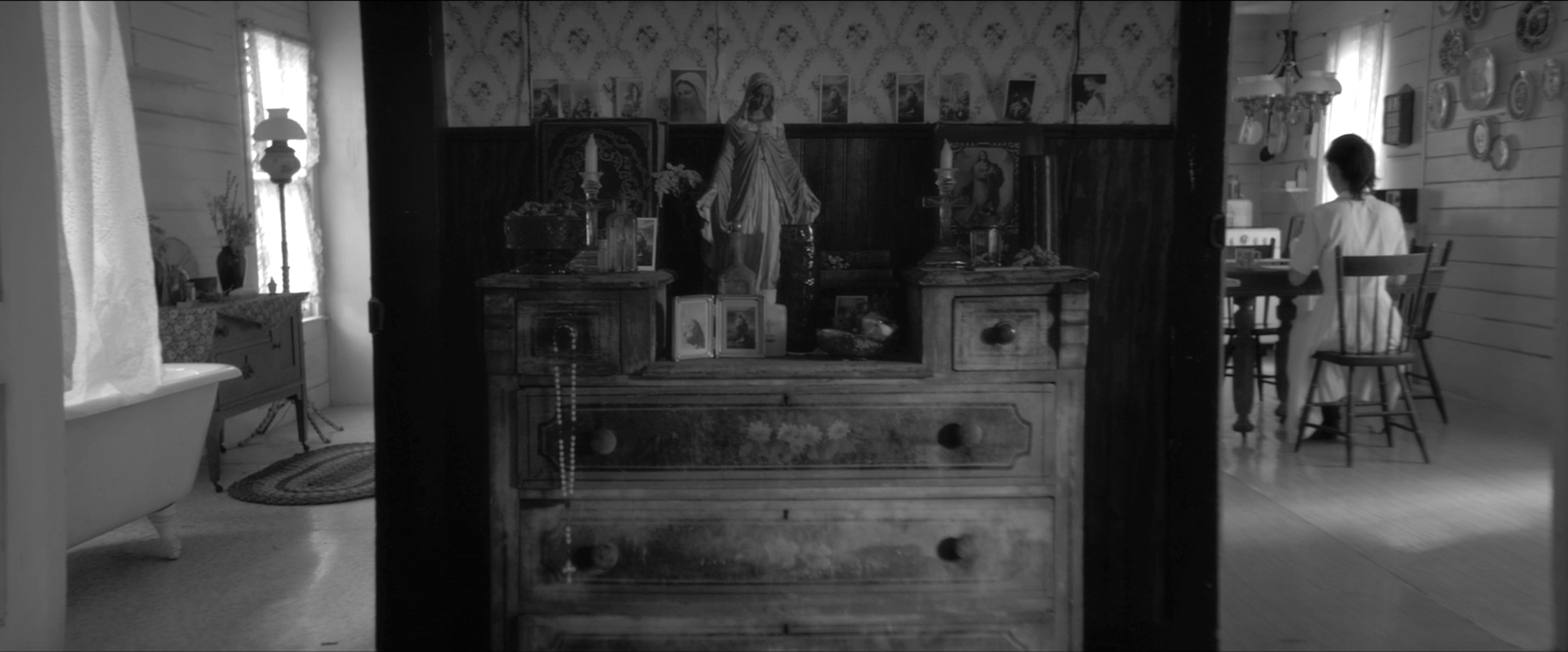
The power of this particular room is also a result of the collaboration between Hensen and cinematographer Zach Kuperstein. Though The Eyes of My Mother was finished in black and white, it was captured in color. As Kuperstein explains in an interview with No Film School, this was done so that the colors of the furniture and props could be isolated and adjusted before the transition to black and white. The result is a stark texture, especially prominent in shots that cleverly use the house’s architecture to draw contrasts between different rooms.
The creepy props continue, of course, but the success of The Eyes of My Mother is drawn from their position in this claustrophobic labyrinth of light and shadow. The obscurity invites the audience to peer closer, to gather visual clues to the inner workings of Francisca’s enigmatic character. Much can be read into the decor, sturdy furniture surrounded by devotional portraits and figurines.
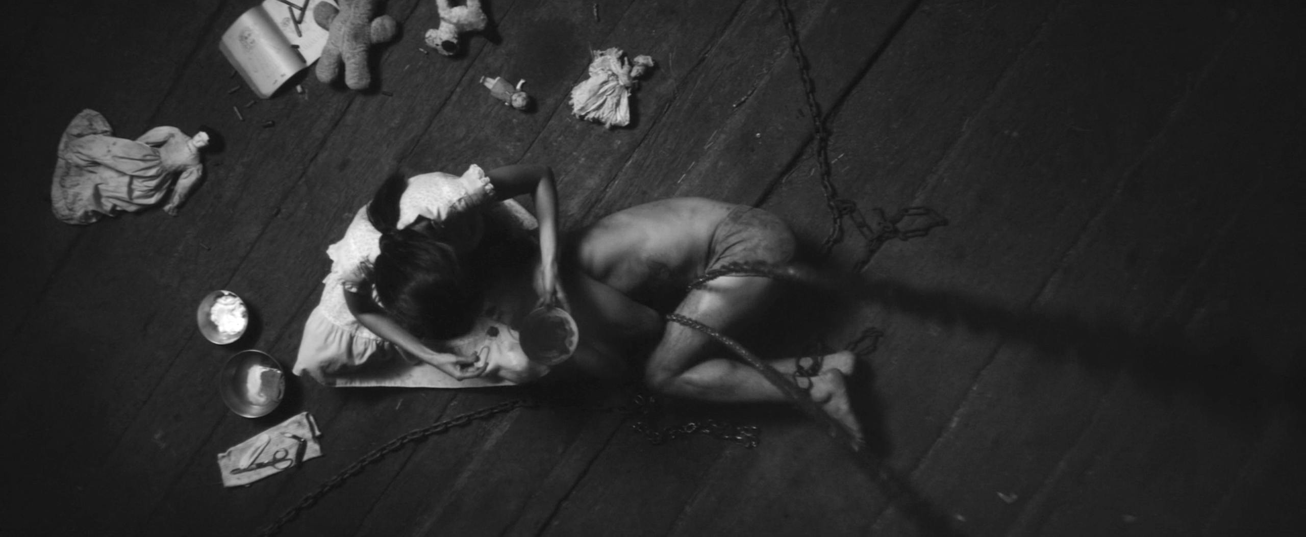
The same is true of the paraphernalia of Francisca’s childhood, toys that never quite disappear. One doll is especially persistent, a rudimentary replacement for the mother. Here it reclines at the far left, stranded beyond the teddy bear and the storybook.
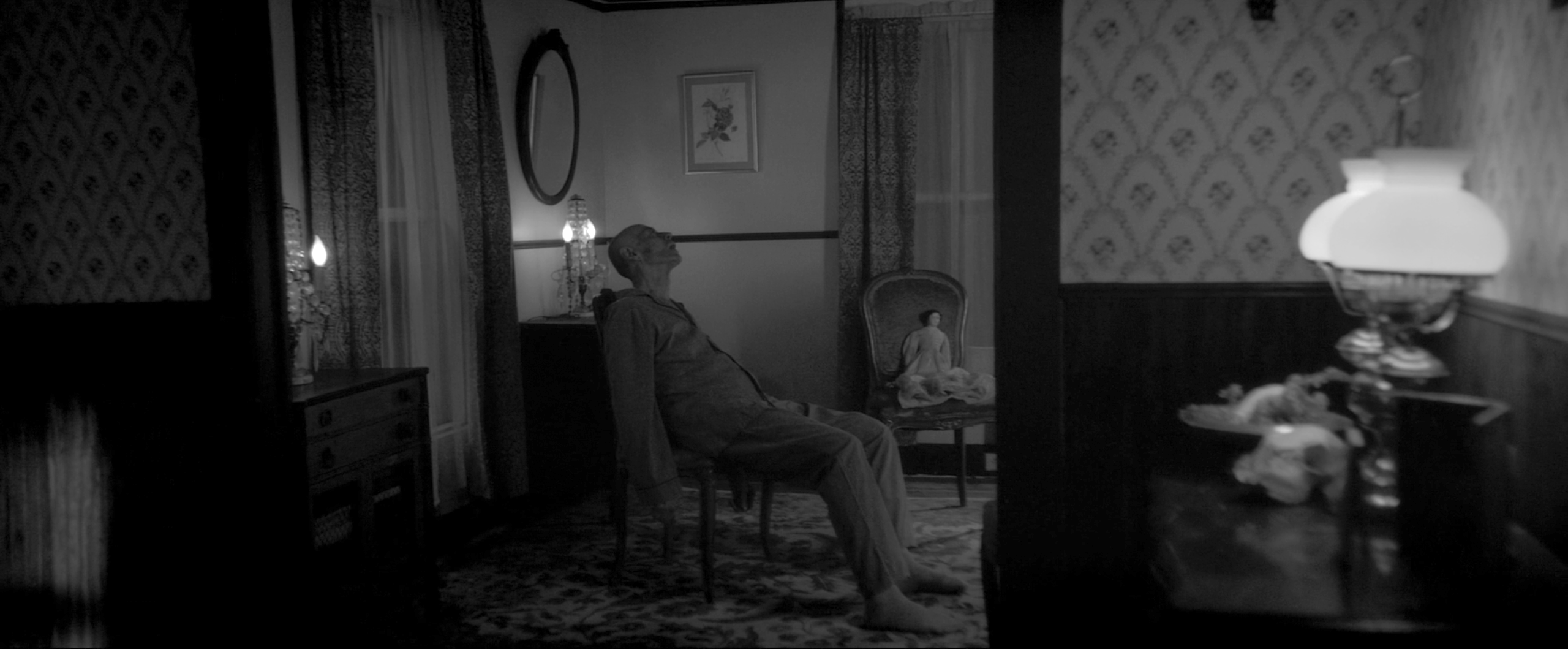
It returns, again and again. It hides in plain sight, always resting just beyond a much more disturbing element of the mise-en-scene.
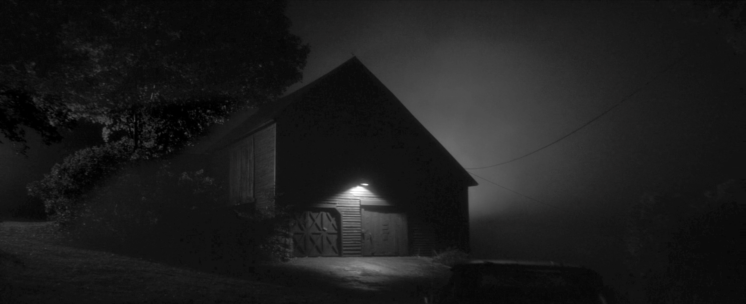
Creepy dolls, of course, are nothing new. Neither are the images of saints. What is novel about The Eyes of My Mother is the way that these icons are folded into the visual language of the film. The clever collaboration of Hensen and Kuperstein leads to a sophisticated palette of white, black and grey, and a powerfully spooky interior to match the forbidding barn outside.
Other 2016 Production Design Winners
BAFTA / Oscar: Fantastic Beasts / La La Land
Other Horror Pictures Covered in This Series
The Exorcist (1973), Sleepy Hollow (1999), The Witch (2015), The Conjuring 2 (2016)


Reader Comments (4)
Wonderful post, Daniel! Really glad to see someone give this film some coverage; I agree that it was one of the best horror movies of last year. The cinematography, production design and eerie direction were so haunting.
I going to have to see this
I fell asleep while watching my screener of this and... decided not to keep going once I awoke. I was not enjoying it to begin with, sadly. Although, yes, the production design was wonderful (better than the cinematography, I felt, which looked far too polished for such a grimy film - but that may just be a personal preference).
Nice article. Great when smaller films win awards against studio ones. Much the way David Mullen should have been nominated for his cinematography of The Love Witch. Too bad you don't give the director more credit, he's making those yes and no decisions that end up on screen that you wrote about. Please next time write your material on a computer. If it's important enough for someone to read then sit and write it, don't tap on your phone while standing in line at Chipotle. Several of the typos here are from autocorrect and not hitting tee wrong keys.