


The Furniture: The Malevolent Secret Code of The Conjuring 2
"The Furniture" our weekly series on Production Design. Here's Daniel Walber
 There are many ways to scare an audience. Music, special effects and editing are combined to surprise the audience with loud, unexpected images of malevolent demons or slashers or whatever. But what about production design? Can you be terrified by a stationary armchair?
The Conjuring 2 holds all the answers. James Wan is an excellent horror craftsman, a director who uses every trick in the book, including the sets and props. Production designer Julie Berghoff and art directors A. Todd Holland and Andrew Rothschild run amok, with the same ferocity as the film's music and editing.
Their first order of business is to exploit some of the genre’s stand-by images. There are a lot of crosses, in this case an entire roomful.
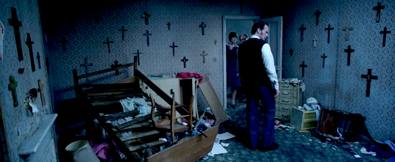
They stand at attention, ready to demonically invert themselves at a moment’s notice. There are smaller crucifixes sprinkled throughout the film, as well as the occasional window lit to resemble a cross...
These fixtures decorate a moody and desolate backdrop. The Enfield house is dominated by pale, almost ill-looking colors. Its walls are not only cursed with hideous wallpaper, but often warped and suggestive of mold. Here’s an armchair in the living room, a ruined object in front of a diseased wall.
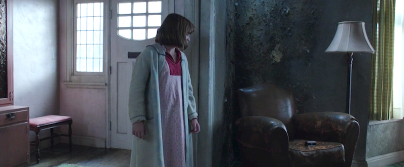
The paper peels off of the walls in the boys’ bedroom and the fireplace downstairs looks as if it has come down with the plague. It creates a mood of constant dread, into which some other design elements emerge as more active players in the creation of suspense.
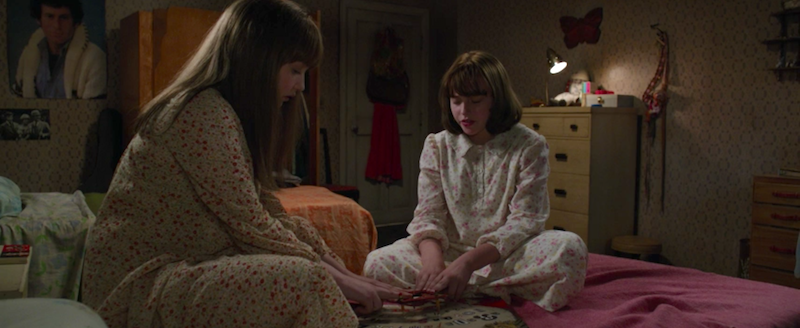
Wan ratchets up tension with suggested, but unfulfilled jump scares, made possible through design. Take, for example, a tense early scene in the girls’ bedroom. We wait, anxiously. In this shot, a suspicious wardrobe lurks behind them, waiting to open.

But it doesn’t. A few seconds later, an empty outfit on the door threatens in a similar way. The room is set on edge, even though the objects stay put. It also doesn’t help that the walls are all covered with faces, any of which might suddenly turn out to be an unwelcome guest.
Finally, I’d like to highlight one last element of the design that is almost certainly lost during a first viewing. The crucial turning point of the plot comes close to the end, when Lorraine Warren (Vera Farmiga) discovers the name of the demonic nun that has been harassing both her and the Enfield family. Its name, which she had scribbled in her bible during a vision back in her house, is VALAK.
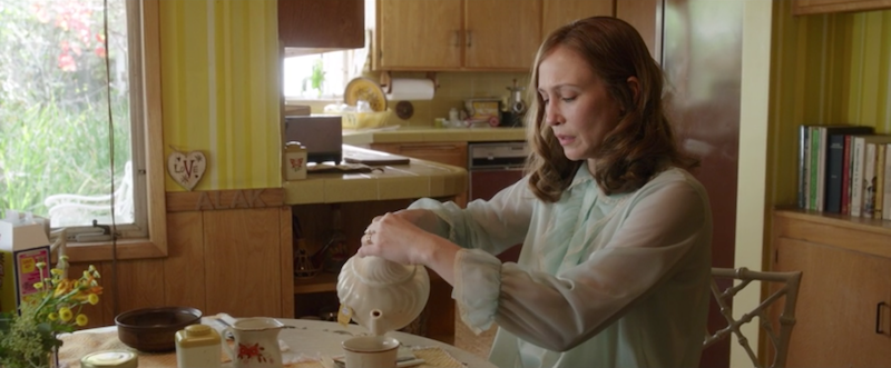
I spell that with capital letters because that’s how it appears in the film, and not only in the crucial moment of revelation. In much earlier scenes set at the Warren house, the demon has already begun autographing the narrative. Take, for example, this shot of Lorraine pouring herself a cup of coffee. Find the little heart that reads “LOVE,” with an especially large “V,” and then follow it to the right.
A short while later, Lorraine is reading her bible in her living room. It is here that she has the all-important vision, and it is in this bible that she writes down the name of Valak. But she could also have just looked at the bookshelf.
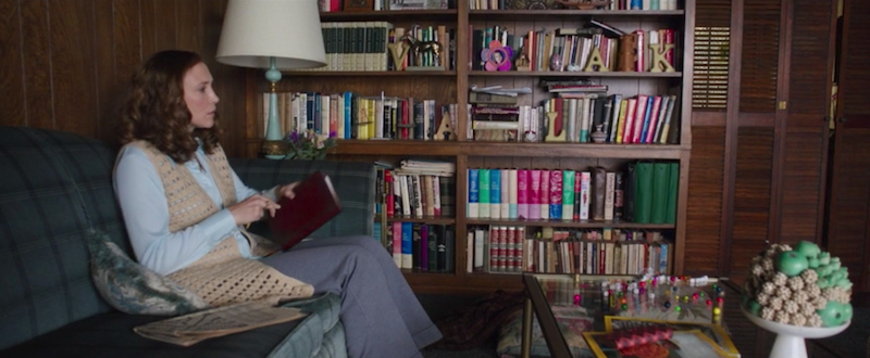
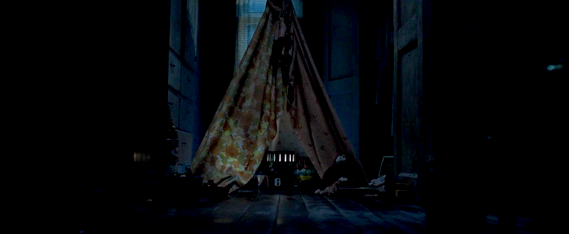
Again, there’s no way to catch this the first time around because the demon’s name isn’t made known to the audience until Lorraine realizes it herself. Nevertheless, it’s also a key to the design of the entire film. The shapes of the two most prominent letters in “VALAK,” the “V” and the “A,” are more present than the crosses. There are tall, skinny triangles everywhere. The most prominent is the younger boy’s tent, where the “Crooked Man” form of Valak spends most of its time.
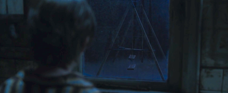
There are fewer examples of “V,” but a crucial one is the television antenna that introduces the first scare sequence with the haunted chair in the living room. The most obvious, damning “A” comes in the form of the swings outside, another recurring image. The demon seeks to insert its name into as many corners as possible, in every available location. It is as if the film itself is possessed by Valak.
Related 'Scary' articles of "The Furniture"
The Exorcist (1973), Embrace of the Serpent (2015), The Witch (2015),
 Daniel Walber
Reader Comments (1)
The production design on both Conjuring films is just stellar, and this article is a great distillation of why. I also love how they get all the period details exactly right for the economic status of the various characters - it helps us identify with them and makes them easier to root for.
The whole VALAK thing, though.... it kind of annoyed me in those early scenes in the Warrens' house, because they were so prominent and I could tell they were spelling something, but I couldn't see what. I liked it with the reveal, but I wish the letters themselves were more subtle. Maybe.