The Furniture: Fantasies of Castle and Forest in The Adventures of Robin Hood
 Wednesday, August 26, 2020 at 11:00AM
 "The Furniture," by Daniel Walber, is our weekly series on Production Design. You can click on the images to see them in magnified detail.
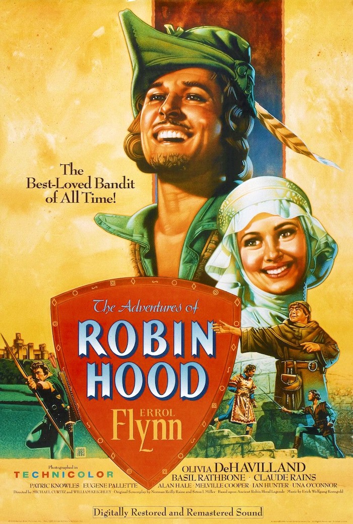 Eleven films were nominated for Best Production Design in 1938. And a number of them would be a great subject for a column, from lavish period pieces set in France (Marie Antoinette and If I Were King) to screwball comedies about class (Holiday and Merrily We Live). And four musicals.
Yet it’s hard to look past The Adventures of Robin Hood, which won. Warner Bros' first big budget Technicolor feature drops Errol Flynn and Olivia de Havilland into a lavish, colorful fantasy of Medieval England. Happily, it’s worth quite a bit more than its price tag. Its primary virtue is playfulness...
...from the lead performances all the way to the production design, which charmingly subverts expectations and uses the aged themes of the Robin Hood legend to its advantage.
It helps, as it turns out, to find an out-of-work German architect. It did the trick for The Golem, after all. In the case of The Adventures of Robin Hood, the architect was Carl Jules Weyl. Having arrived in the US in 1912, he built a career in California, designing such classic LA buildings as the Brown Derby #2 and the Hollywood Playhouse. But construction wasn’t exactly booming after the stock market crash, so Weyl got a job with Cecil B. DeMille. He moved to Warner Bros. in 1934, and by 1938 he’d served as art director for 20 feature films.
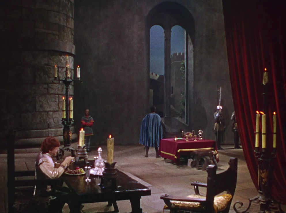
Still, The Adventures of Robin Hood was a next-level project for essentially everyone involved. Its epic scope is clear from its first moments, opening with the wicked Prince John (Claude Rains) hard at work on both his plotting and his dinner. He sits at a grand table in his drafty quarters, as Sir Guy of Gisbourne (Basil Rathbone) stares out a truly enormous window. The grand red curtains to the right must be hanging from somewhere, to be sure, but the enormous pillar on the left seems to suggest a giant’s palace. The room’s height seems to be infinite.
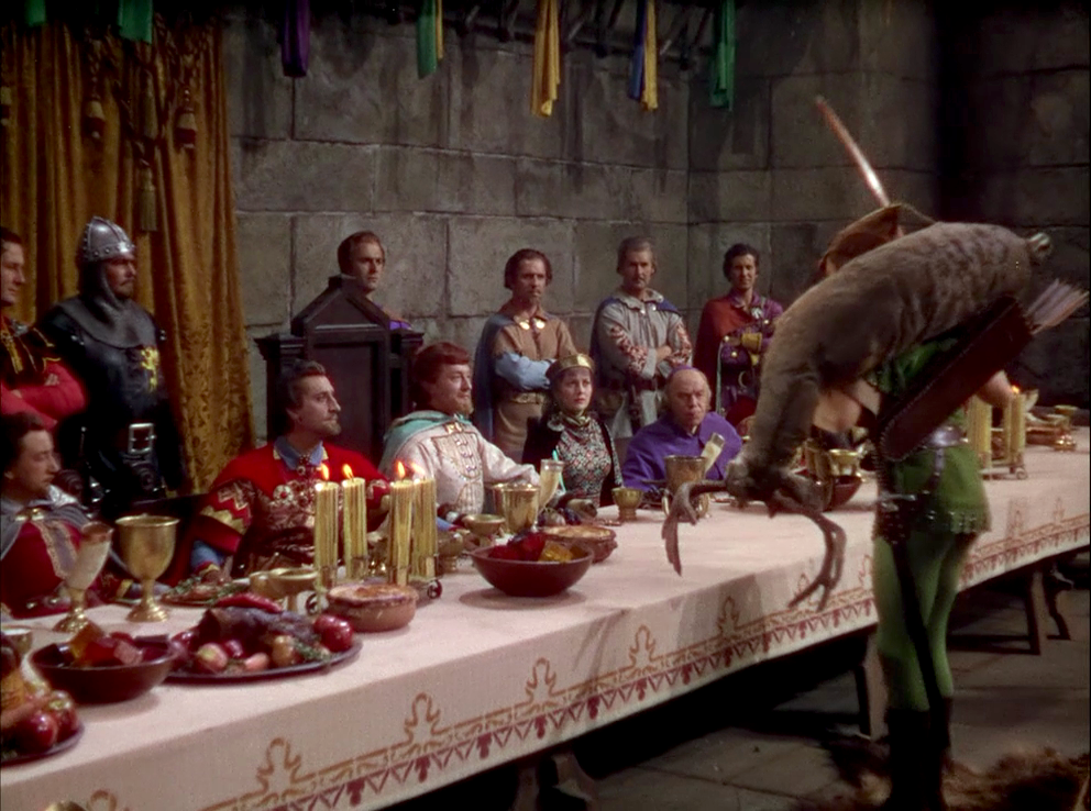
The whole castle is like this. And while there may be a vague effort at historical accuracy, inspired by real Norman castles in England or wherever else, the proportions also help represent Prince John as a man with an overblown sense of himself. His court, too, is a stuffy array of nobles who have little understanding of the land that they own. This goes all the way back to Ivanhoe, for which Sir Walter Scott built a (largely fabricated) drama of Norman-Saxon cultural conflict. True or not, it makes for an entertaining contrast when Robin marches into their banquet with a newly-killed deer slung over his shoulder.
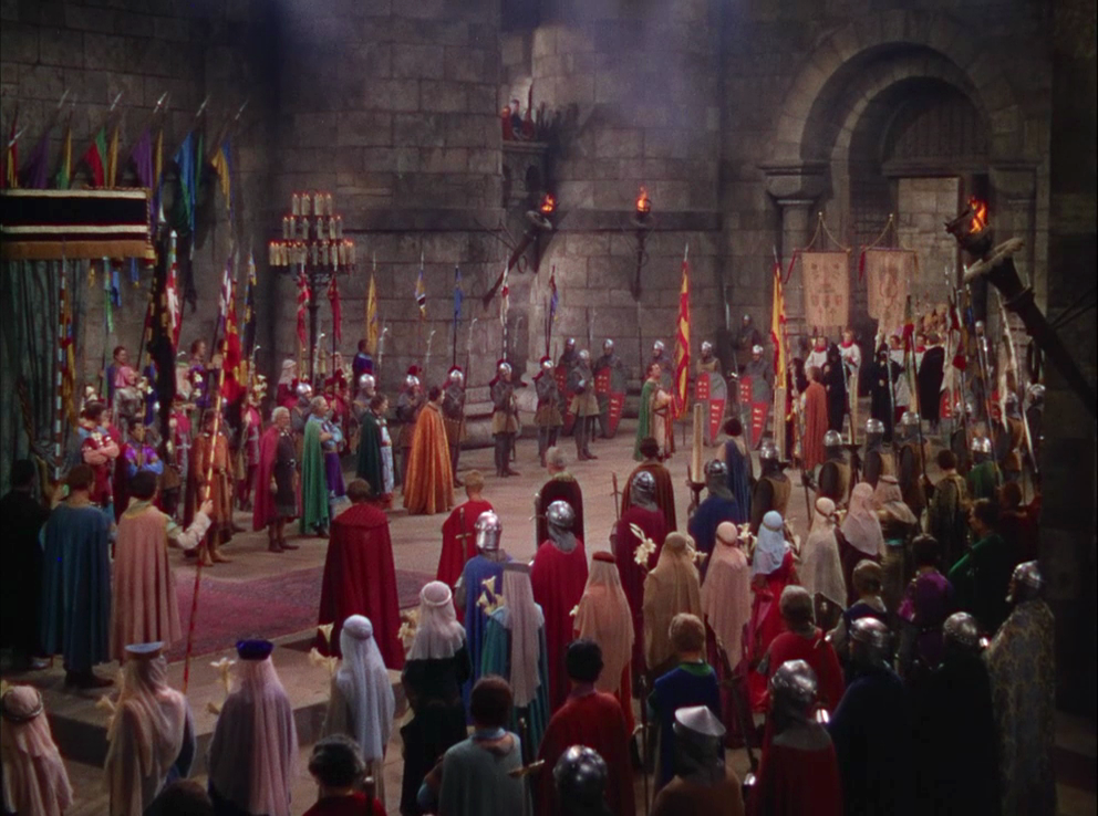
The interesting thing, though, is that Weyl (and director Michael Curtiz) staged John’s stuffiness primarily in vast spaces. The classic dichotomy of the Robin Hood story is that of the castle versus Sherwood Forest, moldy interiors versus the Great Outdoors. So why make these interiors so cavernous, when they could be suffocating?
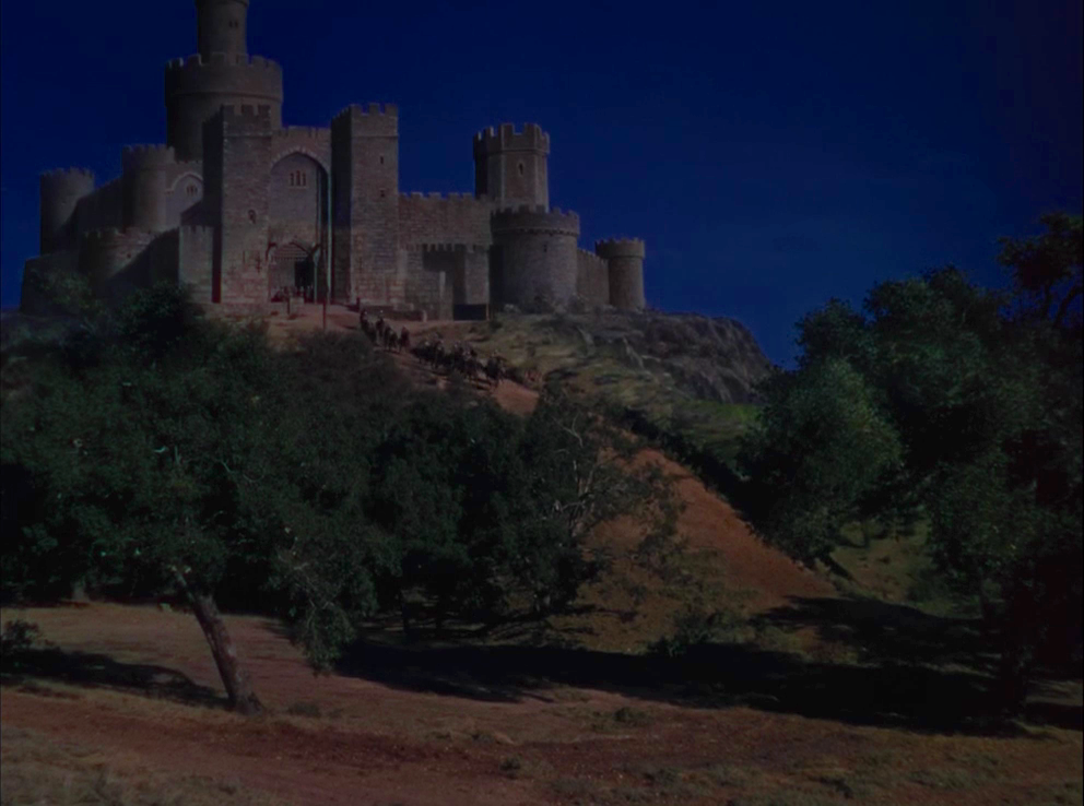
The Adventures of Robin Hood has a fascinating relationship with the concept of “exterior.” Sure, many of the exterior sequences actually shot outdoors, in such places as Bidwell Park and the old Busch Gardens. But the film also participates in a blurring of the line between “sets” and “on location,” often by extending production design out into the physical world. And this is not just in the “It’s only a model” sense, though there is some of that.
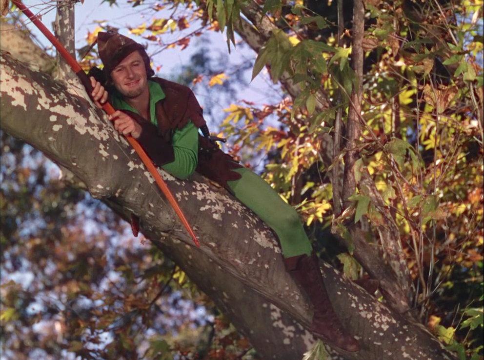
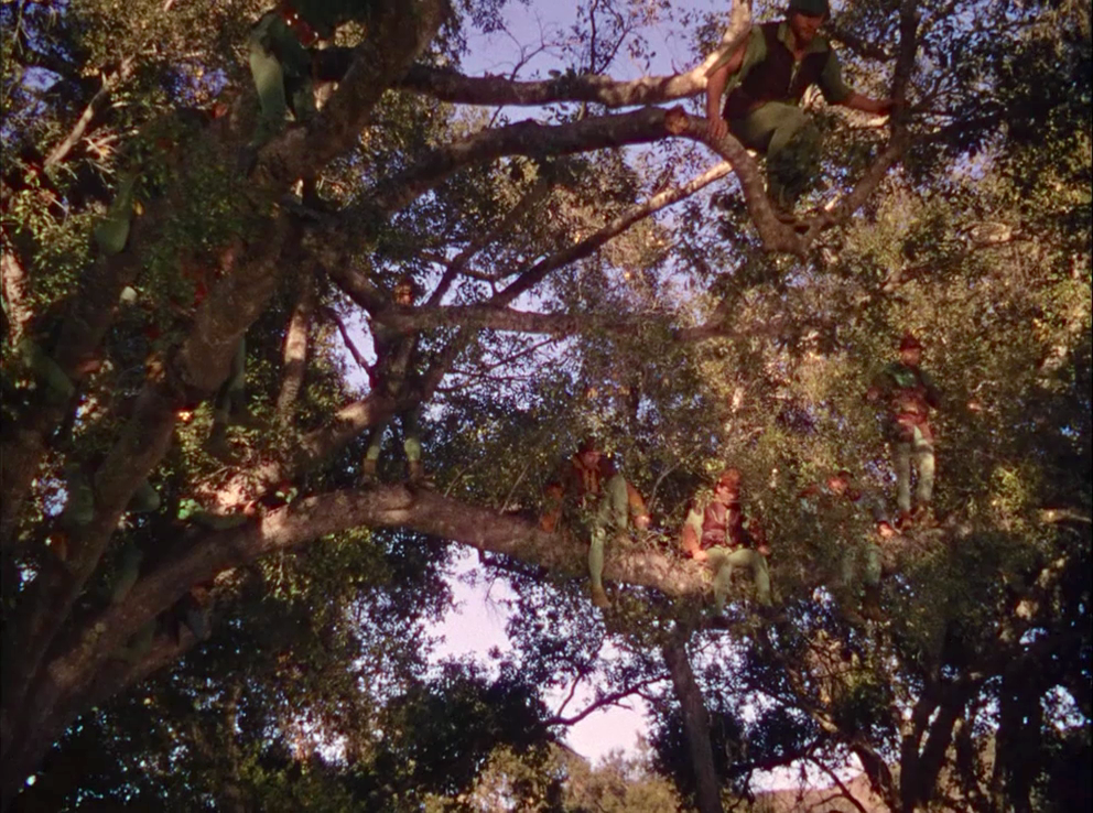
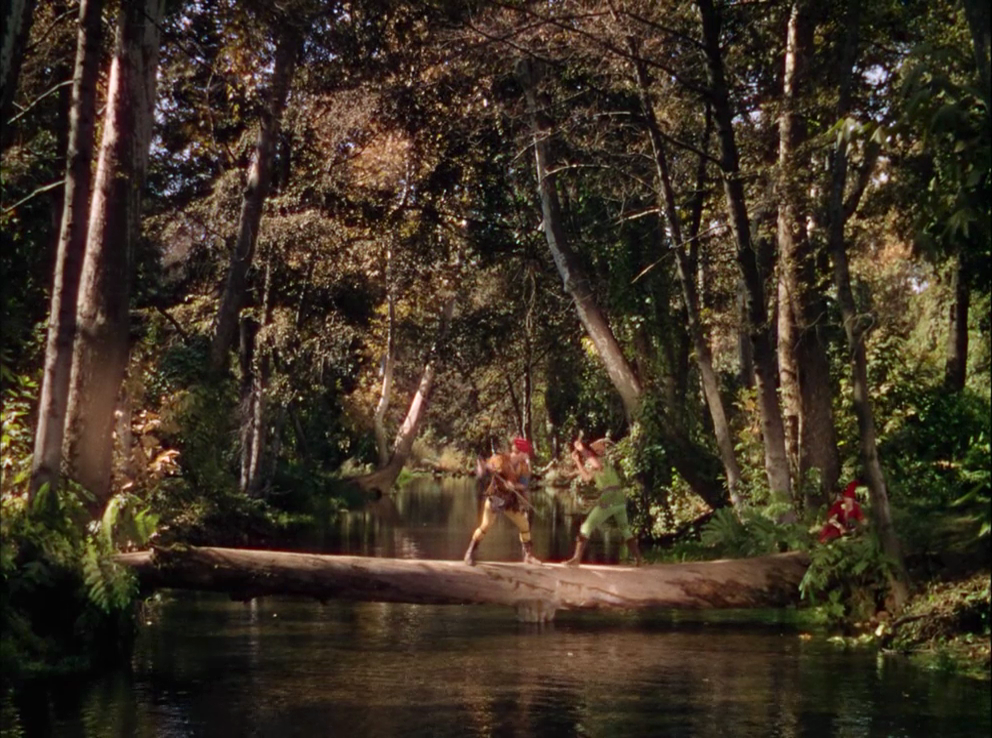
Further afield, the forest itself is enhanced to emphasize its relative coziness. The branches are low enough for Robin Hood’s men to gleefully hang out in them, waiting to ambush Prince John’s lackeys. The castle, ostensibly built for human habitation, gloomily looms over its residents as if hoping they’ll leave. These trees, on the other hand, might as well be playground equipment.
The forest is full of convenient details that make things easier for Robin Hood and his chipper attitude, like the conveniently-placed log on which he spars with Little John (Alan Hale). It doesn’t take a great eye to notice the large beam at its center. But what does it matter, really?
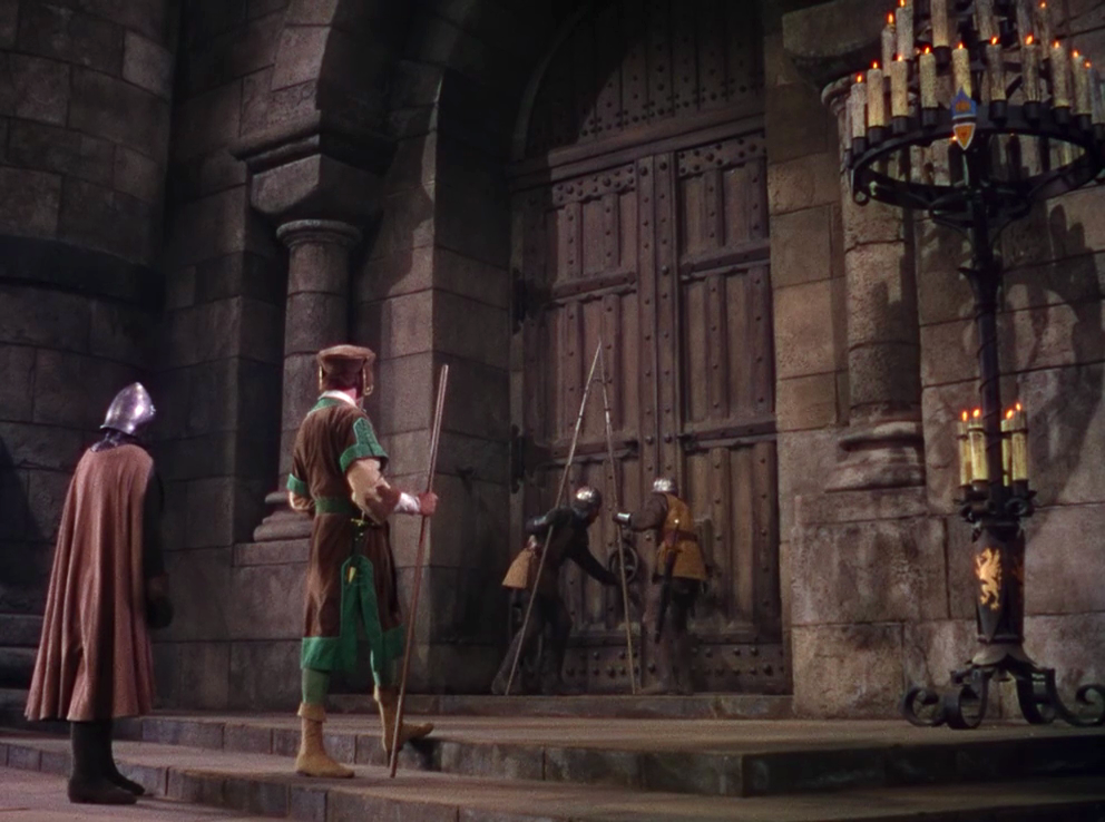
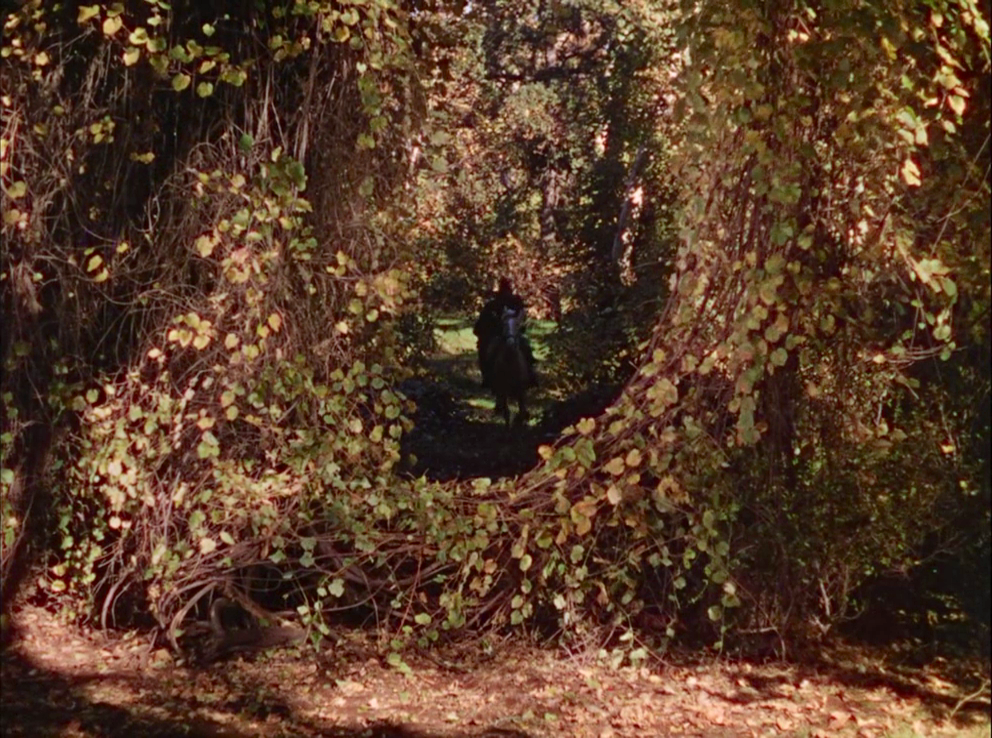
When Robin rushes through the forest on horseback, the greenery gathers in the shape of a round portal, welcoming him into its embrace. It’s much less forbidding than the front door of the castle, to be sure.
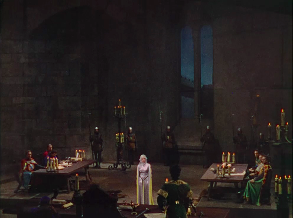
Back at the castle, meanwhile, poor Lady Marian finds herself dwarfed and alienated by rooms that seem to have grown even taller above her. She stands like a lone ray of light against a darkened sky.
Weyl took the old Norman/Saxon, castle/forest, interior/exterior dichotomies of the source material and plays around with them, having quite a bit of fun along the way. And in doing so, he forms another link in a long chain of Hollywood fantasies that treat entire landscapes as malleable. It's an approach that has been endlessly spoofed, abandoned and reinvented over the years, from Robin Hood to King Arthur and beyond.


Reader Comments (6)
Stunning use of color it's like a boy's adventure book come to life.
I love this post! I had never thought about the sets in this way, that they're playing oppposite of expectations in terms of confinement and openness. The whole movie is full of riches like that. such a treasure.
It's really great to have a fresh perspective on a movie that's been engrained frame-for-frame on my brain since I was 7.
Thanks, Daniel!
It's a great movie and the sets are amazing, but I slightly prefer the production design in Marie Antoinette.
Terrific post on a magnificent piece of work that fits into and expands the film it furnishes. It definitely deserved the win though it is a shame it couldn't have shared it with the truly amazing production design of Marie Antoinette.
I always felt the design and costumes in this movie were a film realization of the Robin Hood illustrations of N.C. Wyeth. Bright and colorful and every school kid’s fantasy reproduced in celluloid.