The Furniture: Promising Young Woman and Set Decoration as Weapon
 Wednesday, January 27, 2021 at 3:20PM
 "The Furniture," by Daniel Walber. (Click on the images for magnified detail)
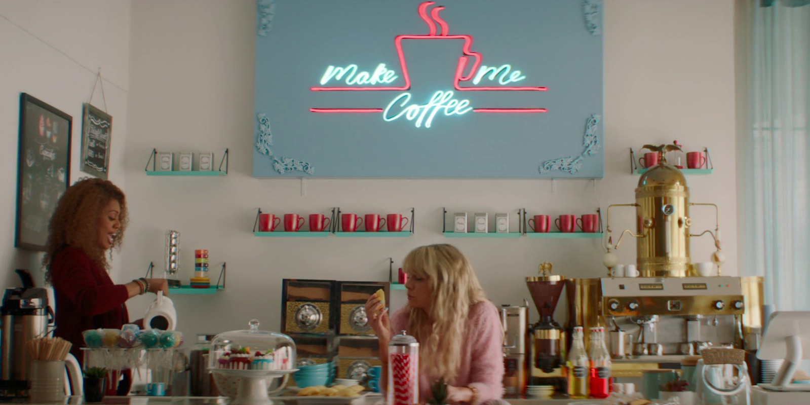
The best part of Promising Young Woman, aside from Carey Mulligan’s performance, is the look. It’s refreshing to see a comedy with so striking a visual sensibility, a neon nihilism that leaps off the screen. It’s certainly the first time I’ve ever seen coffee shop decor that I could describe as “snide.”
The work put in by production designer Michael Perry, art director Liz Kloczkowski and set decorator Rae Deslich is remarkable. Promising Young Woman has such a heightened visual sensibility, occasionally its own plot seems surprisingly tame in comparison...
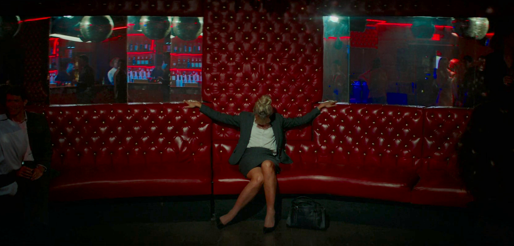
It’s just so unexpected that a night that begins with this harrowing dive bar set doesn’t end in murder for Jerry (Adam Brody).
The film is full of wry flourishes, details that mythologize Cassie’s presence. In one scene, she gets a blue halo - an odd architectural feature of the Instagram-ready cafe where she works.
Opposite Madison (Madison) at lunch, on the other hand, she sits directly under the only red light fixture in the room. Is she an agent of heaven or hell?
So many spaces are cloyingly bright and colorful, from the ridiculous neon pharmacy to the ice-cream-colored diner.
But what I found most interesting is the film’s use of set decoration as an instrument of derision, relentlessly skewering Cassie’s targets. Jerry’s bedroom is lit with a chain of jalapeno-shaped Christmas lights, while his living room features a dart board and an American flag with the outline of the USA spray-painted onto it.
Neil (Christopher Mintz-Plasse), the next victim, has more than one dreamcatcher in his living room.
Some of these details are nearly hiding in plain sight. I didn’t realize until looking back that the plants in Jordan’s (Alfred Molina) gravely modernist home are all dead.
There is a wall of cowboy hats.
What do men put on their walls? Nothing good, to be sure. Intriguingly, though, the only totally non-descript apartment in the movie belongs to Ryan (Bo Burnham), ostensibly the least objectionable man.
I’m still on the fence as to whether we’re supposed to find him charming - after seeing his apartment, it’s hard to identify what Cassie sees in him. The place looks like an Airbnb, decorated to appeal to everyone and no one at the same time.
It’s odd, given how flamboyantly the design team represents the worst aspects of everyone else’s personality in their home decor. Then again, it does often feel as if Ryan’s personality doesn’t go much deeper than “he’s necessary to the plot of this film.”
Either that or those canvasses in the back are a vicious indictment of the flatness of America's straight men, who only recently came around to owning dress shirts in more than two colors and can’t possibly be expected to entertain such shifts in psychology as listening to victims of sexual violence.
Frankly, I think it’s a little of both.


Reader Comments (10)
Powerful film, tho my largest issue with this movie was that everything looks like a set. Nothing looks lived in, and overly decorated.
Impressive and distinct visual look for sure, but two thoughts/questions:
1. This is one of those movies where the sets seem oddly unpopulated. Aside from a few restaurant scenes, it always felt (as Manliano noted above) that we were looking at "sets."
2. I didn't quite get what we were supposed to assume about her mom and dad from the outdated living room. They seemed like normal, concerned parents at the dinner table, but were they.. secretly living in the 80s? Did they still treat their daughter like a child and never moved their "look" (and by implication, their interaction with her) past an immature phase of her life? Wasn't sure, I thought another shoe was going to drop about it, but it never did.
Such a thoughtful piece! Made me appreciate the film so much more
Beautiful movie. I mean visually too.
RIP Cloris Leechman. 94 years young
Great post as always, Daniel. The production design is almost too much, but it definitely gives the movie added punch.
Interesting observation re: Ryan's digs. I think he is supposed to come across as low-key charming and, well, comfortable - but the home decor does give away that he's really just a blank. There's no there there.
That living room (in Cassie's parents' house) was...something else. It's seldom that a room in a movie gives me a headache trying to figure out its raison d'être, but this one sure did.
I got to interview Michael Perry about his work on this film and apparently Emerald Fennell wanted him because he was the production designer on the Sweet Valley High TV series, and among her inspirations for the look she wanted was an Instagram of Murder, She Wrote sets. It was FASCINATING.
Does anyone know what the blue wall decor behind her is called? the french antique looking piece
Ryan's apartment is very neutral because I didn't want to defind him .It's up to the viewer to make a call on who he is.
And ther is only one set, everything else was a dressed location and yes we wanted it to look like sets.
And thank for a well thought out review.
The set decoration in Promising Young Woman is a key part of the film's storytelling, reflecting the contrast between Cassie’s outward appearance and her inner turmoil. The furniture, particularly in the more intimate scenes, plays a vital role in enhancing the atmosphere. If you’re exploring ways to bring your space to life with unique pieces, you might want to check out what garden winds offers. Their products could be a great fit for creating a similar vibe in your own home or project.