The Furniture: "Mank", Crusader Against Tackiness
 Wednesday, February 17, 2021 at 1:46PM
"The Furniture," by Daniel Walber. (Click on images for magnified detail)
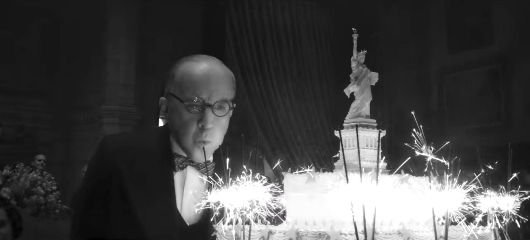
Opulence isn’t all it’s cracked up to be. Sometimes things that are expensive are worse. This is the message of Mank.
Or, rather, a message. But much of the film’s impact does spring from an acknowledgement that it would be cost-prohibitive to replicate the colossal excesses of the real Hearst Castle. Production designer Donald Graham Burt is pretty clear about that in this short video feature about his work. So, rather than trying and failing, they did something different...
Mank undermines the glamor and bombast of the men it critiques, the self-promoting icons who overshadowed the real Herman J. Mankiewicz in both life and death: William Randolph Hearst, Louis B. Mayer and Orson Welles. Burt, art directors Dan Webster and Chris Craine, and set decorator Jan Pascale collaborated with David Fincher and cinematographer Erik Messerschmidt to flatten and denature an entire Hollywood era, its aesthetic values and its dreams of America.
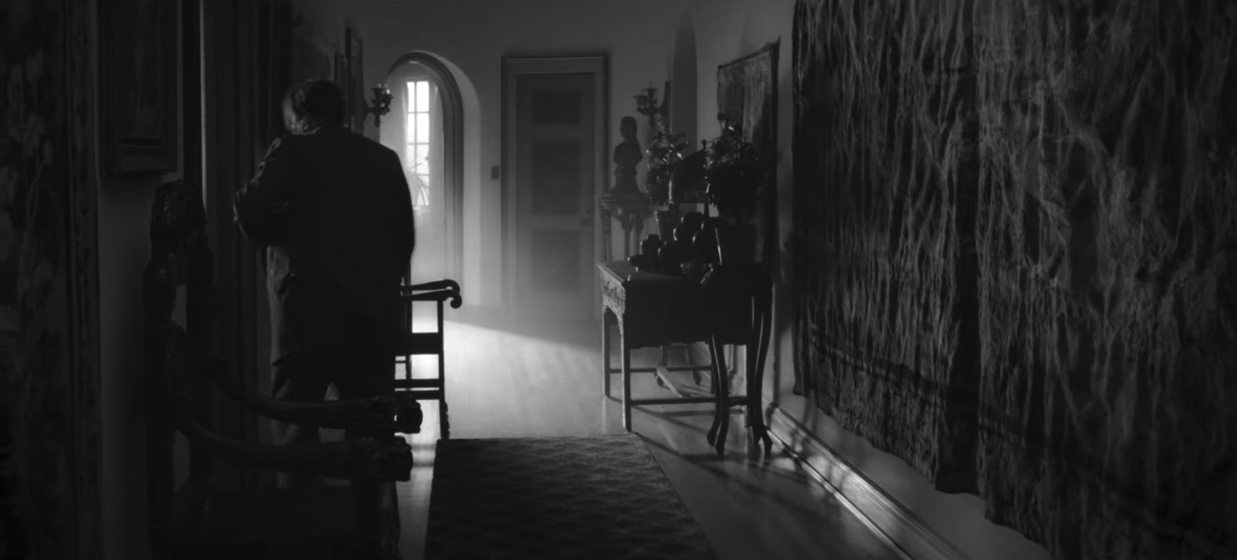
Take, for example, this tapestry. It hangs, not in San Simeon, but in Mank’s own house. But it must be expensive enough, it’s a tapestry. It might be in great condition, too. The thing is, we’d never know. Its colors are lost to the B&W, its patterns rendered incomprehensible by both its own wrinkles and the neglect of the light coming from the doorway.
It begins as an aspiration of decor, the working screenwriter participating in the Spanish Colonial Revival trend that would reach its apogee under Hearst’s roof. But we see it as drab and a little sad.
This is, essentially, the point. Much has been made of Mank’s visual evocations Citizen Kane and the style of the ‘40s studio picture. But as Jessica Dunn Rovinelli pointed over at Filmmaker Magazine, it rarely actually looks like a film from the early ‘40s. Its bag of tricks (grain, cigarette burns) evoke 35mm, but can’t truly imitate it. And Fincher’s digital manipulations don’t stop at Welles, but bounce around the 20th century in their styles. Mank is not a faithful representation of anything in particular.
So then what is it doing?
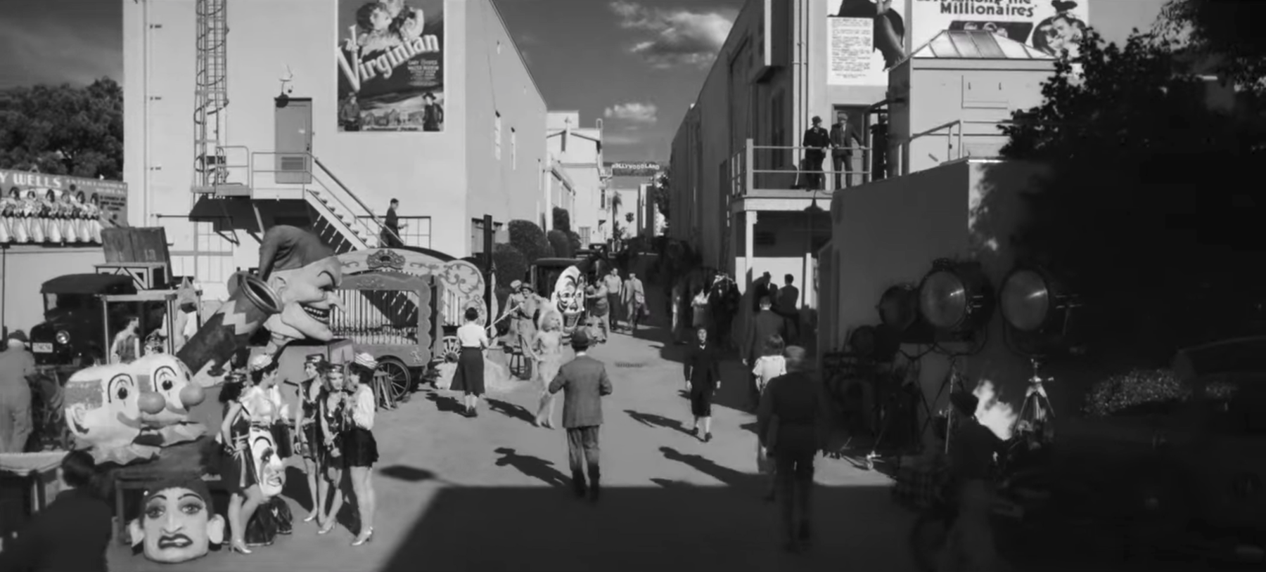
It’s calling attention to filmmaking itself. Hearst and Louis B. Mayer both spent colossal amounts of money attempting to recreate their world according to their whims - Hearst through yellow journalism and architecture, Mayer through cinema. Fincher denies them their flourishes, emphasizing instead the thinness of their aesthetic vision. What’s a three ring circus without color or texture?
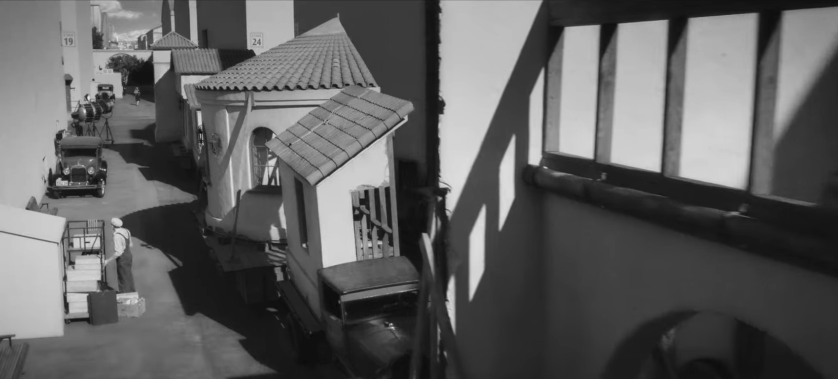
The movies are the easier target, of course. The parade of deconstructed bungalows that follow Marion Davies (Amanda Seyfried) off the studio lot accomplishes that much - as does the charmingly incongruous stake upon which her Joan of Arc chats with Mank (Gary Oldman). It stands oddly alone, without even a flimsy backdrop. It feels more like a fantasy out of 8½ than a functioning film set.
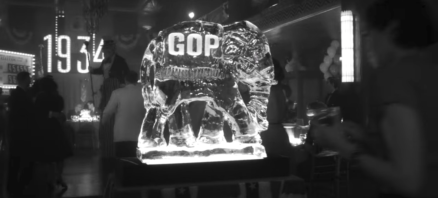
Mayer’s political theater, meanwhile, is simply presented with all the blunt, tacky Americana of the California Republican ethos.
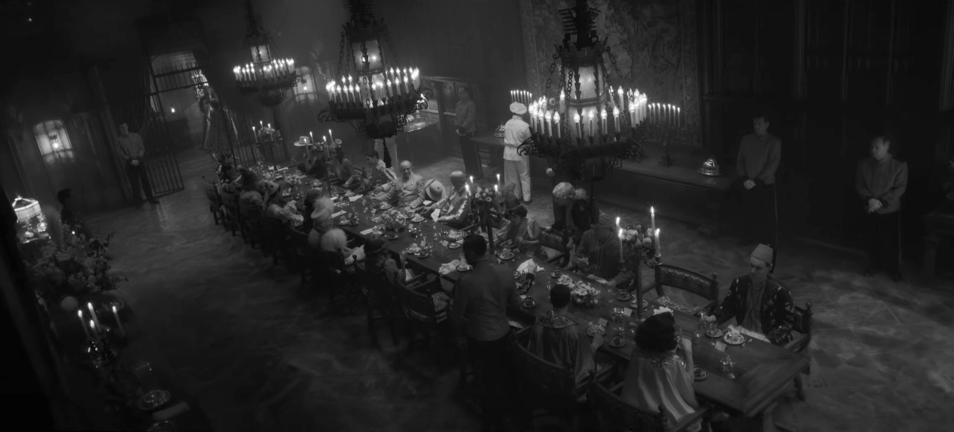
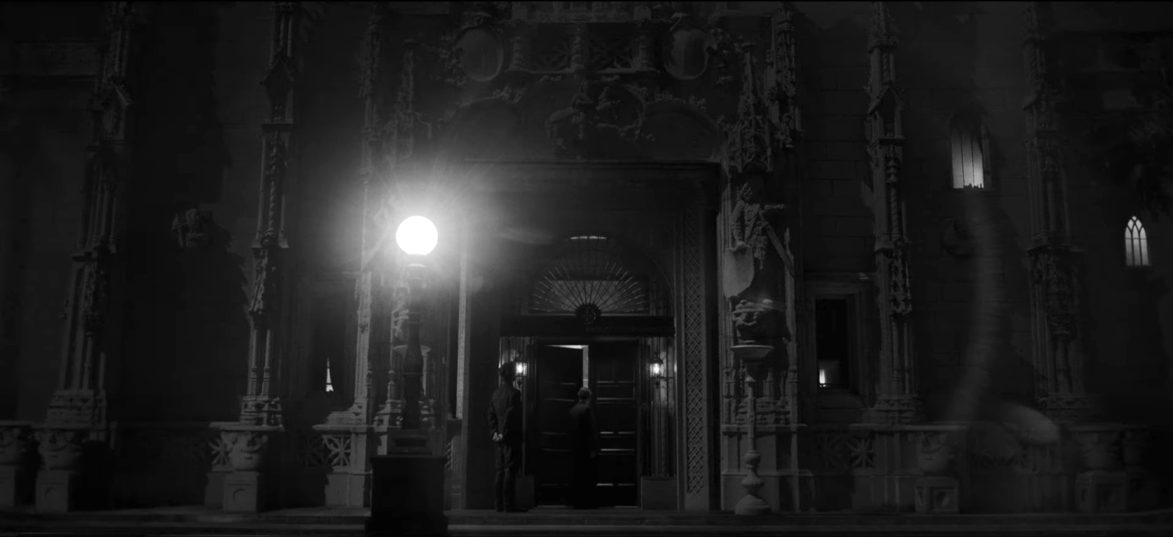
But the star of the show, so to speak, is the recreation of a few rooms in Hearst Castle. The production team did a tremendous amount of research, going so far as to locate the menus of dinner parties hosted at the mansion. While the sets are not exact replicas, they are incredibly detailed. Messerschmidt has said that the dining room featured some of the “most spectacular scenic painting” he’s ever seen.
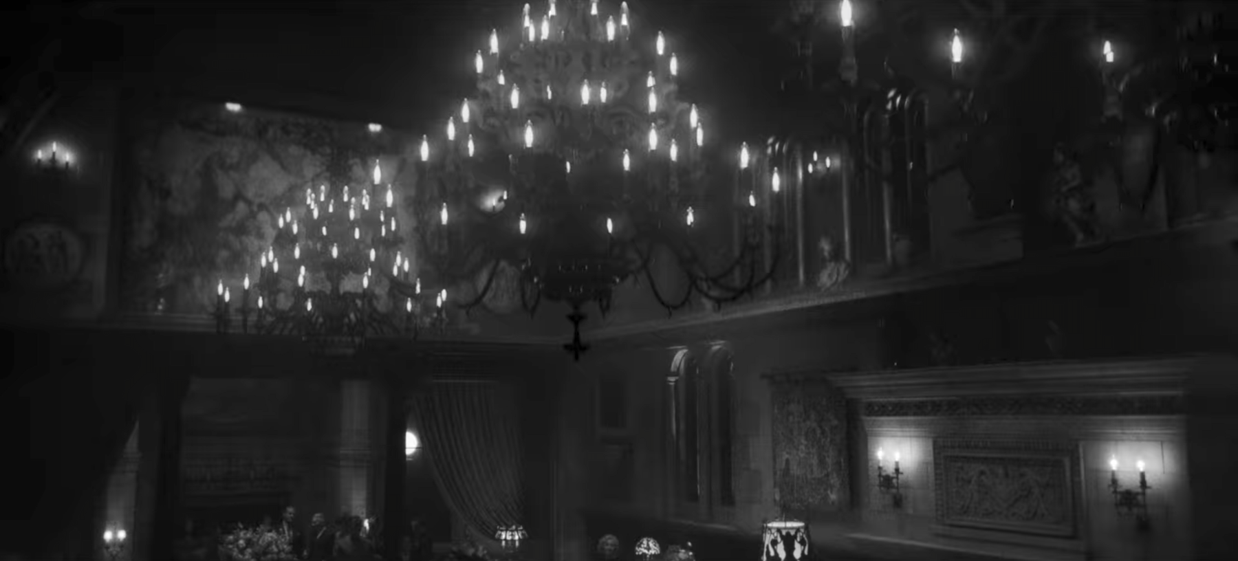
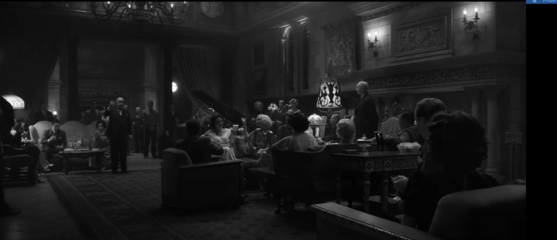
Of course, you can’t actually see any of that painting. It’s a fascinating process, transforming an opulent and bright space into (almost quite literally) a shadow of its former self. Everything seems a little bit distorted.
The effect is muddying. If one were physically in the space, one might get distracted by any of the multitude of colors and patterns, lost in the panoply of decorative arts. But in these frames, very few individual pieces grab the eye. The design is no longer the sum of its parts, but their collective absence.
After all, Hearst’s power is built on lies - lies which have, through their beauty and their power, become illusions. The man went so far as to buy a Spanish monastery and move it into his house in California. Hearst Castle is a landmark in the storied history of American businessmen whose riches seem to render the concept of taste obsolete.
Mank seems determined to single-handedly get revenge for all that bad taste, to tear down these heavenly castles with his wit. He can tell that it’s all false, that its tackiness is perhaps the loudest in history. He will tank his career to point this out.
The only problem is that he isn’t actually the only one in the room who sees it. He’s just the only one who cares. Abuses of power can really only be challenged on their merit, and attacking a demagogue for his loud mouth or his horrendous mansion isn’t often a winning strategy. Wealth can effectively make taste irrelevant - the authenticity of a facade is immaterial, in a sense, as long as you’re asked inside.



Reader Comments (6)
An angle on the movie I hadn't thought of before. Very well-written and really dovetails with the film's political themes.
I'm not a fan of the movie but this should clearly win.
Daniel, this is brilliant. (As always.)
Hi, Daniel! Thought you might like to know:
As of January, "House furnishings in motion pictures" is now an official Library of Congress subject heading.
These photos highlight why I think this movie was a complete miss for me. You almost have to imagine what is going on because everything, save Amanda Seyfried, is muddy and dark. Sorry, but if that's the point, it's conveyed immediately and then becomes just a struggle to wade through. Don't hate me.
I dislike this movie even more than Hillbilly Elegy.