


Posters, Links, Handguns
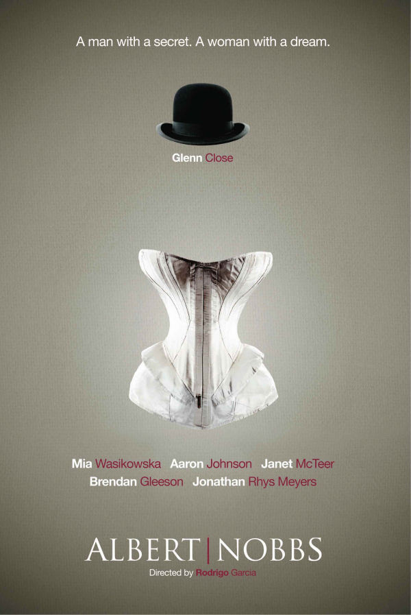
Via Awards Daily, the Albert Nobbs teaser poster. Enjoy it while you can as you know it'll soon be replaced with a boring poster of Glenn Close's floating head. Or perhaps Glenn Close and Mia Wasikowska photographed separately and then awkwardly fused together? Something I'll never understand: it's not like actors are never in the same room. Why not shoot movie poster photography ON THE SET? This shouldn't sound like a genius idea but given the state of movie posters, it is.
On the other hand... staying positive for a moment, we probably bitch too much about bad poster design these days. In truth there's a lot of very good work being done these past few years with the caveat that 95% of the good work is happening in the "teaser" realm rather than within the world of official movie poster. Perhaps Hollywood assumes that the movie obsessive crowds are inspired by good design but the unwashed masses only understand giant floating heads or horizontal stripes featuring film stills?
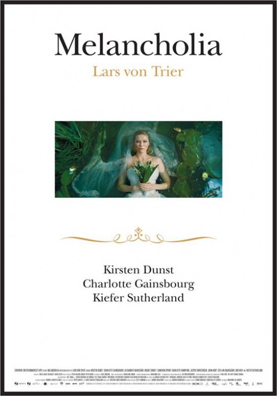
Oh and while we're talking posters... MELANCHOLIA. It's also a beauty. Love the little curlicue flourish.
Upcoming Films
Scott Feinberg liked the Butch Cassidy and Sundance Kid "sequel" Blackthorn at the Tribeca Film Festival with high marks for Sam Shepard as Butch.
Hero Complex JJ Abrams names seven films that influenced the upcoming Super 8.
Tom Shone Smart take on why the superhero movie is suddenly going retro with Captain America and X-Men First Class.
Towleroad I look at the men of May at the movies. Who is headlining? Who should we obsess over?
Artsbeat Tribeca Film Festival Winners
Um...
Towleroad Alex Pettyfer talks about his dick and reveals that he is one. Note to upcoming movie stars: do not act like stardom is a burden when you're still trying to win it. It's a turnoff -- most people would kill to switch places with you. If you turn people off before they're turned on, you're a trivia answer within a couple of years or completely forgotten.
 Yes
Yes
Observations on Film Art wonderful piece on the visual language of movie endings and beginnings.
Gold Derby the Globes and the BAFTAs reveal their awards calendars. Once Oscar chimes in everyone else follows.
Gadgets
Txnologist futuristic cars in the movies, they're totally into gullwings and butterfly wings and not today's boring doors that open sideways.
i09 lists the greatest handguns in sci-fi history so if you like Firefly, Farscape, Star Trek and the like, read on.
 NATHANIEL R
Reader Comments (14)
Well, honestly I LOVE the Albert Nobbs poster! So very very simple, but effective =)
The Melancholia poster, on the other hand...really not quite digging: it looks more like a cheap book cover and wasted white space! So much white! Coming off the beautiful posters done for Antichrist previously, this one's kind of underwhelming...at least to me =/
I really love the Albert Nobbs poster. Plus, its great to see Glenn Close's name associated with a movie that is not animated.
I'm not quite sure what I feel about the Melancholia poster but I do love that it gives nothing away at all. I just kind of wish they did something a little more with it. That picture of Kirsten Dunst is great though.
I can't handle the Glenn Close comes close to an Oscar again.
Oh shut up Pettyfer. The first five letters of his last name fit him perfectly, and it's incredibly pathetic that this talentless pretty boy is famous when he doesn't even want to be,
(But I think the crotch tattoo is a joke on his part, it's apparently a Kanji script. Whatever, he's still arrogant and untalented.)
I personally don't like either poster. Melancholia's has too much white space.
"Something I'll never understand: it's not like actors are never in the same room. Why not shoot movie poster photography ON THE SET?"
Yes, easier said than done my friend. It's always the nice, lovely, normal ones who will give you the time to photograph them together.
Billy -- but shouldn't this be part of the contract, like you know ACTING... the part where you take the promotional photographs for the movie.
Ryan -- i love white space. I don't get why people are so put off with it in posters. So many posters are just so b-u-s-y. I think it's nice to have the minimalism on occasion.
yeah, its almost always part of the contract... i think sometimes though, its just not worth it to piss people off by making them participate in photoshoots longer than they have to. so... taking pics separately and photoshopping actors together is a lot easier than shooting them together.
it's surprising how ungrateful most actors are... and how often they forget that promoting their work is important. ugh.
Haha, I agree on those fronts too, Nathaniel, regarding posters: I always do appreciate the "less is more" approach and have loved those posters too, but i guess my idea of minimalism is to best take something like the theatrical poster for The Social Network, which I thought just worked so well for that film with so little: just a big ol' Jesse Eisenberg photo, but that "You don't get to 500 Million Friends..." overlayed so well over it just sold the movie for me.
I guess I just agree with James in the previous comment about Melancholia's poster: with all the ambition and curiosity I had at watching the trailer, I really just felt like there could have been "more," like he said. I guess I get "put off" as you put it, that you have this whole canvas to utilize and to only utilize about 20% of it with a tiny photo of Kirsten Dunst and some text and the rest WHITE BLANKNESS! just felt like a wasted opportunity for something really magnificent given the awesome trailer it received. Instead, the poster just feels like something I could have put together given a screenshot/Google Image, 15 minutes with Photoshop, and a few font downloads here and there...and I hate to feel like the "I could have made that!" person and downplay what they were going for, but really, the poster just reeks of that!
But, that's just IMHO...not trying to bash or anything here! =)
Not a terrible poster by any means necessary, my first thought was just "...that's it?"
For some reason, it echoed the Revolutionary Road poster for me, which I had similar reservations about.
Yeah, the tattoo visible in the photos above his crotch says アレックス, or "Alex" - maybe he's really forgetful?
Is it just me or is the poster for FAST FIVE really good?? :-)
You've joked before that you can predict I'm going to scream "WHITE SPACE!!!" and while it does annoy me so very much, I think it can work occasionally. Noah Baumback! "Margot at the Wedding" is a bad example of empty white space. "Greenberg", however, is a good example since the white space is actually part of the story being told by the poster.
Yes, posters can be way too busy, but they can also be too UNbusy (...is that a word?) and just look lazy and/or unfinished. Usually, they just look like they couldn't think of anything so they just shove an image of the film's star somewhere (usually at the bottom/bottom right corner) and leave the rest empty so people can go "aah minimalism!" or "aah the emptiness signfies the emptiness of the character" or whatever. Gimme the poster for "Sleeping Beauty" any day, which fills its canvas with beauty in every inch.
I think the "Melancholia" poster is actually kind of brilliant: it looks a lot like a wedding invitation.
Interesting approach, but I'd do a few things differently to more accurately reflect that. 1. Put the cast and crew credits on the sides of the poster (with nothing at the bottom), to operate as a natural border. Tilt where appropriate. 2. Put Von Trier's credit at the bottom of the poster and preface it with "Wedding Photographer:". 3. Put the film title BELOW the curlicue and have it be rendered in two font sizes, both in a curly, cursive font (everything except for the title: size 20 font. The title: size 50 font, all caps) "You're invited to MELANCHOLIA."
Example of good effort putting the actors together on poster is The Kids Are All Right although that LA background is totally not from the scene from the movie.