Oscar Horrors: A Shark in the Edit Suite
 Wednesday, October 24, 2012 at 3:08PM
  Oscar Horrors looks at nominated contributions to this non-Oscar bait genre. Here's Craig on Jaws.
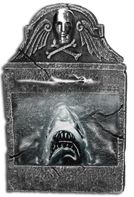
HERE LIES... a beautifully cut shark by the name of Bruce. Oscar-winning editor Verna Fields did the celluloid slicing and dicing...
Spielberg made it a star of fearful proportions. John Williams gave it an iconic theme tune. Roy Scheider, Richard Dreyfuss and Robert Shaw obsessively stalked it. And Richard D. Zanuck and David Brown looked on, clutching the purse strings, as they all went about their blockbusting business. But the person who gave Amity Island’s Great White unwanted visitor fierce presence and a sinister personality most could arguably be the editor Verna Fields. Alongside Spielberg and Co. she was instrumental in terrorizing the world with Jaws, summer 1975’s maiden blockbuster movie. She manoeuvred the shark’s arrival and departure – in tandem, of course, with Williams’ score – helping to create cinema’s scariest PG-rated, non-human villain.
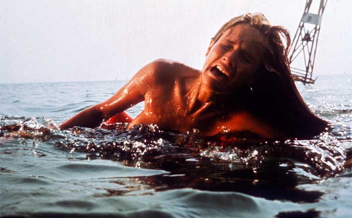
Fields worked wonders with Jaws’ spatial particulars. The film is a feast of horizontal expanse and vertical depth cut with sharp attention to the terrors evoked by the mysteries of distance. When poor Chrissie (Susan Backlinie) – in the instantly memorable and terrifying first, post-titles, scene – feels the pull of (mechanical) death on her water-treading legs, we vicariously retract ours. The endlessness of the ocean is reason enough to inspire terror, but Fields mercilessly positions us alongside, then below, Chrissie to establish instant fear: she’s a gliding silhouette on the surface, Bruce’s first victim; a meal. And we’re right there with her.

In a showy, balletic move (one that inverts the image of the shark’s fin emerging from the water later on), Chrissie’s out-stretched leg disappears into the sea. That’s the last we, or she, will ever see of that. She surfaces only to be yanked to buoy and back – and then under, for good. The scene’s awing power asserts itself in Fields’ intercutting of the attack with shots of lucky non-bather Cassidy (Jonathan Filley) passed out on the shoreline. Fields brings the scene to a close with an ominous visual ellipsis: a return shot of the sea, calm again save for the buoy’s now-eerie distant toll.
The manner in which Fields and Spielberg structured scenes was essential to the film’s lasting potency. The early beach scene, with Brody pensively scanning the shore (where the boy on the lilo meets an unfortunate demise), exhibited Fields’ use of ‘invisible wipe cuts’ to create baleful apprehension and suspense. The scene culminates in the famous dolly zoom that arouses Brody’s nauseous realisation that he’s failed to save the kid. The seemingly covert ‘pond attack’ on the boating instructor (which, due to his son Michael’s involvement, directly triggers Brody’s decision to go shark hunting), was effectively constructed to play with vertical space to instil terror: the high-angle shot of the shark moving sideways (for better access to that tasty-looking leg!) is inverted with a cut to under the water’s surface as the now-chomped leg descends to the ‘pond’ floor. As viewers we’re put on tenterhooks, scared witless: we’re raised high, then plunged in, and soaked with absolute fear.
The unknowable ocean horizon is evoked by the way Fields cuts from characters’ faces to the endless sweep of the sea (or even what could actually be the shark’s POV): Brody, after the ‘pond’ sequence, looks determinedly out, knowing a long dark night of the soul is required to stop the fishy menace; and Quint’s (Robert Shaw) USS Indianapolis speech aboard the Orca, which is halted by disquieting cuts to the boat seen from the water’s surface only a slight distance away.
Jaws’ visceral impact was of course due to the strength and toil of its collaboration, but Fields’ judicious cutting was instrumental in maintaining its flow. She gave it rhythm, shape, mystery. The prolonged tension was her doing. Her cuts helped sculpt the narrative for greater emotional resonance, giving extra urgency to the characters’ motivations. Most of all, she ensured that the killing machine somewhere out there in the ocean had a distinct persona and was always the focus of everyone’s attention, regardless of its actual immediate presence or not, making it a black spot on the consciousness of the townspeople. The phenomenal success of the film surely aided her Oscar win, but her remarkable editorial achievement speaks for itself. Her work on Jaws holds its own today and leaves a near-matchless legacy.

More Oscar Horrors
Hush Hush Sweet Charlotte - Supporting Actress
Phantom of the Paradise -Original Score
Shadow of the Vampire - Supporting Actor
Dogtooth - Foreign Film
Rebecca - Supporting Actress
Monster's Inc - Animated Feature
The Virgin Spring - Foreign Film
Pan's Labyrinth - Art Direction
Them! - Visual Effects
American Werewolf in London -Makeup
Addams Family Values -Art Direction
 Jaws,
Jaws,  Oscar Horrors,
  Steven Spielberg,
  Verna Fields,
  editing


Reader Comments (5)
What a wonderful analysis. Such a deserved Oscar, and in my mind, probably the second-best example of film editing in the 70s, right after The Exorcist.
brookesboy: Hmm...personally The Exorcist would be my 7th place of the decade, as far as editing alone is concerned. Here's my top ten.
1. Jaws
2. The Man Who Would Be King
3. The Sting
4. Rocky
5. All that Jazz
6. Superman
7. The Exorcist
8. The French Connection
9. Performance
10. Chinatown
brookesboy -- agreed that Jaws and The Exorcist are both way up there for editing, both marvelous examples of the kind of distilled film-long suspense, unease, terror that Hollywood is terrible at now (largely because they're so terrified of long takes and when everything is frenetic, sudden freneticism in violent sequences isn't even remotely scary.)
Beautiful post, I couldn't agree more!
Yes, great post. That movie did such a number on me that just reading your descriptions of each scene has me pulling my limbs in!