Best Shot: Deborah's Choice From Goldfinger (1964)
 Tuesday, June 17, 2014 at 9:53AM
 Hi, Deborah here, from Basket of Kisses. We're currently experiencing a site outage, but will be back up soon! Meanwhile, Nathaniel is graciously hosting my entry in Hit Me With Your Best Shot.
Best Shot is one of my favorite blogging series anywhere, but I've never participated until now. Nathaniel tempted me unbearably, though, by selecting a Bond movie. Goldfinger is a movie filled with iconic imagery; imagery that springs immediately to mind. So I should warn you right now.
This is not my best shot... [more]

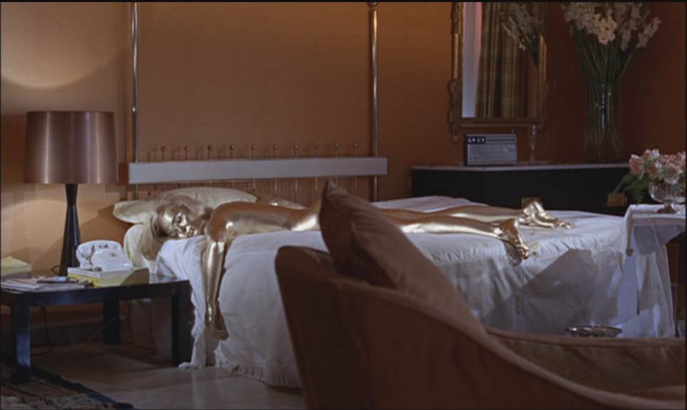
Memorable, startling, sexy, innovative: Everything you want to say about Goldfinger you can say about this shot. But it's not my favorite.
This isn't my best shot either:

It's great, isn't it? It has the high-tech villainy, the less-than-subtle phallic suggestiveness, a scary scientist seen in reflection: It could easily be anyone's best shot, but it isn't mine.
Do note, however, how these two shots work together to build the genius of Bond mystique: In just two images we understand there's sex, death, villainy, mystery, gadgetry, and exquisite set design. Together, these images form a primer on 007. I could throw in something from Robert Brownjohn's iconic (there's that word again) title sequence. But by now, I should probably move on to my personal best shots.
Here's Runner-up #2:

I've always loved this image. It's full of information, personality, and beauty. It's from the "Hood's Convention" scene, late in the film, wherein Auric Goldfinger reveals his plan to knock over Fort Knox to an assembly of gangsters.
Look at the artistry on display! The set design is magnificent, and if truth be told, I think this room is a better showcase for Ken Adam's brilliance than the more celebrated interior of Fort Knox. The room is opulent to the point of ridiculousness, 100% in keeping with Goldfinger's personality. The set design also communicates the Kentucky horse farm location. The mobsters are in groupings of their own, avoiding rival gangs, and the shot is wide enough to convey that. In the foreground, mobsters are playing on a toy horse, while to the left, hoods are playing pool: Cueing the audience that these guys are buffoons, while only Goldfinger is an adult in this room—we know he'll outsmart them before any words are exchanged. Also, that pool table will become a control panel, again conveying Goldfinger's mastery.
But it's not my favorite shot.
Here's Runner-up #1:

It doesn't seem to be an obvious choice, but if you've seen my video essay, "Growing Up a Bond Girl," you know this is the image that turned me gay.
I kid. I'm not technically gay, I'm bi, and this image didn't actually do all the damage. But these women are introduced with a classic musical vamp, keying us in to the fact that they're being seen as sexual objects, and then instead of approaching James Bond or another man, they approach Pussy Galore. As a pre-teen, I sensed what that meant, and I wanted to be one of Pussy Galore's pilots. Hot!
My actual best shot needs a bit of a lead-in.

There's something beautiful about the Bond movies when they slow down. Goldfinger is a marvel of pacing. It's famous for its diverse action sequences: A great car chase complete with ejector seat, the attack on Fort Knox, and the electrical fight between Bond and Odd Job, to name just three. But the movie also backs away and builds tension slowly: Who would imagine that a golf match between hero and villain would fly? Certainly, it'd be a hard sell in the action movies of today.
The sequence in the pictures below is a perfect example. Bond is playing cat-and-mouse with Goldfinger. He's planted a tracker on Goldfinger's car, and is following from a distance through the Swiss Alps. Goldfinger stops by the side of the road for a snack, and the camera slowly pulls back.
It's beautiful, it's scenic, and we get a sense of spying on the villain. The camera continues to pull back.

And now it's the hero doing the spying, adding a layer to the scene. In this shot, by the way, we see the Aston-Martin DB5, the extraordinary car introduced to Bond movies in Goldfinger. But the camera still pulls back.
And here is my best shot...

It's dizzying. In the foreground is Tilly Masterson, about whom we know nothing at this point in the film; she's just a pretty woman Bond passed on the road. In the distance, we can still make out Goldfinger's bright yellow Rolls Royce, so that the two previous shots are contained in this one.
I still gasp a little each time I see this. The beauty of the Swiss Alps is highlighted—Bond films are so great as travelogues, and in the sixties, this was truly a hallmark of the 007 film experience. The very notions of spying, espionage, and assassination are encapsulated in this shot. We see the ignorance of each character: Goldfinger doesn't know Bond is there, Bond doesn't know Tilly is there, Tilly doesn't know that Bond is following Goldfinger, and we, the audience, don't know who she is or why she's about to shoot.
This shot lasts less than a second. Tilly shoots, Bond dodges, and the chase is on. It's the hold-your-breath pause that makes the shot so perfect.
Come back tonight at 10 for all the Best Shot choices, and Nathaniel's too.


Reader Comments (4)
great choice. i'm still trying to decide.
Goldfinger's iconic title sequence wasn't designed by Martin Binder. It wasn't Maurice Binder - if that's whom you meant - either. It was Robert Brownjohn.
Oh, ferfuxake Willy, not only are you right, but I wrote about Brownjohn in my last Bond article on this site!
Perils of editing at midnight.
i fixed it!