Poster Madness! The Best of 2014
 Thursday, January 22, 2015 at 4:30PM
 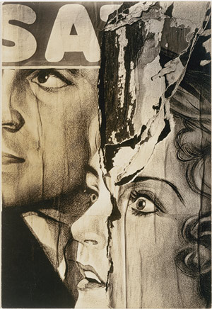 Glenn here with my now annual list of the best movie posters of the year. I should apologize for being so tardy with this, but I've been working on a big non-movie-related project that took precedent. Never mind that though because we're back. Last year logged the first time that I dragged my lil ol' list of the year's best movie posters over from my own blog onto The Film Experience we're back to see what'll win this year. Last year the honor went to Spring Breakers and this year was no less fierce. I have once more assembled an... eclectic list of films ranging from French orgy dramas and Christian religious flicks to British sci-fi and obscure horror titles.
I have tried to keep the posters featured within down to American 2014 theatrical/VOD releases only. That means designs that emerged online as much as 18 months ago can be on here if the film was only released this year (hi Nymphomaniac!). Likewise, designs for 2015 releases that are already hanging in cinema foyers do not feature - I'm going to spend the next year tossing and turning over whether this hilariously unsubtle phallic poster for Fifty Shades of Grey is actually good or completely terrible. Having said that, being an Australian means I have snuck few Aussie films on the list because, I guess, my list my rules. I should also point out that, just like last year, the lack of many big budget blockbusters on the list isn't my contrariness popping up (my lonely passions are now a thing), rather it's just proves that so many working for Hollywood studios would be absolutely lost without the billions of dollars that they take for granted and the audiences that flock to their movies like sheep.
Follow me as I count down the best posters of 2014!
(Click the titles for bigger versions)

40. You and the Night: For its fleshy representation of sexual connectivity.
39. Particle Fever: For etching its themes in a simple, yet eye-catching way.
38. The Strange Little Cat: For its interesting visual ideas (and for Amir!).
37. Grand Piano: For its slick silliness.
36. Hellion: For its crashing of visuals into one dreamy image.

35. Son of God: For surprising shock value.
34. Jamie Marks is Dead: For highlighting the queer aspect of its teen suicide drama.
33. Inherent Vice: For the colours. My favourite of these otherwise busy, overly-worked designs.
32. The Babadook: For child-like simplicity of adults-only ideas.
31. A Girl Walks Home Alone at Night: For crafting its own red and bloodied visual iconography.

30. Palo Alto: For its pink-hued filter on feminine youthful experience.
29. The One I Love: For its gentle prodding of themes and concepts. The brilliant Akiko!
28. Tracks: For using negative space in a way that is actually relevant.
27. Bad Words: For comically pushing the edge of bad taste in a new way.
26. The Theory of Everything: For its lopsided, physical take on romance. Befits the film perfectly.

25. Robocop: For being graphic and living up to its title character's reputation.
24. Birdman: For inciting interest and intrigue.
23. Willow Creek: For taking a cliched design concept and giving it the Bigfoot treatment.
22. Wetlands: For the dirty fuchsia suggestion.
21. Electric Boogaloo: For the shiny VHS memories and use of color.

20. Proxy: For taking its most obvious comparison (Rosemary's Baby) head on and achieving its own unique horror.
19. Starry Eyes: For its wicked, retro other-worldliness.
18. Thou Wast Mild and Lovely: For its scrapbook graphic oddness. For Butter on the Latch.
17. The Double: For the noir and Metropolis inspired impact.
16. Stage Fright: For the entire entertaining, inventive series of posters.

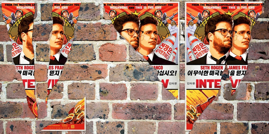
15. The Interview: For funny use of propaganda imagery. For "Do Not Trust Stupid Americans".
14. Maleficent: For the bewitching mystery. The the silky, inky blackness and looking like Michelle Pfeiffer.
13. Private Violence: For thrusting its themes in your face (quite rightly, too).
12. Ukraine is Not a Brothel: For using the body as a canvas and a warzone.
11. Enemy: For being as mysterious as the film. That color!
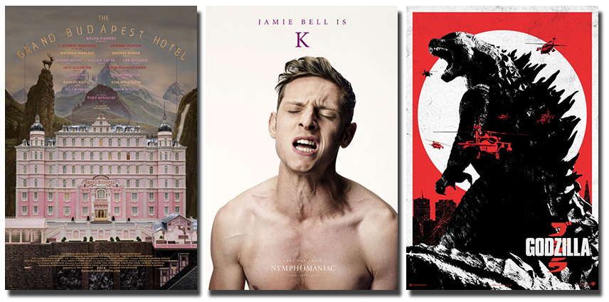
10. The Grand Budapest Hotel: For the delightful whimsy and hand-crafted care.
9. Nymphomaniac: Because I want it on my wall. And ceiling. And on personally-created pillowcases. For the entire series' comical, sexual chutzpah.
8. Godzilla: For nodding to the past with the scope of the modern.
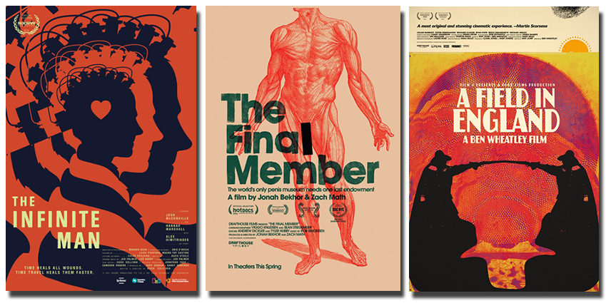
7. The Infinite Man: For its elegant representation of interlocking time-travel story.
6. The Final Member: For its salmon-colored, er, medical muscularity. For telling, but not showing.
5. A Field in England: For its Jodorowsky-esque splash of color and shadow. For the strangeness.
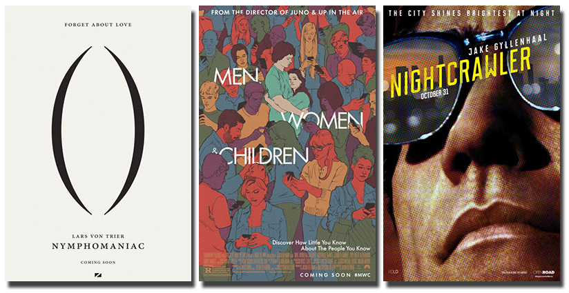
4. Nymphomaniac: For the grammar nympho in all of us.
3. Men, Women & Children: For just interest use of textured pastels (click the big version to see what I mean) and structure. For masking the (supposedly) terrible movie within.
2. Nightcrawler: For getting up close and not letting us escape. For the reflections upon the Hollywood dream. For the pulp, pop art aesthetic.
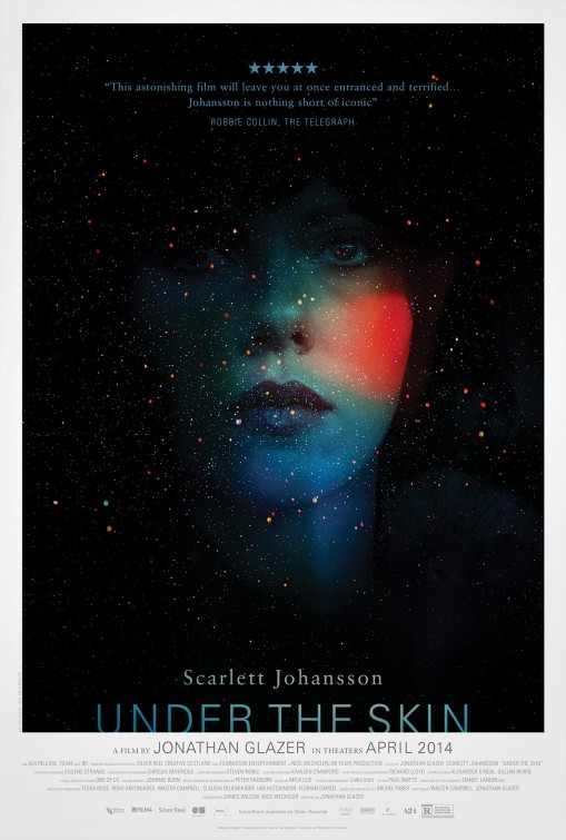
1. Under the Skin: For the speckled allure of space and flesh combined into out truly transfixing image. For the colors and the moods projected upon a woman, rendering Scarlett Johansson somewhat anonymous and mysterious. It begs people to ask, "what is this movie?" as they take it in.
And so that is that, dear readers. What do you think? What caught your eye in 2014? Do you also want Jamie Bell in your bed or are you more a Charlotte, an Uma, or a Shia lover? Let's talk in the comments!


Reader Comments (17)
Really interesting selections as always Glenn! And thanks for thinking of me ;)
Glenn: No place for the Guardians announcement poster? It might not be the most daring composition, but...THAT TAG LINE.
Thanks for these. May I mention my favourite of the year - Stranger by the Lake...
Yesssss I was just thinking about when you were gonna do this post for 2014 or if I had missed it already. Always an excellent spotlight on pieces so thoroughly creative, both known and relatively obscure.
The One I Love poster instantly stuck out at me when I saw it in the lobby of one of my art house theaters. I loved it, made me wanna watch the movie immediately.
I had never seen that poster of The Double before and I'm amazed by it. Didn't like the movie tho. Same with Tracks and You and the Night -- need to catch up on those now.
The whole series of posters for Bad Words were a rather clever take on the title/subject. Really liked each new colorful poster they kept presenting for Inherent Vice as well.
Wetlands is the movie I keep telling everyone who might be able to stomach it to go and seek it out any which way they can. It's the most hysterical thing I've seen in theaters in years. The poster was implied perfection: she is daring you into her world.
The () teaser for Nymphomaniac was a stroke of minimalist genius.
Under The Skin, of course. A24 is getting wonderfully consistent with their overall marketing in general. Their art department needs a spotlight series or something.
Thank you for so much for this, Glenn! brb right-click saving some of these.
Jamie Bell sheets and pillow cases...........I would never sleep.
The One I Love is by far my favorite.
BTW they weren't used as posters per se but I LOVED those HG: Mockingjay district character posters they teased out over the summer. A+ costuming/hair/makeup/casting.
http://www.impawards.com/2014/hunger_games_mockingjay__part_one_ver2.html
A great gallery, Glenn. And thanks for your views on these that give us a new perspective. Birdman, GBH and Inherent Vice are faves. I saw a really cool Maps of the Stars poster online--still waiting for this phantom film to actually open.
Great list! We have some picks in common, but, surprisingly we got the same #1 poster! You can check my list sometime :)
Very interesting list. For me, Grand Budapest Hotel & The Babadook are the ones that stick with me the most, but several of these are effective.
I submit the poster for Robert Greene's domestic, Sirkian, non-fictional, underrated gem of a documentary, Actress:
http://d1oi7t5trwfj5d.cloudfront.net/1f/93/29fc54a34860b59fad0010905a63/poster.jpg
Ones of the list I love: Under the Skin, A Field in England, Nightcrawler, Nymphomaniac(s), Thou Wast Mild and Lovely, You and The Night, Palo Alto, Inherent Vice, The Strange Little Cat, and The Grand Budapest Hotel
Others that I'd rep.
Snowpiercer had much better global marketing:
http://thefilmstage.com/wp-content/uploads/2013/11/snowpiercer_poster.jpg
and
http://www.findelahistoria.com/web/wp-content/uploads/2014/05/snowpiercer_ver20_xlg.jpg
John Wick
http://cdn.collider.com/wp-content/uploads/john-wick-poster-Keanu-reeves.jpg
We Are The Best!
http://www.impawards.com/intl/sweden/2013/posters/vi_ar_bast_ver3.jpg
The Purge: Anarchy
http://ia.media-imdb.com/images/M/MV5BMjE2ODMxMTk1Nl5BMl5BanBnXkFtZTgwMDEzNjEzMTE@._V1_SX640_SY720_.jpg
Midnight Marauder's Inherent Vice poster (that I would buy in a hot minute)
http://payload342.cargocollective.com/1/11/359016/9158492/I_VICE_01_441.png
Borgman
http://d1oi7t5trwfj5d.cloudfront.net/69/9d/8bbf6dd14ccfa5a058da824ac116/borgman-poster.jpg
Listen Up Philip
http://d1oi7t5trwfj5d.cloudfront.net/c4/b4/2b0d78214152a63d973a281c970b/listen-up-philip-poster.jpg
and
http://cdn.indiewire.com/dims4/INDIEWIRE/366a283/2147483647/thumbnail/680x478/quality/75/?url=http%3A%2F%2Fd1oi7t5trwfj5d.cloudfront.net%2Fed%2F7d%2F43d9eaab43f98834f2e0889059ed%2Flisten-up-philip-jason-schwartzman-elisabeth-moss.png
Red Army
http://cdn.indiewire.com/dims4/INDIEWIRE/6dd7012/2147483647/thumbnail/680x478/quality/75/?url=http%3A%2F%2Fd1oi7t5trwfj5d.cloudfront.net%2F59%2F2b%2F9d920754445b81857097f6dfc70a%2Fred-army.jpg
Under the Skin
http://d1oi7t5trwfj5d.cloudfront.net/c1/40/0c7310794e54856a5b42a62a1fed/under-the-skin-poster.jpg
Enemy
http://d1oi7t5trwfj5d.cloudfront.net/47/3f/b9398ff842278569608c449da077/enemy-poster.jpg
Edward, Stranger by the Lake was on last year's list. I considered it a 2013 release.
Thanks for all the kind words. So good to hear people's favourites! Ack, I will respond to people better when I'm not eating dinner and watching MANHUNTER!
Grand Budapest Hotel, Birdman, and Babadook for me as well. I think Babadook was very inspired and has had considerable impact for such a small budget film. Under the Skin reminds me other SF fillms - sorry it doesn't seem very original to me.
I agree about the Mockingjay series of promo posters -very effective.
I agree w/ Volvagia, that first GoTG poster was a beauty. The tagline is classic of course, but I thought the colors were pretty as well.
But this is a lovely list. Well done!
Only Lovers Left Alive is tops for me. I like the snuggles on the couch poster, but love the Tilda sprawled on the bed design that came out first.
LOVE this list, Glenn!
I really like that Under the Skin poster, but best of the year?
The Nymphomaniac teaser poster is GENIUS. Perfectly cheeky, while still saying something about the actual content of the film. I love that something so simple works on multiple levels. The Mockingjay posters were all gorgeous and clever, too.
For me, the poster of the year is the Grand Budapest cast poster. Just gorgeous. The hotel is lovely and astonishing in its own right, but the one with the cast as keys takes the cake for me. I could stare at it for hours.
Is this the "You're Welcome" tagline from GoTG that people are talking about? I do enjoy that, yes, although I don't think the image of the poster is quite as funny as the tagline.