Oscar Style: Henry Hobson & Those Gorgeous Graphic Sequences
 Monday, February 23, 2015 at 2:30PM
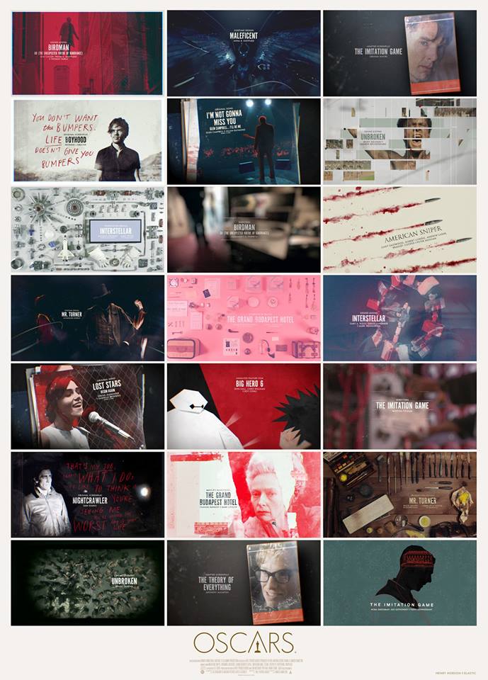
 Manuel here to talk about the gorgeous designs we saw last night. The Oscar telecast was, as usual, a very pretty affair. Humor may be subjective (a pun can both garner a laugh and an eye roll) and winners can be fought over (oh those Birdman takedowns aren't gonna get any less nasty now are they?) but the show will always provide the eye candy. And I'm not just talking about the gorgeous dresses, the preened faces and the sculpted male torso that walked the stage. I'm here to talk about the beautiful title cards that were featured throughout the night.
Combining Tumblr-ized minimalism and Instagram's cataloguing style, Henry Hobson and the Elastic Design created some beautifully stylized graphic sequences for last night's awards:

I particularly loved the (ever so brief! -- guess they wanted to keep these sequences short and sweet?) Best Picture montage:
Best Picture Oscar Nomination Title Sequence - 2015 from henry hobson directing & design on Vimeo.
If there's one objection to make about all these pretty pictures is that they seemed designed to deny us of the power of those moving pictures we were supposed to be honoring (or, in the case of the In Memoriam tribute, of the work which Meryl reminded us, would live on).
Were you taken with the designs? Or did you wish we could have gotten full clips of some of these nominees, especially as the telecast was unusually reticent to show clips of any kind?


Reader Comments (15)
The graphics were nice, but I really wanted to see clips. Especially In Memoriam. And Joan Rivers should have been included. She may not have made that many films, but she raised the Oscars with her Red Carpet antics and gave it a Pop Culture cred that it was losing. They owe her.
( I did like the make up graphics showing the transformations.)
I was! I loved the In Memoriam tribute. So delicate.
"Reticent to show clips."
My first thought of the night (after Best Supporting Actor) was "wow, they're really giving us long acting clips for once." Those are the categories where clips really matter, right?
I loved the graphics too so i'm pleased you highlighted them. Thought it was a classy way to do In Memoriam but it shyould have been sped up a little more to include more people. as usual they left out some biggies.
I agree with Hayden-- as long as there were clips in the acting categories, I'm content.
I thought the title cards were gorgeous and added an air of class to the proceedings.
I love the graphics, although it bugged me that they were also used as a timesaver in order to devote more time to...what exactly?
Thank you for highlighting the design elements of the Oscars telecast! Loved the graphics and as mentioned earlier In Memoriam images.
P.S., to geek out further, I would love to see a post dedicated to Oscar's set design through the years; last night's was gorgeous.
Very well designed (the Production Design slides in particular, which is appropriate), but I would have preferred to see the actual craft - the costumes, the editing, the actual moving, cinematographic work!
On a related note, I sorely miss the montages of films past and present. These current producers don't seem to be very fond of them because I can't recall any major clip package or montage during any of the last three ceremonies. A shame. When they played the "Sound of Music" clips it was a reminder of how just how satisfying it is to actually *see* the movies in motion.
Hayden -- Right! I noticed that too and they were particularly well-picked except for the one of Reese Whiterspoon.
I liked the graphics for the most part, as well, but I wish they weren't used for the Animated Feature category. While the home audience had likely seen "Big Hero 6" and "Dragon" and "Boxtrolls," how many had seen clips from "Song of the Sea" or "Kaguya"?
I thought the design cards worked best for the In Memoriam segment - they seemed very elegant and poignant. Meryl Streep's intro was so well written & delivered.
Thematically it was working for me up to the best picture segment.
I thought they should have used some clips for the best song segment, I found the lack conspicuous for "Lost Stars" and "Beyond the Lights".
Very nicely done
They were in charged of this last year as well right? Great stuff both years!
Nathaniel, are you with the general consensus that Joan Rivers should have been included? Why did they snub her anyway? Surely things have changed since the 90's when they were more uptight about her red carpet shtick?
I love those designs, but at the same time I wish they had shown clips to showcase the actual work done on the films (at least, for cinematography, VFX, production design)