Oscar Stages Through the Years
 Wednesday, February 25, 2015 at 11:49AM
 Ask and you shall receive. Manuel here to take up Joel V's suggestion in the comments (for this post on the gorgeous graphics we saw on Sunday) and give us a look at past Oscar stages. I will hand it to Craig Zadan and Neil Meron, while NPH was only so-so (though thankfully willing to embrace the male gayze) and that ceremony ran way too long, they sure know how to make the telecast a stylish affair.
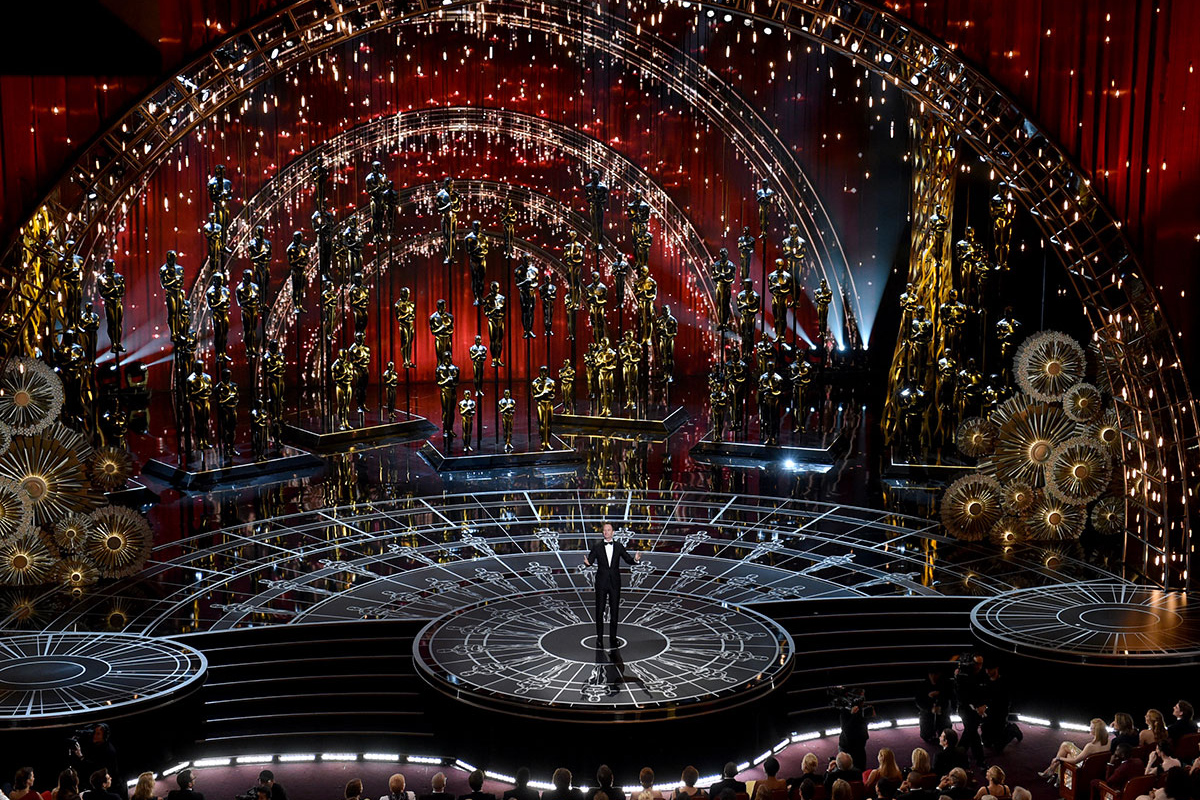
 NPH amidst a stage that's giving us steampunk Oscar glam realness
This is Derek McLane's third time desigining the Oscar stage (he won an Emmy for last year's) and it's clear why Meron & Zadan love him, though please let us not speak of his designs for Peter Pan Live!
But, how well does this year's stage design hold up? Take a look at the last ten years of Oscar stages, which have in the last decade alone garnered 5 Emmys for Outstanding Art Direction for Variety, Nonfiction, Reality or Reality-Competition Program, nabbing a nomination every single year. Talk about a hot streak!
86th through 77th Academy Awards after the jump...
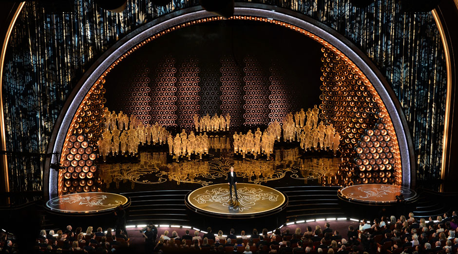
 86th Academy Awards (Host: Ellen DeGeneres). Designer: Derek McLane
 85th Academy Awards (Host: Seth McFarlane). Designer: Derek McLane
 84th Academy Awards (Host: Billy Crystal). Designer: Oscar winner John Myhre (Chicago & Memoirs of a Geisha)
 83rd Academy Awards (Hosts: Anne Hathaway & James Franco). Designer: Steve Bass
 82nd Academy Awards (Hosts: Steve Martin & Alec Baldwin). Designer: David Rockwell
 81st Academy Awards (Host: Hugh Jackman). Designer: David Rockwell & Michael Whetstone
 80th Academy Awards (Host: Jon Stewart). Designer: 10 time Emmy winner Roy Christopher
 79th Academy Awards (Host: Ellen DeGeneres). Designer: Oscar nominee J. Michael Riva (The Color Purple)
 78th Academy Awards (Host: Jon Stewart). Designer: Roy Christopher
 77th Academy Awards (Host: Chris Rock). Designer: Roy Christopher
Which one is your favorite?
I have a weakness for AMPAS's blue period (but that might be because I still think the Hugh Jackman year remains the high watermark of these most recent ceremonies), but there's something to be said about those beautiful deco flourishes and those seemingly perennial Swarovski curtains.


Reader Comments (18)
I thought the set this year was staggeringly beautiful. As gaudy as possible without crossing the line into tacky. I stared at it the whole time. (I also didn't think Harris--or the show--was so bad.)
These are so beautiful. Like little tiny snow globes of decadent glittery fabulousness.
This year's stage was interesting but so busy. For me it's between the clean blue of the 81st with Hugh and the sparkle of the 85th with Seth.
This year was the high mark for me. It was the first time I remember commenting on how gorgeous it was more than once during the show. Second choice would probably be MacFarlane's year - really pretty, though I remember the strangeness of it matching Adele's dress when she sang. Hugh was easily my favorite host, and when they had those images of the nominees with five actors walking out to present a person each? STUNNING set pieces for that. The copied version the next year wasn't nearly as majestic.
I like all of them except the 77th (too Beverly Hilton-Golden Globes-our budget is SO tight). if I had to pick just one, it would be last year. This year looked great from a distance, but in close up, you could see the Edison bulbs and wires and it lost a lot of its magic.
But why don't they just move the awards to Radio City Music Hall since that is the look they are trying to copy.
I could live in that 82nd design. <3
This year was good, but I liked the 85th best. I also liked the 82nd.
This year's set was my favorite of this group. The stage glittered like Mrs. Haversham's garden sparking back to life in an electrical storm swimming with giant fireflies. Absolutely breathtaking. Too bad NPH had to stink it up with his lousy jokes.
The 77th year hosted by Chris Rock is my least favorite (and I loved him as host!), with its cold metallic feeling. And those giant panels resembling the Microsoft logo certainly don't warm up the place. Blech.
What a great idea for an article, I love perusing these!
I usually prefer a minimalist approach, but I think this year's is head and shoulders above the rest. Stunning and new. But the 82nd and 85th are the runners-up.
For some reason I don't like it when the orchestra isn't there...
ALL of these are gorgeous but my absolute favorite was the 2001 (74th) Oscars, whose set seemed to pay homage to Moulin Rouge. That also happened to be my favorite telecast because they made a point to explain and show via clips what each technical category was about. That was the last time the Oscars felt like a classy important event, and they need to go back to that.
Derek McLane has a cheap aesthetic.
This year was the first year where my mouth literally hung open, the stage was so beautiful. Like, it literally took my breath away. I've noticed this a lot this year though. I though the BAFTA stage was a marvel for the eyes.
Not crazy about the 77th or the 80th, but it might just be the photos. I love what McLane does with that theater.
This year's had beautifully designed depth to the stage, but too Christmas-y.
I like the beehive stage of last year's the most. At least it was strange, with ghostly Oscars on stage.
Second would be 85th for its openness and the many Oscars framing the stage.
Jackman's is beautiful, minus the rectangular partitions on stage and the absence of the actual statue in some form (other than it being on the screen on the upper right.
Worst has to be 78th...
Manuel you know how to make a boy feel special. Such a great compilation, with favorites being the 87th, 85th, and 81st (seriously where are they hiding that Swarovski curtain?). Honorable mention to the 72nd with their Y2K realness design, and the 40th for their technicolor Regency-esque? style. If only my room sparkled that much...
Everything about the 81st was perfection. The stage is pretty much on the same level as the audience. The stage feels massive in depth, which if you've been to the Dolby is pretty much impossible.
Also, the seating of the 81st was brilliant. It's have a circle, and I just love that audience members can be looking at each other.
Finally, when the Acting awards were handed out and the screens moved to reveal the previous winners? OMG.
The only thing I didn't like about the 86th design were the Oscars in the background that looked like big Gummibears.
I loved that the 84th Oscar stage looked like a classical cinema with the red velvet curtain.
My favorites are the 81rst and 82nd Oscar stages. I just love blue. <3