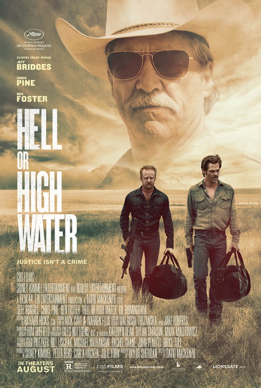
The Furniture: Porches and Nostalgia in Hell or High Water
 Monday, November 28, 2016 at 2:00PM
 "The Furniture" is our weekly series on Production Design. Here's Daniel Walber...
 The Old West has been dead since well before the dawn of cinema, and so the best Westerns are parables of a way of life in decline. Yet despite the history, there are plenty for whom the mythology of the cowboy and the outlaw isn’t extinct. That’s why the Western has lived on, well after the death of even the oldest Americans who could remember those days. It’s also what drives films like Hell or High Water, which use symbols to chronicle the last days of the Old West’s cultural descendants.
It takes place in a nearly empty West Texas, now being picked over by banks. Taylor Sheridan’s script is insistent in its reminders of this context. “No wonder my kids won’t do this shit for a living,” says an anonymous cattle rancher fleeing an encroaching fire. “The days of robbing banks and trying to live to spend the money - long gone,” says an anonymous old man in a burger joint.
This is why the surface tension between the criminal brothers (Ben Foster and Chris Pine) and the aging Texas Ranger (Jeff Bridges) is a red herring...

They are all fossils, equal parts of a narrative equation that is itself a thing of the past. Production designer Tom Duffield (The Birdcage), art director Steve Cooper (X-Men: First Class) and set decorator Wilhelm Pfau (MacGruber) make this quite clear.
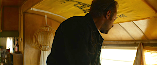
Take, for example, the trailer where Tanner (Foster) is currently living. There's a “Don’t Tread on Me” flag on his ceiling. Neither subtle nor original, it's stands for the hollowness of his struggle.
Generic symbols of an Old West patriotism crop on walls throughout the film. In the diner, a proud eagle perches above the generic diner-style benches.

Here’s another one. Marcus (Bridges) and Alberto (Gil Birmingham) rest under a framed print of a Western equestrian painting.

The next shot is closer to Marcus, who sits next to his overturned white cowboy hat sipping a Shiner, a beer nearly as old as cinema.

The color palette and the lighting of nearly every interior in the film shares this gloom. The walls are all in decaying tones of yellow, blue and green. The last room where Tanner and Toby’s mother slept before her death is especially despondent.

Yet one design element presents a counter-narrative to all of this decline. As anyone who has watched a classic Western can tell you, this is a genre about porches. Look no further than that iconic image from My Darling Clementine, Henry Fonda kicking up one of his legs.
Hell or High Water may have more porch shots than any other Western. And while most of them are more interesting for their cinematography than their production design, there is one porch in particular that holds major metaphorical import. It’s the one on the central ranch house, which the bank stole from the boys’ mother and for which they now rob that very same bank.
Here it is, before the money has been won. The tank in the back is rusty. The wood is unpainted. The grass is brown, the bushes untended.

In the film’s last few minutes, Marcus comes to this same porch. Time has jumped forward, and the ranch looks markedly different. The oil drills are only the most obvious change. The windows and the tank are clean. The house and the columns have been painted white, complementing the much greener yard around them.

This is a fantasy, even if the plot insists otherwise. Toby has recreated some of the good old days, with the immense wealth of discovered oil and a white painted house. It’s so different from everything else in the film, an endorsement of the robberies and the refusal to accept reality. Maybe it’s a statement by Sheridan and director David Mackenzie that another world is possible for West Texas. But more likely it is a conclusion without resolution or even ideology, like Sheridan’s script for Sicario. This is a land of lost men and cyclical crime. There is no future. There is only memory and metaphor.

previous 2016 films on The Furniture
Ghostbusters | Star Trek Beyond | Hunt for the Wilderpeople | The Conjuring 2 | Love & Friendship | Weiner-Dog | The Lobster | Everybody Wants Some !! | The Witch | Hail Caesar! | Deadpool


Reader Comments (6)
The more I talk and read about it, the more I love this movie. No movie has ever done a better job of representing how small and desolate all these West Texas towns are. It's freaking perfect.
Ben -- i like it more the more i read pieces about it. I'm sure it's headed to Oscar nominations.
Daniel - fantastic writeup. One of my favorites in this series.
Nice post!
Yes, the hospital bed with the plastic mattress, that spoke volumes.
I didn't notice that the porch had been painted. An endorsement? Maybe. Or just an observation: people can commit crimes and live pretty happily ever after, especially if they have saved their children from hopeless poverty.
My favorite scene, I've come to realize, was the one in the casino when Toby watches the news. I can't get it out of my head.
This is such a good movie I hope it does not get ignored at Oscar time
I loved the note about the porch - very perceptive.
This film gets better in my memory all the time. Particularly the believable and easy rapport between the two pairs of actors (Pine & Foster, Bridges & Birmingham).
A big contender for BEST CAMEO has to be Margaret Bowman as the acerbic waitress:
'How are you?' 'Hot. And I don't mean the good kind.'
'What don't you want?'
(interrupting his order) 'That wasn't a question.'
For me the most striking design elements were the billboards for check cashing and payday loans set against the western landscape. A perfect visual representation to underscore the theme of corporate greed draining the life from the region.