The Furniture: A Scenery Buffet for the Battling Burtons
 Monday, March 6, 2017 at 10:39AM
Editor's Note: "The Furniture" is our weekly series on Production Design. We strongly suggest going forward that you click on the images to see them in their more detailed large glory. Many older films were of course designed for giant screens, not thinking of their eventual home as phones or small TV set.
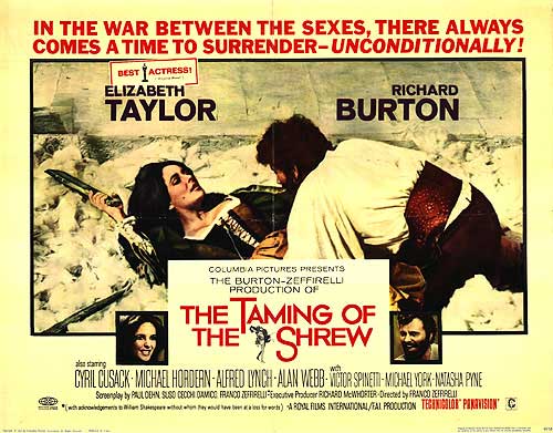
Franco Zeffirelli is not a man of subtle tastes. When he’s lucky, his opulent excesses achieve camp status. But when he’s not, it rolls over the audience like an 18-wheeler full of circus elephants. This has generally been the rule for his theatrical productions, some of which have nonetheless become war horse mainstays at major opera companies.
And so it may come as something of a surprise that the director’s overzealous artistic passion actually works quite brilliantly in his film version of The Taming of the Shrew, which opened 50 years ago this week. It turns out that his style is perfect for the frenetic madness of William Shakespeare’s screamiest comedy, heightened to a fever pitch by the deafening roars of Elizabeth Taylor and Richard Burton.
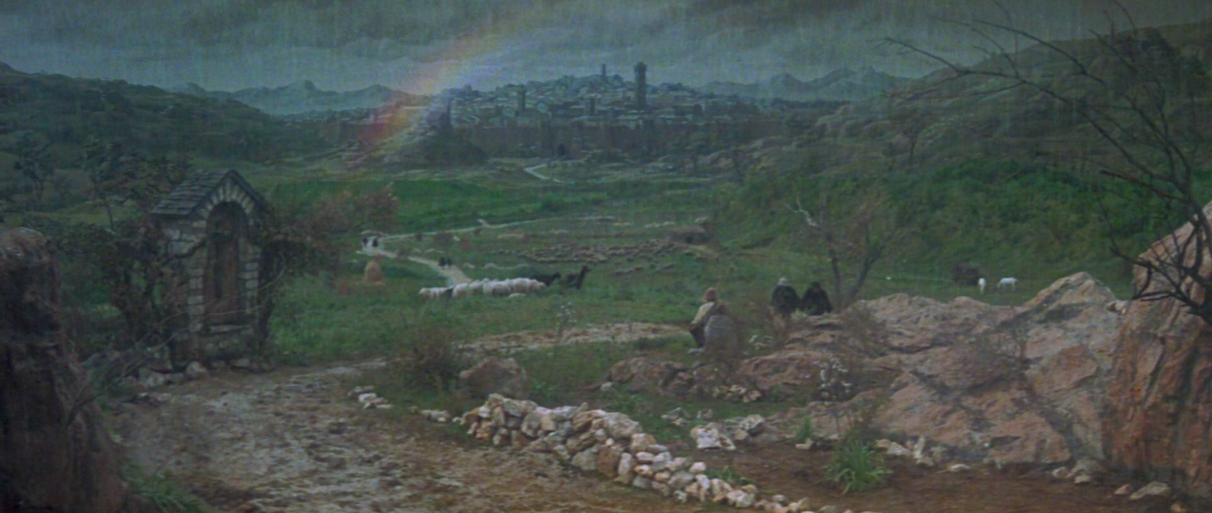
The setting is Renaissance Padua, introduced by way of a delightfully pastoral matte painting. Not content simply with a city in the rain, Zeffirelli showcases a rainbow. Two-dimensional sheep mingle with their three-dimensional, breathing brethren...
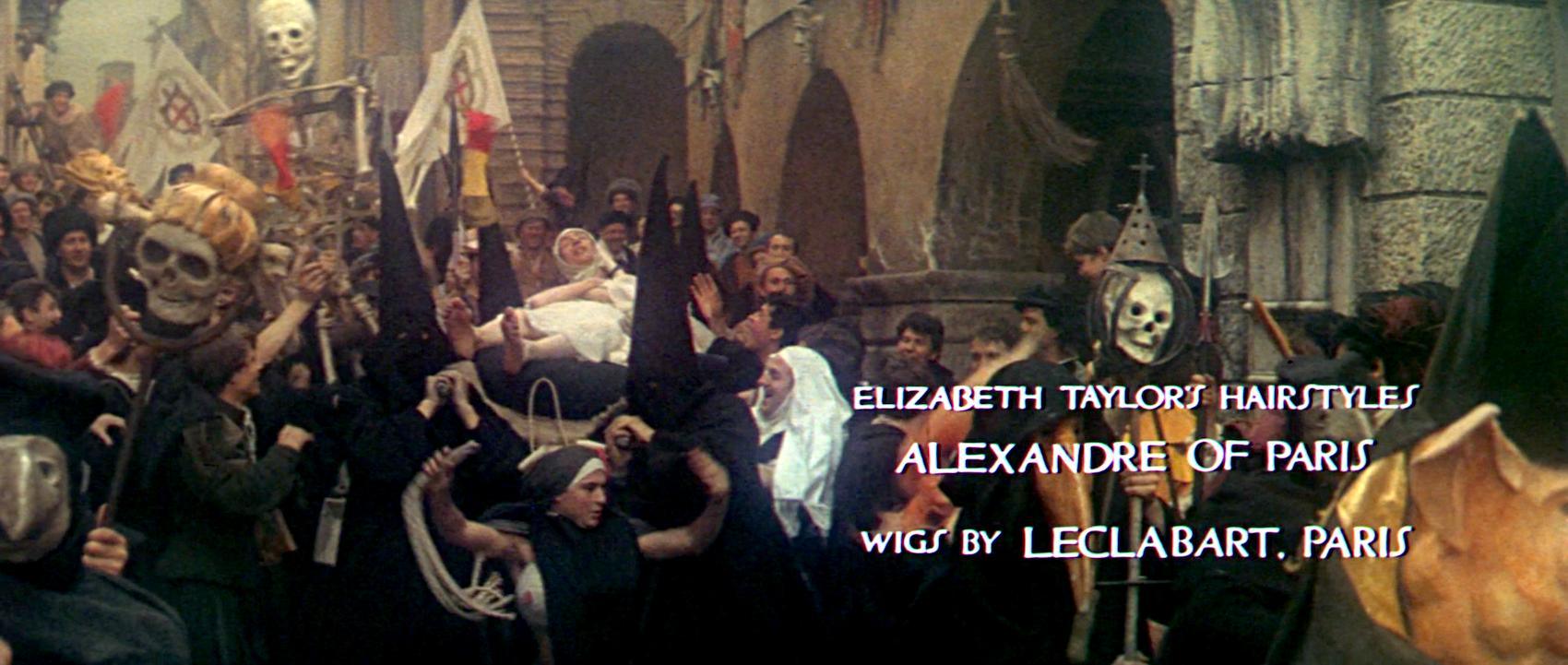
Lucentio (Michael York, in his film debut) arrives in the midst of a boisterous graduation festival. The tiny streets fill with crowds of brightly dressed youths and enormous puppets, a procession that launches the opening credits.
Lucentio falls for Bianca (Natasha Pyne), but she cannot marry before her elder sister Katharina (Taylor). And so a flamboyant and willing hero is recruited to woo her, the lusty charlatan Petruchio (Burton). He, Lucentio and all of their rivals descend upon their ostentatious Renaissance palazzo.
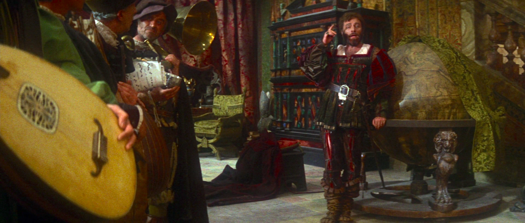
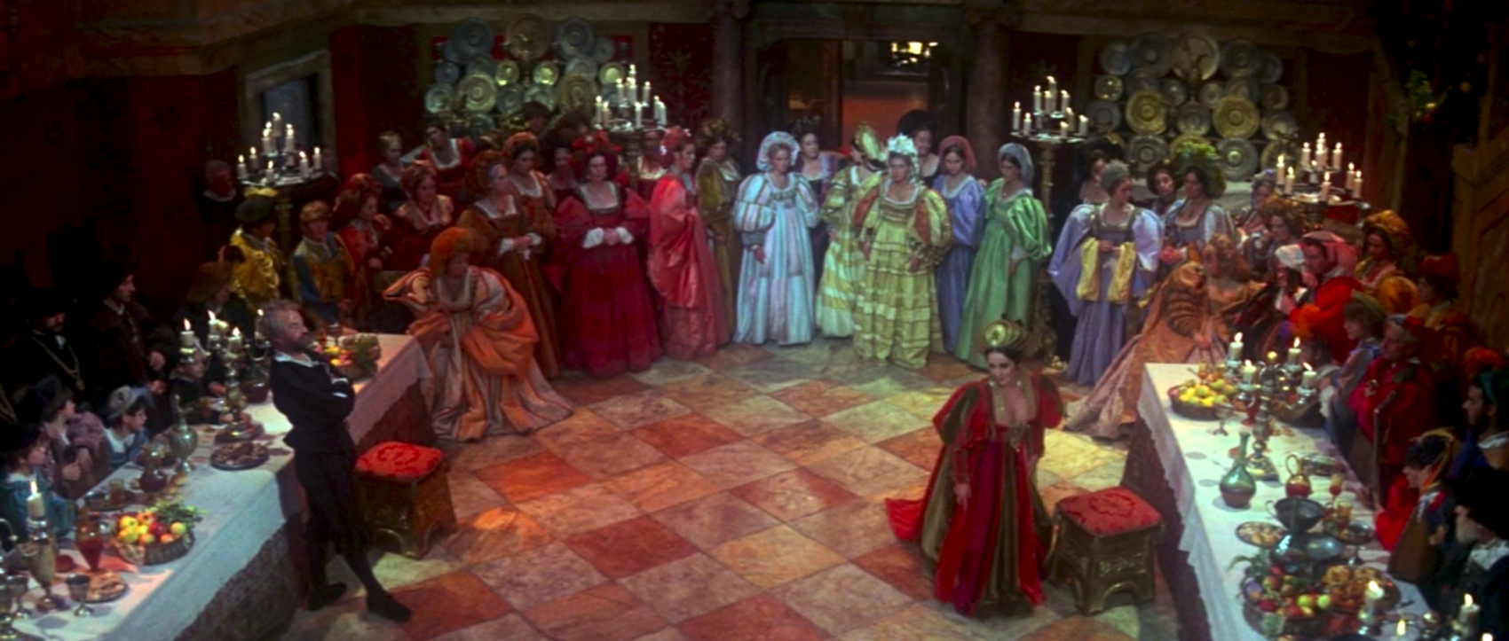
The interior sports tapestries and stained glass, ornate lanterns and walls of vibrant Italian marble. Every available inch is filled with the work of Oscar-nominated production designer Lorenzo Mongiardino, art directors Giuseppe Mariani and Elven Webb, and set decorators Luigi Gervasi and Dario Simoni.
Or, rather, every inch that hasn’t already been claimed by the equally extravagant work of Oscar-nominated costume designers Danilo Donati and Irene Sharaff. The clothes complement the shapes and colors of the sets. Here, Burton’s ensemble echoes the garish dresser behind him.
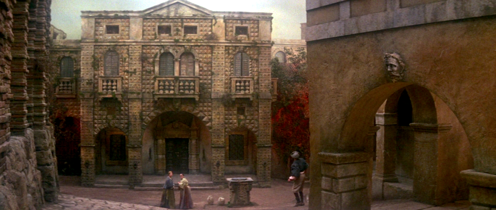
Zeffirelli has often used extras and their costumes as part of his grand backdrops, and The Taming of the Shrew is no different. The piazza outside, a set that includes a fountain and a church, is an ideal place for this. All of Padua seems to turn out for Katharina and Petruchio’s wedding, filling the square nearly to capacity.
(But don’t let the size of the crowd distract you too much from the frescoes painted on the buildings themselves.)
 please do click to see the details
(But don’t let the size of the crowd distract you too much from the frescoes painted on the buildings themselves.)
That said, opulence alone doesn’t make for great production design. What raises The Taming of the Shrew above Zeffirelli’s lesser works is its comic purpose. This scenery was built expressly for Taylor and Burton to maniacally chew. The production team feeds their deranged thespian hunger with a hefty supply of furniture.
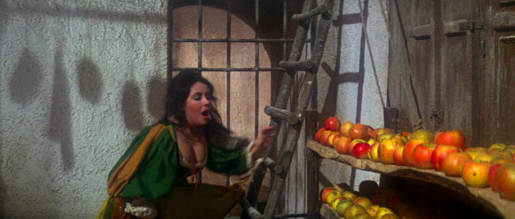
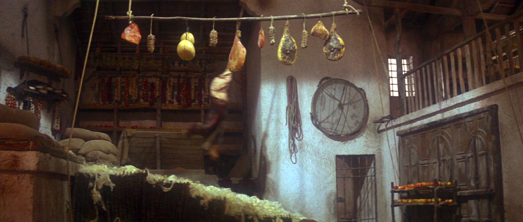
The first battleground is the palazzo’s storage wing, overflowing with wool and fruit and cured meats. The sets amplify the shouts and snarls of the adversaries, as they burst through trap doors and fly up stairs.
Petruchio even vaults through the air, hurtling past a charismatic array of hanging meats.
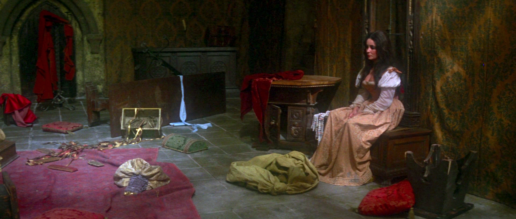
Furniture is introduced only for Katharina to throw it. Petruchio calls from an elaborate meal of pears, meats, soup and polenta, then tosses it all to the floor. Later he does the same to a fabulous array of Renaissance clothing. Here Katharina sits amid the wreckage.
Eventually the destruction leads to a happy ending, but not a quiet one. Zeffirelli suggests that the couple finds stability when Katharina finally realizes their similarity, a shared love of loud choleric behavior. The finale is not a submission, but rather an opportunity for the newlyweds to finally direct their combined malice at everyone else.
It’s not only a creative reading of the play, but also a perceptive use of the couple’s off-screen reputation, not to mention their immediately previous triumph in Who’s Afraid of Virginia Woolf? Rarely has production design been so extravagant in its uproarious, hilarious rancor.
Other 1960s films featured in 'The Furniture':
The Wonderful World of the Brothers Grimm (1962), How the West Was Won (1962), Come Blow Your Horn (1963), Fantastic Voyage (1966), and The Oscar (1966)



Reader Comments (5)
It is a baroque dream overstuffed with busyness but since the stars are outsized personalities playing outsized personalities it all comes together and works. This is one of Liz & Dick's best pairings and the overall look of the film adds much too it.
I'm trying to think of modern movies this overstuffed with "stuff to look at" and they're really not all that common anymore. Moulin Rouge! and... ?
Nathaniel-
THE BLING RING!
Those scenes alone recreating Paris Hilton's house and all the goodies inside were amazing! So many places to look
Nathaniel - there definitely are fewer examples of this these days, probably a result of budget priorities shifting away from opulent production design. I do think both Florence Foster Jenkins and Marguerite head in that direction, showing fandom as the crazed accumulation of stuff. Joe Wright's Anna Karenina is also pretty rich.
I'd say the work of Tarsem Singh fits that mold.
"Furniture is introduced only for Katharina to throw it."
Sounds about right for an Elizabeth Taylor movie.