FYC: The Furniture's 2017 Oscar Ballot
 Monday, January 8, 2018 at 4:41PM
"The Furniture," by Daniel Walber, is our weekly series on Production Design. You can click on the images to see them in magnified detail.
 Production design can be a tricky thing to award. Like so many other categories, there’s a tendency to simply recognize “most,” rather than “best.” Moreover, great design can hide in plain sight. Brilliantly-conceived sets can seem like ready-made locations, particularly in contemporary films. Transportive design elements sit in the background, working their magic under the radar. It can take both a close eye and a little extra research to identify the year’s best work.
Still, here we are. Oscar voting is open and it’s time to make a last pitch. Below are my ideal nominees for Best Production Design, five films that often press up against detailed realism, while never letting go of their own movie magic...
Honorable mentions: Afterimage, Atomic Blonde, Frantz, King Arthur: Legend of the Sword, mother!, A Quiet Passion
The Beguiled - Anne Ross, production designer - Jennifer Dehgan, art director - Amy Beth Silver, set decorator
I’ve already written about The Beguiled at length, but I’d like to draw attention to one detail I missed in the first pass. The iron gate outside the house, framing the facade of Madewood Plantation, was designed specifically for the film. (You can read about this process and more in this excellent interview with Jennifer Dehgan.) The imposing ironwork is a perfect complement to the action, amplifying the tension from above. The interior staircase does the same, as well as the cloudy mirror in the room where Colin Farrell recuperates. Much of the design team’s triumph involves the profound, but also subtle adaptation of these locations to the needs of the film. It is muted but not monochromatic, hazy but not dull.
Casting JonBenet - Leah Popple, production designer
Along with being the best American documentary of 2017, Casting JonBenet also includes some of the year’s most evocative production design. In fact, the movie wouldn’t really work without its sets. They provoke questions and dislodge memories, lending the interviews/screen tests a therapeutic, if also troubling quality. Director Kitty Green uses them to slowly escalate, passing slowly and deliberately through the spaces of the Ramsey home. The breathtaking final sequence is like a communal exorcism, in which the Ramsey stand-ins multiply before our eyes - that is, until the rug is pulled out from under us and the sets are exposed as just that, replicas on a soundstage. It’s breathtaking and chilling, a meticulously conceived enigma of American memory and anxiety.
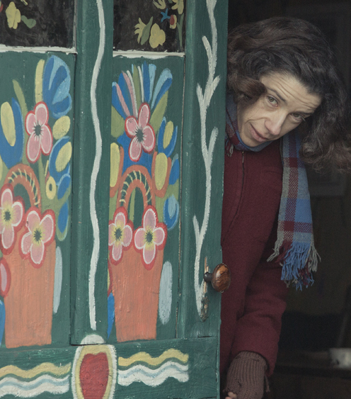
Maudie - John Hand, production designer - Owen Power, art director - Dara Hand, set decorator
I am perhaps biased, in that I have seen Maud Lewis’s actual house, which now rests in the Art Gallery of Nova Scotia. But the design triumph of Maudie isn’t one of replication. There’s no record of what the house looked like before Lewis started painting, nor of its intermediate stages. The production design of Maudie, therefore, is a speculative and sensitive reading of creative development. The walls are a canvas for depicting self-discovery and actualization, an equal partner with Sally Hawkins. The choice to begin with blues, bluebirds and blue flowers, is especially inspired, a bright assertion of the creative spirit with little concern for dwelling in the adversity of circumstance.
Nocturama - Katia Wyszkop, production designer
Realistically, this is the only one likely to make it to an Oscar nomination, though The Beguiled might have a shot. The Shape of Water may even win, and it would deserve it. The design of the world outside of the military facility is just as enchanting as that within, from the sickly green pies to the duck-shaped shoe brush that Elisa (Sally Hawkins) uses every morning. Her oceanic wallpaper is a marvel in an of itself. There’s a lush, visual consistency in the film’s rejection of the commodification and corporatization of the American mind, military as well as artistic. The Shape of Water is a passionate assertion of beauty both fantastic and domestic, the blue of the eternal deep shimmering against the gelatinous green of the future.


Reader Comments (6)
Wow, this is a perfect ballot. Fantastic work. Thank you for the insights!
I'm just disheartened "Wonderstruck" has been so dismissed this awards season, and this is certainly one of the categories it ought to be recognized in.
You have left me wanting a whole huge essay on SHAPE OF WATERs production design.
that anecdote about THE BEGUILED's iron gate!
I think I'm team The Last Jedi re: this category (not that I expect it to actually get a nomination of this sort), but I appreciate you highlighting this side of Maudie. It wouldn't have occurred to me, but you make a good point.
I love how Maudie’s house changes each time we see it, bit by bit. From the paintings on its wall, windows, door.. even the decorating stuffs keep adding up. It reflect the change in the couple’s life along with the storytelling. She lights up his life. Great Production Design work.
If i had a ballot:
The Shape Of Water
Blade Runner 2049
Atomic Blonde
Downsizing
mother!