'Nightcrawler' and L.A. in the Digital Age
 Wednesday, October 29, 2014 at 8:58PM
 Glenn here to offer a rebuttal to my own work.

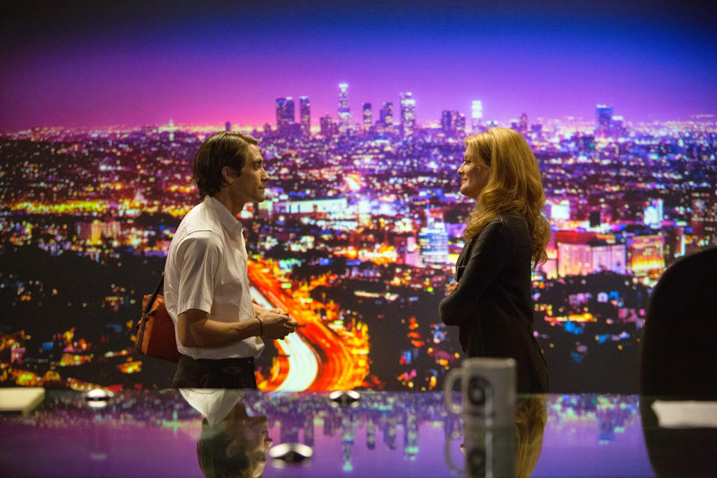
When I reviewed David Cronenberg’s Maps to the Stars at the New York Film Festival, I was highly critical of the film’s look. It’s the ugliest film of 2014 so far and will likely remain a recurring staple of my anti-digital rants for some time to come. Fair is fair, however, and lest I get the reputation of somebody who is strictly against digital, I wanted to sing the praises of Robert Elswit’s work on Nightcrawler. Neither a horror film as befitting its Halloween release date, nor a superhero film like many people have thought due to its title. Yet, in spite it this, the film works as both an unsettling work of urban and moral decay and a portrait of a man who, in his own eyes, is a bit of a hero.
Nightcrawler is a film that has a visual point of view, finding interesting compositions to tell a story that in the grand scheme of things is fairly conventional in its narrative beats and structure. It takes the familiar image of Los Angeles and twists it into a city where at night it becomes a muddy-skied haze. This is a film that is both gorgeous to look at and repugnant to the eye at the same time. The Los Angeles of Nightcrawler seethes and creeps and Elswit’s camera shows just what can be achieved with the medium.
Directed by Dan Gilroy - not to be confused with brothers Tony Gilroy (the film's producer and director of Michael Clayton) or John Gilroy (the editor) - it's certainly very much inspired by the form-pushing work of Dion Beebe (Team Film Experience’s Top Ten Greatest Working Cinematographers) and Paul Cameron on Michael Mann’s Collateral. I don't consider this much of an issue given that film had perhaps my favourite cinematography of the '00s, and what’s the point of groundbreaking work in the industry if it can’t be adapted and played with by future filmmakers? In a way it's the same as how another Jake Gyllenhaal film, End of Watch, appropriated the look made famous by found footage horror and supplanted it onto the streets of gangland L.A.

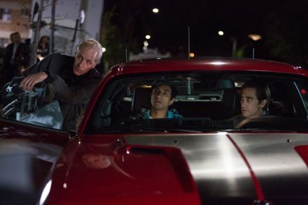
Despite what some people may think, I am very much capable of falling head over heels for digital camerawork. I just appreciate it when filmmakers do something with the format that you otherwise can’t with film. What’s the point of the conversion if not to do something unique that sets it apart? I have no doubt celluloid would have worked amazingly for Gilroy's film, and in fact he did film the daytime sequences on 35mm highlighting how different the two mediums can be. I enjoyed watching that disparity taken advantage of, an aesthetic choice that entirely works for Nightcrawler as it captures Gyllenhaal’s sunken face as he films the aftermath of the city’s violence, pawning his footage to bottom-of-the-barrel TV networks. Leaving my screening and I couldn’t help but think of what Maps to the Stars could’ve been if they’d had anything close to resembling Nightcrawler’s keen sense of craft. That the film is partially about the alarming ease that we can capture the world within which we exist, it makes it incredibly relevant piece of work, too.


Reader Comments (3)
so excited for people to see this one. So much worth recommending about it even if i'm not sure about it as a whole film. but you're right. it sure does look good and the performances are just on fire
"What’s the point of the conversion if not to do something unique that sets it apart?" Amen to that, Glenn!
I also really liked this. The visuals are not only great but so absorbing and appropriate for the theme of the movie. And the performances are fantastic. Not only Gyllenhaal and Ahmed which are great, but also Ruso, who I'd never thought much of as an actress defends her character quite well - I thought she had to walk a fine balance to make her dynamics with Gylenhaal's character somewhat "believable" (not the right word, I know, but at least to keep it from being blatantly preposterous) and I think she got that. I wonder if the fact her husband's the director (plus maybe she's trying to stage some sort of comeback?) pushed her over her usual mediocre range.
If I'd gone into more of the film's acting and story mechanics and themes I could've talked for ages. Russo is indeed fantastic. Hopefully good enough to remind some casting agents.