FYC: "Pain and Glory" for Best Cinematography
 Thursday, January 2, 2020 at 3:00PM
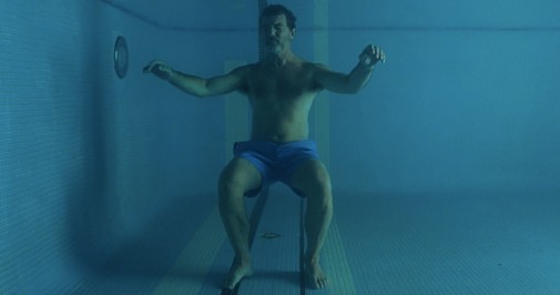
Pedro Almodóvar might be known for his brilliant reds, but his latest and most autobiographical film starts in blue. Submerged in blue, as it happens. In the bottom of a swimming pool tiled in shades of cyan, we find our blue-clad protagonist, underwater, pensive as he is enveloped by diluted chlorine and the memories of a distant past. They are remembrances of maternal warmth and white linens drying in the sun, shots so beautiful they seem more real than the present life for which they are prologue. Color theory has its limitations, of course, and Almodóvar's brush is guided more by emotion than by dogmatic rules. José Luis Alcaine's photography follows the same logic…
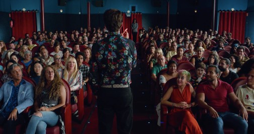
Throughout Pain and Glory, blue acts like a conduit of longing for what is long gone. Its cool shades taint the liveliness of the other colors in sets and costumes, talking to them in conversations as antagonistic as they are complementary. Though, when it comes to the dialogues between blue and red, the discourse gets particularly complicated. Red burns bright with emotion but blue is the submission of the feeling, it's loss and the pain of absence. It's an old lover in red talking to an artist lost in azure sadness.
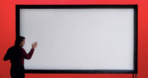
To chart Almodóvar's filmography is to see an aesthetic of melodramatic artifice being born out of transgressive experiments, the maturity of an old man coming from a chrysalid of wild provocation. It's red bleeding blue. Moreover, his films don't look natural, even when they are shot outside in unadorned landscapes. The light has the quality of stagecraft and the mise-en-scéne is always rich with patterns and colors too bright to be anything but a dream. Alcaine has been the director's DP for decades and his technique has heavily informed this look, perfecting a style that's instantly recognizable but also rich with the evocation of raw sentiment.
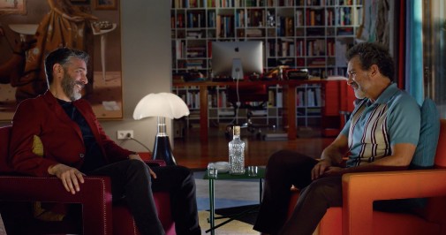
In Pain and Glory, these filmmakers' collaboration reaches its sublime apotheosis. Nothing could be more appropriate, for this is a story concerned with the theatre of memory but also with the evolution of artists and their visions. After all, red and blue are not only the colors of the protagonists' conflicting emotions. They are also the décor of the Spanish Filmoteca where ultramarine walls are accented by drapery in red velvet, the shade of open wounds and ripe strawberries.
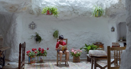
As mentioned before, there's also the matter of the film's photography making memory into something more real than the principal action, cinematic in opposition to the theatricality of the present. It's as if the past is more authentic than a life lived in the now. The past is concrete, stable and full of wonders. It's also a formless marvel asking to be turned into cinema by those lost in the pain of current affairs. If memory is real, the contemporaneous happenings have the stiltedness of a play directed with an eye too attuned to rigid blocking in detriment of organic motion.
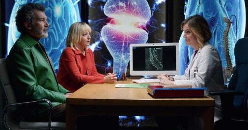
Notice how Alcaine shoots the interludes between mother and son with wandering cameras and a luminosity suggested by natural sources. A visit to the doctor's office in 21st century Spain, on the other hand, is a hallucination of colorful lights making paintings out of office backgrounds and foregrounding perfectly lit actord. In the cave, if you looked up, you saw the sky, but now you only see a picture of the sky. Now, a consultation with clinicians has the same look as a staged monologue. Life is a show and memory is cinema. Cinema is real. In the end, it's all autofiction. It's blue and red, Pain and Glory, it's Almodóvar's heart and Alcaine's camera.
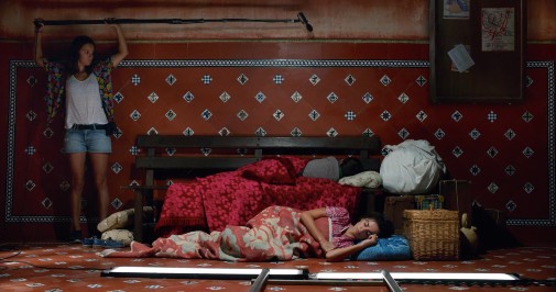
In other words, it's Oscar-worthy work. The production design of Antxón Gómez is also stupendous and Alcaine's lensing wouldn't be as perfect without it. Oscars for everyone!


Reader Comments (7)
It's a beautiful movie in more ways than one
This is why I always love watching Almodovar. He's a master.
I've never quite warmed (heh) to Almodovar's visual style, and I'm afraid "Pain and Glory" didn't convert me. Sure, it's colorful, but it all reads so flatly to me - rarely do I retain or marvel at individual compositions or lighting choices.
Personally, I would stump for "Ad Astra," "The Lighthouse," "Portrait of a Lady on Fire," "A Hidden Life," and "The Painted Bird." It's astonishing to me that any of those could be overlooked!
yesterday I analyzed the use of cinematography in this film at a post of Awardsdaily and how Alcaine and Almodovar contrast the timing with the palette and even atmosphere, to create a Moebius band structure for the film, an infinity loop in which is impossible to select where is the real starting point and when it actually you can set a real ending... it is a complete masterpiece.
It's too bad the popular players will get the cinematography nominations because the work in Pain and Glory, The Lighthouse, Portrait of A Lady on Fire and Ad Astra are more interesting to me.
Three of the most emotionally effective scenes of the year for me in this one film. Gorgeous in all ways.
I am looking for article regarding stress management in dentistry.