93rd Academy Awards: "Cinematography as ________ "
 Monday, March 29, 2021 at 7:30PM
 Please welcome new contributor Timothy Lyons...
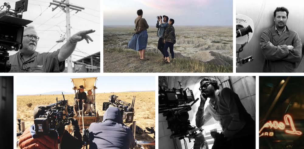
The cinematographers’ branch (like all branches in the Academy) loves a familiar face - think your Lubezkis, your Richardsons and your Deakinses. One of the happy byproducts of an unusual cinematic year mostly void of big anticipated productions and usual suspects, is the higher-than-normal number of newbies recognised across the craft categories for this year’s Oscars. The five nominees for Best Cinematography are made up of: one returning nominee, one longtime veteran of the industry finally getting his due, one up-and-coming darling of the indie scene, one newcomer shortlisted for his feature film debut, and one individual who is (shockingly) on his first nomination despite shooting one of the most picturesque Best Picture winners (!) in recent memory.
Let's explore the five achievements the Academy has chosen to reward these artists for, presented in ascending order of personal preference…
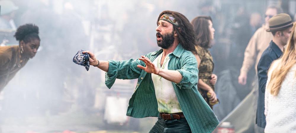
5. THE TRIAL OF THE CHICAGO 7 (Director of Photography - Phedon Papamichael)
“Cinematography as Simple Conduit”
We begin with the nadir of the category - an example of a coattails nomination if ever there was one. Phedon Papamichel was previously nominated for his far superior work on Alexander Payne’s Nebraska (2013) and I can only imagine the reasons he has returned here are because: 1) he is one of the few recognisable names on the ballot and; 2) his work is attached to one of the (inexplicable in this case) Best Picture frontrunners. There is nothing particularly wrong with Papamichel’s work here - it is perfectly polished and pleasant to look at - it’s just that it is so wholly pedestrian and really only there in service of getting writer/director Aaron Sorkin’s script to the screen.
Take the courtroom scenes which are shot almost exclusively in a slightly low-angle mid or two-shot. There is nothing extra in the visual language to give Sorkin’s words and the actors’ speechifying any additional life. While Papamichel could be forgiven for perhaps not wanting to ‘overdo’ these passages, one only has to look at the riot and demonstration portions of the film to see where his work really fails to push things cinematically. There is a distinct lack of movement and immediacy to these scenes, particularly in the altercation on the hill. The players are all there, they’re laying it all on the line - projecting bravely, but there is a two-dimensionality or flatness to the way it’s all presented. There is a distinct lack of depth that brings to mind the aesthetic of an early-2000s HBO TV-movie - attractive enough but uninteresting.
Perhaps much of the blame should be laid at the feet of director Sorkin who I’m sure had just as much input on how the whole thing was to be presented. But is an Oscar nomination really the right reward for a DP struggling valiantly against a director ill-equipped to direct his own screenplay?
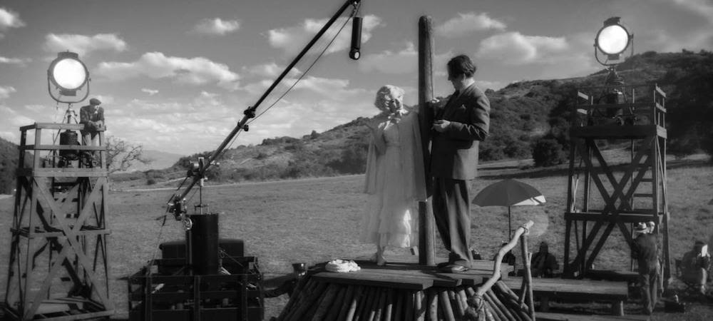
4. MANK (Director of Photography - Erik Messerschmidt)
“Cinematography as Stylistic Copycat”
Erik Messerschmidt receives his first nomination for what is actually his first credited work as cinematographer on a narrative feature film. Before lensing David Fincher’s ode to old Hollywood, Messerschmidt worked as the gaffer on the director’s Gone Girl (2014) and shot most episodes of Netflix’s psychological crime saga Mindhunter, executive produced and partially directed by, you guessed it, David Fincher. Messerschmidt takes over the mantle of Fincher’s DP from frequent collaborator Jeff Cronenweth (Fight Club, The Social Network, Girl with the Dragon Tattoo, Gone Girl) and while watching Mank, I couldn’t help but wonder what a talent like Cronenweth might have added to proceedings beyond the visual aping on display.
On the surface, the elements are all here for a journey back to the Golden Age of cinema: black and white, high contrast, soft faces, tableau-like composition and a graphic use of light and shadow. While I can’t believe I’m about to write this, what’s missing is the heart. The film only truly comes alive visually during scenes at Hearst Castle, but much of this comes down to the Production and Costume Design rather than the photography. There is a coldness to it all, a strange metallic sheen that may have come from the decision to shoot on digital over film stock. There is also the sense that stylistic choices never reach beyond the expected into the exciting. Each scene is filmed as you would expect a recreation of cinema in the age of Citizen Kane to be filmed, lacking artistic risk.
One can almost pinpoint how each composition is lifted (consciously or otherwise) from an earlier work of Hollywood filmmaking. But hey, maybe that was the whole point after all. I just wish it didn’t look so often like “Drunk History presents the story of Herman J ‘Mank’ Mankiewicz”.
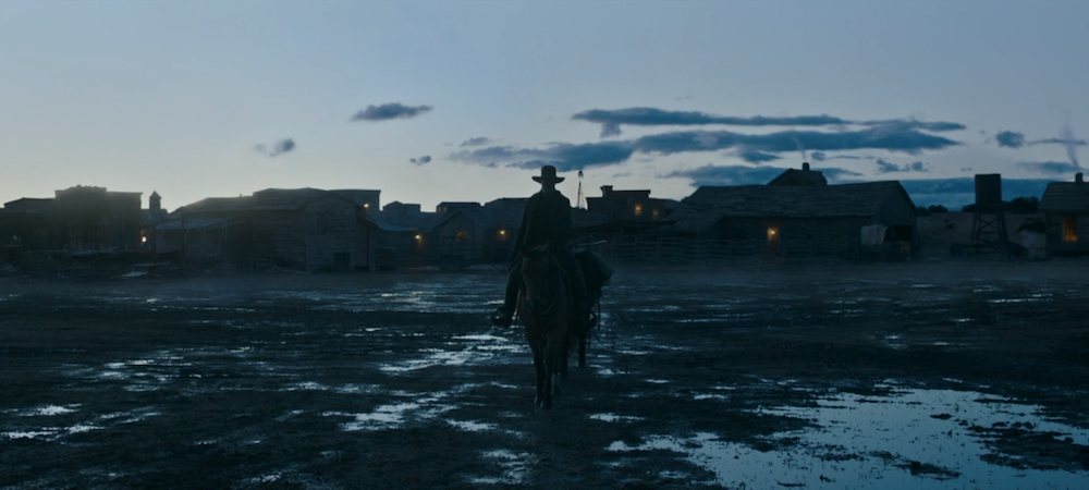
3. NEWS OF THE WORLD (Director of Photography - Dariusz Wolski)
“Cinematography as Setter of Mood”
Now we come to the good stuff. Film veteran Dariusz Wolski is shortlisted for the first time despite a previous ASC nomination (Crimson Tide), shooting a sumptuous ‘visual feast’ recognised in other craft categories (Sweeney Todd) as well as a blockbuster Best Picture nominee (The Martian). For the record, my favourite of his achievements to this day is his photographing of Alex Proyas’ sci-fi/horror/noir cult-classic Dark City (1998). Wolski is finally recognised for his work on Paul Greengrass’ neo-western come road movie.
Much of what can be expected from the genre is probably what landed Wolski the nomination: expansive panoramas of harsh landscapes, stunning aerial shots of untamed frontiers, beautiful vistas of period townships - ie. voter catnip. These scenes don’t disappoint but they are sometimes hampered by obvious CG assistance (the dust storm set-piece, numerous riding scenes, establishing shots of the various towns and villages). Why I think Wolski deserves the nomination comes in the contrast of the quieter moments: the telling of the titular news to a sea of eager faces lit only by lamplight, Kidd (Tom Hanks) leaving town on horseback in the early morning hours after a rainstorm, Kidd and Johanna by the campfire at dusk tentatively hinting at a future bond. It is during these scenes that Wolski shows his mastery of light and shade.
The emotion of News of the World is carried largely without dialogue or overt symbolism and the cinematography has to do much of the heavy lifting. You only have to revisit the scene where Kidd returns to his (now empty) marital home to see how Wolski is working at the height of his talents. The camera creeps at a slight distance, slowly following a silent Kidd through dishevelled rooms filled with soft, diffuse light and grainy shadow that stands in stark juxtaposition to the blinding desert sun outside. It is a short scene, but says so much thanks to Wolski.
2. JUDAS AND THE BLACK MESSIAH (Director of Photography - Sean Bobbitt)
“Cinematography as Probing Eye”
Every now and then I remember that Sean Bobbitt lost the Academy Award for 12 Years a Slave (2013). Then I remember that Sean Bobbitt wasn’t even nominated for 12 Years a Slave (?!?) despite stunning work and his film actually winning Best Picture (usually a recipe for success across craft categories - at least as far as nominations are concerned). Nothing will ever fix that oversight, but it is great to see Bobbitt finally honoured for his talents.
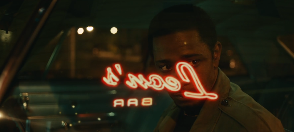
Bobbitt’s artistry here does so much to enhance the success of Judas and the Black Messiah that it's difficult to know where to start and to not go over the arbitrary word limit I’ve set myself. First there’s the sharp, gloriously lit and detailed close-ups of faces that highlight every slight twitch and nuance and get at the real human people behind the cause. There are the inky blacks that seem to creep in from the edge of the frame and choke the life out when tensions are high and; the subtle shifts in focus and composition that always keep Lakeith Stanfield’s O’Neal offset as ‘other’ whenever things seem to be getting too comfortable. Take note of the powerful contrast between the green and amber jewel-toned world inside the Panthers and the drab normality of those outside; it's as if O’Neal’s undercover life takes place on another spectrum of reality altogether. Bobbitt also successfully invokes a specific time and place without ever feeling like he is merely parodying the filmic style of the time.
What is most remarkable considering all these elements, is how all of one piece it all feels and how the cinematography never draws attention to itself. Bobbitt can probably thank Judas and the Black Messiah’s late breaking Best Picture buzz for his nomination as his work does not scream ‘most’ cinematography but this cannot take away from how highly deserved the belated recognition is. (For a more in-depth analysis of Bobbitt’s work, see Cláudio’s FYC Article here.)
1. NOMADLAND (Director of Photography - Joshua James Richards)
“Cinematography as Window into a Life”
As we come to the end of the nominees, we also come to the front-runner for the actual prize and my personal pick for the win. You might know Joshua James Richards’ work from Francis Lee’s God’s Own Country (2017) as well as Chloe Zhao’s The Rider (2017). He finds himself on his first citation thanks to Zhao’s Nomadland. For trivia buffs, Zhao also happens to be his romantic as well as creative partner.
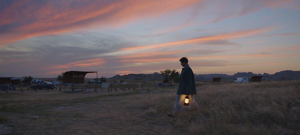
Shooting predominantly during magic hour using mostly natural light, the film has an overall ethereal, dreamlike and melancholy energy that hangs over proceedings. This quality lends itself obviously to the stunning landscapes, bringing out a richness in the surroundings, but also adds to the more intimate study of character. You can see every wrinkle and every crag on the faces of Fern and the other nomads - every life’s triumph and tragedy writ on their visage. Deep shadows reveal impossible pain while the orange glow emits a hope for a future. Out on the road there is coldness, isolation, loneliness but just over the horizon there is light. As the sun sets on the here and now, it rises somewhere along the road ahead. This strange push and pull between what is thematically so real and visually so mesmeric brings Nomadland into the realm of visual poetry - apparently simple but deceptively layered. It is so remarkable to behold but at the same time so unobtrusive.
This kind of texture in the work is what happens when the roles of writer/director and cinematographer are so tightly intertwined - it is difficult to see where one ends and the other begins and there would be no one without the other. Richards’ win is one of the biggest locks of the upcoming honours (*knocks on wood*) and it will be one of the most richly deserved.
BONUS ALSO-RANS. Minari, Cherry and Tenet are probably the films that came the closest to breaking into this lineup - having best picture heat, an ASC nom, and huge tentpole status, respectively, behind them. First Cow and I’m Thinking of Ending Things probably received a few passion votes as well.
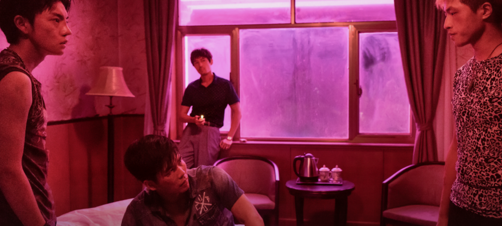
For me however, the biggest miss by far is The Wild Goose Lake (thankfully, recognised right here). Jingsong Dong’s hyper-stylised, oppressive and kinetic work on Diao Yinan’s neo-noir caper was one of the biggest unexpected cinematic treats of 2020. His sustained tracking and impressionistic use of colour in the nighttime scenes presents its seedy underworld as a nightmarish mirror image of our own reality. Truly hypnotic stuff. See also: his work on Bi Gan’s Long Day’s Journey Into Night (2018), which closes with a now legendary 59-min unbroken take.


Reader Comments (22)
I know Nomandland has this but I am really pulling for Judas and the Black Messiah.
Timothy -- what a beautiful piece. love the unexpected shout out to WILD GOOSE LAKE at the end too. I think maybe you're a little harsh on MANK though. I agree somewhat (it also didn't make my nominee list) but I think it's still well done in terms of DP work.
Unfortunately The Vast of Night wasn’t even eligible, because its cinematography is better than half of these nominees.
Everyone I talk to about MANK's cinematography says the same thing: "Why was it shot in scope?'
It was made for Netflix, meaning everyone will see it on a 1.77:1 monitor with black bars on the top and bottom of the screen. On the other hand, it's trying to evoke old Hollywood, late 30s/early 40s, but that was 1.33:1.
Again and again and again, I hear: "What were they thinking?"
Nathaniel - - thanks so much for the feedback. I think my harsh feelings towards Mank’s cinematography stems from wrestling with my deep disappointment with the film overall vs. my initial sky-high expectations and trying to get to the bottom of why (Seyfried’s performance excluded) the movie felt so hollow from top to bottom. I don’t think Messerschmidt is totally to blame but he’s an integral piece of the whole.
I think MANK "as stylistic copycat" is wildly off the mark. Sure, it's in black and white, and sure, Fincher emulates old film language through dissolves and cue marks, but other than that it looks very little like a film of the period - deliberately. The digital burnish is pronounced; the B&W is decidedly *low-contrast,* at times quite washed out (not sure what you watched); and, as noted above, it's shot in widescreen, which didn't exist in the 30s and 40s when the film is taking place. Rather than a rote simulation, MANK takes major gambles with its look and feel. Now whether you like the results or not is another matter, but to claim that it's merely cribbing strikes me as erroneous.
This is an inspiring write-up of the category. Thank you Timothy for describing in words what the cinematography of these films evokes in us emotionally. Excellent work!
Thank you for this article.
I'm also not on board with MANK's cinematography. In as much as it's a technical achievement on its own, it's also one of the reasons that kept me at arms length due to its stylistic choices. I mean, the disconnect between the production design + sound trying to emulate as much of the era as possible and the cinematography being in scope makes for a stylistic disconnect that took me out the whole time.
NOMADLAND is winning this and I'm so happy. How often do we have a film production this small-scale win this award? Beautiful in every way.
I don't understand Chicago 7's nomination at all. Especially at the expense of First Cow.
Jonathan - - thank you for the alternative reading. I’m definitely not the definitive voice on the art of cinematography.
I do think however if you look at the interior scenes or the nighttime walk around the Hearst grounds you’ll see what I’m talking about in terms of the contrast levels which exists concurrently with a softer focus. I also feel that if you view films from the pre code era into the 40s that were actually shot outdoors you’ll see a lot of the light-blasting and ‘washing out’ to which you’re referring. For me the argument around the scope is moot. I didn’t actually have a major problem with it, but I also don’t think that particular creative choice absolves the creators from the comparison to the films of the time.
I don’t mean to suggest that Messerschmidt’s work is completely without value. He’s obviously a brilliant technician. In this review, I tried to get at the craft behind the overall sense of feeling the films projected. I just found the general vibe of Mank’s photography to be quite shallow and distancing and I believe the visual mimicry to be a large part of that. But I love a lively debate :-)
The first thing I thought about after viewing "Mank" is I understand the B & W, but why Scope, to re-create era should be the era 1.33:1.
This just in:-
https://awardswatch.com/amazons-being-the-ricardos-begins-production-with-nicole-kidman-and-javier-bardem-adds-alia-shawkat-tony-hale-and-jake-lacy/
Nicole Kidman (NOT Cate Blanchett) will be playing Lucille Ball!!!
Yes Nomadland for the win in my opinion...
Mank's cinematography seemed mushy and a pale imitation of Citizen Kane's rich contrasts
Judas and The Black Messiah was really rich with intense color and contrasts It really added to the film's intensity...
I know that I’m more of a fan of it than most, but I think calling Mank “visual aping” while Nebraska’s routine work is “superior” feels off the mark.
Welcome Timothy! This is a great write-up.
John T - - “far superior” is in comparison to Chicago 7 but it’s a low bar. Papamichel’s nom for Nebraska was easily my least favourite of the 5 finalists in its year and the fact that the nomination came at the expense of 12 Years a Slave and Her still smarts. Had Nebraska not been filmed in black and white I doubt it would have been a finalist. If they really wanted to go down that route, Frances Ha was right there!
Hey now... let's not blame NEBRASKA for 12 years a slave's snub. Nebraska was always going to make the list as a) an ASC nominee b) a best picture nominee c) shot in black and white. What cost 12 years a slave was either THE GRANDMASTER or PRISONERS or INSIDE LLEWYN DAVIS none of which had best picture heat.
that was a very strange year in cinematography and the voting was obviously close (consider that the ASC had 7 nominees which ia completely atypical (they always stick to 5). But even so... ASC wasn't interested in HER so i doubt that had any hopes of making it.
I blame Inside Llewyn Davis for the 12 years miss personally (maybe because i dont like the look of ILD) because it's self-consciously showy with its obviously post-production augmented palette in a way that 12 years a slave is not.
@ Clara
That is oooold news (here)...
I'm nervous that Mank will win here for the element that I thought was the worst part of the movie (other than the script). The muddy, murky and yes, even low contrast cinematography. I too want Nomadland to win, but if I'm being honest, I just don't want Mank to win. There, I said it.
Welcome Timothy. This was a wonderful piece.
I'm not a fan of the look of "Mank" neither. Some scenes looked too washed out. The film I wish got more attention and had made the list is "I'm Thinking of Ending Things." The editing and cinematography together really created an off-kilter ominous feeling throughout. It's very much a visual adaptation of the book. I actually prefer the film over the book, which is a rare thing, and a lot has to do with how well Kaufman and his team visually interpreted the story.
I want NOMADLAND to win, and I ultimately think it will. of the nominee, MANK is the only other one that I like enough to nominate myself. I got to see MANK on a big screen and thought it looked excellent and i'm sure people can talk about all these things about why it's wrong, but ultimately that doesn't affect me and my experience of watching it. I do wonder, however, if I were to rewatch on Netflix...
Agreed that THE WILD GOOSE LAKE was impeccable here. I was also a very big fan of LA LLARONA, GHOST TROPIC, VITALINA VARELA, MARTIN EDEN and MINARI.
I don't get the visual appeal of JUDAS, sadly. I've loved Bobbitt's work in the past. Glad he's a nominee now, though.