


Emmy Category Analysis: Main Title Design
The Film Experience Team takes a look at the major Emmy categories & some extras, too.
By Nathaniel R
If you're a regular reader 'round Emmy time you'll know that this particular category is of significant niche interest to us. That's partially because voters are (mostly) forced into keeping it fresh. Unless your show changes its opening titles significantly each season, you'll only be eligible on your first season. It's also because we dig main titles and we totally miss them in cinema which seems to have (mostly) abandoned this wonderful practice of setting the mood before the story begins. Let's look at the nominated titles.
The nominees are listed below the title and, unless otherwise noted, this is a first nomination for each of them...
 click to view
Between the World and Me (HBO)
Hazel Baird (2nd nomination), Diego Coutinho, Rafael Morinaga
This team from studio Elastic designed a stunning, rapidly shifting, crumping, tearing collage for HBO's special based on Ta-Nehisi Coates book of the same name. The team drew extensively from Ta-Nehisi's book, artwork by Calida Garcia Rawles and Molly Crabapple, and mixed it all up with seminal figures, historical moments, and literary works representing Black life in America. The effect is like a scrapbook being both created and deconstructed with stop motion animation in front of your eyes. It's a wow but will enough voters take this category series to watch all of the nominees?
Baird is an award winning Scottish designer whose done title and graphic design work for shows like American Horror Story, The Morning Show (Emmy nomination), Nancy Drew, Claws and movies like The Inventor, Velvet Buzzsaw, and the new Netflix film Fear Street Part One -1994.
The Good Lord Bird (Showtime)
Efrain Montanez, Eduardo Guisandes, Abigail Fairfax
Cleverly designed like colorful woodcuts, we see images of runaway slaves, the Civil War, flying birds, rolling onions, and churchs and bibles. My favourite touch is the red sun which looks like a perfectly round fingerprint. This is the first nomination and even the first tv / movie show (at least according to IMDb) for all of these artists. They're from the studio King and Country which does a lot of promo commercials for TV series including previous memorable bits for Vikings and American Gods.
 click to view
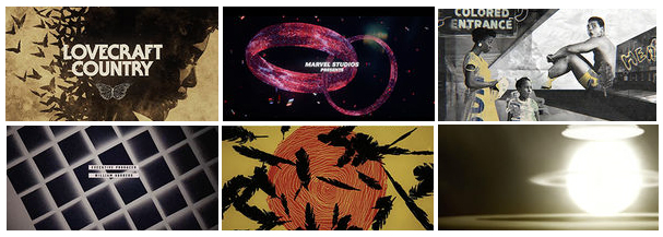
Lovecraft Country (HBO)
Patrick Clair (12 noms | 2 wins), Raoul Marks (11 noms | 2 wins), Ken Taylor (2 noms)
Clair and Marks are mainstays of this category. They won Emmys for True Detective (2014) and The Man in the High Castle (2016). Some other shows they received nominations for include Westworld, The Crown, and Daredevil (which really ought to have won this prize in its year... we still think about that creative and original opening sequence years later)
The opening titles for Lovecraft Country are on an episode to episode basis so each gets its own animated illustration with the title of the episode and some design elements fading into view. It's gorgeous and distinct and it could easily win. We know Emmy likes this team and they do very memorable work. No wonder HBO keeps reusing them.
The Queen's Gambit (Netflix)
Saskia Marka, David Whyte
Usually nominees in this category are for opening titles but The Queen's Gambit is nominated for its end titles (it doesn't have opening titles), a black and white and grey graphic presentation of text and squares and lines. It's beautiful and trancelike and thankfully not overly obvious -- you can see a chess board's influence in its frequent squares but never in a basic -- 'oh, look a chess board' kind of way. But will it be too subtle and unflashy for a win?
Raised by Wolves (HBOMax)
Steve Small
Though we wrote about the series once here at TFE, we were disappointed to hear so few people talking about it. Ridley Scott's strange sci-fi dystopia takes place after a cataclysmic religious war when two androids, Father and Mother, attempt to restart the human race with embryos they have stored from the destroyed world. They aren't alone on the barren planet for long, the old wars and idealogical conflicts coming to wreak havoc again. The opening credits are truly haunting and unique, looking like moving watercolor paintings of infrared film with images of space travel, planets, and nuclear explosions depicting the old war. One of the images, a figure floating in the sky between buildings, its head glowing, will take on much greater resonance (and terrror) when you see it within the narrative. It's absolutely stunning work from Steve Small (the only sole nominee in this category this time, the other work coming from teams of artists) but did Emmy voters even watch the show? We're afraid they didn't since this was the show's only nomination, despite being fascinating television overall. This was voted the best title sequence of 2020 by the website Art of the Title and... I concur.
not the nominated title design but thought it would be fun to show the opening titles of each episode
WandaVision (Disney+)
John LePore, Doug Appleton, Nick Woythaler, Alex Rupert, David Wave
While most Emmy voters will probably assume the nomination is for those ever-evolving opening titles, inspired by different eras of television, the nomination is actually for the long closing title sequence (which, weirdly we couldn't find an embeddable or linkable video fo) which is also something of a shape-shifter. The camera backs away from the tv screen showing the episode you've just been watching to reveal a perplexing environment of computers, analyzing it, and then to highly pixelated tv screen images that are distorted by how close they are to the camera. Until it changes again, appearing to zoom inside an image of Vision's eye on TV screen and then it's all interior computer like blues, green, and red lights which start forming objects which are also partially obscured though you can catch a flower blossoming, a pair of glasses, a baby's mobile, and finally two adjoining red wedding rings. It's effective, mysterious and even a bit fun -- ooh, look there's an image of Vision and Scarlet Witch's headdresses from their classic costumes that look like they were formed with a Light-Brite.
This work by the studio Perception has a a great shot at winning since the series is so widely seen, and voters will assume it's both the clever opening titles and the closing titles giving it double the persuasive pitch for worthiness. What's more the score that's playing during this sequence is also nominated.
Predictions
- WandaVision
- Lovecraft Country
- The Queen's Gambit
- Between the World and Me
- Raised by Wolves
- The Good Lord Bird
Personal Ranking
- Raised by Wolves
- Between the World and Me
- Lovecraft Country
- WandaVision
- The Queen's Gambit
- The Good Lord Bird
Which show are you rooting for in this particular category?
 NATHANIEL R
Reader Comments (7)
FYI: The name of the author of Between the World and Me is Ta-Nehisi Coates.
omg thank you! Justice for raised by wolves! That title sequence is incredible art, complete with an evocative and gorgeous title theme, and the show is unlike anything i have ever seen before. The acting by Mother and Father is also out of this world (sorry for bad pun had to be said) and deserving of recognition.
How was the Flight Attendant not nominated for this?!? That said, among these nominees, I’d go Lovecraft Country. Couldn’t quite get into the show, but these visuals were memorable.
I too think The Flight Attendant was snubbed of a deserved nomination if not win. I am trying to think of a title sequence that was memorable. I liked how Dexter visually equated making breakfast with committing murder. Perhaps at some point TFE can do a feature on great title sequences to show why this art form merits our attention.
I ended up skipping The Flight Attendant credits after episode one. Trying too hard, in my opinion.
I would say
Between the World and Me
Lovecraft Country
Queen's Gambit
The Flight Attendant The great snubbed in this category.
STILL PISSED THAT MRS AMERICA WAS SNUBBED HERE LAST SEASON!
Flight Attendant is also snubbed this season, like WHY and HOW?
Rooting for Lovecraft and Wolves now!!!