


Curio: Oscar Minimalism
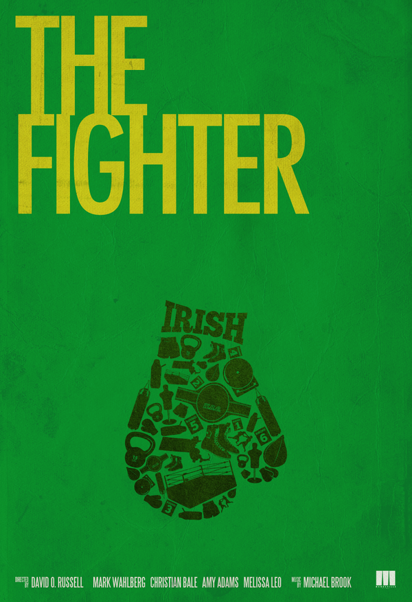
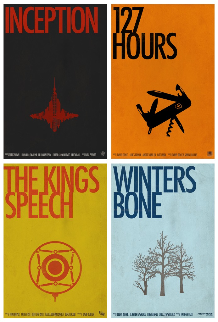
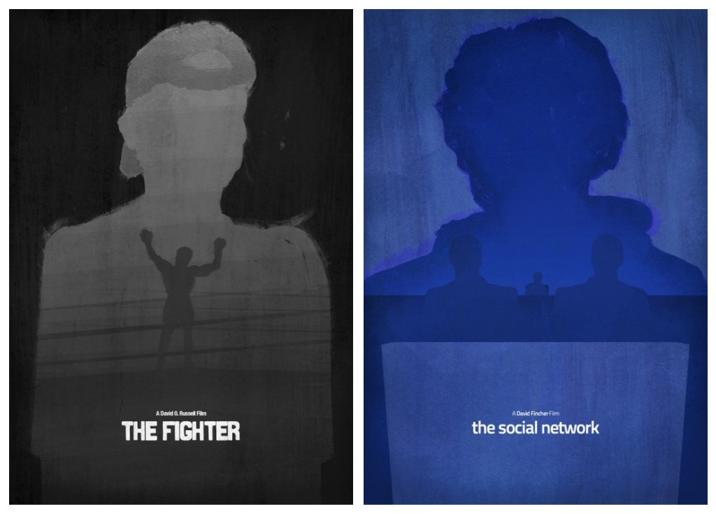
Alexa here. In the weeks since the Oscar nominees were announced, graphic artists have been busy designing alternative posters for the best picture contenders, and I've been busy bookmarking. But this week, with all the competing films floating in my head, I'm especially fond of designs that manage to strip a film down to a single, representative image. David Lopez took it upon himself to design a poster for each of the nominated films by doing just that. His poster for The Fighter is especially effective, but I do wish he could have included the full title in more of his designs.
More Minimalist Beauties after the jump
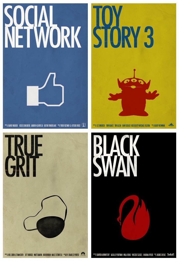
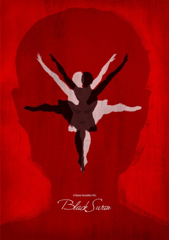
Another set I love are these painterly versions of five of the nominees by Dean Walton (a.k.a. Mr. Shabba). You can buy a limited edition set of prints here. His Black Swan is my choice; I love the evil Nina face hiding in the overlapping figures.
 Alexa
Alexa
Reader Comments (11)
agreed that the evil Nina face in the Black Swan poster is choice. you don't even notice it at first. and the alien with 3 eyes is a fun way to represent toy story 3 except those aliens (THE CLAW) always remind me of the first movie. I still think that scene is the hardest i've ever laughed in a movie theater. Just did not see that coming at all.
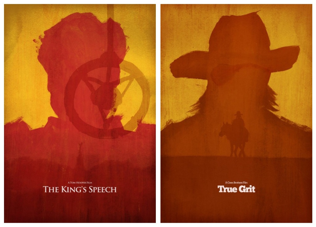
I've been staring at it for several minutes, and I just can't place what that image in the first True Grit poster is supposed to be.
David, it's an eyepatch. :)
It's an eye patch, I think
is that a plane in the 127 hours poster? and if so, what does that have to do with the movie?
127 Hours: Swiss Army knife
I effing love when graphic artists do these things for current movies. I'm always constantly trolling the google image search engines for new and cool minimalistic poster designs of movies that probably wouldn't have any otherwise. A few favourite were from a link posted nearly a year ago depicting all the Tarantino film in minimalist single action form. Those were amazing, I was literally gagging over them while forwarding them to everyone I knew. It was complete and shameless stanning.
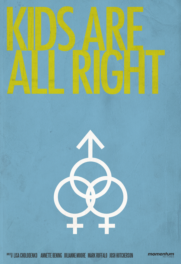
Anyways, true to form, I love the David Lopez designs. Some are a bit obvious (King's Speech, Winter's Bone) but the ones that take an unexpected detail or a figure or an encapsulating symbol and represent it as the movie's core tend to be the most fully realized. Sorta of the essence of minimalism. The Kid's Are All Right one is just perfect example. I wanna frame it on my wall.
The 127 Hours one is great as well.
That makes sense. Much more sense than the state of New York being swallowed by a black hole, which is what it looked like to me on a first glance.
I like the 127 Hours one but it irritates me that it's a swiss army knife when a key part of the story is that it specifically wasn't a swiss army knife.
These all remind me of outfits on Runway where the judges go, I get the concept, and the execution is good, but no one in the world could wear that. These images are good caling-cards for the artists (which is maybe all they're meant to be), especially if minimalism is your thing, but maybe two of them tops could even remotely work as a poster image. The cult of minimalist graphic artists seems to swell by the day, but if you have to truncate or mis-render the title (Winters Bone, Social Network) or settle on an only semi-recognizable image (True Grit), surely you're in danger of turning "minimalism" into an end in itself?
Also, the 'male' sign (in the TKAAR poster) doesn't look like that. At first glance I loved these but the execution on some of the posters leave a bit to be desired