Team FYC: The Conjuring for Best Production Design
 Wednesday, December 4, 2013 at 12:23AM
 In this FYC series series, our contributors are highlighting their favorite fringe contenders this awards season. Here's Dancin' Dan on The Conjuring...
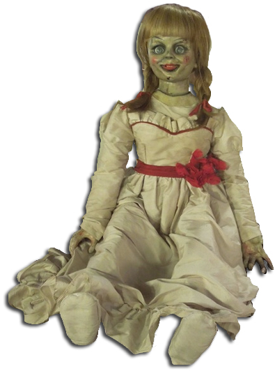
 Let's face it: The Academy doesn't, as a rule, like horror films. Even when they're done well. But James Wan's The Conjuring is one we hope they'll honor, especially in the below-the-line categories. The technical elements are all exceptionally well-done, but the production design in particular is damn near flawless. For starters, take a look at that Annabelle doll. Creepy, right? But also totally believable as a toy that a girl might have loved as a child in the 40s or 50s and kept with her as a young adult in the 60s.
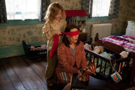
The whole film is stuffed with smart design like that. Production Designer Julie Berghoff, Art Director Geoffrey S. Grimsman, and Set Decorator Sophie Neufdorfer built the Perron house used in the film from the ground up and filled it with period-appropriate appliances, photos, and toys that felt used and loved - and, perhaps most importantly, that don't look "scary".
The smartest thing The Conjuring does is to not look like a modern horror movie - all dark and tinted blue or gray, with every set and prop looking like it's on the verge of decay. The Perron house looks old because, simply, it's an old house, and the Perrons bought it knowing it was a bit of a fixer-upper. The items in the basement look old and rotting because they've been blocked off for decades. The family's personal items look new, or at least new-ish, as would fit a middle-class family in 1971. The attention to period detail is all over the movie, and it gives the movie a homespun quality that always works in its favor.


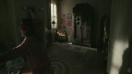
There are a lot of reasons why The Conjuring works as well as it does: strong, surprisingly nuanced performances from Vera Farmiga, Patrick Wilson, and Lili Taylor; the genuinely unsettling score; the almost old-fashioned cinematography - but for me the MVP is all the little details around the edges of the frame, constantly lending a sense of reality to the film. The art direction of The Conjuring is effectively scary when it needs to be (the spiral mirror reflecting on Vera Farmiga's face, that monstrous wardrobe, the Warrens' room of occult objects), but mostly it serves to remind you that these were real people this happened to - a family that could have had a normal life if things had just worked out a little differently. And that's where the true horror lies.


Reader Comments (4)
the doll in the movie looks like Chucky whereas the real doll was a cute rag doll but i agree with you except this point
I have a lot of problems with The Conjuring as a film, but I loved the production design. That cabinet in the bedroom is so perfectly off. You wouldn't notice it in another film but it draws the perfect amount of focus with the odd placement of the ornamentation to signal bad things in a horror film. A lot of The Conjuring works like that. Everything is just a little off.
french girl is right about Annabelle, though. Annabelle, in real life, is so scary because she looks like a perfectly harmless rag doll. The film version might even be one of the dolls from James Wan's Silence about evil dolls/puppets.
Your points about the actual Annabelle doll are well-taken, but one of the reasons I like the choice to make the doll different is that the rag doll wouldn't have felt of a piece with the look and feel of the film the way that porcelain doll does. It may be one of the (admirably few) obvious choices the film makes design-wise, but I think it's a smart one.
Thank you for all the support! It was a super fun film to make and I had the support of my director James Wan and all the producers. It takes a collaborative group to make such a great project. I hope to be a part of the next one!