Interview: Carol's Production Design Judy Becker
 Tuesday, December 29, 2015 at 12:30PM
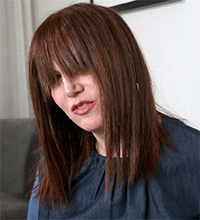
  Judy Becker. Photo © Tom Uhlman at New York TimesThis won't have escaped you but we're a little bit obsessed with Todd Haynes's Carol. We tried to devote a week to it but the love can't be contained by calendars. The romantic drama about a glamorous society wife and a young shopgirl is rolling out slowly -- agonizingly slowly -- to more cities each week. It leads the Golden Globe nominations and though the Academy's decisions about the year's "best" are yet to come, there's reason to be hopeful that they'll embrace the filmmaker's triumphant return to the silver screen.
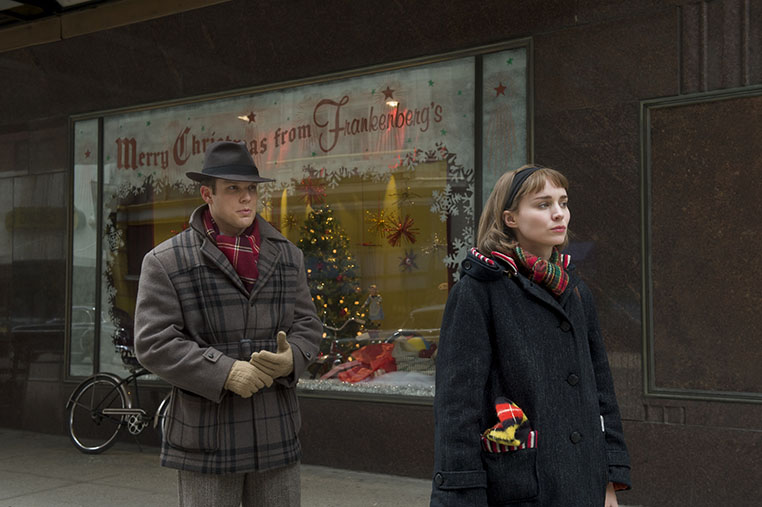
The Oscar-nominated production designer Judy Becker (American Hustle), is responsible for most everything you see onscreen in Carol from Therese's humble apartment to Frankenberg's Department Store, the Aird estate, and much more. "The props, there are close-ups on them, so I don’t know how you can say, that’s not important," she says passionately, underlining the fact that everything we see is part of 'the look'. She describes herself as a very hands-on designer and is sure this drives new members of her staff crazy but she has high praise for her frequent set decorator Heather Loeffler. "She never gets upset if I veto something but, at the same time, she brings a lot to the table and surprises me all the time with great stuff."
Though Becker is best known for her frequent collaborations with David O. Russell this is not her first Todd Haynes film, having also designed his abstract Bob Dylan biopic I'm Not There (2007). We began our chat marvelling at his genius. Though I'm Not There was a larger scale task, essentially designing multiple worlds, Carol wasn't much easier for different reasons. "Every film has its challenges," she explains. And films as gorgeously realized as Carol don't happen without a lot of planning, work, and inspiration.
Our interview is after the jump...
NATHANIEL R: I’m a huge fan of Raising Victor Vargas, which you did a long time ago...
JUDY BECKER: That was an important movie for me.
NATHANIEL R: ...but that film and a lot of your films actually like Shame and Brokeback Mountain -- they're very minimalist in comparison to Carol, which is just so lush. Brokeback and Vargas are both about characters who are much further down the socioeconomic scale than Carol & Harge. Shame is upscale but also minimal. Do you feel a particular gift with the humble sets that somehow still convey a lot.
JUDY BECKER: I really love doing humble stuff. I enjoy it and find it inspiring. I don’t know why that is. I was just in Memphis, for the Indie Memphis Film Festival and it’s a fascinating town for Americana and older buildings and things, and I took like 2000 pictures. I want to use them in a movie!
But this world was actually in its way quite humble, because it’s a New York City in 1952. It’s not the Eisenhower ‘50s, it’s the post-war 1950s and it’s still like a traumatized New York City, and a country that’s recovering from the war. And so really what we were thinking about in the movie is though it looks really lush, if you examine it carefully, it’s quite austere in the set decorating and the use of color. We were thinking very specifically about this kind of austerity, and this kind of sparseness. But it’s naturalistic at the same time, so I did get to use a lot of my talent and love for scenic aging and for grittiness. But at the same time the movie’s just so gorgeous.

The cinematography is just... [struggles for words]
It is! If the sets had been lavish it would have been too much, it would have been overkill. I think that when you have more in one area, you need to have less in another. Things need to balance each other out, and I think that’s really what happens in Carol. Everything is so well balanced. I was realizing this today that even with the use of color, with these bright reds in Carol’s lipstick and nails, and in Rooney’s hat, if we had used that color in too many places, we wouldn’t be remembering those the way we remember them. Who can forget Carol’s fingernails? That’s because there’s very little of that kind of saturated color in the movie. That kind of balancing is so important to achieve the effect that you want to achieve, and you have to work with every single department to get that.
So when you are making a movie and you’re working on the look of a crucial set or scene, how do you sense if it’s working or not?
Lots of layers of planning. With certain sets like ones that require a lot of set decoration for example, an aspect of improvisation comes in. I always think of myself as a little bit of a jazz musician. I get very inspired in the moment and things happen that you don’t always plan. It’s like you have to start with the melody in a jazz song, and you have to start with the bigger picture. In the toy department, for example, we built a model, and we did a million renderings and we really planned the structure. When we were dressing it -- and I get very involved with that -- we knew that there was going to be this case of dolls, and there was going to be this train set, and toys towering over her. But for some of the details, it was, This is going to look good there, this is going to look good there, this is going to be a good foreground object. And that just kind of comes at the last moment.
So you’ve done early 50s now and you just finished ‘70s with American Hustle, and Joy...
It goes from the 60s through the 90s.
American Hustle (2014) brough Judy Becker her first Oscar nomination. She'd love another go at the 1970s
NATHANIEL R: You’ve covered the gamut.
JUDY BECKER: [Laughs] I know! I haven’t done pre-war, but aside from that, yeah.
So is there any particular period you're really fond of. Or maybe you'd like to do something futuristic?
Sure, I think most designers would. But I would also love to explore the 70s more, because I feel like I’m not done with that. I think it’d be really interesting to do a hippie movie in less of a cliché way. I think it’s a time period and a movement that lends itself to garish overkill, and it would be fun to do it in a way that was a little different. There’s a lot of things I would enjoy. Depression Era would be great.
Okay. I have to ask about the scene in the projector room in Carol, because obviously Todd is such a cinephile...
An amazing cinephile.
Did he give more input into that particular set. Was he like "the projector has to look like this!"
We built that set. The main thing for Todd was that it would fit those people, and it would be accurate for how many people could sit there and look through the view or cutout into the theater, so that was a lot of research. Of course, we had an accurate projector, but that’s fairly easy to find. It was more like, is it accurate that there would be this many people that could fit on this side. That all had to be researched and plan, and we did fulfill the accuracy, but we had to look into that.
What was the hardest detail or look to get right for this?
A lot of little things were hard, like finding a lot of the more upscale locations and places to shoot. Like, it’s supposed to be the Ritz Tower at the beginning of the movie where Carol is having a drink, and Therese and Carol meet and that guy comes up and says, 'Hey Therese!' Finding all of the locations took a lot of time, street scapes always do in a period movie. You never find a street that’s 100% right, so you have to find one that you know will look right and you can afford to transform. We were lucky because Cincinnati had a lot to offer in that sense, but one thing that Cincinnati also has, one of the few new elements, are these huge sculptural modern street lights and modern sign holders that are everywhere. So they were on those streets and they got erased in post. One of the few visual effects we did!
The biggest challenge was the toy store for sure, finding that location.

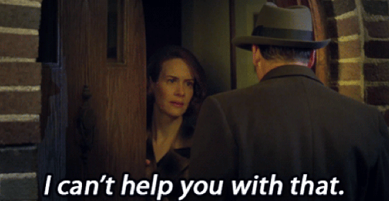
NATHANIEL R: OK, I have to share a personal obsession with you. When Harge goes to Abby’s house -- you don’t see inside, just her door. There's something about it that is fortress-like. It look so impenetrable, which I thought was just brilliant. Did you spend a lot of time fussing over this door?
JUDY BECKER: That was one of the hardest locations to find. We looked at so many houses. It had to have so many different elements, and it had to not look like Carol’s house, so we would know it was somewhere different. Actually it is always those little things, like a set that is only in the movie for a second, that are the hardest to find. We obsessed about it.
Sometimes those moments really make a movie. If you stack up enough of those moments, you’re blown away.
Yes! They do, and if you don’t pay attention to them, they can ruin a movie. Not ruin a movie, but lower it a little bit.
So you’ve done two films with Todd Haynes. Do you plan to work together again?
That’s up to Todd, but I would love to. He’s an amazing director, just at the top for me.
I’m hoping he speeds up a little. He takes a long time in between movies.
The great directors often don’t speed up. I see how hard it is for my friends who are directors. And then you read, 'why didn’t they make a movie in 9 years?' And I’m like, 'They tried to make five different movies, but it never happened!!!'
You've also worked with David O Russell frequently.
Yes, for ten years.
For the production designer, does the work vary a lot from director to director, I mean how much they get involved?
Yes. Todd’s very involved with the visual aspects. Todd comes from an art background, and for that and many other reasons, he’s much more hands on with the sort of artistic aspect of the filmmaking. [David] will not bring a presentation, for example, and he likes to look at locations only after there’s been a lot of vetting. He really cares about the visual look of the movie, but in a different way. He presents me with a lot of abstract ideas, and I then show him a lot of materials to sort out how we’re going to realize those ideas.
Joy is Becker's 5th film with David O. Russell
That makes total sense. Because David O Russell seems more like – and I don’t mean this reductively -- an actor/screenplay type of director.
I’ve read recently that he doesn’t like being called that. I understand why, because he’s very cinematic, but it happens in a different way. He gets on set, plans the day for like three hours, and the starts going. So much of what you see in his movies was created on the day, and in that moment, so you really have to be very careful that everything 360º is really ready for him, because he’ll change...
Change camera angles and blocking and everything?
I’ll see his movies and I didn’t even know he shot so many things, because I’m not on set all day long. I’m just like, 'Wow.' It’s a very different kind of creativity.
Todd, in some astonishing way, has everything in his head. I don’t know how he does it, because I look at the final movie and I see all these things that were there and the way they work together to tell the story is just astonishing. Every detail. Things that were part of my world when we were making the movie -- I see it in the movie, and [Gasps] it all ties together so beautifully.

more... Carol | Joy | Production Design | Interviews
Oscar Visual Charts


Reader Comments (6)
Thank you for acknowledging the best film of 2007 right off the bat!
Flawless, flawless, flawless.
All in Carol works like a surgery room: impeccable. Not a wasted frame or cheap dialogue. Miraculously, also has a beating heart in the form of two formidable actresses. Todd Haynes is a genius: with so little (in the form of plot-twists: you can telegraph what's gonna happen and you don't care!) getting so much is overwhelming. Best ensemble film of the year for me. And by ensemble I count ALL the crew working towards this miracle. This and The Assassin made my year and left everything else in the dust. And it was a good year!
Judy Becker is among one of my favorite production designers as she just does incredible work and I first heard of her through Zach Braff in the commentary for Garden State as he lauded her throughout the commentary with Natalie Portman.
Love the department store and its Madame Alexander dolls. Where would she know that detail? Was someone in her family a collector with those lovely blue boxes?
She did a great job with "Carol"
This was really great, Nathaniel! Loved it!