


Thoughts I had while staring at that new Bridge of Spies Poster
Manuel here. I had to check but it strikes me that for a film that ranked #8 in TFE’s collective “We Can’t Wait!” list, we haven’t really discussed the upcoming Tom Hanks/Steven Spielberg film, Bridge of Spies. I saw this poster displayed at my local multiplex and well, I had to share some of my thoughts on it.
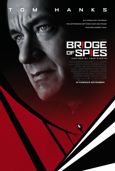
• Floating head? Noooooo!
• It is a bit of an improvement over that floating head/flag one from a few months back.
• Hanks does give good furrowed brow.
• Red and black and white makes for a clean design and the typography clearly alludes to the film’s Cold War themes but this poster really isn’t helping you figure out the plot other than reminding you that Hanks is (yet again) playing an “honest man." To be fair, from the trailer, it looks like a hard one to boil down to a simple plot synopsis.
• Why isn’t Spielberg’s name more prominently displayed? Even those Daniel Day-Lewis-heavy posters for Lincoln had the “A Steven Spielberg” line a tad more visible.
• No “Academy Award Winner”? (but then Hanks has never been one to brag)
• At least the bottom of the film aims to remind you of that other Hanks/Spielberg’s collaboration, Catch Me If You Can, and its amazing opening titles. Still one of the best Spielbergs and just think of its young actressy roster: Amy Adams, Ellen Pompeo, Jennifer Garner, Elizabeth Banks, even a blink-and-you’ll-miss-her Amy Acker!
• That bottom half is also slightly Hitchcockian (and by that, I mean it’s a Saul Bassian riff on North by Northwest, no?)
• It’s also giving off The International vibes.
• Are the red I's… bridges? I’m baffled by that design choice but maybe that’s why I’m not in movie poster designing business since I’d have squeezed in Amy Ryan into this poster and somehow made sure to remind you that Mark Rylance and Billy Magnussen are also in it.
Does this poster boost or dim your excitement?
 Manuel Betancourt
Reader Comments (14)
Dim. It looks tried, true and old fashioned to me and that doesn't excite. Of course, they may be going for just the audience who would like those things.
Dim. It looks tried, true and old fashioned to me and that doesn't excite. Of course, they may be going for just the audience who would like those things.
The top half makes me want to see it less, the bottom half makes me want to see it more. It's a conundrum of a poster, and I agree with the Spielberg namelessness being odd.
Of course, if it were up to me it would be just Billy Magnussen dressed as Spike, so what do I know?
Totally agree with John T about the two halves of the posters dividing my interest. But still, based on that trailer, I'm a No but will probably have to see it because of the Oscars.
D is right-the Oscars aspect of this film sort of makes YNMS moot. Only 4 Spielberg-directed movies (Indiana Jones 4, The Terminal, Always, and The Sugarland Express) have managed to miss out on at least one Oscar nomination, so Bridge of Spies will be seen regardless.
these two halves do NOT go together. It looks like a war between a graphic designer and the studio mandates.
It would've been a much more striking poster without that floating head! I want to be excited for this, but the trailer left me seriously disinterested.
I don't mind that Tom's head is on the poster but it should have been worked into some semblance of illustration to match the bottom half and then the poster would have been terrific. As has been pointed out the two halves don't work together now.
I'm still a yes though because of the people involved and I love spy thrillers.
Chalk up another vote for "I only want to see the movie that the bottom half is advertising". Actually, what I find myself really wanting is for the Floating Hanks Head to be drawn in the same monochromatic pop-art style as the bridge.
Poster makes it looks boring. Spielberg and Hanks are old news, but people wanting that Good Housekeeping seal of approval kind of film may flock to it out of inertia.
The best part is the drawing which reminds me of both Saul Bass and "North by Northwest"
That's a lame-ass poster.
I love this! this is a great poster. Thank you for sharing.