The Signage of the Lambs
 Tuesday, March 22, 2016 at 6:48PM
 Can we get a round of applause for Daniel's great work on the new series "The Furniture"? I'm loving it so much and we're only two episodes in.
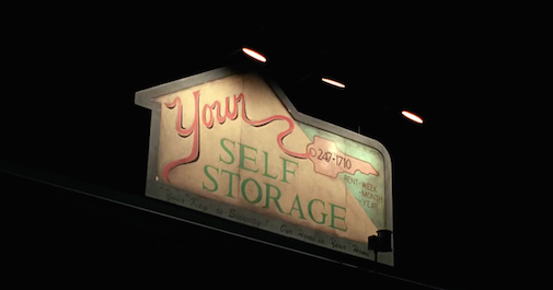
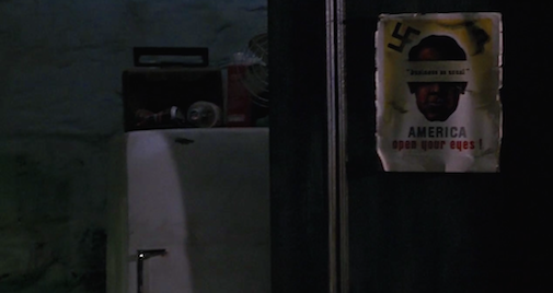
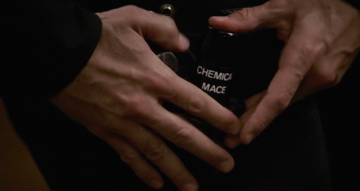
Consider this a spin-off one-off. I thought I'd share a particular movie obsession that we haven't yet dived into in all these years of blogging - signs. Shove a professional sign or any diegetic text or hand-scrawled message in front of the camera and I go all bookworm eyes. Are they subliminal subtitles? That's surely up to the set decorator, prop man, production designer and director. But on our recent revisit to Silence of the Lambs (1991) its signs felt newly purposeful.
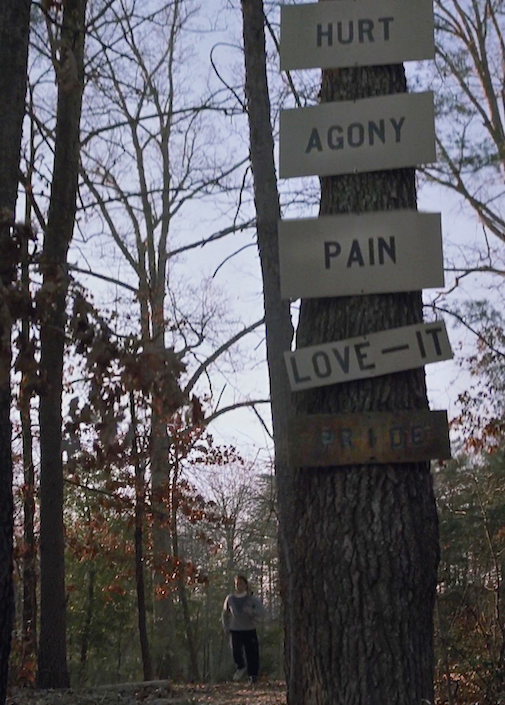
Probably because the film begins with such a bold aggressive dare, nailed right to a tree. [More...]
HURT
AGONY
PAIN
LOVE - IT
That's quite a statement.
I was going to share a gallery of every single unspoken / non subtitled word in the horror classic but after grabbing over 50 screenshots that feels excessive even for excessive-friendly sites like this. But here are 12 key images from the film that use extra unspoken words to tell the story.
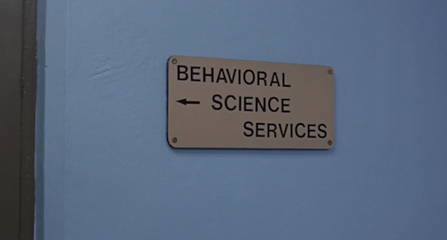
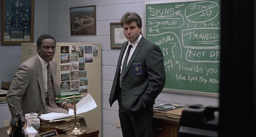
What is that "blue eyed boy" business on the board?
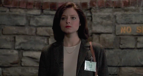
Love how the No Smoking sign just reads as a simple warning for Clarice: "No." as she enters the asylum/jail

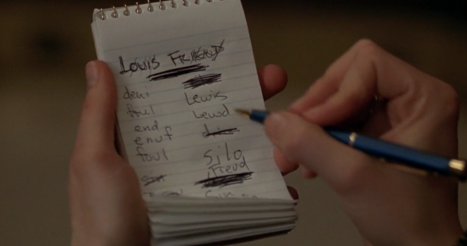
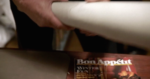
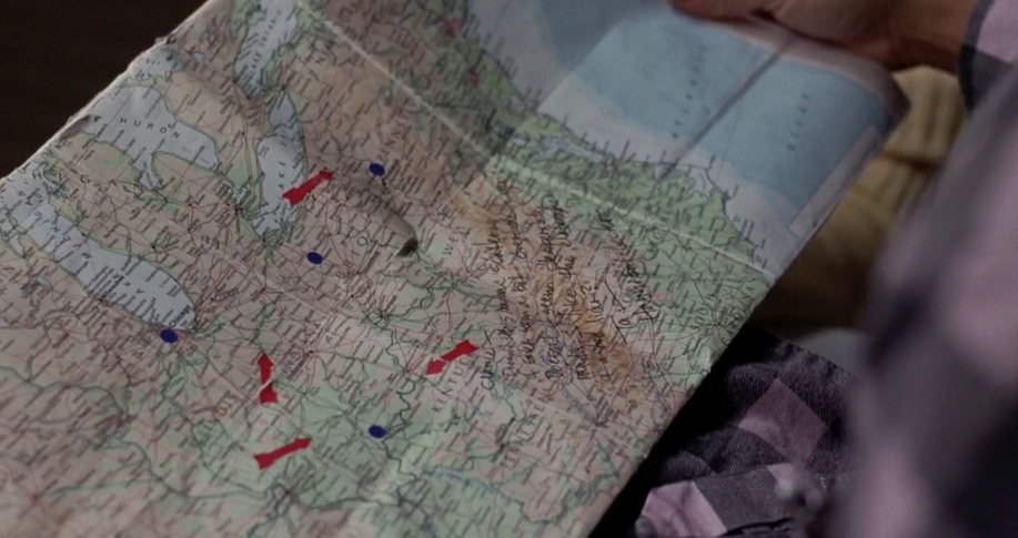
I tried to blow this up to read it. I goes something like this:
Clarice -
Doesn't this ??? scattering ??? seem a bit overdeliberate?
Doesn't it seem desperate ??? like the elaboration of a bad liar?
Ta,
Hannibal Lecter

Bon Appetit is a good joke if an obvious one. But how brilliant are the books in Bill's first victim's room. Diet books and a romance novel called "Silken Threads"
Do you have a secret infinity for handwritten scrawls, printed materials, and other kinds of signage onscreen? If so please share so I don't feel alone, utterly alone.


Reader Comments (8)
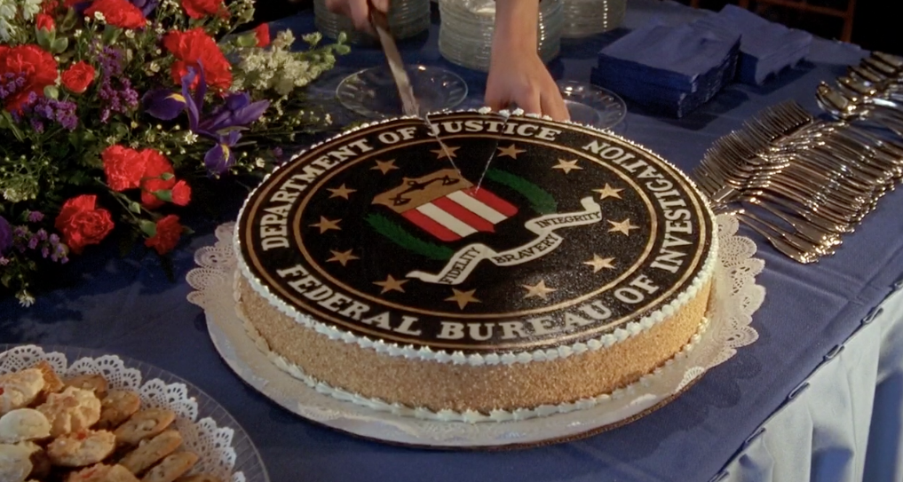
That FBI cake sure as hell looks delicious.
More Silence of The Lambs please!
The Diary in Gone Girl is such a hoot for me.
I like corporate advertising in science fiction movies: Blade Runner, Back to the Future Part II, and the original Total Recall.
I love signs, but my favourite is newspaper clippings. I want to pause and read and discover whether they wrote entire articles or if they didn't. And if they did whether they're any good.
You are not alone - I think many share our attention to detail. I refuse to call it an obsession.
Gone Girl has that revealing diary, and also Amy's maddening clues, and her own calendar/planner complete with yellow sticky notes. Great details.
I know it isn't your favourite series but Harry Potter made incredible use of a plethora of printed design details. Signage in Diagon Alley, textbooks, parchment letters, the Marauder's Map (with moving dots for people walking) and The Daily Prophet. The wanted signs and the Daily Prophet were used most effectively for exposition. JK Rowling and Stuart Craig who did the production design share your love for the written clue.
GUYS, GUYS!
MARGOT ROBBIE IS PLAYING TONYA HARDING IN A BIOPIC TITLED "I, TONYA"!!!
*faint*
I definitely identify with this - I remember pausing and reading the text beneath the chapter headings the first time I saw The Royal Tenenbaums. That chalkboard line is from an e.e. cummings poem called "Buffalo Bill" which ends "how do you like your blue-eyed boy Mr Death"
The professor who made me fall in love with Altman was obsessed with the use and framing of signage in NASHVILLE. Worth a look....
Love this series.
On the first set of signs - I also like that at the bottom is "OR DIE," which is appropriately shaded darker than the others.
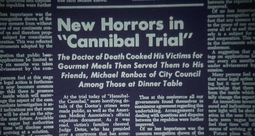
The freeze frames really bring out details I totally missed, although some of them shatter the illusion of reality - like the news clipping, most of which is repeated text that clearly has nothing to do with Hannibal. (Although I find it amusing that it seems to be from some kind of diplomatic agreement - whether real or fictional, who knows.)