The Furniture: The Color of Beaches
 Monday, July 25, 2016 at 10:30AM
 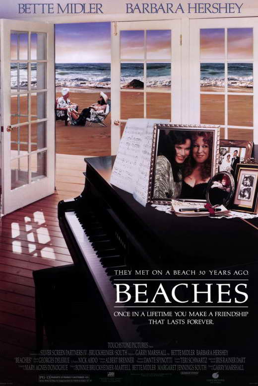 "The Furniture" is our weekly series on Production Design. Here's Daniel Walber...
Beaches, despite its enormous and enduring cultural imprint, still retains some surprises. It’s not subtle at all, yet it also contains countless little details, both of performance and design. It’s a melodrama that rewards rewatching, not only for the ritual of crying along with a beloved tearjerker, but also for the charismatic density of its images. And so, heeding the call of Nathaniel’s obituary and reappraisal of Garry Marshall’s long career (and a comment from Craver), here’s a look at the Oscar-nominated production design of Beaches.
The color palette of the film is almost schematic. That’s not a slight against production designer Albert Brenner and set decorator Garrett Lewis, either. It works, this insistence on pinks and greens reaching its emotional pinnacle along with the characters.
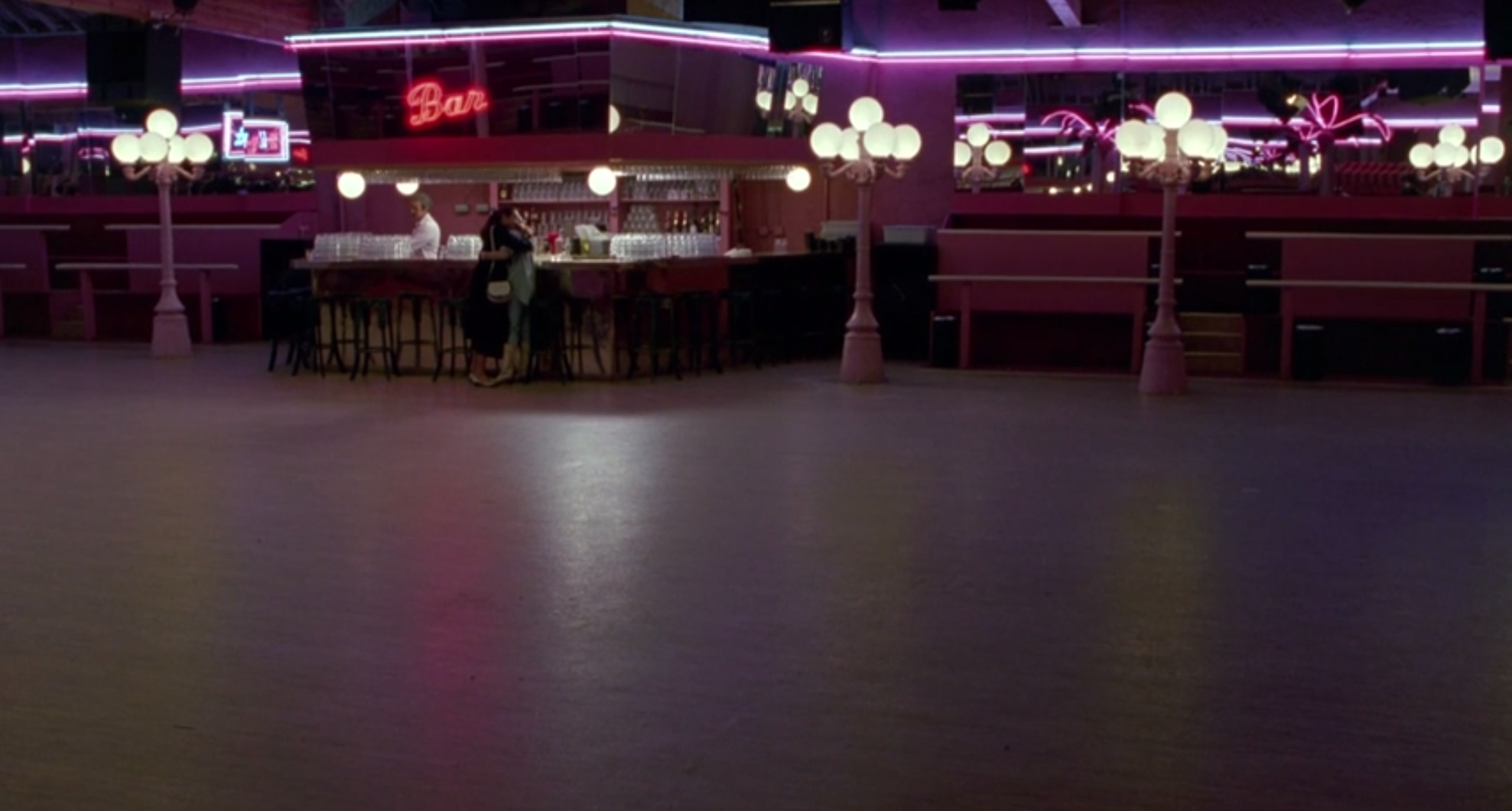
To be sure, Oscar nomination is probably owed specifically to the two fabulous production numbers, “Industry” and “Otto Titsling.” But rather than praise two isolated scenes, I’d like to take a look at this insistent thread of color...


