


Posterized: Marilyn Snapped, Cronenberg Triangulated, Puss Entranced
New(ish) Posters! Let's discuss (aka judge harshly).
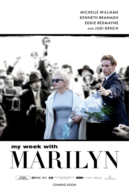
It's actually nicely stylized. But note that the big sell is not Michelle Williams but Marilyn Monroe herself, whose font size towers over her pretenders. I wonder what this movie will mean to Michelle Williams career though? If it flops does Hollywood assume she can't carry a film, even though it's less a Michelle movie than another Marilyn nostalgia exercize?
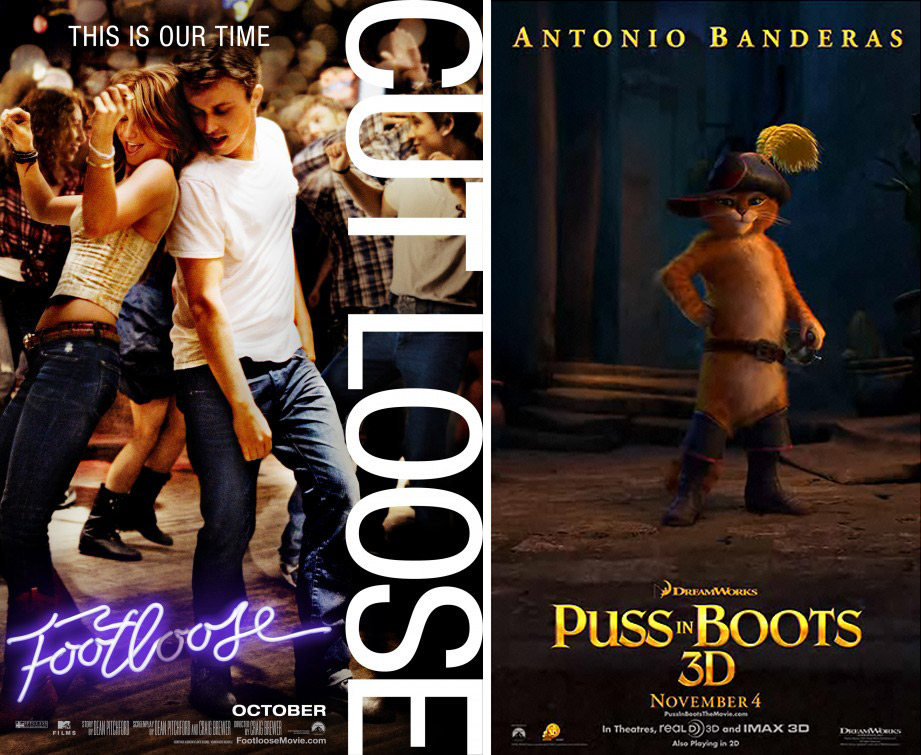
I swear to god that tagline for Footloose irritates me like little else. It can't be your time, when you're robbing the previous generation of one of their quintessential identifiers. Saying that Footloose represents "our time" (i.e. today's teenagers) is like seventies teenagers pretending that the 1950s (Grease) were their ti... oh wait... uh...
Meanwhile you can't tell it here but the Puss in Boots motion poster is brilliant. You simply must click over if you love cats like I love cats.

Finally here are two European posters for David Cronenberg's A Dangerous Method, which each put the three star faces all in each other's headspace -- one of them literally -- as their guiding design principle. You can see what they're going for but don't the faces need to be more level and more obscured by one another to achieve that psychological note. It's a little pedestrian, right? May the movie be anything but.
 NATHANIEL R
Reader Comments (15)
I have nothing especially positive to say about the Marilyn poster or movie; they both seem so routine and uninteresting. If I want to see into Marilyn's soul, I can go watch The Misfits. Anyway, I hope Michelle knocks it out of the park, even if the movie's as unexceptional as it sounds.
I will say, though, that you're totally right -- the Puss in Boots motion poster is super-cute, and surpasses any expectations I would've had about something involving "Puss in Boots" and "motion poster." Bravo!
I worry more that if My Week with Marilyn fails everyone will assume that Michelle Williams needs to be dour depression to be brilliant. That can't be a happy place for an actress to reside. Lighten up and do some comedy!
LOL too cute re; Puss in Boots!! LOVE IT
I actually quite like the effect of the left-hand version of A Dangerous Method, because I think it does achieve the desired effect: disorients me visually at first and forces me to focus on it more carefully; I also love the b/w and the fact that they made Kiera look like a young woman circa 1900. In fact, the slight blurring almost obscures the actual personalities for me; I'm intrigued by the composition, not by "stars". I'd actually hang that one on my wall.
On the other hand, the less said of the right-hand one, the better. the faces are too hard, and I am too aware of it being "Kiera" up front (fine for her fans, I suppose, but she almost looks as though she is posing for another VF cover.) The two posters are worlds apart, for me.
That motion poster for Puss is adorable, and I enjoyed the trailer much more than I ought to, I especially loved the music and titles at the beginning that seem to be a parody of all the big action/superhero films, and the tag line "He's been a bad, bad kitty."
The first Dangerous Method poster has a great concept of literally putting the characters in each other's head space, but the execution makes it look like someone just did a terrible job Photoshopping. If I had no idea what the movie was about I would wonder who the hell approved it. Maybe the publicity machine is banking on everyone thinking Natalie Portman, and not Keira Knightley, is the star.
I'm torn between the two Cronenberg posters... on the one hand, the poster on the left conveys the psychological weirdness of the movie, but the poster on the right conveys the eroticism of the movie (OMG, Keira's gaze!!!). I wish the concepts had been merged.
Ewww. The "Dangerous Method" poster on the right is this year's "King's Speech."
Oh, the luscious Eddie Redmayne. Can't wait.
The ADM poster on the left is good - would be better if there were all on the same level a la The Hours poster.
Have you seen all the new stills floating around of ADM? They look great - although they look a little stagey
I love cats, and I love the motion poster. Thanks for the link!
The Marilyn poster is awful: the poor photo and bad lettering! the b&w vs. color is an old trick, but here is a clever idea though, given we are dealing with an icon and her isolation from the world around her (that's the movie plot point in case you haven't read the books). Then again it should have left out Redmayne to convey that.
And, yes we all know Williams doesn't look like her at alll, but give the girl a chance. We haven't even watched a trailer yet. I trust "acting" can do miracles, don't you?
I quite like the Dangerous Method poster on the left. Like the use of colour, effect and that it sorta reminds me of an old movie. The one of the right is woeful.
And, yes, don't get me started on that "Footloose" tagline. Ugh.
Can't seem to get the Puss in Boots poster to work.
In the ADM poster on the left (which I like), all three of them look "period." In the awful one on the right, the men look "period," while the bare-shouldered Keira looks as if she's on a red carpet right now.
Regarding A Dangerous Method poster,
the left one indicates the film is about ghosts or a woman killed by one of the two men. the right one indicates the film is about a rich mistress and her husband and secret lover.
Regarding My Week With Marilyn poster,
Not only Marilyn’s name is bigger than the leading female, but look at the boobs, is she wearing a cone bra? They really prepare for the best candid shot to emphasize the body figure.
About the ADM posters, the color one is hideous. Blech. The black and white one is promising though I don't know what it's trying to convey. Persona it ain't. But in either case, if I was Vincent Cassel, I'd be pissed.