Halfway Pt. 2: Visual Cinematic Achievements of 2014
 Monday, July 7, 2014 at 2:51PM
  Before the holiday weekend we wondered what AMPAS voters might latch on to had they had to vote right then on the Oscars. It was a hypothetical exercize since we all know the studios backload the year and 85% of the intended contenders for "best" honors are as of yet unavailable. On to something not at all hypothetical.
Consider this my tracking sheet for the film bitch awards at year's end. It also doubles as an FYC directed at Academy members. Awards are too often regarded as trivial pursuits but they aren't at all. Award winners and nominees go into the history books or web archives as it were and, later, baby cinephiles seek them out for cinematic education. I speak from experience and I've heard so many similar growing up cinephile stories over the years that I know this to be true. So think carefully over even movies you didn't love when you weigh titles for "Best" in various categories. You owe it to future generations to really focus on the last word in "For Your Consideration"
Here's what I'd vote for (at the moment) in the visual categories if the year ended right now. I hope you'll join me in sharing your favorites (that have already opened) in multiple categories.

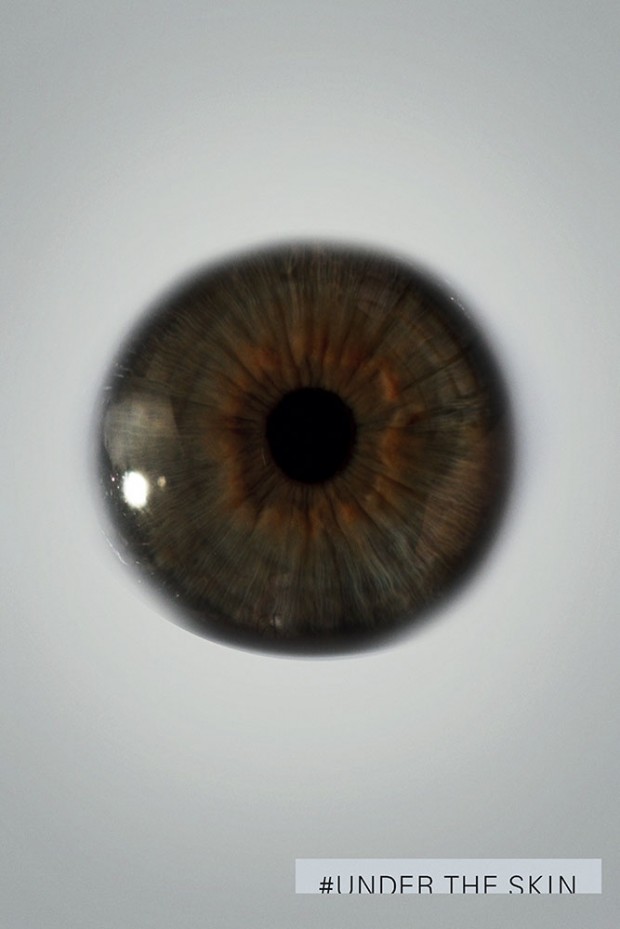
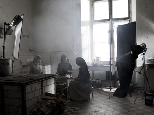
BEST CINEMATOGRAPHY: Seamus McGarvey isn't lighting and composing in a vacuum for this visual fx behemoth, but much of the painterly grandeur and awe that Godzilla, would be king of blockbusters, conjures relies heavily on his gift; While black and white films often win praise solely because they're novelties in the 21st century, Ryszard Lenczewski & Lukasz Zal's work on Ida would be stunning in any color, with its diffuse sensitivities and meticulous emotional focus; Darius Khondji is easily among the most neglected of Oscar-ready DPs with a filmography that includes stunning films from multiple A list auteurs and he does another fine job with the warmly retro but never inappropriately romanticized period work on The Immigrant; Hong Kyung-pyo's nails amazing technical challenges on Snowpiercer and his lighting often makes the grim fascinating imagery pop; and, finally, Daniel Landin serves Jonathan Glazer's mesmerizing purposes beautifully with the eery, cold aesthetics of Under the Skin... like peeks into some unfathomable abyss.
Smart costumes, mutant powers, and big hair are after the jump
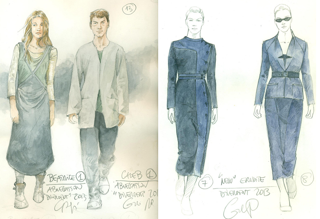
BEST COSTUME DESIGN: Divergent's costumes by Carlo Poggioli are devoutly schematic based on the franchise's vaguely silly sci-fi communist premise where people are assigned walks of life and individuality is not prized, but the color schemes and slight derivations within its monochromatic severity are, in an ironic way, its best claim to its own individuality as a franchise; Milena Canonero's has lent her prodigious versatile gift to Wes Anderson before and Grand Budapest Hotel gives her ample opportunities to shine with eye popping color, fantastically indistinct "period" and a huge swath of visually enticing characters; Patricia Norris (interviewed) somehow keeps a sea of black depressing wool in The Immigrant from feeling oppressive and she has fun with the film's theatrical colorful subplots; Michael Wilkinson's work on Noah is wonderfully hard to categorize given that it feels futuristic despite all the B.C. material - loved that bit on the podcast when Nick claims that Naameh (Jennifer Connelly) invented top-stitching. Ha!; Finally, Catherine George, in her biggest task yet, details the absurd socioeconomic disparity of Snowpiercer with real aplomb and enough post-apocalyptic chic to gag on... gagging... maybe my stomach is just thinking of those 'protein slabs'?

BEST PRODUCTION DESIGN: If Adam Stockhausen doesn't win a second consecutive Oscar nomination for his edible storybook creations in Grand Budapest Hotel something is rotten chez AMPAS; I can only imagine that Julie Berghoff had great fun with her props department and set decorators on Neighbors; Mark Friedberg, grotesquely ignored by the Academy despite design work as glorious and ambitious as what he was doing on Far From Heaven and Synechdoche New York makes great use of Iceland's otherworldly volcanic landscape and that massive wooden ark set on Noah; Ondrej Nevkasil's work on Snowpiercer is but one of many moving pieces of its overachieving technical puzzle but its beautiful work, shifting as you move through the train and often with a larger sense of pop theatricality than the cramped physicality should theoretically allow for; Some moviegoers would like more specificty in Under the Skin but I love its minimalism and I'll never forget Scarlett's abstract HQ interior with that foreboding unkept human exterior.

BEST FILM EDITING: Jeffrey Ford & Matthew Schmidt keep Captain America: The Winter Soldier's action sequences coherent, punchy and more tense with character than superhero movie action beats usually aim for; James Herbert & Laura Jenning's cuts on Edge of Tomorrow are built to be noticed but the movie is surprisingly nimble in its purposeful redundancies, keeping enjoyable parallel pace with our own awareness; Jaroslaw Kaminski's work on Ida (Jaroslaw Kaminski) seems to almost have a preternatural understanding of exactly when to cut and shift perspective, whether to allude or confront; Snowpiercer is a machine and Steve M Choe & Changju Kim keep the gears spinning with tense staccato rhythms; Paul Watts has a difficult cast keeping Under the Skin as mysteriously elusive, and as quick 'what did we just see?' frightening as it needs to be while never losing our attention

BEST VISUAL EFFECTS: Captain America: The Winter Soldier used its visual fx as support rather than the main event during its setpieces which is smart if you'd like to avoid empty spectacle; Godzilla performed the same trick often arriving just after the devastation lesser blockbusters would focus on...and damn those monsters were impressive; Some of it may have swung a bit too Middle-Earthy but Noah still held considerable visual attention (though one wishes the two-of-every-animal bit had been stronger); Oscar would never go for it but the visual effects in Under the Skin were creepily inventive and didn't feel at all like other films; and finally X-Men Days of Future Past is filled with funky powers and even though some of it is weirdly interchangeable (Sunspot and Colossus and Iceman all power up visually in exactly the same way: press a computer button if you want fire, steel or ice) the mutated moves are a lot of fun to watch.

BEST MAKEUP & HAIRSTYLING: Belle sure maximize's Belle's beauty; The Grand Budapest Hotel's showiest makeup work is Tilda Swinton's ancient horny heiress but the looks of the entire cast are deliciously just-so for their individual purposes and sophisticated, too; The theatrical looks jazz up The Immigrant's visuals but even its most sober treatment of forlorn unadorned faces and hair adds drama; The Rover and Snowpiercer are two of the rare post apocalyptic movies to remember that the characters probably wouldn't bathe and their wounds probably wouldn't heal beautifully... (bonus points to the latter film for remembering to have fun with its designs which is always a bonus, even in grim stories)

The biggest surprise looking over my own votes is that Maleficent shows up approximately nowhere. Even in slim fields like "Makeup". The truth is every element felt like both a hit and a miss simultaneously. For example, I loved Jolie's eyes and makeup but I couldn't deal with the redundant and dumb prosthetic cheeks on a movie star who already has cartoon cheekbones; don't waste your budget when your visual effects need more fine tuning! I also wanted to love its cinematography but I found it way too dark (I blame 3D which often makes movies murky) and wanted to love its art direction but there was enough visual incoherence in The Moors to discourage affection. While never as tacky as Eyesore in Wonderland there was still too much of everything. It reminded me a bit of Rise of the Guardians which definitely had that 'look at all these busy worlds that couldn't share a universe!' problem.
 I love all three the actress playing the fairies. So why did I hate the fairies so much in Maleficent?
A Soapbox Addendum
As far as other movies with budgets bigger than the GDP of some countries, I purposely skipped the redundant Transf4rmers and that redundant sequel to the uneccessary Spider-Man reboot. Give us something NEW. Remakes and sequels have always been on the menu and that's fine but now that reboots are also around (and have not replaced remakes or sequels but just added a third way of doing the same thing over and over) and now that both the standard adaptation and the time honored "trilogy" are on their way to extinction via greedy padding for three-part one shots or two part finales in order to demand two to four ticket purchases for a single story, things have really gotten out of hand.
It's up to us as viewers to start rejecting all this homogenization. Support variety and the originals whenever you can. Buy tickets to Snowpiercer. Go see Ida which is doing incredible business for a black and white foreign indie. Buy the DVDs of Under the Skin and Grand Budapest Hotel. If you must see a padded franchise, a part 2 even though you didn't love part 1, fight that lemming drive - buy a ticket to something else and sneak in. Or, here's a concept. If you didn't love something, don't see its sequel just because you're hoping "it might improve". Go see something that people actually think is already great that's playing on fewer screens.
Otherwise we all might as well all stay home, quit the movies and watch television full time because that's what cinema is threatening to becoming with all these "series" and padded experiences. I swear most movies seem to want to be a season of True Blood now where there's about 2 hours of exciting story but somehow it lasts for 12 hours. [/End Soapbox]
Which costumes, imagery and sets did you go wild for this year?


Reader Comments (14)
I'm so happy that so many critics and moviegoers love Ida! In Poland we gave it all the important awards. Hopefully it will be our Oscar submission. And it would be so amazing to see Ida nominated for cinematography or editing (maybe even acting).
Eh, a man can dream... :)
The second paragraph of this piece is one of my favorite paragraphs ever written about the responsibility of film awards.
I would add The Double, one of my favorite movies of the year so far, to a lot of these categories. Especially Production Design and Costume Design. And Blue Ruin, which had awesome Cinematography and Editing.
I also really liked the Production Design of 'Nymphomaniac', even though I kind of hated the movie (I like that weird world Lars Von Trier's movies take place, which is neither America nor Europe, but somewhere in between).
Gorgeous writing about these crafts, Nathaniel. Really smart stuff. And when you break it down like that-- damn, Snowpiercer and Under the Skin were really excellent, unique technical efforts, weren't they?
I like the soapbox bit. Preach!
I'd add Tracks and Only Lovers Left Alive for Best Cinematography, but it's hard to argue with those picks.
Love everything in this post. I'm struck by how many films in the first half of the year are so visually inventive. "Under the Skin" and "The Grand Budapest Hotel" are popping up all over my craft categories at this point in the year. I also never considered "Neighbors" for production design, but I'm so glad you were able to recognize how much skill went in to all of those really effective sight gags.
Other favorites from this first part of the year, visually, was the costumes and editing for "Only Lovers Left Alive." That film had such an interesting and unique tone and pace to it, which I absolutely loved. It enveloped me into the world so quickly and kept moving at its own steady, deliberate pace. Also, the characters costumes were so new and specific. I was really into it all.
Nate why no oscar chart updates???
Me -- I explained in the previous 'what would they have voted for if they had to vote right now' Oscar post
Grand Budapest hotel in production design, costumes, makeup and cinematography goes without saying. Snowpiercer similar to Hotel should be up in many categories. Lego Movie I think has some beautiful production design and visual effects and while it is considered an animated movie the work gone into creating the unique universe with stunning effects make it worthy for me. Noah also has some nomination worthy aspects especially the cinematography featured in that sunset portrait of the film and Libatique is such a genius. The Immigrant another film with breaktaking cinemtography and some great period details in the movie as well. The question of Maleficent is similar to Oz last year where I found the tech stuff good but not inventive and looking similar to some costumes you would find in a halloween store (which will probably happen by the end of the year for Maleficient). The Double is another great techinal achievement from this year. In terms of editing In Your Eyes is a film that relies on editing to tell the story and as I liked the film I felt it was succesfull. In terms of visual effects Godzilla in it's creation is just so good especially when the reveal and tail light up you just cheer. Ultimately from the start of the year it was cinematography in many films that was beautiful and with heavy hitters like Lubezki, Deakins and Delbonnel still to come this is going to be a fantastic year for cinematography.
With costumes, definitely Grace of Monaco. Hot mess of a movie but Nicole had so may beautiful things to wear.
OH MY GOD I HAD NO IDEA "IDA" IS APPROACHING $3M BOX OFFICE!!
Happy day.
I said it before, but I've loved every single technical aspect of The Immigrant. It's so damn intimately epic, with strong echos of Max Ophuls. Have you seen Lola Montes, and Madame de...? I saw Lola again after seeing The Immigrant and caught IDENTICAL frames. Definitely Hit me With Your Best Shot material. It was entrancing. I believe this is Khondji's best work since My Blueberry Nights, or even Se7en.
Glad to see Under the Skin mentioned a few times on here, because I think it's going to get a few nods. The Grand Budapest Hotel (without a doubt) is going to get many nods and deservingly so! I'm waiting for The Immigrant to come out over here...been dying to see it! Great post!
Nathan, thank you for being such an articulate advocate for all things Oscar. Every nominee is significant because this is for history and forever. That is why on Nomination Morning, I still get chills everytime. The Academy Awards are our steadfast timeline through the universal journey of cinema.